Monthly Archives: October 2018

Locally Weighted Regression (Loess)

In this post I will be presenting scatter plots overlayed with Loess smoothing curves and their residual plots. Data generated from a simulation is used for the plots.

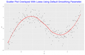
This scatter plot is overlayed with loess smoothing curve with the default smoothing parameter of 0.75.

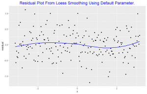
The residuals are graphed against x and a loess curve is superposed; for the curve on this display, alpha = 0.8. The loess curve suggests there is some dependence of the residuals on x, since the curve is not nearly horizontal. This means the default smoothness parameter is too large in the smoothing of the scatter plot above. This indicates that the loess curve has not effectively found the signal.

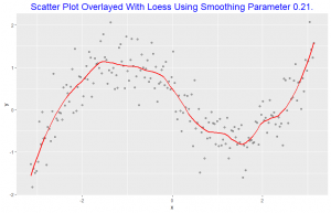
The scatter plot is overlayed with loess smoothing curve with smoothness parameter of 0.21

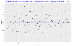
This plot shows no dependence of the residuals on x, since the loess curve is horizontal. This suggests the loess curve with smoothness parameter 0.21 overlayed on the scatter plot is not distorting the underlying pattern. This indicates that the lowess curve has effectively found the signal. For the loess curve in this plot alpha = 0.8.

Dot Plots

In this post I will be constructing three dotplots. I will use data in a two-way table to construct these dotplots. The population of  8 Countries in West Africa namely Cote d’Ivoire, Ghana, Liberia, Mauritania, Mali, Niger, Senegal and Togo from 2008 through 2017 is cross classified in my two way table where response is the population, the row classification is Country and the column classification is Year.


In this plot we observe that the mean population growth of Ghana over the 10 year period is the highest among the 8 countries considered. Mauritania has the least mean population growth which is not too different from the mean population growth of Liberia.


Grouping by country Ghana is seen to have experienced the highest population growth over the 10 year period. The population growth of Mauritania and Liberia are about same, these two Countries experienced the least growth over the 10 year period. The other countries also experience increase in population growth over the 10 year period.


Grouping by Year, much more insight is gain on how each Country’s population grew compared to the others from year to year. From 2008 to 2017 Ghana is seen to maintain its lead in population growth at higher rates compared to the other countries. Liberia and Mauritania did not experience much increase in population growth from each year to the other. The other countries did increase.

When we grouped by year ( column variable) we are able to compare the population growth of all countries for each time period, but when we group by country ( row variable )  comparison is quite challenging, we see mainly how each country’s population grew over the 10 year period. Grouping by year seems to give us more insight into comparison and thus I will consider grouping by Year ( the column variable ) as better.


Comparing Distributions

In this post I will be comparing distributions of data using a one-dimensional scatterplot, a Quantile plot, Quantile – Quantile plot and Tukey mean difference plot. The dataset used for this is studentdata from the LearnBayes package which contains results from a survey given to a large group of students from an introductory statistics class. A random sample of size 100 is taken from the data with variables Haircut and Gender.

The one-dimensional scatterplot shows the distribuition of the male and female haircut. Female haircut was more than male haircut. From the quantile plot we observe that in the 0.2 quantile both male and female haircut was zero. The median of the Haircut for females is about 25 and that of males is 10. Comparing haircut for the 0.95 quantile we observe that male haircut is slightly less than 20 whiles that of females is about 70. Thus comparing the two distributions of the data we see that female haircut was more than males.

Throughout the entire range of the distribution, the female haircuts are greater than the male haircut as seen in the quantile – quantile plot. The relation between the two distributions can best be discribed by an exponential function. From the Tukey Mean-Difference plot we observe that the difference of the haircuts across all quantiles was positive and increased as the mean haircut increased. Also indicating that female haircut was more in all the quantiles.

The quantile-quantile plot of the measurements is the best display to compare the distribution of the haircut for males and females. Not only are we able to compare each quantile of male haircut and female haircut but we are also able to state a relationship by use of a function between the two measurements by looking at this graph which the other displays can not readily give.


Pythagorean Relationship

The data used for the graph is NBA standings for 2016-17 for the Eastern Conference. The first panel is a scatter plot of log2(win/loss) against log2(points scored/ points allowed) overlayed with a line of best fit. There is a positive association. The best fitting choice for k is 14.148. We did not observe any unusual teams from the residual plot. A standardized residual plot was also constructed which showed that all points were within two standard deviations of the mean indicating that there were no unusual points.