Monthly Archives: September 2018

Visualizing Amounts

In this post I will be comparing the best Broadway shows for two time intervals: 2000-2008, and 2009 – 2016. I will be using total attendance for Broadway shows over the two time intervals as my measure of best. I will present four grouped and stacked bar graphs, the first two needs some improvements and the final two are the improved versions of the former. The data for the plot can be access at  https://think.cs.vt.edu/corgis/csv/broadway/broadway.html

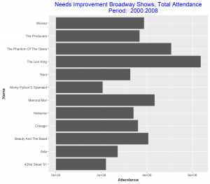
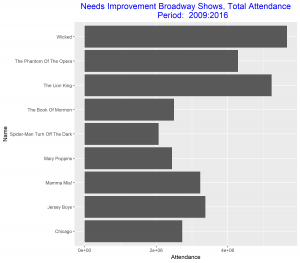
Since our aim is to compare the best Broadway shows over the two time intervals, we can improve these two graphs above be arranging the bars in each in a decreasing order. We also relabel the vertical axis to make it more descriptive of our data. These improvements will make the graphs stand out and good to be used for our comparison.

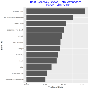
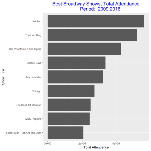
From the improved graphs we observe that the best Broadway show from 2000 – 2008 was the show with title “The Lion King” and the best in 2009 – 2016 was the show with title “Wicked”. The total attendance for the best show in 2000 – 2008 was greater than the total attendance for the best show in 2009 – 2016. The show title “The Lion King” came out as the best out of eleven other competitors as against the show title “Wicked” which came out as the best out of only eight competitors. The least best Broadway shows were “Monty Python’s Spamalot” and “Spider-Man Turn off the Dark” respectively for the two time intervals. Both gained this position with about the same total attendance.

Exponential Population Growth

The graph above is a plot of China’s population growth from 1962 to 1971. The log base 2 of the population is on the left vertical axis and the actual population size is on the right vertical axis. The plot of the actual population against year shows and exponential growth in population. Taking log base 2 of the population and plotting it against year gives a linear graph. From the graph we observe that China’s population increased by 26.6% over this 10 year period.

In this graph we compare the population growth of China and India. The log base 2 of the population is plotted against year, hence the linear graphs. China’s population is increasing at slightly higher rate than that of China. The intercepts of the two graphs shows that China’s population is higher than that of India.

Nutritional information for a selection of US cereals.

A correlation matrix of the numeric variables in the dataset, UScereal in the MASS library, is formed together with a scatterplot matrix using all the variables.  The highest correlation is between potassium and fibre.  On the horizontal scale log base 10 of fibre is plotted and on the vertical scale log base 10 of potassium is plotted. The log base 10 of each variable is plotted to stabilize the variability in the data. Plotting the log of the data also helped to make use of more of the data rectangle making the data standout. We observe a positive association between the two variables. As the fibre in the cereal increases the potassium in the cereal is also increased. We encountered a challenge with taking log since there were some observations which were 0, resulting in some points on the vertical scale.


We violated visual prominence by using squares to show the data. The overlap between the squares makes it difficult for the data to standout. Including a text and a reference line are needless in this plot (superfluity).

Protein is seen to be the most correlated variable to both potassium and fibre from the correlation matrix. From the plot we observe that there is a positive correlation between these  three variables. As fibre increases and potassium increases, protein also increases. The lower left corner of the plot has more dark blue points but moving further to the right more light blue colors are seen which represents increase in protein.