Monthly Archives: November 2018

POP CHARTS

On page 262, Cleveland states that “Any data that can be encoded by one of these pop charts (such as a pie chart, divided bar chart or an area chart) can also be decoded by either a dot plot or multiway dot plot that typically provides far more pattern perception and table look-up than the pop-chart encoding.” Demonstrate that Cleveland is right by finding two pop charts in the media and redrawing each data by using a dot plot or multiway dot plot. In each case, show the original pop chart and the new plot and explain why the new plot is an improvement.


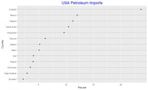
Since the slides in the pie chart are arranged in increasing order of percentages except the “other” category, we observe that the pattern perception for both the pie chart and the dot plot are very similar. We note the difficulty in visually obtaining the difference in percentages between the slides in the pie chart unlike in the dot plot. The dot plot gives an added information due to it’s position encoding as it detects that two different line segments could be used to represent percentages between 2.19 to 6.19 and 9.64 to 12.01 respectively, in this spirit we may consider the 23.66 percent import from Canada as an interesting outlier. Thus the dot plot is an improvement over the pie chart.


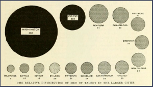
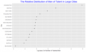
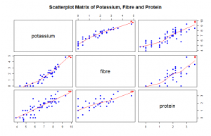
In the area chart, the area of each circle represents the number of talented people in that city. As we observe, it’s difficult to distinguish the difference in area for some of the cities without having to look at the numbers beneath them. One may argue that with the numbers beneath each circle the graph may as well be represented by just a frequency table. The area chart do not provide efficient detection of geometric objects that convey information about differences of values. The dot plot shows the number of talented people using a log scale. The data are graphed by position along a common scale and pattern perception is far more efficient than the area chart. For example, it is hard to detect a change in the circle areas for Philadelphia and New York just by looking at the area plot without looking at the number beneath the circle, but the dot plot shows that the numbers vary much. Table look-up is far more accurate and rapid from the dot plot than from the area chart. The matching operations necessary to decode values from the area chart are both slower and less accurate than the scanning and interpolation operations that provide table look-up from the dot plot. Hence the dot plot is an improvement over the area chart.


Multivariate Data

In this post we construct a scatterplot matrix, a coplot, and a spinning 3-dimensional scatterplot for Potassium, Fibre and Protein which are three variables in the dataset UScereal in the MASS package with eleven variables for a group of 65 breakfast cereals. Based on our graphs, we describe the general relationships between the three variables. In addition, we find two “special” cereals that seem to deviate from the general relationship patterns.

We plot log base 2 of the variables potassium, fibre and protein to improve the resolution of our plot, most data points were clustered at one side of the graph. From our scatterplot matrix we observe that the relationship between potassium and fibre, potassium and protein, fibre and protein is about a positive linear association. An increase in one variable saw an increase in the other.


In the coplot also we plotted log base 2 of Potassium against log base 2 of Fibre while we condition on log base 2 of Protein. From the two panels at the lower left of the coplot we observe a nonlinear relation between the amounts of potassium and fibre in cereals when we condition on protein. From the lower left panel, below 1.414 of fibre in the cereals potassium is constant and above 1.414 of fibre there is a positive linear association. In the second panel from the lower left there is a positive linear association below 1.416 of fibre and a positive linear association above 1.416 of fibre as protein increased. The slopes are however different. We observe some interaction between protein, potassium and fibre. From panel (3,1), (1,1), (2,2) and (3,3) we observe a positive linear association between potassium and fibree. At this point no effect of protein is seen.

As fibre increases potassium increases. Protein increases and stops at around a height of 10. Two special cereals with Protein above the normal protein levels for all cereals and corresponding to the highest levels of fibre and potassium which deviate from the general relationship pattern are 100% Brand and All – Bran indicated with red in all the plots.


Color

In the first part of this post I will construct four time series plots on the same graph and in the second part I will choose a nice palette for a bivariate normal density estimate. The data set for the time series plot is the Broadway show from https://think.cs.vt.edu/corgis/csv/broadway/broadway.html and the data for the bivariate normal denstiy estimate is simulated.

In the time series plot above we plot the mean Capacity as a function of week number, comparing years from 2010 to 2013. The choices help to distinctively distinguish the series for each year. A loess curve is overlayed on each year’s series. At the beginning of 2010 the mean capacity was 82.5, this decreased from the first week till the 13th week and then increases till the 30th week and also decreased from there till the 52nd week recording a mean capacity of about 71. In 2011 mean capacity decreased from the first week till the 9th week and increased till the 32nd week. 2012 shows a similar pattern as 2010. 2013 was interesting to look at, mean capacity increased from the first week till about the 25th week then decreased till about the 38th week and increased till the end of the year.


In the contour graph of the bivariate normal density estimate we use the palette “Dark2”. With this we are able to see clearly each of the contour curves well. The contour curves are ellipses. The negative slope of the major axis shows the negative correlation between the two variables and its eccentricity shows the correlation value is close to -1.