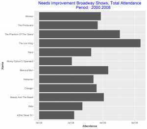
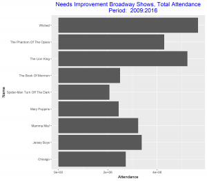
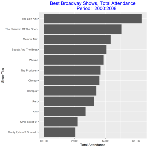
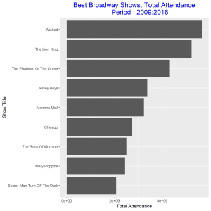
In this post I will be comparing the best Broadway shows for two time intervals: 2000-2008, and 2009 – 2016. I will be using total attendance for Broadway shows over the two time intervals as my measure of best. I will present four grouped and stacked bar graphs, the first two needs some improvements and the final two are the improved versions of the former. The data for the plot can be access at https://think.cs.vt.edu/corgis/csv/broadway/broadway.html


Since our aim is to compare the best Broadway shows over the two time intervals, we can improve these two graphs above be arranging the bars in each in a decreasing order. We also relabel the vertical axis to make it more descriptive of our data. These improvements will make the graphs stand out and good to be used for our comparison.


From the improved graphs we observe that the best Broadway show from 2000 – 2008 was the show with title “The Lion King” and the best in 2009 – 2016 was the show with title “Wicked”. The total attendance for the best show in 2000 – 2008 was greater than the total attendance for the best show in 2009 – 2016. The show title “The Lion King” came out as the best out of eleven other competitors as against the show title “Wicked” which came out as the best out of only eight competitors. The least best Broadway shows were “Monty Python’s Spamalot” and “Spider-Man Turn off the Dark” respectively for the two time intervals. Both gained this position with about the same total attendance.