In this post I will be comparing distributions of data using a one-dimensional scatterplot, a Quantile plot, Quantile – Quantile plot and Tukey mean difference plot. The dataset used for this is studentdata from the LearnBayes package which contains results from a survey given to a large group of students from an introductory statistics class. A random sample of size 100 is taken from the data with variables Haircut and Gender.


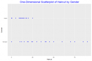
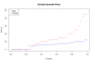
The one-dimensional scatterplot shows the distribuition of the male and female haircut. Female haircut was more than male haircut. From the quantile plot we observe that in the 0.2 quantile both male and female haircut was zero. The median of the Haircut for females is about 25 and that of males is 10. Comparing haircut for the 0.95 quantile we observe that male haircut is slightly less than 20 whiles that of females is about 70. Thus comparing the two distributions of the data we see that female haircut was more than males.


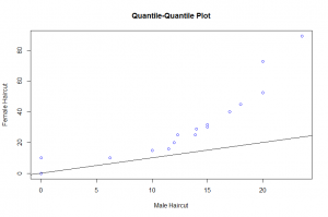
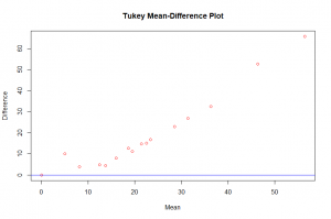
Throughout the entire range of the distribution, the female haircuts are greater than the male haircut as seen in the quantile – quantile plot. The relation between the two distributions can best be discribed by an exponential function. From the Tukey Mean-Difference plot we observe that the difference of the haircuts across all quantiles was positive and increased as the mean haircut increased. Also indicating that female haircut was more in all the quantiles.
The quantile-quantile plot of the measurements is the best display to compare the distribution of the haircut for males and females. Not only are we able to compare each quantile of male haircut and female haircut but we are also able to state a relationship by use of a function between the two measurements by looking at this graph which the other displays can not readily give.