Monthly Archives: January 2013

The Yankees and the World Series — using R to graph

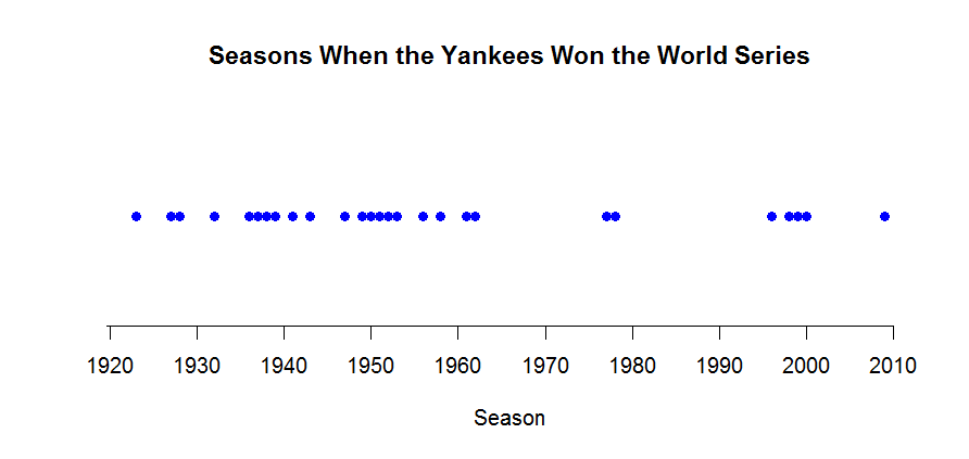
I thought it might be helpful to illustrate the flexibility of the basic R system in creating graphs.  I’m giving a talk in about a month to undergraduate math students in Michigan.  The topic is the playoff system in baseball.  Whenever one talks about World Series, one thinks of the New York Yankees who won 27 World Series.  What seasons did the Yankees win their titles?

I have a vector years containing the seasons of these 27 titles.


1923 1927 1928 1932 1936 1937 1938 1939 1941 1943 1947 1949 1950 1951
1952 1953 1956 1958 1961 1962 1977 1978 1996 1998 1999 2000 2009

I want to create a simple “number line” plot where I have a scale of season values from 1900 (first year of two leagues in MLB) to 2010 and I display dots at the season values.

Here’s the process in R.

1.  I use the plot function to plot the year values on the horizontal against the value 1 on the vertical.  I use a solid circle plotting character (pch = 19), turn off the axes and scales (axes = FALSE), add a horizontal axis label and a title.

plot(years, 1 + 0*years, pch=19, axes=FALSE, ylab="", xlab="Season",
main="Seasons When the Yankees Won the World Series", col="blue")

2. Now I want to add a horizontal axis. I do this the axis function — the argument indicates the bottom side, and seq(1900, 2015, 10) indicates the axis tick marks are to be displayed from 1900 to 2015 in steps of 10.

axis(1, seq(1900, 2015, 10))

Here’s my completed graph. It shows that the Yankees were really the dominant team in between the seasons 1920 and 1960.

R tips

There were a couple of R questions in the last homework that I’ll answer.

How does one draw only two axes?

If you want to draw only two axes instead of the default four, first do your graph with the axes turned off:

library(MASS)
plot(log(mammals), axes = FALSE)

Then use the axis command twice to draw two axes with scales:

axis(1)
axis(2)

How do you get the scale-line rectangle and data rectangle to be the same?

You do it the same way as above. You plot, turning off the axes by specifying axes = FALSE. Then you use the axis function twice. For example, if you type

axis(1, at=seq(0, 10 2))

you are specifying that the x axis is drawn from 0 to 10 with tick marks at 0, 2, …, 10.

Examples of Unclear Vision

In last week’s blog assignment, you were supposed to show me examples of a scatterplot that displayed unclear vision.  This seemed to be a fun assignment — let me show you several examples that you created.

Here’s Nate’s graph.   It is unclear for two reasons:  the large solid plotting points overlap, making it hard to see the individual points, and the aspect ratio is chosen so it difficult to see the pattern of points.

Janine crated a really bad graph — bad in the visual sense.

Janine chose small plotting points and added connecting lines which obscure any pattern one might see in the graph.

Some of you showed me bad graphs that had poor axis labels, a poorly worded or hard to read caption, or a inappropriate title.  Although these graphs are bad, actually they illustrate poor communication (that we talk about in the Clear Understanding section) rather than poor vision.

Women as Academic Authors

There are interesting data visualizations that appear on the Internet.  For example, The Chronicle of Higher Education recently had a special study on women as academic authors.   They looked at the authorship of over 2 million articles over 1765 fields and subfields.  They focused on the percentage of papers that had a female author.

They have an interesting visualization of this massive dataset.

Have a look at this graph.   From a statistical viewpoint, is this an effective presentation of this data?

A better graph

In the last post, I was critical of a scatterplot from the perspective of clear vision.  I thought I should show a graph that I think is easier to understand.

A couple of years ago, I gave a conceptual calculus multiple-choice exam to all of our Calculus I sections.  We gave the exam at the beginning of the semester (pretest) and again at the end of the semester (posttest).  The questions were on various aspects of calculus, including Derivatives, Limits, Functions, and Applications.

Using the R package ggplot2 (a package we’ll learn about later in the class) I constructed a scatterplot of the improvement (posttest – pretest) against the pretest.  I color coded the questions by the type of question.

What do we learn from this graph?

  • Note that the legend is placed outside of the plot window and there is much less clutter in the graph.
  • It is interesting that there were a number of questions where there was little improvement in the scores.  I notice three blue points in the lower left of the graph — the students struggled on these limit questions on the pretest and showed little improvement in the posttest.
  • How about success?  The three green points in the upper left of the graph correspond to derivative questions.  On these questions, we observe substantial improvement between the pretest and posttest.  Perhaps these questions matched up closely with content in the course.

Improving active learning graph

In the previous post, I showed a graph that supposedly shows the benefit of an active learning approach in teaching.

From the viewpoint of clear vision, this graph has problems.  Let me list some of the problems I see.

  • Generally, this graph has too much clutter.
  • The plotting points have dots that are surrounded by circles, squares, and diamonds, with different shades.  I have a hard time distinguishing the points.
  • There are six overlapping lines with different shading.  It is hard to understand the meaning of the lines although there are labels on the left.
  • It is hard to read the labels on the left since they interact with the inward tic marks.
  • The legend for the plotting points is inside the line which adds to the clutter.
  • Hard to read the text label right above the x axis.
  • I don’t understand the <> notation, but part of the problem is that I don’t read many physics papers.

How would I improve this display?

  • I would remove much of the text from the figure window.
  • I’d use simpler plotting points, perhaps using color or different plotting symbols to distinguish groups.
  • The legend should go outside of the plot window.

Graph demonstrating active learning

Recently, Karen Meyers from the Center of Teaching and Learning talked about an article by Richard Hake in the American Journal of Physics that demonstrates the value of active learning.  This graph that she showed seems appropriate for our class.

One of the main principles in Chapter 2 is that a graph should have Clear Vision which basically means that the message should be clear from reading the graph.  I think there are several problems with this display — can you think what they are?


Famous Hockey Stick Graph

I’ll be using this blog to display good statistical graphs and graphs that aren’t so helpful from a statistical point of view.

It seems appropriate today to show the famous “hockey stick” graph since it appears that the National Hockey League Strike is Over.

This graph comes from this New York Times article.

This graph summarizes temperature data for over 1000 years.  What do we see in this graph?

  • Since this is called the “hockey stick” graph, clearly the notable feature is that temperatures have remained constant for a long time, but suddenly in the last 100 years, the temperatures have jumped up.
  • I am also interested in the variability of the temperatures over time.  I’m not quite sure what the grey section represents, but after 1600, the variability gets much smaller.
  • I think it is interesting that there are two sources of temperature data — tree rings, corals, etc (blue) and thermometers (red) and the two sources of data agree for recent years.

From a statistical point of view, is this a good graph?  Generally, I would say yes.  It is easy to read and it clearly communicates the pattern of change of the temperatures.

Could I improve this graph?  There are a few small things I’d change.

  • The tic marks pointing inward get in the way of the data.  I’d use outward facing tic marks.
  • I’d put the descriptive text outside of the data window.   Currently it looks a bit cluttered.
  • Although this may have been part of the original display, I’d add a caption explaining what is be learned from this display.

Welcome to Statistical Graphics

Welcome to MATH 6820 Statistical Graphics.  I will be using this blog as regular communication for this course.

This graph is helpful for understanding changes in the Consumer Price Index.  There is a story about I created this graph and what is supposed to show that I’ll tell later.