In the last post, I was critical of a scatterplot from the perspective of clear vision. I thought I should show a graph that I think is easier to understand.
A couple of years ago, I gave a conceptual calculus multiple-choice exam to all of our Calculus I sections. We gave the exam at the beginning of the semester (pretest) and again at the end of the semester (posttest). The questions were on various aspects of calculus, including Derivatives, Limits, Functions, and Applications.
Using the R package ggplot2 (a package we’ll learn about later in the class) I constructed a scatterplot of the improvement (posttest – pretest) against the pretest. I color coded the questions by the type of question.
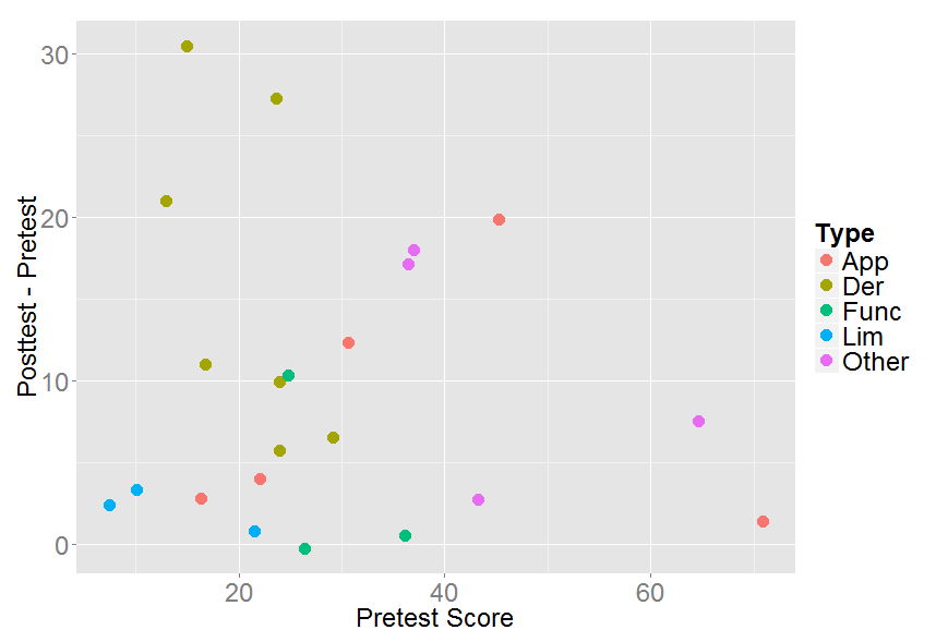
What do we learn from this graph?
- Note that the legend is placed outside of the plot window and there is much less clutter in the graph.
- It is interesting that there were a number of questions where there was little improvement in the scores. I notice three blue points in the lower left of the graph — the students struggled on these limit questions on the pretest and showed little improvement in the posttest.
- How about success? The three green points in the upper left of the graph correspond to derivative questions. On these questions, we observe substantial improvement between the pretest and posttest. Perhaps these questions matched up closely with content in the course.