I’ll be using this blog to display good statistical graphs and graphs that aren’t so helpful from a statistical point of view.
It seems appropriate today to show the famous “hockey stick” graph since it appears that the National Hockey League Strike is Over.
This graph comes from this New York Times article.
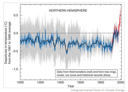
This graph summarizes temperature data for over 1000 years. What do we see in this graph?
- Since this is called the “hockey stick” graph, clearly the notable feature is that temperatures have remained constant for a long time, but suddenly in the last 100 years, the temperatures have jumped up.
- I am also interested in the variability of the temperatures over time. I’m not quite sure what the grey section represents, but after 1600, the variability gets much smaller.
- I think it is interesting that there are two sources of temperature data — tree rings, corals, etc (blue) and thermometers (red) and the two sources of data agree for recent years.
From a statistical point of view, is this a good graph? Generally, I would say yes. It is easy to read and it clearly communicates the pattern of change of the temperatures.
Could I improve this graph? There are a few small things I’d change.
- The tic marks pointing inward get in the way of the data. I’d use outward facing tic marks.
- I’d put the descriptive text outside of the data window. Currently it looks a bit cluttered.
- Although this may have been part of the original display, I’d add a caption explaining what is be learned from this display.