Monthly Archives: February 2013

Making sense of scatterplots

One of the most popular statistical graphs is the scatterplot which we use to visualize relationships between two quantitative variables.  Although a scatterplot is a common plot in our introductory statistics class, I think we overestimate our students’ abilities to actually understand the patterns that we’d like them to see.

I just read an interesting blog which talks about the difficulty in interpreting scatterplots.

At the graduate level, I find that students generally have difficulty in interpreting residual graphs.  It probably means that they haven’t had sufficient experience in reading residual graphs.


Nice way of getting R output

There is a real nice feature of RStudio that allows you to create a html file containing your work — R code and any textual or graphical output.

I’ll illustrate it using the snowfall example from my R by Example book.

1.  I create a file with the R code for the snowfall graph.

2.  In RStudio, choose Compile Notebook from the File menu.

3.  It creates this html file including the R code and the snowfall graph.

This code may help in creating your graph for this week’s assignment.  Also, I encourage you to use this Notebook feature — it provides an easy way of sharing R work.


Popular statistics packages

I just found this interesting article discussing the popularity of different software package for doing statistics. How does one measure popularity?  One way is to measure the number of discussions on the different listservs for each of the packages.

There is a nice graph that shows the month email discussion on each listserv over a 20-year period.   Look at the lines corresponding to the two software giants SAS and R.  What conclusion do you draw from looking at this graph?

Olympics bronze medal runs – Part II

In the first post, we looked at the pattern of bronze medal times in the men’s 200 meter run.  By plotting the log time against year, we figured out the general pattern of decrease over years.   That’s the first part of the story.

By exploring the residuals from the loess fit, we can learn more.  Below I’ve pasted the residual graph — remember that the residuals are expressed in a log (base e) scale.

What do we see in this residual graph?

  1. Most of the residuals fall between -.01 and +.01.  Remember that .01 on the log e scale corresponds to a change of 1%.  So most of the times fall within 1% of the fitted curve.
  2. I see three outliers — there are three residuals smaller than -0.01 — they appear to correspond to the years 1912, 1968, and 1996.

Are there any special circumstances in the years 1912, 1968, and 1996 that would explain these unusually low bronze medal running times?  Actually, 1968 was a special year in that the Olympics were held in Mexico City which has a high altitude.  A venue at a high altitude means perhaps less air resistance that could contribute to faster running times.  One of the most remarkable Olympics records is Bob Beamon’s amazing long jump which occurred during these same Olympics.

A hypothetical conversation with my graphics class

One problem with an online course is that I can’t physically turn back homework and talk about some of the issues on the problems.  So I’ll pretend that I am turning back your “which log” graphs and make up a hypothetical conversation.

Jim:  Many of you lost points on this assignment since you didn’t interpret the rate of change on your graphs.

Student A:  But you didn’t tell us to interpret the graph in the assignment.

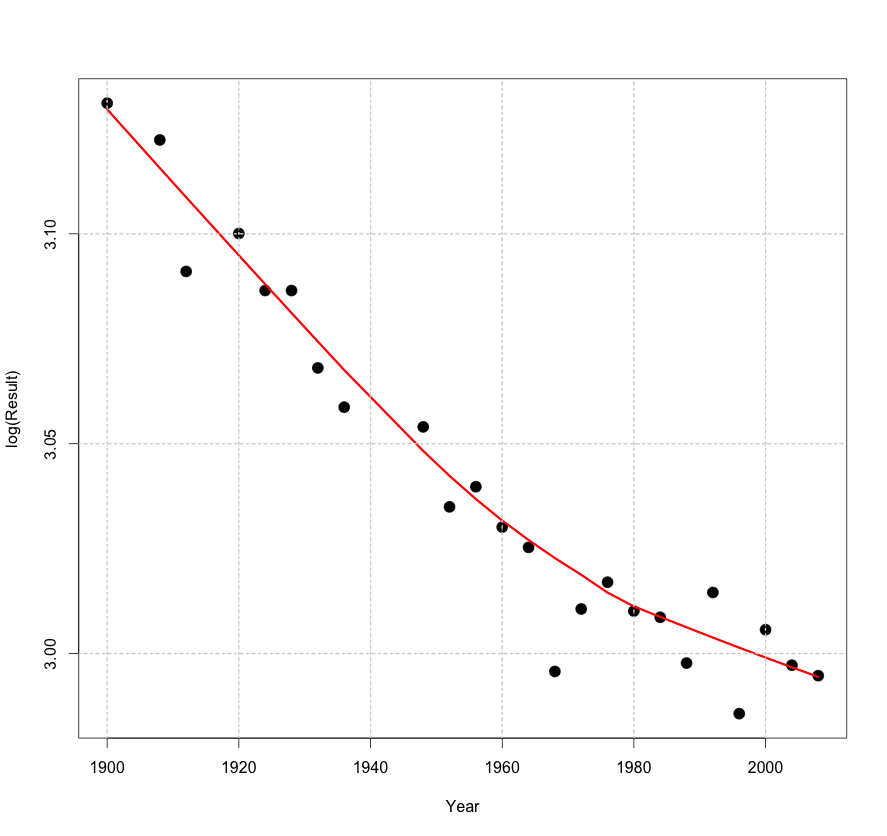
Jim:  That’s true — I did not specifically ask you to interpret the graph.  But what is the point of plotting the log of the response against time?  We take the log to better see and interpret the rate of change of the response.  A log converts exponential growth to linear graph and it is easy to read linear growth from the graph.

Student B:  But I did interpret the graph that you still took off points.

Jim:  Yes, you told me that the national debt is increasing.  But I think I knew that before I looked at your graph.  What I don’t know (and still don’t know since you didn’t tell me) is the rate of the increase.  How much has the debt increased each year?

Student C:  Do we always have to interpret our graphs?

Jim:  Most graphs don’t speak for themselves.  Actually, maybe you can put a push button on the graph that says “PRESS HERE” and then the graph (in a nice voice) can actually explain itself.  But since this is hard to do, you have to write the basic message:  what should the reader learn from viewing your graph?

Student D:  Okay, I understand.

Jim:  If you put away your cell phone, we can continue with the topic for today’s class.

Olympic bronze medal times

When one explores medal results of the Olympics, it is pretty clear that athletes are performing better over time.  A good graph can be helpful in understanding the rate of improvement of performance.

I have a nice dataset that contains all of the medal times for all of the running times for both gender for all of the Olympics.  I’m going to focus on the bronze medal time of the men’s 200 meter run.  Why bronze?  Well, the gold medal time might reflect the accomplishments of a single person, while the bronze medal time might be better at measuring the performance of “top runners” during that Olympics year.

I expect the bronze medal running times to decrease over time and I want to describe this decrease.  I believe that these times will decrease in a multiplicative fashion, so I will graph the logarithm of the time against year.  What log did I take?  I’ll explain after I show you the graph.  To make it easy to see the general pattern, I add a loess smoothing curve (we’ll learn more about this method later in the class).

In this case, I decided to take a natural (base e) logarithm.  Why?  There is a nice property of logs base e.    A log increase of x is approximately equal to a percentage change of 100 x %, and a log decrease of x is approximately the same as a percentage decrease of 100 x%.   Using this property …

  • For early years, it looks like the pattern is a straight line with slope -0.03 / 20.  So in each 20-year period, the time has been decreasing by approximately 3 percent.
  • For later years, the pattern is different — the slope is more like 0.015 – 0.020 over 20 years.  So in recent years, the times have been decreasing only 1.5  – 2 percent each 20 years.

Actually, there is more to this graphical story when we look at residuals — I’ll continue next week with a Part II.


Hall of Fame Voting

In baseball, great players get elected into a Hall of Fame.  To get elected, a player must receive at least 75 percent of the vote among the baseball writers.  If they don’t get 75% of the vote, they are eligible for election for the following year.  Generally, the pattern is that the voting percent for a particular player increases over time and the hope is eventually that he will get over 75% of the vote and be elected to the HOF.

I recently saw the following graph that shows the voting pattern for many players over time.  I’ve pasted the graph below; the original article and graph can be found here.

Each line trajectory corresponds to the voting pattern for a particular player. The yellow dots below the horizontal line correspond to the first year the player is eligible to be voted in, and the yellow dots above the horizontal line correspond to players inducted in the HOF.

What is interesting to me is that the slopes of the HOF trajectories seem pretty similar across players.  I would suspect that one could make a reasonable prediction of a player’s chance of getting inducted in the HOF based on his initial voting percentage.

The Most Poisoned Names

One general place I go to find interesting graphs is statsblogs.com.  I recently found an interesting graph that focus on the most poisoned names.   A person was interested in the names that Americans give their children.  A poisoned name is one that shows a big dropoff from one year to the next.

Here is the graph.  On the horizontal axis, we see the year, and the vertical axis represents the percentage of children with a particular name.  A poisoned name is one that exhibits a sharp decline — the largest declines I see are Katina in the 1970’s and Ashanti in the early 2000’s.

This is a nice graph since it clearly shows the poisoned names.  I like the use of different colors and the labels are helpful and don’t make the graph too cluttered.