Daily Archives: January 26, 2013

R tips

There were a couple of R questions in the last homework that I’ll answer.

How does one draw only two axes?

If you want to draw only two axes instead of the default four, first do your graph with the axes turned off:

library(MASS)
plot(log(mammals), axes = FALSE)

Then use the axis command twice to draw two axes with scales:

axis(1)
axis(2)

How do you get the scale-line rectangle and data rectangle to be the same?

You do it the same way as above. You plot, turning off the axes by specifying axes = FALSE. Then you use the axis function twice. For example, if you type

axis(1, at=seq(0, 10 2))

you are specifying that the x axis is drawn from 0 to 10 with tick marks at 0, 2, …, 10.
Examples of Unclear Vision

In last week’s blog assignment, you were supposed to show me examples of a scatterplot that displayed unclear vision.  This seemed to be a fun assignment — let me show you several examples that you created.

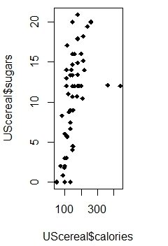
Here’s Nate’s graph.   It is unclear for two reasons:  the large solid plotting points overlap, making it hard to see the individual points, and the aspect ratio is chosen so it difficult to see the pattern of points.

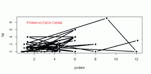
Janine crated a really bad graph — bad in the visual sense.

Janine chose small plotting points and added connecting lines which obscure any pattern one might see in the graph.

Some of you showed me bad graphs that had poor axis labels, a poorly worded or hard to read caption, or a inappropriate title.  Although these graphs are bad, actually they illustrate poor communication (that we talk about in the Clear Understanding section) rather than poor vision.