***** Update, the links to the site weren’t working so I posted then to this blog, See below ****
It took a bit longer than expected, but I’ve finally completed some comps for the redesign of the valentine website. I ran into a few issues while creating these (mainly designers block), but I’ve got them done and I am ready to have people review them and rip them apart. I’m only allowed two comps to show my contact at the Valentine, so please choose the TWO better designs and critique form there. I am meeting with the client this Friday, so if you can get back to me before Thursday night, I would be eternally grateful.
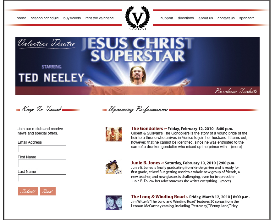
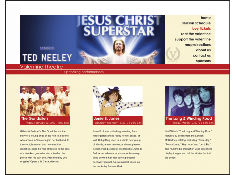
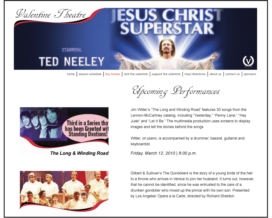
*** Things that have to be in the design – Logo, Title of business, Large flash banner (Jesus Christ super star for each), and a purchase button that pops
Now about the design, they want a clean and simple site that isn’t too distracting or contemporary. I showed them my portfolio site and the Architecture site that I built and they really enjoyed what I created. I about 90% sure they wanted something similar.
Important Links
Valentines website: http://www.valentinetheatre.com/
My portfolio site: http://www.rprnow.com/portfolio2/
Architecture site: http://www.bgsu.edu/architecture
My Comps (click below to enlarge)

3 thoughts on “Comps finally online”
Leave a Reply
You must be logged in to post a comment.
9:19 am - 1-27-2010
HI Paul!
I like Comp 3 and 4 personally. Comp 3 has a nice simple design that isn’t too distracting however I like the way you used the color in comp 4. In comp 4, the logo for the valentine theatre seems a little more dominant while in 3, it is embedded within the image. Maybe try and bring this element into Comp 3?
I am not 100% set with the font that is being used for the headers (updates and Upcoming…)
Another thing to possibly think about is the size of font you have for your links, It seems a little small to me and a little hard to read. May be one thing to think about depending on their target audience. Now that I look closer, I think I like the links n Comp 1 and how the logo is more dominant.
Hope this helps, Looks good!
Jess
12:16 pm - 1-27-2010
Hello Paul,
I vote for Comp 1 and Comp 4. They both have a “Valentine Theater” feel to them and they seem organized and useable. I agree with Jess about the script font – a different, elegant, but readable font should be utilized. Comp 4 seems to complement their mailers that I get at home. I also agree about the font size for the links- make them bigger. Think of the audience that may be going to these events…we all have eye glasses now, so be kind to us and also the crowd older than me (they too visit websites)!! I really like the red/yellow complement in comp 4. Hope this helps!
Laney
11:05 pm - 1-27-2010
Hi Paul!
I think you’ve done a great job with all of your comps. Here is my response, I really like Comp # 2. I like the yellow/brown color of the box underneath everything and I love how the information is set up in that box, it’s easy to read. I also like Comp #1 the only thing I would change about it is the font for the headlines because it’s script I think it’s a bit too small to read, you can stick with a fancier font but I would look around for another choice.
Overall, I think you should use Comp #2 but modify the links section at the top. If you could put the links like you have them in Comp #1 into Comp #2 I think that would be the way to go! Make sure the links are big enough to see but aren’t too distracting. I hope this helps! If you need anymore help just holler.
-Mel