Stacey Rate

Another amazing bgsu blog

Blog #4

Filed under: Blogs — slrate at 12:03 pm on Wednesday, December 10, 2008

This is a painting of Marilyn Monroe by Andy Warhol. This work contributed a new understanding of color to the world. Most people were using realistic colors before Andy Warhol and the other pop artists came along. People started thinking outside of the box and used bright, vibrant colors other than boring normal colors. The color principles that make this work stand out is just how vibrant they are. Instead of using a normal hair color he used this bright neon yellow for her hair. The same thing applies to her eye shadow, skin color, and lip stick color. This work doesn’t really differ than any of his other work. In all of his pieces he used vibrant neon colors. He used dominance in that it is just a single image in the painting. He addresses it very realistically with the details of her face and hair. The colors, on the other hand, are very unrealistic. I am not afraid to use bright colors in my work now that I see it can turn out well.


This is an advertisement to stop smoking by Scott Plous. This work has given happy brighter colors to a bad situation. Normally an advertisement that deals with smoking wouldn’t have light greens and blues. Many of the quit smoking advertisements that I found were just pictures with people with cigarettes in their mouths, or something with a black background and a cigarette with a slogan. This stood out to me because it was a cartoon using one of the cigarette logos. This is also something that younger children might understand better than anything else because it’s a cartoon. They understand the fact that the camel is sick and that smoking is bad for you. How this differs from his other work is that he is actually showing “Joe Chemo” on his deathbed compared to him walking around. How he has used dominance is that he made the camel in the hospital bed his main focus. He addresses it in a non-serious way which most people wouldn’t do if they were being associated with smoking. It has made me hate smoking even more and it made me even happier that my mom quit smoking when I was younger. 

This is a dress by Betsey Johnson. With this dress she has given girls a way to be feminine and girly without having to wear pink. I don’t like pink that much and I would wear this blue dress instead of a pink dress. What stood out to me was this dress is actually wearable by normal people. It looks like something we could buy for a formal occasion. Many dresses and other clothing I see on the runway are very strange. It differs from other works because many of her dresses are very colorful and this is only white and blue. She used the body as dominance. She shaped the dress to fit closely to the body. She addressed the human form very well with this dress. It could probably look good on anybody with the way it is shaped. I haven’t really been influenced after seeing her work because I’m not that into fashion.

Image Essay #10

Filed under: Image Essays — slrate at 11:26 am on Wednesday, December 10, 2008

This image is a good example of the hierarchical triangle. The girl in the picture is the most important figure. She is the largest figure, and she looks like she is the caretaker of the two boys. Both of the boys are subordinate to her because they are smaller and they are looking up to her. The boy crouching is accentual to the boy that is standing and he is accentual to the girl sitting down. He is the accentual person because he is the smallest image. The color scheme for this image is a split complementary color scheme. It is a split complimentary color scheme because it has reds, blues, and greens. The reds are evident in the girls dress and her lipstick. It is also shown in the ground behind the girl and the two boys. It is also shown in the standing boys hair. The blue is shown in the blanket that is wrapped around the girl, the sash in the kneeled boy and the sky. The greens are shown in the flowers and grass.

Image Essay #9

Filed under: Image Essays — slrate at 11:15 am on Wednesday, December 10, 2008

This is a work made by Barry McGee. Barry McGee is a street artist who also paints large murals on walls in galleries. This is a great example of color schemes, unity and variety, Gestalt, and spacial or kinetic illusion. Barry McGee has put almost every type of color scheme in this picture. It has analogous, complementary, split-complementary, and tetradic color schemes. It does not contain a monochromatic color scheme. 

This is a good example of unity and variety and Gestalt because each box has the same pattern, but each box is different in it’s own way. The principles of Gestalt that this piece contains are repetition, unity, variety, and containment. The repetition occurs in each box and it breaks the pattern by having separate boxes with different patterns. This piece has containment because all of the boxes are contained into one big box. It has unity because all of the separate boxes are working together. It has variety because each box is different, but have the same general idea.

Image Essay #8

Filed under: Image Essays — slrate at 11:00 am on Wednesday, December 10, 2008

This image is a good example of color, hierarchy, and dominance. The color scheme is a triad. The image consists of reds, blues, and yellows. Red is the dominant color, yellows are the subordinate, and the blue is accentual. The reds and yellows are most evident in the fire and the animal in the front. The blue is shown in the sky and around the animals mouth and the person’s feet. Other colors used in this picture are grey tones. This suggests that it is the “dark” part of the game. 

Hierarchy and dominance is evident in this picture because he is in the middle ground, he is the biggest part in the picture, and he has obviously just defeated the animal. It looks like there is a lizard in the bottom left corner that is going to be his next enemy. It looks as if he will win because he has the giant ball with the spikes on it.

Image Essay #7

Filed under: Image Essays — slrate at 10:38 am on Wednesday, December 10, 2008

This picture of the Start Wars characters is a perfect example of the hierarchical triangle. The most important character in the movie, Luke Skywalker, is in the foreground of the picture. He is also the biggest person in the image. He is the dominant figure. Princess Leia and Han Solo are the subordinate characters in the movie and in the picture because they are directly behind Luke Skywalker. You can also tell they are the subordinate characters because they are slightly smaller than Luke. All of the other characters such as Chewbacca, R2D2 and C3PO are all accentual characters. They are all important to the movie, but in this specific one they are the least important, therefore, they are the smallest and placed around all of the main characters. Even though Luke Skywalker is in the front of the triangle, the way that Darth Vader’s hand is coming out and is bigger and above the rest of the characters and how large his head is in the background, it seems as if he is the dominant character. He is just as important as Luke Skywalker, so he is placed in the background, not to be overlooked, but to stand out. 

Image Essay #6

Filed under: Image Essays — slrate at 10:18 am on Wednesday, December 10, 2008

This picture is a perfect example of an analogous color scheme. Analogous color schemes consist of colors that are next to each other on the color wheel such as green, light green, and yellow or red, orange and yellow. This picture has reds, yellows, and greens. The dominant color is green, the subordinate color is yellow and the accentual color is the reds. In Annie Liebowitz’s version of the Wizard of Oz, she uses intense colors that create tension within the piece. This picture has tension because of the vibrancy in the colors. Annie Liebowitz did a great job of incorporating Keira Knightley’s hair and dress color with the flowers. Even her skin tone has a sort of yellow tint to it. The picture is also well balanced because none of the colors are too overpowering. They are all complimenting each other in the right way. 

The area of focus in this picture is Keira Knightley because she is in the foreground and she is perfectly in focus. The background is slightly out of focus because it’s not as important to the picture.

ArtsExpose #4

Filed under: ArtExpose — slrate at 9:17 pm on Tuesday, December 9, 2008

Arts Extravaganza                           


December 5th at 6:00 pm                   


Art Building            


1.)  Provide a brief detail-oriented technical description or summary of the event you attended.  This section should remain journalistic and should not be reflective of your opinion.

Many clubs come together and have the arts extravaganza. The students work was for sale and families could do various activities such as eating free food, buying pottery, or taking a picture with Santa Claus. Music students were also involved in the arts extravaganza. In three separate rooms, ensembles would play Christmas music for people to watch or to enjoy as they were passing by going to a different activity. A gallery with teachers work from the university was also displayed.


2.)  Use the section below to write a well-structured paragraph focusing on your personal critical insight / response to the event.  How did you interpret or react to what was presented to you? 

I interpreted this as something I might get to do as I get older and higher up in college. It made me realize that some of my work may be displayed and it gave me a sense of accomplishment. Even though I am a freshman, it gave me something to look forward to. I really enjoyed looking at other students work to see what kinds of mediums are available to me being an art major and music minor. 


3.)  What information, ideas, images, etc. most impressed you and why?

What impressed me the most were the vans outside, the ceramics, and the photography. I never would have thought to make vans be a work of art. I always just picture them on the road. I was impressed by the ceramics because anything displayed there was about 100 times better than my little pinch and coil pots. My works were all bumpy and everything was so smooth. There was also very intricate work and everything was beautiful. The photography impressed me the most out of all. I love photography. I always have and I always will so seeing any kind of picture just captivates me and I just look at one picture for 5 minutes. 


4.)  Overall, how would you rate this event (10 being the most worthwhile)?
            (10 / 9 / 8 / 7 / 6 / 5 / 4 / 3 / 2 / 1 )

I would rate this event a 10. 

I gave this a 10 because it is a great way to show parents what their students are doing in school. They know that their students aren’t just screwing off and they are actually doing something with their lives. It is also a great way to get students involved. I really enjoyed watching the glass blowing, jugglers, and everything else at the arts extravaganza. I would like to be involved in the future. 

ArtsExpose #3

Filed under: ArtExpose — slrate at 8:28 pm on Tuesday, December 9, 2008

A Christmas Carol                            


December 5th at 8:00 pm                   


Eva Saint Marie Theatre in University Hall             


Please choose the type of event from below and include in your blog post

1.)  Provide a brief detail-oriented technical description or summary of the event you attended.  This section should remain journalistic and should not be reflective of your opinion.

The event I attended was A Christmas Carol by Charles Dickens. It was modified by someone at the university and it was about 1 hour and 45 minutes. It depicted the life of Ebenezer Scrooge and the ghosts of Christmas present, past, and future, and also how Scrooge transforms himself through the night. 


2.)  Use the section below to write a well-structured paragraph focusing on your personal critical insight / response to the event.  How did you interpret or react to what was presented to you? 

How I interpreted the play is how many other people did also. I laughed and felt a sense of remorse at the right times for Scrooge. When my mom, sister, and I left the play, we talked about our favorite parts and our not so favorite parts. 


3.)  What information, ideas, images, etc. most impressed you and why?

 The images that most impressed me were the special effects that they were able to pull off. They had smoke machines and what looked like a trap door so the ghosts and other people were able do come out of the fireplace. This impressed me because I didn’t expect much of a play that didn’t involve that many people. The aura it put off reminded me somewhat of a high school play. What else impressed me was how well the actors did the English accents. I actually believed that some of them were British after watching the play for about half an hour. I also thought the actors were incredible because of the way they portrayed the characters and their clothing and everything else.    

4.)  Overall, how would you rate this event (10 being the most worthwhile)?
            (10 / 9 / 8 / 7 / 6 / 5 / 4 / 3 / 2 / 1 )

I would rate this event a 10. 


5.)  Justify your rating in the question above:

I gave this event a 10 because there wasn’t anything that I didn’t like about the play. It was well written, performed, and the effects were great. I really enjoyed seeing A Christmas Carol portrayed in a different way than just watching movies when they can do the inevitable. The only thing that would make me not like my experience was that the seats were a little too snug, but that has nothing to do with the play. 


Blog #3

Filed under: Blogs — slrate at 10:31 am on Monday, November 17, 2008

Artists Stories

1. Do we define a place or does a place define us?

I think that it can go both ways. With certain people a place defines them and others define the place. Some artists need to work in certain environments. They may have music playing, certain lighting, and they all have their own methods of working. Pepon Osorio made places into specific time periods and he would also transform houses. 

2. How is each of the featured artists influenced by particular places? How is this influence reflected in the artist’s work?

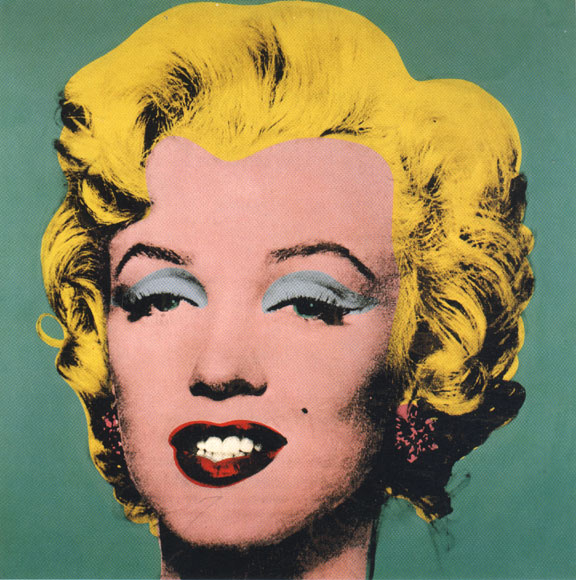
Richard Serra used big spaces. How this influence reflected the artists work is that he had very large pieces. He wanted people’s eyes to move around the art. His work is influenced by his work in stell mills and shipyards when he was younger. Pepon Osorio would turn houses into certain time periods, and in one case he made a whole house “plastified.” His work is influenced by him working as a social worker in the Bronx. Sally Mann is inspired by 19th century photographs. Her work is influenced by old cameras, and she often uses the cameras that have glass with them. They are often marked by scratches. Margaret Kilgallen and Barry McGee were street artists and they also painted compositions on walls in buildings. Margaret’s work is influenced by folklore and Barry’s work is influenced by contemporary urban culture. How this is reflected in Margaret’s work is that her paintings usually have women walking etc. independently. How this is reflected in Barry’s work is that it shows spray paint cans, and empty beer bottles. 

3. Which artist do you feel most connected to and why?

I felt most connected to Sally Mann. Even though she was a little off mentally, her photography was amazing. I have always wanted an old camera because the quality of the photos is just amazing. Yes, you can do much more with digital cameras now, but there is just something about using film that makes me feel happy. She explained how art is her life and her passion and when it made me think of myself. Much of her work reminds me of my favorite photographer Annie Leibovitz because of the tension in her photos. Another reason why I felt most connected to Sally Mann was because she isn’t scared to create whatever she wants. She doesn’t care what other people think and she used whoever she wanted. I want to do that with my work, but I am still in the mode of people telling me what to do with my art. Hopefully, I will be as good as that some day. 

4.When you were young, was there a place that interested you? A place that scared you? List five places from your childhood. Use one word to describe each of them.

Tree in my backyard for climbing- Adventure

Aunt’s house in Florida- Vacation

School- Hell

Softball field- home

My bedroom- Serenity

5. Pick one of those places. Try and remember it as well as you can. Answer these questions about it… What objects occupy that place? What are the textures and sizes of those objects? What was the lighting like? Was it a dark dreary place? Or a bright happy one?

The objects that occupied my bedroom were my bed, dresser, TV stand, and all of my other material possessions. They are all larger objects. The texture of my bed is softness, but the headboard and my dresser were made out of wood, so I would get a grainy feel out of it. The TV stand is made out of a sort of plastic wood so it was smooth. During the day my room was very bright because I have a large window in the middle of the outside wall. At night it was fairly dark, but I had a touch lamp, so I could get up to three values of light. It was a bright happy place because when I was younger, I was obsessed with the color pink. Ironically now, I only like a few shades of pink. I think all of my love for the color was used up when I was younger. It was also happy because I had all of my art work on the walls and they usually had vivid colors on them. 

My stories

1. What are the important stories that are told in our society today in books, movies, pictures, music, and new, or by friends and family? Consider if you could personally gaurantee a single story to be passed down to future generations what would that story be what form would it take and why?

Stories that are told today are love stories, comedies, and action. Every time a story is redone, it is altered in some way. I like this because it means that everybody makes it their own. The story that I would pass down would be Romeo and Juliet. The form that it would take would be orally because when the story would be told there would be more emotion involved rather than just reading it in a book. 

2. Why are some stories told, as opposed to others? Why do some stories continue to be told over time while other are lost?

Some stories are told more as opposed to others because they are more interesting. It is all about preference and if a story is boring and tends to drag on, nobody is going to want to listen to it and nobody is going to want to tell it. Also, stories that have interesting characters, endings, and plots are more likely to be told over time. People are interested in drama, we thrive on it and stories are the perfect way to satisfy that need without actually having to deal with drama in our own lives.

3. How do the artists featured in Stories use journals of sketchbooks in their artistic processes? Is a journal or sketchbook a work of art? Why or Why not?

They document what they see. Richard Serra would carry a sketchbook around with him everywhere and when he would see something that inspired him, he would just take it out and start to roughly sketch everything. Journals and sketchbooks are works of art. Writing is a form of art and sketchbooks are works of art because something was created. Anytime something is created, it is art. 

4. Each artist in this hour describes an even or element in his or her childhood that resonates in current work. Do you remember a time when you were 5,10, or 15 years younger. Please record, in a present tense voice, the experience that were important at that time. How did you spend your days? What did you dream about? What emotions did you feel? Write a self-description in your childhood voice, followed by a second description of yourself at the age from the point of view you have now.

An element from my childhood that resonates in my work is when I got my first camera. It was a camera from Kraft Macaroni and Cheese. It had the Kraft dinosaur on it and it was orange like macaroni and cheese. To put the film inside the camera, you had to slide it over. The film wasn’t like it is now, it was in the shape of a small telephone and it snapped into place. I would take it everywhere and take pictures of anything and everything. Usually the pictures sucked but my mom and others would encourage me and say “Those are very nice Stacey!” and I would just smile and take more pictures. I was about 5 years old when I got that camera from my mom and dad and I was so excited. I spent my days just snapping pictures. I dreamed about being a professional photographer. When I was younger I didn’t know that it could be a career so I would just say “Mommy, I want to be a picture taker when I grow up.” I felt every happy emotion possible in this experience. 

5 year old voice: I got a new camera today. It has the macaroni guy on it. It’s fun and I like to take pictures of stuff. I’m really happy that my mommy and daddy got me a camera! I want to be a picture taker when i grow up. It would be fun.

Having my first camera at a really young age jump started my love for photography. Over the years I have grown to love art and appreciate it even more. I have always loved taking pictures and I will never forget my Macaroni and Cheese Camera or my Coca-Cola camera.

Image Essay #5

Filed under: Image Essays — slrate at 8:35 am on Sunday, October 19, 2008


This is another image by Kara Walker. It is a very good example of negative and positive space and dominant, subordinate, and accentual shapes. This piece of art work is mostly negative space but your eye is immediately drawn to the black on the page because there is very little of it. Even though there is very little positive (black) spaces on this piece she still managed to have dominant, subordinate, and accentual shapes. The dominant shape would be the vine that the baby or young child is standing on. The subordinate shape would be the child and the accentual shape would be the spaces in between the vine and the white space in between the child’s hands and legs. At first you just think that it’s a person about to walk off of the vine and then realize that it’s a young child. What Kara Walker did by using a young child instead of an adult or anyone else is she created tension. Kara Walker uses negative and positive space and dominant, subordinate, and accentual shapes very well in all of her works.

Next Page »