Blog #4
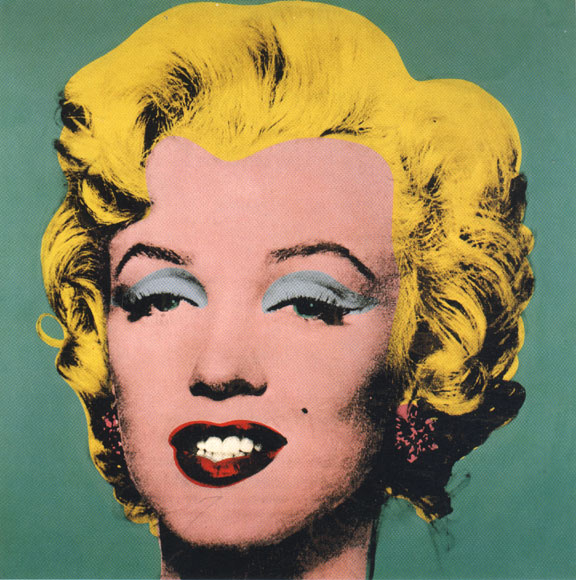
This is a painting of Marilyn Monroe by Andy Warhol. This work contributed a new understanding of color to the world. Most people were using realistic colors before Andy Warhol and the other pop artists came along. People started thinking outside of the box and used bright, vibrant colors other than boring normal colors. The color principles that make this work stand out is just how vibrant they are. Instead of using a normal hair color he used this bright neon yellow for her hair. The same thing applies to her eye shadow, skin color, and lip stick color. This work doesn’t really differ than any of his other work. In all of his pieces he used vibrant neon colors. He used dominance in that it is just a single image in the painting. He addresses it very realistically with the details of her face and hair. The colors, on the other hand, are very unrealistic. I am not afraid to use bright colors in my work now that I see it can turn out well.
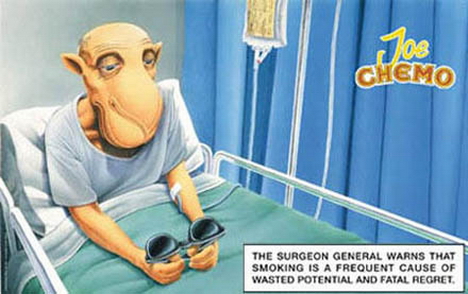
This is an advertisement to stop smoking by Scott Plous. This work has given happy brighter colors to a bad situation. Normally an advertisement that deals with smoking wouldn’t have light greens and blues. Many of the quit smoking advertisements that I found were just pictures with people with cigarettes in their mouths, or something with a black background and a cigarette with a slogan. This stood out to me because it was a cartoon using one of the cigarette logos. This is also something that younger children might understand better than anything else because it’s a cartoon. They understand the fact that the camel is sick and that smoking is bad for you. How this differs from his other work is that he is actually showing “Joe Chemo” on his deathbed compared to him walking around. How he has used dominance is that he made the camel in the hospital bed his main focus. He addresses it in a non-serious way which most people wouldn’t do if they were being associated with smoking. It has made me hate smoking even more and it made me even happier that my mom quit smoking when I was younger.

This is a dress by Betsey Johnson. With this dress she has given girls a way to be feminine and girly without having to wear pink. I don’t like pink that much and I would wear this blue dress instead of a pink dress. What stood out to me was this dress is actually wearable by normal people. It looks like something we could buy for a formal occasion. Many dresses and other clothing I see on the runway are very strange. It differs from other works because many of her dresses are very colorful and this is only white and blue. She used the body as dominance. She shaped the dress to fit closely to the body. She addressed the human form very well with this dress. It could probably look good on anybody with the way it is shaped. I haven’t really been influenced after seeing her work because I’m not that into fashion.
June 2, 2010 @ 7:48 am
The reality is that colors play a big part in the world we live in.. doesn’t matter what is being sold, taught, looked at or critiqued.. colors play on the mind and influence our decisions.. I think that most of us don’t really pay attention to it but interestingly enough our minds react to it and give us the urge to take action.
April 26, 2011 @ 9:03 am
Hey, thanks really enjoyed the blog, i have a blog which you and your readers may be interested in, thanks for the valuble information.
Bueaty Products