On page 262, Cleveland states that “Any data that can be encoded by one of these pop charts (such as a pie chart, divided bar chart or an area chart) can also be decoded by either a dot plot or multiway dot plot that typically provides far more pattern perception and table look-up than the pop-chart encoding.” Demonstrate that Cleveland is right by finding two pop charts in the media and redrawing each data by using a dot plot or multiway dot plot. In each case, show the original pop chart and the new plot and explain why the new plot is an improvement.


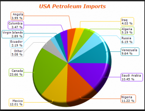
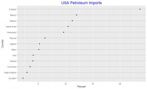
Since the slides in the pie chart are arranged in increasing order of percentages except the “other” category, we observe that the pattern perception for both the pie chart and the dot plot are very similar. We note the difficulty in visually obtaining the difference in percentages between the slides in the pie chart unlike in the dot plot. The dot plot gives an added information due to it’s position encoding as it detects that two different line segments could be used to represent percentages between 2.19 to 6.19 and 9.64 to 12.01 respectively, in this spirit we may consider the 23.66 percent import from Canada as an interesting outlier. Thus the dot plot is an improvement over the pie chart.


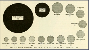
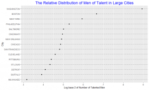
In the area chart, the area of each circle represents the number of talented people in that city. As we observe, it’s difficult to distinguish the difference in area for some of the cities without having to look at the numbers beneath them. One may argue that with the numbers beneath each circle the graph may as well be represented by just a frequency table. The area chart do not provide efficient detection of geometric objects that convey information about differences of values. The dot plot shows the number of talented people using a log scale. The data are graphed by position along a common scale and pattern perception is far more efficient than the area chart. For example, it is hard to detect a change in the circle areas for Philadelphia and New York just by looking at the area plot without looking at the number beneath the circle, but the dot plot shows that the numbers vary much. Table look-up is far more accurate and rapid from the dot plot than from the area chart. The matching operations necessary to decode values from the area chart are both slower and less accurate than the scanning and interpolation operations that provide table look-up from the dot plot. Hence the dot plot is an improvement over the area chart.