Posting a presentation

Here’s a simple way of creating a presentation that you can share with the world (more specifically the two student readers in our class).

1.   Use Google Drive to create a Presentation.  This program works much like Powerpoint.  I created a simple presentation.

2.  When you are done, Publish your document to the Web.  You should get a url address that gives the location of your presentation.

3.  Make a new blog posting where you give the link to your presentation.  Here’s a link to my simple presentation
https://docs.google.com/presentation/d/1_CofNTS7qfuYIU9cbMPlZRFVJwgMllPS_g5GioLHgZ8/pub?start=false&loop=false&delayms=3000

ggplot2 to Graph Pitching Data

For the last several years, Major League Baseball has put cameras in the ballpark recording the path of every pitch thrown.  Using a new R package pitchRx, one can download this data.  We’ll explore locations of pitches for one of my favorite pitchers Cliff Lee.

Using this package, it is easy to download all of the pitching data for Cliff Lee for the games that he pitched on April 4 and April 9 this season.  I created a data frame lee.fastball that contains a lot of information about each of the fastballs that Lee threw in these two particular games.

Assuming you have installed the package ggplot2, then you load the package by typing

library(ggplot2)

Suppose I am interested in graphing the locations of all of these fastballs as they cross the plate.   Location is relative to the strike zone so I also want to show the strike zone in a graph.  Also I want to show the pitches thrown to right-handed hitters and those thrown to left-handed hitters.  We’ll see that it is easy to create attractive graphical displays using this graphics package.

First we identify the aesthetics or roles of the different variables in my data frame.  Here

px — gives the horizontal location in feet (0 corresponds to the middle of the strike zone)

pz — gives the vertical location, feet above the ground

stand — gives how the batter stands — right handed or left handed

1.  One starts by a ggplot function — this identifies the data frame, and the aes argument identifies the x var, the y var, and stand will be given different colors. (This won’t do any graphing.)

ggplot(lee.fastballs, aes(px, pz, col=stand))

2. Now we add layers to this command. If we want to add a point layer, we simply add geom_points() (this is an example of a geometric object).  We don’t need a argument, but the size=4 argument makes larger size points.

 ggplot(lee.fastballs, aes(px, pz, col=stand)) + 
  geom_point(size=4)

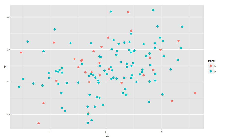
Note that since we indicated that stand has a color attribute, the two categories of stand are plotted using different colors and a legend is added.

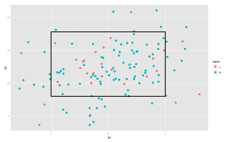
3. To add a strike zone to the graph, we add a geom_rect() layer to the current graph. Here I am specifying an average strike zone — the exact strike zone depends on the batter and the umpire.

ggplot(lee.fastballs, aes(px, pz, col=stand)) + 
  geom_point(size=4) + 
  geom_rect(mapping = aes(ymax = 3.56, ymin = 1.6, 
                          xmax = -1, xmin = 1), alpha = 0, size=1.2,
            colour = "black")

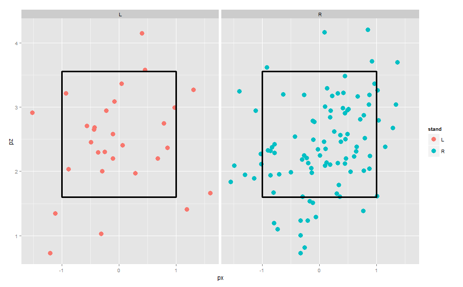
4. To put the left-handed and right-handed batters in different panels, we use the facet_grid() function.

ggplot(lee.fastballs, aes(px, pz, col=stand)) + 
  geom_point(size=4) + 
  geom_rect(mapping = aes(ymax = 3.56, ymin = 1.6, 
                          xmax = -1, xmin = 1), alpha = 0, size=1.2,
            colour = "black")  +
  facet_wrap(~stand)

4. To see the pattern of locations, it is helpful to smooth by a density estimate and show contours. I’ll do this by substituting the geom_point with geom_density2d.

ggplot(lee.fastballs, aes(px, pz, col=stand)) + 
  geom_density2d(aes_string(x="px", y="pz"), 
                 bins=4, size=1.4) + 
  geom_rect(mapping = aes(ymax = 3.56, ymin = 1.6, 
            xmax = -1, xmin = 1), alpha = 0, size=1.2,
            colour = "black")  +
  facet_wrap(~stand)

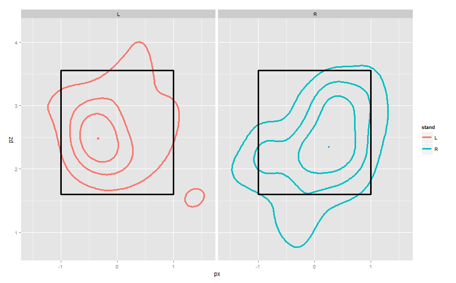
These displays are from the catcher’s perspective behind home plate. Lee is well-known to “pound the outside against righties, go inside against lefties” and these graphs demonstrate these tendencies.

Bad Use of Color in a Graph

We’ve talked about situations where the use of color is helpful in statistical graphics.  But one has to be careful.  Here is a recent example of a poor use of color in a line graph displayed in the Significance web site.  (This is a statistics magazine sponsored by the Royal Statistical Society and the American Statistical Association.)

Quoting the critic of this graphic, you don’t want to use 21 different colors to display results from 21 schools.  I don’t think any reader can distinguish that many colors.  Also the writer is critical of this graph from other perspectives.  The message of the graph should be obvious from the display and the caption — you don’t want the reader to be fishing around in the article to find the explanation of the graph.


Baseball Graphs

A new season of baseball is starting this weekend.  Many articles are being written now about the current state of baseball.  One interesting thing is that the rate of strikeouts (this is when a batter swings three times and misses) is the highest in the career of the sport.

The New York Times has a great collection of graphs in today’s paper.  The top graph shows you the rate of strikeouts per game for every team in the last 112 years.  Every point has an associated label — you can easily find the unusual teams each season with respect to strikeouts.

I see that the 1980 Texas Rangers struck out an average of 3.61 times per game.  In contrast, the 2010 Arizona Diamondbacks struck out an average of 9.44 times each game.


Exploring MAC Shooting Data

To illustrate different methods for plotting 3-dimensional data, I collected some shooting data from the 12 MAC women basketball teams.  There are three measures of shooting accuracy:

FGA – field goal shooting percentage
FTA – free throw shooting percentage
3FGA – three-point field goal shooting percentage

I’m interested in exploring the relationships between these three measures.

1.  First, I try a three-dimensional scatterplot.  The plot3d function (package rgl) constructs the plot and allows you to spin it around to see better the structure.  Here’s a video of the spinning scatterplot. (Click the below link.  I’ve colored BGSU as red; the rest of the points are colored blue.)

mac

From this viewpoint, BGSU looks pretty average from the viewpoint of shooting accuracy.  They did pretty well in the league standings, but I don’t think their success was due to shooting percentage.

2.  Another thing to try is a scatterplot of all possible pairs of variables.

BGSU still corresponds to the red point and the blue points are the three teams with the highest values of FGA. We see that these good FGA teams also do well in Free Throw Shooting Percentage. These three teams are above average in Three Point Shooting Percentage, but I notice the team with the highest 3-Point Percentage is not one of these three teams. Generally, there are not strong relationships between these three variables.

3.  Another thing to try is a coplot — here you condition on one variable and look at the conditional scatterplots of the other two variables.  Here I condition on FTA and look at scatterplots of FGA and 3FGA.

This is harder to read. Look at the lower-left scatterplot — this is a scatterplot of FGA and 3FGA for the teams with a poor FTA percentage. The bottom center plot is a scatterplot of FGA and 3FPA for the teams with a slightly better FTA, and so on.
Focus on the bottom left and top right scatterplots — these are the scatterplots for the poor and strong foul shooting teams. Generally, poor foul shooting teams also are poor in the other two shooting stats; likewise great foul shooting teams are good in other two measures.

Smoothing Website Visit Counts

Last week, you worked on loess smoothing and we’re talking about graphing time series data this week.  It seemed worthwhile to give you a personal example of smoothing a time series.

Back in 2007, I wrote a book that illustrates computation using R for my Bayesian class (MATH 6480).  I have a website where I have information about the book and Google Analytics has been keeping track of all of the people who have been visiting the site.

I downloaded a file that gives the number of visitors for each day from the first (November 30, 2007) through the day I collected the data (March 16, 2013).   (This is total of 1934 days.)  I am interested in the pattern of counts over time.

1.  I first tried graphing the counts as a function of day number.

Note that I changed the plotting character to a solid dot (pch = 19) at a smaller size (cex = 0.5).  I didn’t find this plot that illuminating due to the large variability across days.  I know from previous exploration, that there is a drop off in counts over weekends and special times.  Anyway, it is tough to see the pattern across days.

2.  My next thought was to collect counts over weeks instead of days.  This would help smooth over some of the day-to-day variation that I don’t care about. I collapsed the data over 276 seven-day periods and I plot the count over week number.  I added a loess smooth to see the pattern.   I played with different smoothing fractions until I did not see any pattern in the residual graph.

What is the pattern of visits? I see steady growth in the visits until Week 100, steady counts from Weeks 100 to 150, another period of growth between Weeks 150 and 200, a little drop off around 200, and a gradual growth from Week 230 to the current week.

Actually, some of the pattern makes sense to me. The original book was published in 2007 and I came with a revision in 2009 — this might explain the growth around Week 150. I was fortunate that both Bayesian thinking and the use of R have shown increasing popularity in recent years.

Back from Spring Break

I just returned from Florida and had a wonderful time enjoying the wildlife and weather.  Here are some graphical musings.

1.  I was reading some postings in the Visitor’s Center at the Loxahatchee National Wildlife Refuge.  They recently had an annual bird count where, on a particular day, they record the number of birds bound of various species.  For example, they may have found 23 Great Blue Herons, 12 Cattle Egret, 19 American White Ibis, 73 Black Vultures, etc.  They graphed the data using a bar graph.

Instead we could use a dotplot.

Which graph would you prefer and why?

2.  There is an interesting article in today’s New York Times about gun ownership.  They show the following graph that shows that gun ownership in the United States has decreased over time.

How could we improve this graph using principles from Cleveland’s book?

3.   Here’s an “interesting graph” — can you think of a better way to graph this data?


Dotplots

There is an interesting recent blog posting at http://www.statsblogs.com/2013/02/18/revisiting-clevelands-the-elements-of-graphing-data-in-ggplot2/

This is interesting for several reasons:

  1. The author is rereading Cleveland’s book, the primary book for our class.
  2. It gives you some nice illustrations of dotplots (the focus of your blog homework this week).
  3. Also it mentions the following good general principles in constructing statistical graphs.
  • A graphic should display as much information as it can, with the lowest possible cognitive strain to the viewer.
  • Visualization is an iterative process. Graph the data, learn what you can, and then regraph the data to answer the questions that arise from your previous graphic.


Making sense of scatterplots

One of the most popular statistical graphs is the scatterplot which we use to visualize relationships between two quantitative variables.  Although a scatterplot is a common plot in our introductory statistics class, I think we overestimate our students’ abilities to actually understand the patterns that we’d like them to see.

I just read an interesting blog which talks about the difficulty in interpreting scatterplots.

At the graduate level, I find that students generally have difficulty in interpreting residual graphs.  It probably means that they haven’t had sufficient experience in reading residual graphs.


Nice way of getting R output

There is a real nice feature of RStudio that allows you to create a html file containing your work — R code and any textual or graphical output.

I’ll illustrate it using the snowfall example from my R by Example book.

1.  I create a file with the R code for the snowfall graph.

2.  In RStudio, choose Compile Notebook from the File menu.

3.  It creates this html file including the R code and the snowfall graph.

This code may help in creating your graph for this week’s assignment.  Also, I encourage you to use this Notebook feature — it provides an easy way of sharing R work.


Popular statistics packages

I just found this interesting article discussing the popularity of different software package for doing statistics. How does one measure popularity?  One way is to measure the number of discussions on the different listservs for each of the packages.

There is a nice graph that shows the month email discussion on each listserv over a 20-year period.   Look at the lines corresponding to the two software giants SAS and R.  What conclusion do you draw from looking at this graph?

Olympics bronze medal runs – Part II

In the first post, we looked at the pattern of bronze medal times in the men’s 200 meter run.  By plotting the log time against year, we figured out the general pattern of decrease over years.   That’s the first part of the story.

By exploring the residuals from the loess fit, we can learn more.  Below I’ve pasted the residual graph — remember that the residuals are expressed in a log (base e) scale.

What do we see in this residual graph?

  1. Most of the residuals fall between -.01 and +.01.  Remember that .01 on the log e scale corresponds to a change of 1%.  So most of the times fall within 1% of the fitted curve.
  2. I see three outliers — there are three residuals smaller than -0.01 — they appear to correspond to the years 1912, 1968, and 1996.

Are there any special circumstances in the years 1912, 1968, and 1996 that would explain these unusually low bronze medal running times?  Actually, 1968 was a special year in that the Olympics were held in Mexico City which has a high altitude.  A venue at a high altitude means perhaps less air resistance that could contribute to faster running times.  One of the most remarkable Olympics records is Bob Beamon’s amazing long jump which occurred during these same Olympics.

A hypothetical conversation with my graphics class

One problem with an online course is that I can’t physically turn back homework and talk about some of the issues on the problems.  So I’ll pretend that I am turning back your “which log” graphs and make up a hypothetical conversation.

Jim:  Many of you lost points on this assignment since you didn’t interpret the rate of change on your graphs.

Student A:  But you didn’t tell us to interpret the graph in the assignment.

Jim:  That’s true — I did not specifically ask you to interpret the graph.  But what is the point of plotting the log of the response against time?  We take the log to better see and interpret the rate of change of the response.  A log converts exponential growth to linear graph and it is easy to read linear growth from the graph.

Student B:  But I did interpret the graph that you still took off points.

Jim:  Yes, you told me that the national debt is increasing.  But I think I knew that before I looked at your graph.  What I don’t know (and still don’t know since you didn’t tell me) is the rate of the increase.  How much has the debt increased each year?

Student C:  Do we always have to interpret our graphs?

Jim:  Most graphs don’t speak for themselves.  Actually, maybe you can put a push button on the graph that says “PRESS HERE” and then the graph (in a nice voice) can actually explain itself.  But since this is hard to do, you have to write the basic message:  what should the reader learn from viewing your graph?

Student D:  Okay, I understand.

Jim:  If you put away your cell phone, we can continue with the topic for today’s class.

Olympic bronze medal times

When one explores medal results of the Olympics, it is pretty clear that athletes are performing better over time.  A good graph can be helpful in understanding the rate of improvement of performance.

I have a nice dataset that contains all of the medal times for all of the running times for both gender for all of the Olympics.  I’m going to focus on the bronze medal time of the men’s 200 meter run.  Why bronze?  Well, the gold medal time might reflect the accomplishments of a single person, while the bronze medal time might be better at measuring the performance of “top runners” during that Olympics year.

I expect the bronze medal running times to decrease over time and I want to describe this decrease.  I believe that these times will decrease in a multiplicative fashion, so I will graph the logarithm of the time against year.  What log did I take?  I’ll explain after I show you the graph.  To make it easy to see the general pattern, I add a loess smoothing curve (we’ll learn more about this method later in the class).

In this case, I decided to take a natural (base e) logarithm.  Why?  There is a nice property of logs base e.    A log increase of x is approximately equal to a percentage change of 100 x %, and a log decrease of x is approximately the same as a percentage decrease of 100 x%.   Using this property …

  • For early years, it looks like the pattern is a straight line with slope -0.03 / 20.  So in each 20-year period, the time has been decreasing by approximately 3 percent.
  • For later years, the pattern is different — the slope is more like 0.015 – 0.020 over 20 years.  So in recent years, the times have been decreasing only 1.5  – 2 percent each 20 years.

Actually, there is more to this graphical story when we look at residuals — I’ll continue next week with a Part II.


Hall of Fame Voting

In baseball, great players get elected into a Hall of Fame.  To get elected, a player must receive at least 75 percent of the vote among the baseball writers.  If they don’t get 75% of the vote, they are eligible for election for the following year.  Generally, the pattern is that the voting percent for a particular player increases over time and the hope is eventually that he will get over 75% of the vote and be elected to the HOF.

I recently saw the following graph that shows the voting pattern for many players over time.  I’ve pasted the graph below; the original article and graph can be found here.

Each line trajectory corresponds to the voting pattern for a particular player. The yellow dots below the horizontal line correspond to the first year the player is eligible to be voted in, and the yellow dots above the horizontal line correspond to players inducted in the HOF.

What is interesting to me is that the slopes of the HOF trajectories seem pretty similar across players.  I would suspect that one could make a reasonable prediction of a player’s chance of getting inducted in the HOF based on his initial voting percentage.

The Most Poisoned Names

One general place I go to find interesting graphs is statsblogs.com.  I recently found an interesting graph that focus on the most poisoned names.   A person was interested in the names that Americans give their children.  A poisoned name is one that shows a big dropoff from one year to the next.

Here is the graph.  On the horizontal axis, we see the year, and the vertical axis represents the percentage of children with a particular name.  A poisoned name is one that exhibits a sharp decline — the largest declines I see are Katina in the 1970’s and Ashanti in the early 2000’s.

This is a nice graph since it clearly shows the poisoned names.  I like the use of different colors and the labels are helpful and don’t make the graph too cluttered.


The Yankees and the World Series — using R to graph

I thought it might be helpful to illustrate the flexibility of the basic R system in creating graphs.  I’m giving a talk in about a month to undergraduate math students in Michigan.  The topic is the playoff system in baseball.  Whenever one talks about World Series, one thinks of the New York Yankees who won 27 World Series.  What seasons did the Yankees win their titles?

I have a vector years containing the seasons of these 27 titles.


1923 1927 1928 1932 1936 1937 1938 1939 1941 1943 1947 1949 1950 1951
1952 1953 1956 1958 1961 1962 1977 1978 1996 1998 1999 2000 2009

I want to create a simple “number line” plot where I have a scale of season values from 1900 (first year of two leagues in MLB) to 2010 and I display dots at the season values.

Here’s the process in R.

1.  I use the plot function to plot the year values on the horizontal against the value 1 on the vertical.  I use a solid circle plotting character (pch = 19), turn off the axes and scales (axes = FALSE), add a horizontal axis label and a title.

plot(years, 1 + 0*years, pch=19, axes=FALSE, ylab="", xlab="Season",
main="Seasons When the Yankees Won the World Series", col="blue")

2. Now I want to add a horizontal axis. I do this the axis function — the argument indicates the bottom side, and seq(1900, 2015, 10) indicates the axis tick marks are to be displayed from 1900 to 2015 in steps of 10.

axis(1, seq(1900, 2015, 10))

Here’s my completed graph. It shows that the Yankees were really the dominant team in between the seasons 1920 and 1960.

R tips

There were a couple of R questions in the last homework that I’ll answer.

How does one draw only two axes?

If you want to draw only two axes instead of the default four, first do your graph with the axes turned off:

library(MASS)
plot(log(mammals), axes = FALSE)

Then use the axis command twice to draw two axes with scales:

axis(1)
axis(2)

How do you get the scale-line rectangle and data rectangle to be the same?

You do it the same way as above. You plot, turning off the axes by specifying axes = FALSE. Then you use the axis function twice. For example, if you type

axis(1, at=seq(0, 10 2))

you are specifying that the x axis is drawn from 0 to 10 with tick marks at 0, 2, …, 10.