For the last several years, Major League Baseball has put cameras in the ballpark recording the path of every pitch thrown. Using a new R package pitchRx, one can download this data. We’ll explore locations of pitches for one of my favorite pitchers Cliff Lee.
Using this package, it is easy to download all of the pitching data for Cliff Lee for the games that he pitched on April 4 and April 9 this season. I created a data frame lee.fastball that contains a lot of information about each of the fastballs that Lee threw in these two particular games.
Assuming you have installed the package ggplot2, then you load the package by typing
library(ggplot2)
Suppose I am interested in graphing the locations of all of these fastballs as they cross the plate. Location is relative to the strike zone so I also want to show the strike zone in a graph. Also I want to show the pitches thrown to right-handed hitters and those thrown to left-handed hitters. We’ll see that it is easy to create attractive graphical displays using this graphics package.
First we identify the aesthetics or roles of the different variables in my data frame. Here
px — gives the horizontal location in feet (0 corresponds to the middle of the strike zone)
pz — gives the vertical location, feet above the ground
stand — gives how the batter stands — right handed or left handed
1. One starts by a ggplot function — this identifies the data frame, and the aes argument identifies the x var, the y var, and stand will be given different colors. (This won’t do any graphing.)
ggplot(lee.fastballs, aes(px, pz, col=stand))
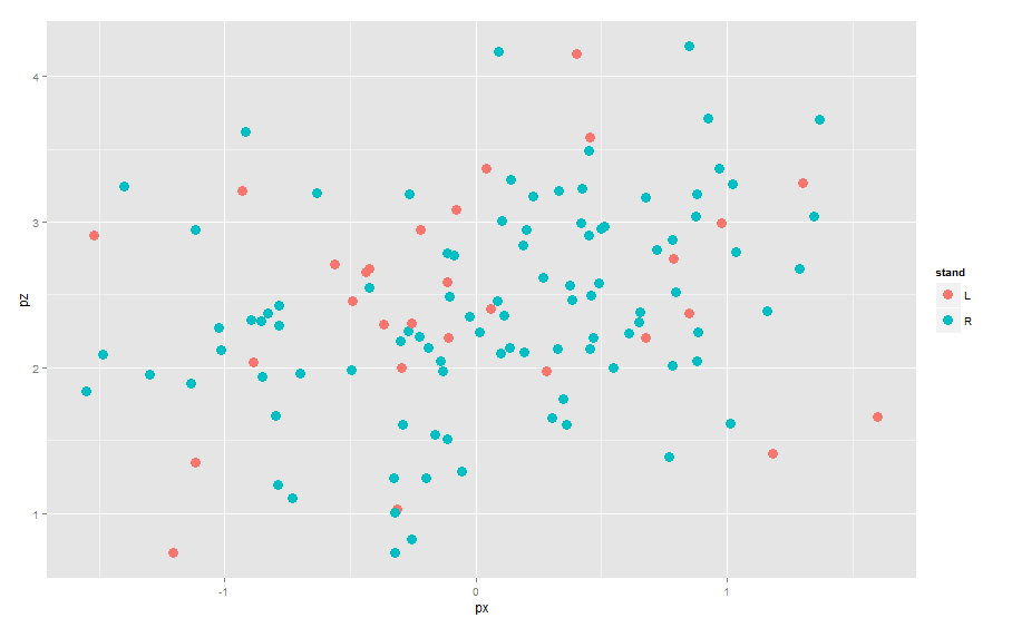
2. Now we add layers to this command. If we want to add a point layer, we simply add geom_points() (this is an example of a geometric object). We don’t need a argument, but the size=4 argument makes larger size points.
 ggplot(lee.fastballs, aes(px, pz, col=stand)) +
  geom_point(size=4)

Note that since we indicated that stand has a color attribute, the two categories of stand are plotted using different colors and a legend is added.
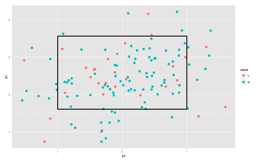
3. To add a strike zone to the graph, we add a geom_rect() layer to the current graph. Here I am specifying an average strike zone — the exact strike zone depends on the batter and the umpire.
ggplot(lee.fastballs, aes(px, pz, col=stand)) +
  geom_point(size=4) +
  geom_rect(mapping = aes(ymax = 3.56, ymin = 1.6,
                          xmax = -1, xmin = 1), alpha = 0, size=1.2,
            colour = "black")

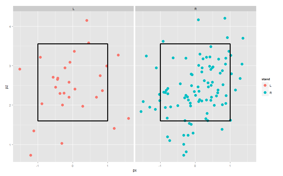
4. To put the left-handed and right-handed batters in different panels, we use the facet_grid() function.
ggplot(lee.fastballs, aes(px, pz, col=stand)) +
  geom_point(size=4) +
  geom_rect(mapping = aes(ymax = 3.56, ymin = 1.6,
                          xmax = -1, xmin = 1), alpha = 0, size=1.2,
            colour = "black")  +
  facet_wrap(~stand)

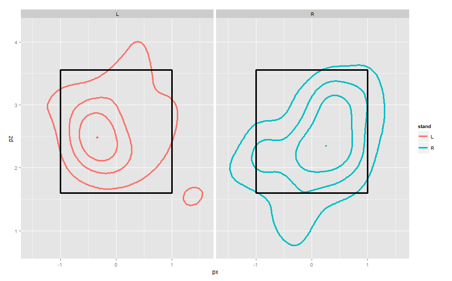
4. To see the pattern of locations, it is helpful to smooth by a density estimate and show contours. I’ll do this by substituting the geom_point with geom_density2d.
ggplot(lee.fastballs, aes(px, pz, col=stand)) +
  geom_density2d(aes_string(x="px", y="pz"),
                 bins=4, size=1.4) +
  geom_rect(mapping = aes(ymax = 3.56, ymin = 1.6,
            xmax = -1, xmin = 1), alpha = 0, size=1.2,
            colour = "black")  +
  facet_wrap(~stand)

These displays are from the catcher’s perspective behind home plate. Lee is well-known to “pound the outside against righties, go inside against lefties” and these graphs demonstrate these tendencies.
