Examples of Unclear Vision

In last week’s blog assignment, you were supposed to show me examples of a scatterplot that displayed unclear vision.  This seemed to be a fun assignment — let me show you several examples that you created.

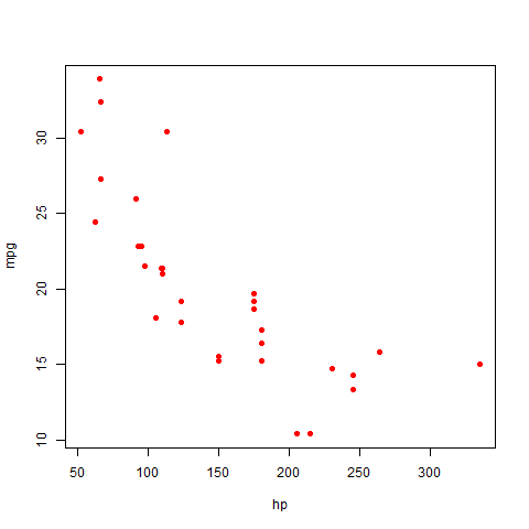
Here’s Nate’s graph.   It is unclear for two reasons:  the large solid plotting points overlap, making it hard to see the individual points, and the aspect ratio is chosen so it difficult to see the pattern of points.

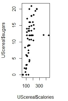
Janine crated a really bad graph — bad in the visual sense.

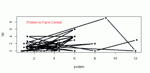
Janine chose small plotting points and added connecting lines which obscure any pattern one might see in the graph.

Some of you showed me bad graphs that had poor axis labels, a poorly worded or hard to read caption, or a inappropriate title.  Although these graphs are bad, actually they illustrate poor communication (that we talk about in the Clear Understanding section) rather than poor vision.

Women as Academic Authors

There are interesting data visualizations that appear on the Internet.  For example, The Chronicle of Higher Education recently had a special study on women as academic authors.   They looked at the authorship of over 2 million articles over 1765 fields and subfields.  They focused on the percentage of papers that had a female author.

They have an interesting visualization of this massive dataset.

Have a look at this graph.   From a statistical viewpoint, is this an effective presentation of this data?

A better graph

In the last post, I was critical of a scatterplot from the perspective of clear vision.  I thought I should show a graph that I think is easier to understand.

A couple of years ago, I gave a conceptual calculus multiple-choice exam to all of our Calculus I sections.  We gave the exam at the beginning of the semester (pretest) and again at the end of the semester (posttest).  The questions were on various aspects of calculus, including Derivatives, Limits, Functions, and Applications.

Using the R package ggplot2 (a package we’ll learn about later in the class) I constructed a scatterplot of the improvement (posttest – pretest) against the pretest.  I color coded the questions by the type of question.

What do we learn from this graph?

  • Note that the legend is placed outside of the plot window and there is much less clutter in the graph.
  • It is interesting that there were a number of questions where there was little improvement in the scores.  I notice three blue points in the lower left of the graph — the students struggled on these limit questions on the pretest and showed little improvement in the posttest.
  • How about success?  The three green points in the upper left of the graph correspond to derivative questions.  On these questions, we observe substantial improvement between the pretest and posttest.  Perhaps these questions matched up closely with content in the course.

Improving active learning graph

In the previous post, I showed a graph that supposedly shows the benefit of an active learning approach in teaching.

From the viewpoint of clear vision, this graph has problems.  Let me list some of the problems I see.

  • Generally, this graph has too much clutter.
  • The plotting points have dots that are surrounded by circles, squares, and diamonds, with different shades.  I have a hard time distinguishing the points.
  • There are six overlapping lines with different shading.  It is hard to understand the meaning of the lines although there are labels on the left.
  • It is hard to read the labels on the left since they interact with the inward tic marks.
  • The legend for the plotting points is inside the line which adds to the clutter.
  • Hard to read the text label right above the x axis.
  • I don’t understand the <> notation, but part of the problem is that I don’t read many physics papers.

How would I improve this display?

  • I would remove much of the text from the figure window.
  • I’d use simpler plotting points, perhaps using color or different plotting symbols to distinguish groups.
  • The legend should go outside of the plot window.

Graph demonstrating active learning

Recently, Karen Meyers from the Center of Teaching and Learning talked about an article by Richard Hake in the American Journal of Physics that demonstrates the value of active learning.  This graph that she showed seems appropriate for our class.

One of the main principles in Chapter 2 is that a graph should have Clear Vision which basically means that the message should be clear from reading the graph.  I think there are several problems with this display — can you think what they are?


Famous Hockey Stick Graph

I’ll be using this blog to display good statistical graphs and graphs that aren’t so helpful from a statistical point of view.

It seems appropriate today to show the famous “hockey stick” graph since it appears that the National Hockey League Strike is Over.

This graph comes from this New York Times article.

This graph summarizes temperature data for over 1000 years.  What do we see in this graph?

  • Since this is called the “hockey stick” graph, clearly the notable feature is that temperatures have remained constant for a long time, but suddenly in the last 100 years, the temperatures have jumped up.
  • I am also interested in the variability of the temperatures over time.  I’m not quite sure what the grey section represents, but after 1600, the variability gets much smaller.
  • I think it is interesting that there are two sources of temperature data — tree rings, corals, etc (blue) and thermometers (red) and the two sources of data agree for recent years.

From a statistical point of view, is this a good graph?  Generally, I would say yes.  It is easy to read and it clearly communicates the pattern of change of the temperatures.

Could I improve this graph?  There are a few small things I’d change.

  • The tic marks pointing inward get in the way of the data.  I’d use outward facing tic marks.
  • I’d put the descriptive text outside of the data window.   Currently it looks a bit cluttered.
  • Although this may have been part of the original display, I’d add a caption explaining what is be learned from this display.

Welcome to Statistical Graphics

Welcome to MATH 6820 Statistical Graphics.  I will be using this blog as regular communication for this course.

This graph is helpful for understanding changes in the Consumer Price Index.  There is a story about I created this graph and what is supposed to show that I’ll tell later.