I just returned from Florida and had a wonderful time enjoying the wildlife and weather. Here are some graphical musings.
1. I was reading some postings in the Visitor’s Center at the Loxahatchee National Wildlife Refuge. They recently had an annual bird count where, on a particular day, they record the number of birds bound of various species. For example, they may have found 23 Great Blue Herons, 12 Cattle Egret, 19 American White Ibis, 73 Black Vultures, etc. They graphed the data using a bar graph.
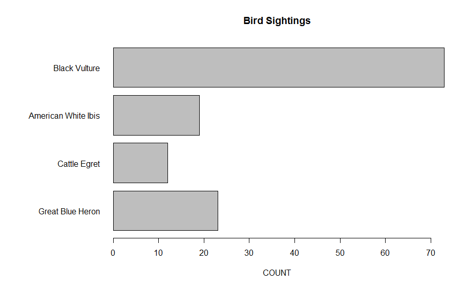
Instead we could use a dotplot.
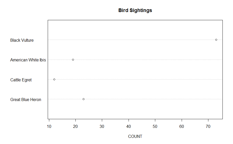
Which graph would you prefer and why?
2. There is an interesting article in today’s New York Times about gun ownership. They show the following graph that shows that gun ownership in the United States has decreased over time.
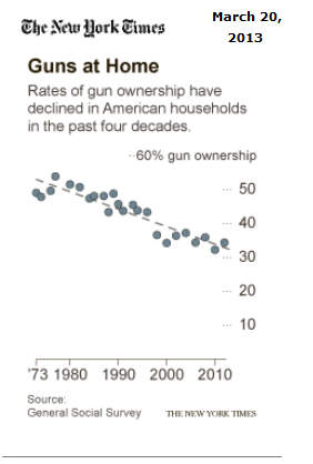
How could we improve this graph using principles from Cleveland’s book?
3. Here’s an “interesting graph” — can you think of a better way to graph this data?