When one explores medal results of the Olympics, it is pretty clear that athletes are performing better over time. A good graph can be helpful in understanding the rate of improvement of performance.
I have a nice dataset that contains all of the medal times for all of the running times for both gender for all of the Olympics. I’m going to focus on the bronze medal time of the men’s 200 meter run. Why bronze? Well, the gold medal time might reflect the accomplishments of a single person, while the bronze medal time might be better at measuring the performance of “top runners” during that Olympics year.
I expect the bronze medal running times to decrease over time and I want to describe this decrease. I believe that these times will decrease in a multiplicative fashion, so I will graph the logarithm of the time against year. What log did I take? I’ll explain after I show you the graph. To make it easy to see the general pattern, I add a loess smoothing curve (we’ll learn more about this method later in the class).
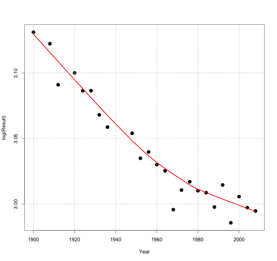
In this case, I decided to take a natural (base e) logarithm. Why? There is a nice property of logs base e. A log increase of x is approximately equal to a percentage change of 100 x %, and a log decrease of x is approximately the same as a percentage decrease of 100 x%. Using this property …
- For early years, it looks like the pattern is a straight line with slope -0.03 / 20. So in each 20-year period, the time has been decreasing by approximately 3 percent.
- For later years, the pattern is different — the slope is more like 0.015 – 0.020 over 20 years. So in recent years, the times have been decreasing only 1.5 – 2 percent each 20 years.
Actually, there is more to this graphical story when we look at residuals — I’ll continue next week with a Part II.