Assignment 6-Camera Raw

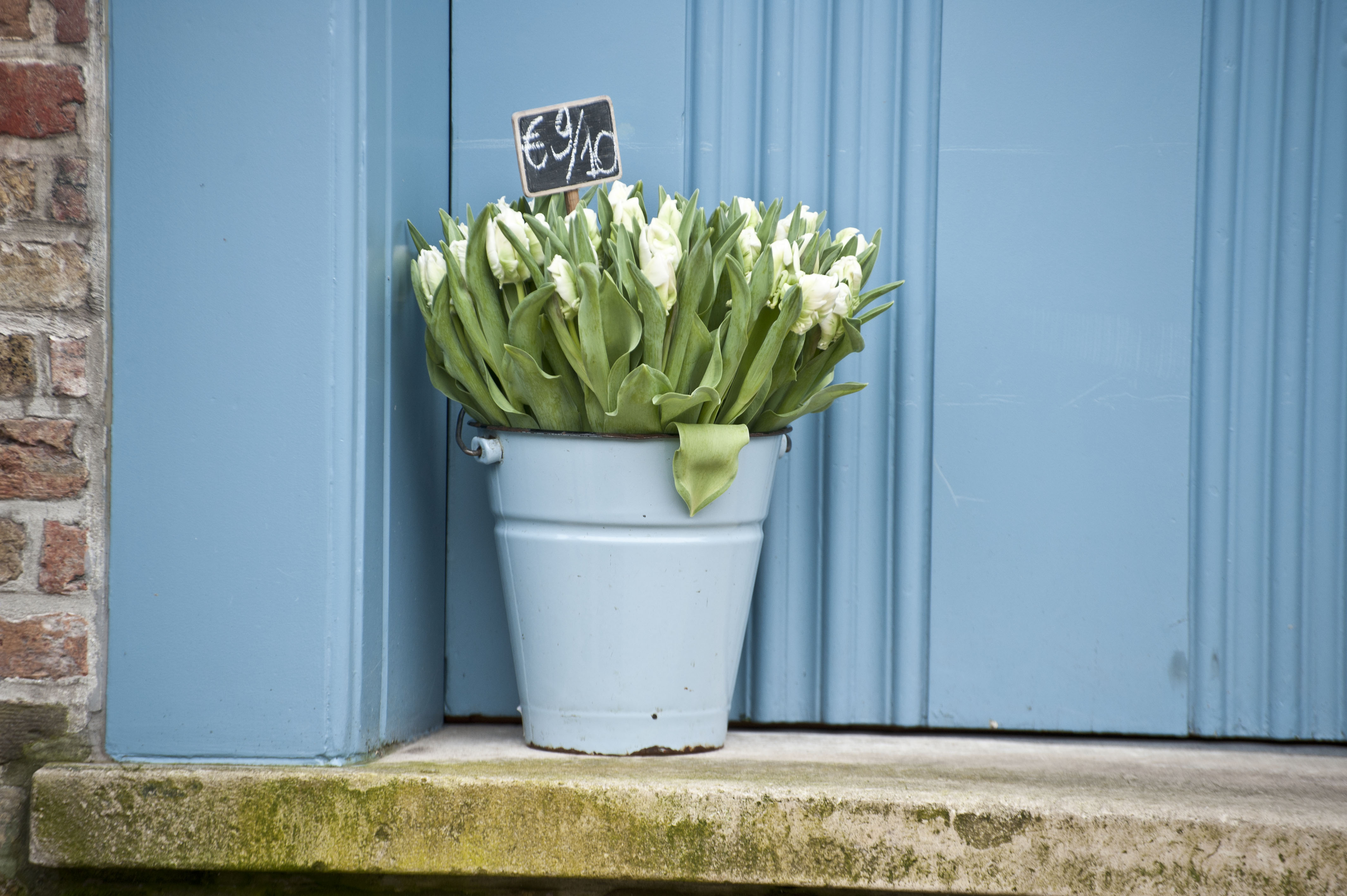
Posted in VCT460 on November 9th, 2010 by Gillian Hanson

Using camera raw to adjust white balance first chose ‘auto’ in the white balance drop down box. Adjust the temperature and tint favorably. To pick middle grey for the program use the white balance tool and click on a light grey area in the photo. Use P to view before and after as you make your changes. Here is a before and after example:

The yellow looks white, which is the true color.

Part2: Exposure
To adjust exposure using Camera Raw first find out where the problem areas are using the clipping triangles in the histogram. Drag the exposure favorable while keeping in mind the warnings from the clipping triangles. If you photo is too under exposed use the Recovery slider to turn the clipping triangle solid black.

Another alternative is using the black slider to adjust the shadows. Do not over saturate the colors. Adjust to preference.

Examples:

Part 3: Impact

To help a photo stand out move the clarity slider to the right to preference.
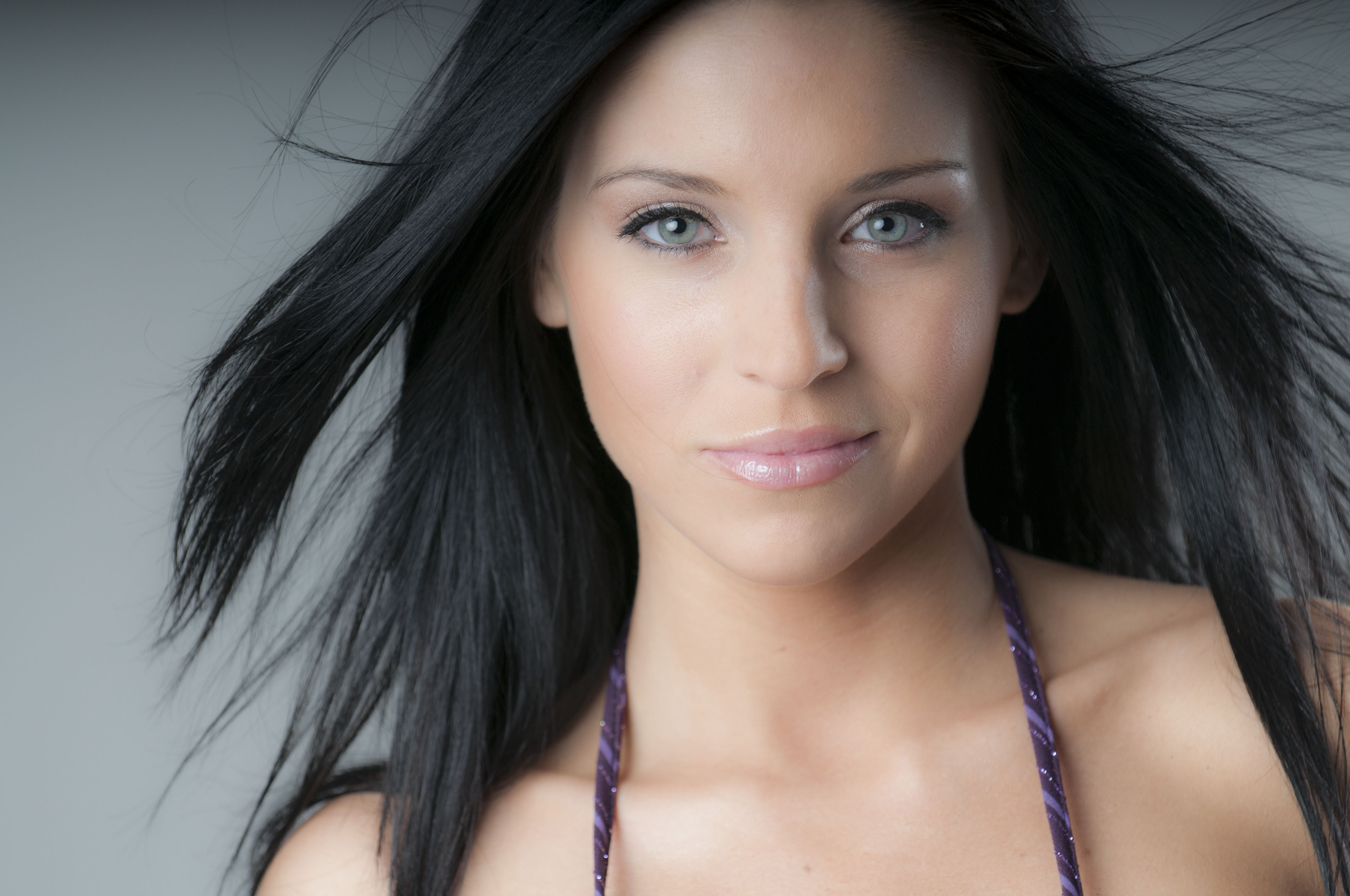
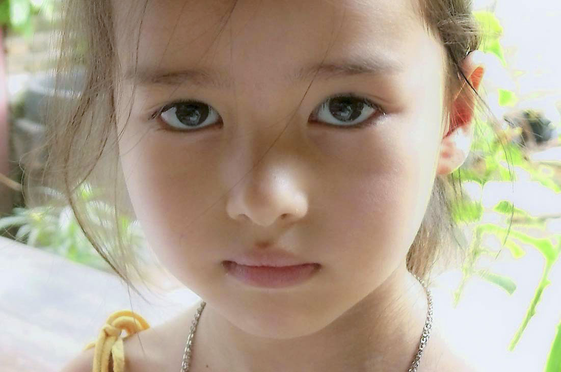
Part 4 Soften:
To soften an image (usually a portrait) drag the clarity to the left, decreasing the clarity giving a smooth surface to skin.

Part 5: Adjust fill light- use fill light slider to adjust fill light.

Part5: Add contrast. To let the foreground and the background separate. Use curves or by adjusting the highlights and shadows to create the contrast that makes the photo more interesting.

adjust to preference.

Part 6: Cropping Images- use the crop tool to crop. Select the dimensions for the photo too needed. drag and select cropping area. hit enter to accept.

Part 7: Straighten: If an image is slightly crooked adjust the image by using the Straighten tool. When straighten tool is selected drag across horizon to straighten image.

click on image to see full crop.

Project 3- package design

Posted in VCT460 on October 26th, 2010 by Gillian Hanson

I have also been interested in the different tastes of organic food. Some companies produce large quantities of fruit with the help of fertilizers and adding nutrients in the soil that I like to call ‘fruit steroids’. These fruit have less taste than those that are grown more organically. For my product I want to come up with an organic package design for more organic fruit. Some believe that the more love and care you put into a plant the better the plant will produce healthy fruit.

In addition to this I want to provide several designs that are both smart designs as well as organic. I hate when I go to the grocery store and I buy a pint of strawberries and they look good on the top and bottom but in the middle where no one can see it a rotting strawberry that ruins all of those around it. One of my ideas is creating an ‘egg carton design’ so that the consumer sees each individual strawberry before they buy it similar to the packaging of eggs. I made sure to consider space and how to present the box in a store.

Another design that I have in mind is mimicking the natural shape of the strawberry to exaggerate the organic quality and love that were put into the growth of the strawberries.

The final design that I have some up with is my box design. It is a smart design because it will look be shaped to give off the impression of many strawberries that will help be cost effective.

Overall the bright designs as well as functionality will provide a good package design that represents the extra time and care that are put into wonderful tasting strawberries!

Design One, Front and Back: squares are glue, dotted lines are fold lines

Design Two, No glue needed Front and Back:

Three designs:

Photo:

Assignment 5- Oct 5, 2010

Posted in VCT460 on October 5th, 2010 by Gillian Hanson

Part 1: Make HDR:

Original image:                                                Final Image:

—————–

My photo:
Original:                                                         Final:

—————-

For part one I feel that this a good substitute for the actual HDR process. It brings out more range of colors although it still does not compare to a true HDR image.

Part 2: Remove a person
Original:                                                         Final:

—————-

This is a good tool to know how to use in photoshop although it touches into the ethics of photography. How much can we edit a photograph and still keep it truthful?

Part 3:
I could not understand how to make water font, but I did make sort of the same thing but instead the font is in metal or any other texture. The font looks like it is coming out of the background. I was trying to find alternate directions on how to create the water font and came across this website:

http://moesrealm.com/photoshop/tutorials/liquid-text-photoshop-tutorial/

My final image:

Part 4: Make a sunny day:

Original:                                                   Final:

——–

Another Photo

Original                                                        Final

————–

This technique could be used to stretch photos to extreme abstract. You can alter the background of many images using the Quick Selection Tool and having other backgrounds to use.

Assignment 4- September 28, 2010

Posted in VCT460 on September 28th, 2010 by Gillian Hanson

For this assignment I first selected the color range -red color of the car -and changed the hue/saturation to make the car black. Next I flipped the image so that it was facing the same direction as the other car. I did this because I needed to copy and past the Sheriff door onto my photo but the letters would be backwards if I kept it facing the opposite direction. I also copy and pasted the siren light off of the top of the car using the magnetic lasso. I converted both copy and pasted objects to smart objects so I didn’t do any destructive damage. After that I used the patch tool to get rid of the dice hanging from the rearview mirror. I continued to select areas of the car that were still red and adjusting the hue/satuation until most of the car was black while keeping the highlights. I changed the rims of the tires the same way too so that they were black. To finish up I went through a few spots with a black colored paintbrush in spots where the red was still obvious.

This is my finished car:

This is the original car:

This the police car I copy and pasted from:

Magazine Spread Project.

Posted in VCT460 on September 28th, 2010 by Gillian Hanson

I am doing my magazine spread on Olive Garden. I like their advertising and how they apply the rich italian culture to there advertisements. Since it is a restaurant I plan to use food photographs on my project. I like to harmony of the olive and the tan color similar to the one that olive garden uses with their color palette. I plan to make a collage of their products and apply appropriate text and a logo.

Assignment 3-Sept. 14 2010

Posted in VCT460 on September 14th, 2010 by Gillian Hanson

Part 1:

I used the lasso tool to get a good selection around the person. Next I went to refine edge after I made my selection. I placed my selection on a black background and than adjusted the radius. After that I adjusted the edge to create a natural selection by feathering and smoothing the edges. Next I used the refine radius tool to grab some more of the smaller details such as the loose hair, earrings, and some parts of the skin that I missed. Before finishing my refine edge changes I decontaminated the colors. I than placed the selection on the background and converted it into a smart layer. I than adjusted the size to better fit the background. Finally I cropped the image to make it look realistic.

Part 2:

For this photo I used the adjustment layers so that the black and white adjustments were not destructive. From the background image I used the black and white adjustment layer to make the picture black and white. Finally I used the brush tool to bring back the color in part of the photo, such as the tower and the colors reflected in the water.

Part 3:

To make a panoramic I used automate to merge three of the five photos. Then I used automate again to merge the other two photos. I adjusted the size of the smaller portion of the panoramic and did my best to line up the two images to create the full panoramic.

Movie Assignment thumbnails.

Posted in VCT460 on September 13th, 2010 by Gillian Hanson

“Based on the book by the famous Dr. Seuss. Inside a snowflake exists the magical land of Whoville. In Whoville, live the Who’s, an almost mutated sort of munchkinlike people. All the Who’s love Christmas, yet just outside of their beloved Whoville lives the Grinch. The Grinch is a nasty creature that hates Christmas, and plots to steal it away from the Whos which he equally abhors. Yet a small child, Cindy Lou Who, decides to try befriend the Grinch.” -imdb

“Rejected by the Who’s as a child and living in spiteful seculsion for most of his life, the Grinch has always hated the citizens of Whoville. That especially goes for Christmas with the Who’s noise, phony sentiment and wasteful materialism. When little Cindy Lou Who’s attempt to transcend the festivities’ empty commercialism by inviting the Grinch ends with his public humiliation, the Grinch hatches upon on his supreme scheme to ruin the holidays.” -imdb

For my designs I want to show the traditional christmas and then convey how the Grinch sees christmas. I have many different ideas about to do this. Perhaps creating a christmas wonderland scene and then have the Grinch be vandalizing the scene. Or perhaps the Grinch pushing the Christmas wonderland out of the frame to make room for himself. The pictures I have found online all have the Grinch dressed up in a santa suit so it would be a good idea to show comparison between the two santas. I really like the movie poster I found that just shows his hand and a broken christmas bulb. It will be hard to recreate the Grinch logo.

Assignment 2- September 7, 2010

Posted in VCT460 on September 7th, 2010 by Gillian Hanson

Part 1:

Before and After

For this photo I used the patch tool to correct the creases in the photo. I used the healing brush tool to correct the dust specks. I also used to clone tool to get rid of the dust specks. After that I cropped part of the corner and bottom out of the photo because it was damaged. I also adjusted the contrast to make the photo look better. And finally I used the burn tool to add more detail in spots that needed it.

Part 2:
Before and After

To correct this photo I first used the filter ‘dust and scratches.’ To use this filter I first selected around the subject with the lasso tool. Then I feathered the edge to give to filter a smooth edge. After that I selected the inverse in order to be working with the background. I than applied the filter to get rid of the spots in the background. After that I used to healing brush tool in order to fix the spots on the face, the hair, and the shirt.

Part 3:

Before and After

For this photo I used the patch tool several times to get rid of all of the tears in the photo. After that I used spot healing brush and the clone tool when I had more detailed parts that had tears so I could match the tones as close as possible (hair, face, hands). I also used the burn tool to make the shadows on the left shoulder more dynamic as well as around the numbers on his jersey to make them stand out more. Finally to get rid of the water stain I changed the whole picture to black and white. I also gave him a nasty black eye because he’s a football player and it makes him looker tougher.

Assignment 1 – August 31, 2010

Posted in VCT460 on August 31st, 2010 by Gillian Hanson

Part 1:

For Part One to straightened the image I used to ruler tool. The ruler tool is found under the eye dropper tool. I used the ruler tool to make a line parallel with the horizon. After that the option to “straighten” was available at the top. This straightened the image.

Part 2:
To correct the perspective of these photos I first used the crop tool. Once I had the crop selected I was able to click the option for perspective. The perspective option allowed me to move each corner of the crop box individually to align the crop box correctly with the corners of the wall painting.

Part 3:
For this part I first selected the car by using the magnetic lasso tool, and refined the edges to make my selection look more realistic. I converted my selection to a smart object to avoid it being a destructive transformation. After that I choose my background.  I placed my smart object on the background and resized it to look more realistic. I duplicated the smart object (car) changed the color, and rotated the image to make it look like another car. I also used the burn tool and made the second car look darker than the car in the foreground.

Part 4:
I first corrected the dog photo to look more like the corrected photo. I used various options while in the photoshop raw mode. The first photo is the origianl file I was given to adjust. The second photo is MY adjusted photo. And the third photo is the photo in which mine was to be modeled after. The objective was to get Photo 1 to look like Photo 3. Photo 2 is my final piece.

I used the same technique for the car photo as I did to make my final image. I used magnetic lasso and refined the edges, than combined the photos and made minor adjustment to make the photo look more realistic.

Have a great day!

Image Essay #1

Posted in Uncategorized on January 16th, 2009 by Gillian Hanson

     This photograph is an above representation of geometric shape because  it includes many shapes. The bicycle tires are circles and they create stretched circle shadows too. In the center of the bike the frame creates a triangle that is behind the pole. The sun on the bike creates a shadow which is an elongated silhouette of the bicycle. Even though the picture is simple in composition, I believe that it has good balance throughout.
    The angle at which the picture is taken makes the connecting point where the two juxtaposed ‘bikes’ meet off center which is attractive to the viewer. There is a lot of movement within the photo too because   of  all of the shapes and lines.  The photographer took the simple bike and made it look more interesting and complex. The pole and it’s shadow make a line that is a dominating rectilinear shape stretching across the whole photo. Although the line run almost down then middle of the picture the shadow angles off the the left which makes the photo more interesting to look at.
    Also I like that it is a black and white photo, it shows the shapes as being more noticeable as a whole. The viewer doesn’t focus on just the bike or just the shadow.

Skip to toolbar