Daily Archives: February 9, 2013

Olympics bronze medal runs – Part II

In the first post, we looked at the pattern of bronze medal times in the men’s 200 meter run.  By plotting the log time against year, we figured out the general pattern of decrease over years.   That’s the first part of the story.

By exploring the residuals from the loess fit, we can learn more.  Below I’ve pasted the residual graph — remember that the residuals are expressed in a log (base e) scale.

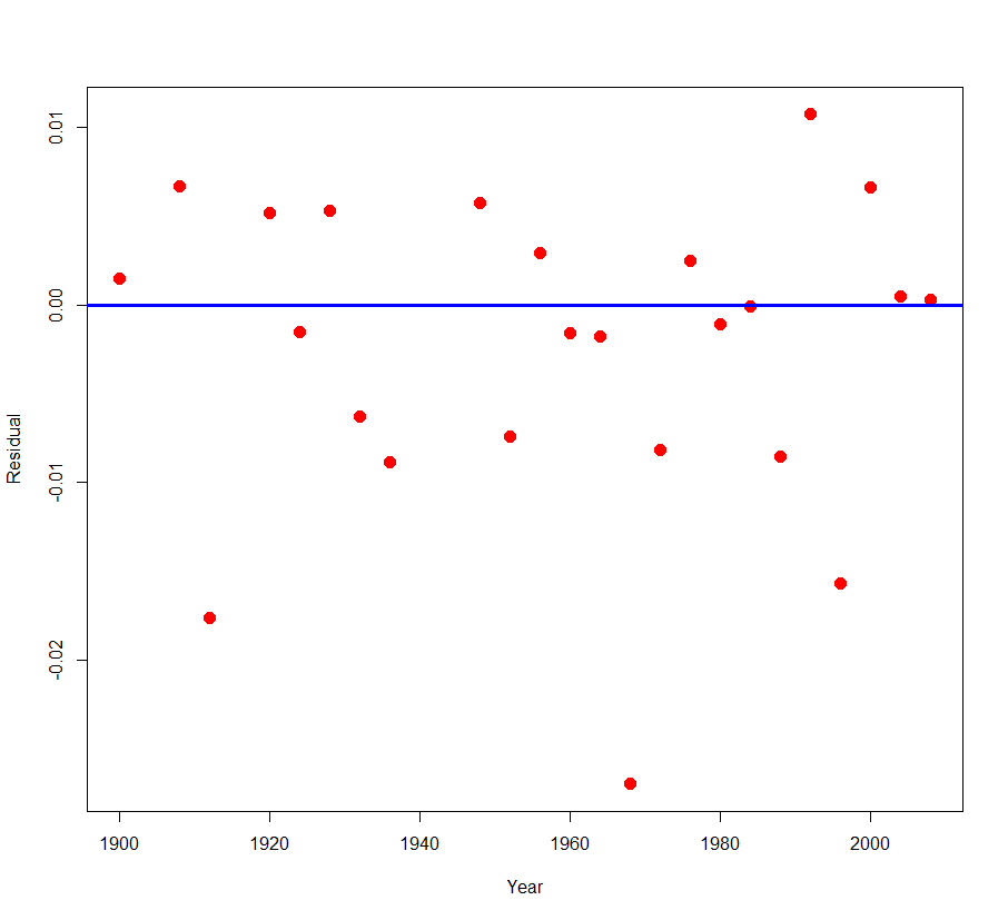
What do we see in this residual graph?

  1. Most of the residuals fall between -.01 and +.01.  Remember that .01 on the log e scale corresponds to a change of 1%.  So most of the times fall within 1% of the fitted curve.
  2. I see three outliers — there are three residuals smaller than -0.01 — they appear to correspond to the years 1912, 1968, and 1996.

Are there any special circumstances in the years 1912, 1968, and 1996 that would explain these unusually low bronze medal running times?  Actually, 1968 was a special year in that the Olympics were held in Mexico City which has a high altitude.  A venue at a high altitude means perhaps less air resistance that could contribute to faster running times.  One of the most remarkable Olympics records is Bob Beamon’s amazing long jump which occurred during these same Olympics.

A hypothetical conversation with my graphics class

One problem with an online course is that I can’t physically turn back homework and talk about some of the issues on the problems.  So I’ll pretend that I am turning back your “which log” graphs and make up a hypothetical conversation.

Jim:  Many of you lost points on this assignment since you didn’t interpret the rate of change on your graphs.

Student A:  But you didn’t tell us to interpret the graph in the assignment.

Jim:  That’s true — I did not specifically ask you to interpret the graph.  But what is the point of plotting the log of the response against time?  We take the log to better see and interpret the rate of change of the response.  A log converts exponential growth to linear graph and it is easy to read linear growth from the graph.

Student B:  But I did interpret the graph that you still took off points.

Jim:  Yes, you told me that the national debt is increasing.  But I think I knew that before I looked at your graph.  What I don’t know (and still don’t know since you didn’t tell me) is the rate of the increase.  How much has the debt increased each year?

Student C:  Do we always have to interpret our graphs?

Jim:  Most graphs don’t speak for themselves.  Actually, maybe you can put a push button on the graph that says “PRESS HERE” and then the graph (in a nice voice) can actually explain itself.  But since this is hard to do, you have to write the basic message:  what should the reader learn from viewing your graph?

Student D:  Okay, I understand.

Jim:  If you put away your cell phone, we can continue with the topic for today’s class.