Monthly Archives: March 2013

Baseball Graphs

A new season of baseball is starting this weekend.  Many articles are being written now about the current state of baseball.  One interesting thing is that the rate of strikeouts (this is when a batter swings three times and misses) is the highest in the career of the sport.

The New York Times has a great collection of graphs in today’s paper.  The top graph shows you the rate of strikeouts per game for every team in the last 112 years.  Every point has an associated label — you can easily find the unusual teams each season with respect to strikeouts.

I see that the 1980 Texas Rangers struck out an average of 3.61 times per game.  In contrast, the 2010 Arizona Diamondbacks struck out an average of 9.44 times each game.


Exploring MAC Shooting Data

To illustrate different methods for plotting 3-dimensional data, I collected some shooting data from the 12 MAC women basketball teams.  There are three measures of shooting accuracy:

FGA – field goal shooting percentage
FTA – free throw shooting percentage
3FGA – three-point field goal shooting percentage

I’m interested in exploring the relationships between these three measures.

1.  First, I try a three-dimensional scatterplot.  The plot3d function (package rgl) constructs the plot and allows you to spin it around to see better the structure.  Here’s a video of the spinning scatterplot. (Click the below link.  I’ve colored BGSU as red; the rest of the points are colored blue.)

mac

From this viewpoint, BGSU looks pretty average from the viewpoint of shooting accuracy.  They did pretty well in the league standings, but I don’t think their success was due to shooting percentage.

2.  Another thing to try is a scatterplot of all possible pairs of variables.

BGSU still corresponds to the red point and the blue points are the three teams with the highest values of FGA. We see that these good FGA teams also do well in Free Throw Shooting Percentage. These three teams are above average in Three Point Shooting Percentage, but I notice the team with the highest 3-Point Percentage is not one of these three teams. Generally, there are not strong relationships between these three variables.

3.  Another thing to try is a coplot — here you condition on one variable and look at the conditional scatterplots of the other two variables.  Here I condition on FTA and look at scatterplots of FGA and 3FGA.

This is harder to read. Look at the lower-left scatterplot — this is a scatterplot of FGA and 3FGA for the teams with a poor FTA percentage. The bottom center plot is a scatterplot of FGA and 3FPA for the teams with a slightly better FTA, and so on.
Focus on the bottom left and top right scatterplots — these are the scatterplots for the poor and strong foul shooting teams. Generally, poor foul shooting teams also are poor in the other two shooting stats; likewise great foul shooting teams are good in other two measures.

Smoothing Website Visit Counts

Last week, you worked on loess smoothing and we’re talking about graphing time series data this week.  It seemed worthwhile to give you a personal example of smoothing a time series.

Back in 2007, I wrote a book that illustrates computation using R for my Bayesian class (MATH 6480).  I have a website where I have information about the book and Google Analytics has been keeping track of all of the people who have been visiting the site.

I downloaded a file that gives the number of visitors for each day from the first (November 30, 2007) through the day I collected the data (March 16, 2013).   (This is total of 1934 days.)  I am interested in the pattern of counts over time.

1.  I first tried graphing the counts as a function of day number.

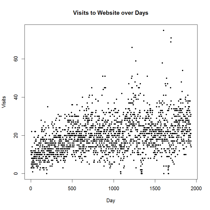
Note that I changed the plotting character to a solid dot (pch = 19) at a smaller size (cex = 0.5).  I didn’t find this plot that illuminating due to the large variability across days.  I know from previous exploration, that there is a drop off in counts over weekends and special times.  Anyway, it is tough to see the pattern across days.

2.  My next thought was to collect counts over weeks instead of days.  This would help smooth over some of the day-to-day variation that I don’t care about. I collapsed the data over 276 seven-day periods and I plot the count over week number.  I added a loess smooth to see the pattern.   I played with different smoothing fractions until I did not see any pattern in the residual graph.

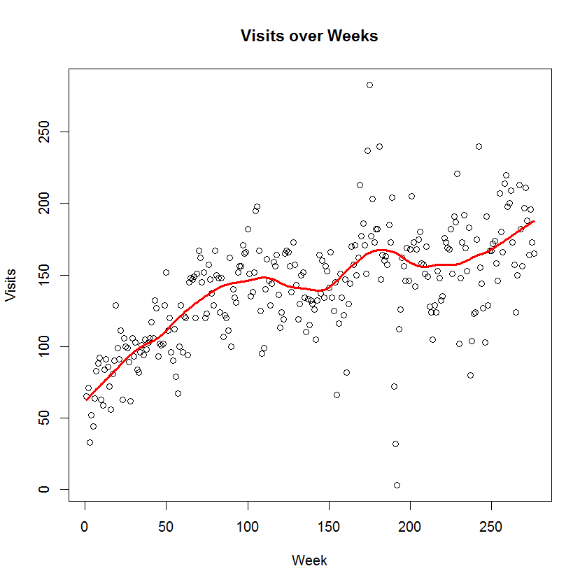
What is the pattern of visits? I see steady growth in the visits until Week 100, steady counts from Weeks 100 to 150, another period of growth between Weeks 150 and 200, a little drop off around 200, and a gradual growth from Week 230 to the current week.

Actually, some of the pattern makes sense to me. The original book was published in 2007 and I came with a revision in 2009 — this might explain the growth around Week 150. I was fortunate that both Bayesian thinking and the use of R have shown increasing popularity in recent years.

Back from Spring Break

I just returned from Florida and had a wonderful time enjoying the wildlife and weather.  Here are some graphical musings.

1.  I was reading some postings in the Visitor’s Center at the Loxahatchee National Wildlife Refuge.  They recently had an annual bird count where, on a particular day, they record the number of birds bound of various species.  For example, they may have found 23 Great Blue Herons, 12 Cattle Egret, 19 American White Ibis, 73 Black Vultures, etc.  They graphed the data using a bar graph.

Instead we could use a dotplot.

Which graph would you prefer and why?

2.  There is an interesting article in today’s New York Times about gun ownership.  They show the following graph that shows that gun ownership in the United States has decreased over time.

How could we improve this graph using principles from Cleveland’s book?

3.   Here’s an “interesting graph” — can you think of a better way to graph this data?


Dotplots

There is an interesting recent blog posting at http://www.statsblogs.com/2013/02/18/revisiting-clevelands-the-elements-of-graphing-data-in-ggplot2/

This is interesting for several reasons:

  1. The author is rereading Cleveland’s book, the primary book for our class.
  2. It gives you some nice illustrations of dotplots (the focus of your blog homework this week).
  3. Also it mentions the following good general principles in constructing statistical graphs.
  • A graphic should display as much information as it can, with the lowest possible cognitive strain to the viewer.
  • Visualization is an iterative process. Graph the data, learn what you can, and then regraph the data to answer the questions that arise from your previous graphic.