Inclass Assignment 6, March 29, 2011

For this in-class assignment, I followed the instructions throughout the whole thing. I have not used camera outside of this class so this was a new learning experience. I decided it would be easiest to do the blog as a whole not in parts because I figured a lot of repeating would be happening.

Throughout the assignment I worked with the white balance tool, and the clipping tools first. Here I was able to adjust exposure of the image and the white balance of another. I also used the clarity sliders on 2 different images to achieve two different looks. I was also able to bring out detail on a backlit image and added contrast to soft images. Cropping was one of the last things I did as well as straightening an image with the straighten tool.

Personally I think Camera Raw was a quicker easier way to edit photos.

Comments

Inclass Assignment 5 March 22, 2011

Part 1: Make a quick HDR effect

For this part of the assignment, I took the sample photo into Photoshop and followed the directions on the link. Once that was completed, I went back into Photoshop with one of my own images. From there I made 3 copies of my original image, making for copies total. In one copied layer, I adjusted the highlights and shadows. In the next layer copy, I adjusted the saturation and desaturated the whole image. On the final layer copy, I adjusted a blur on top. In the desaturation layer, I also adjusted the light to hard light, and in the blur layer, I adjusted the light to soft light.

Part 2: Remove a person with Content Aware

For this part of the assignment, I again used the sample image and followed instructions. Then I used one of my own images and removed a goy on a bike. To do this, I first selected the guy on the bike I wanted to remove. From here I selected the fill option in the edit menu. I set it to content aware and hit ok. Once the biker was removed, I repeated the steps to get rid of any artifacts lingering where he once was.

Part 3: Make a sunny day

For this part of the assignment, I started off by using the sample and following the tutorial. Once that was complete I took a picture off the internet of a gray day and turned it sunny. To do so, I started by adjusting the curves to lighten up the image. Then I adjusted the vibrance to add a little more color to the image. I then selected the gray sky and added a gradient layer of blues to create the sunny day. After that was complete, I added the clouds and put a photo cooling filter over the water so it has the illusion it is reflecting the sky. And there you have it…a sunny day.

Comments (9)

CD Research

For the CD booklet I have decided on American Honey by Lady Antebellum. To me the song is summer time in a nut shell. It’s been my favorite song for a while now and I always try to decide on things I love because it makes projects easier. This song describes my summers,  growing up in small towns and things like that. For my booklet I have really decided to focus on the simple things in life; fields, flowers, sun, etc. I thought something simple and “down home” would be perfect to really pull out the feeling of the song. Not only do my images work for this song, but a lot of Lady Antebellum songs alike.

Comments (22)

Magazine Ad Research

For my magazine ad spread, I have decided to do something near and dear to my heart; shoes! I have had a love affair with shoes for 23 years and it is only getting stronger. Not only am I doing a shoe ad, I am doing a Zigi Soho shoe ad. I have recently purchased my first pair of Zigi Soho sandals and I love them. This company makes shoes that are fun and flirty. With it being so close to Spring and sandal weather, I wanted to show off these vibrant shoes and get me in the mood for toe nail polish and flip flops.

As for the ad itself, I want it to represent the brand, and the best way to do that is by showing off the product and using lots of bright fun colors. The color scheme I have decided on consists of pink, orange, yellow, blue, and green; all in the brighter stages. I want to have pops of color in the texts and frames I plan on having the shoes I wish to advertise in. Basically, I want the ad to be as fun and flirty as the shoes themselves.

The images I have researched give a great feel for what kind of shoes this company makes. Currently everything is “boho chic” or bohemian chic. Lots of beading, feathers, and bright colors can be found in their current line of Summer sandals. My goal is to shoe that off to the best of my ability. The only concern I have is making my ad look too cluttered so I will try my best to monitor that situation.

Following is the research and creative processes I have come up with for my future ad:

Comments (20)

Inclass Assignment 4 Re-do Feb. 22, 2010

To start this assignment off, the correct way this time, I made a black and white layer. From there I took the reds down to make the car black. I then Copied the white panel from the cop car and pasted it into my new cop car. I did this with the minor details of the car as well. I did the perspective transform to make everything fit and the eraser tool to make sure I got rid of what I did not want. Sorry if the image is really small I had trouble uploading it.

Comments (15)

Movie Poster/DVD Cover Research

For my movie poster and dvd cover, I have decided to do them on the movie “Gridiron Gang.” This is a movie about a juvenile corrections guard who wants to make a difference in the statistics of juveniles released back on to the street of L.A. He plans to create a football team to have the boys act more like brothers and team members rather than rival gang members on the verge of killing eachother.

The movie is based on a true story and I am particularly fond of true stories. A plus side is that it is also a sports related movie, which I also like.

For the poster and cover, both, I want to portray the themes of jail, football, and believing in something. I plan on doing this by layers and different opacities. The colors I am planning on using are in the gray scale of things but I also want pops of yellows and golds for the text and colored filters on some layers.

Following are some internet research and sketches of my potential ideas:

Comments (28)

In Class Assignment 4 Feb. 15, 2011

Part 1- Turning a Car into Another Car

To start this project I dragged the cop car on top of the other car a few times to get all the parts of the car the right sizes. Then I used the magnetic lasso tool to select the car and then selected the inverse to delete the unwanted background. From there, I used the eraser tool to get rid of what the lasso tool missed and to erase out the windows so the backgrounds matched.

Comments (34)

In Class Assignment 3 Feb. 8, 2011

Part 1- Combining Background and Portrait into a Single Composite

For part one, I began by selecting my model with the magic wand tool. Here I selected the big chunks of background and then selected the inverse. From here I went and selected the refine edge box. In the refine edge box I played around with the different settings until things looked normal. I also played with the edge brushes to fine tune the outline of the model. From there I decided how I was going to output, which I did new layer with layer mask, and that was that. I basically followed the tutorial step for step throughout this process since it is something that is new to me.

Part 2- Creating a Non-Destructive Adjustment Using Adjustment Layers

For part two, I started off by opening the black and white adjustment layer. From there I used the brush tool to paint off some of that layer to reveal the color underneath.

Part 3- Creating a Panoramic Image

For part three, I started off by opening up Photoshop, going to file…automate…photomerge…and then I added the photos. From there I clicked merge and and cropped the final image.

Comments

Children’s Story Research

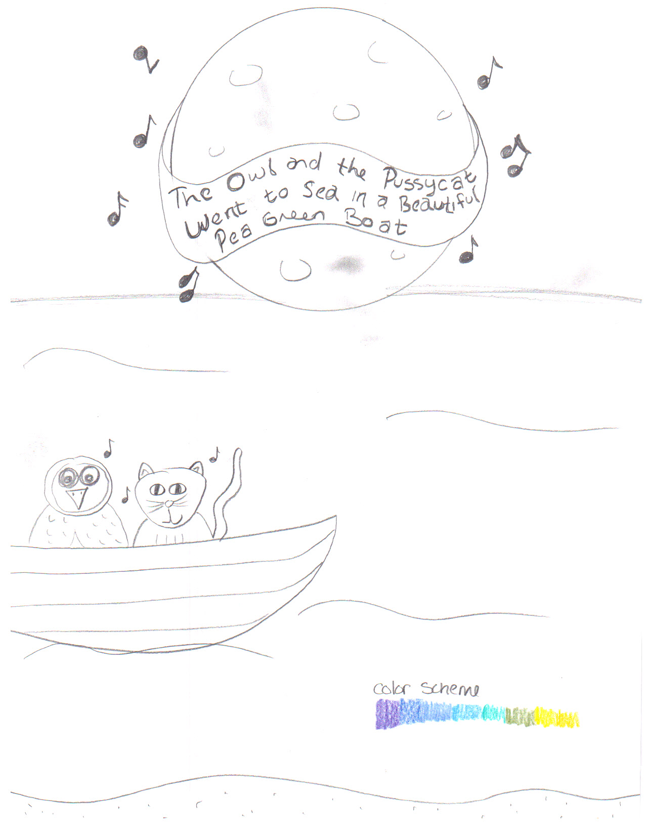
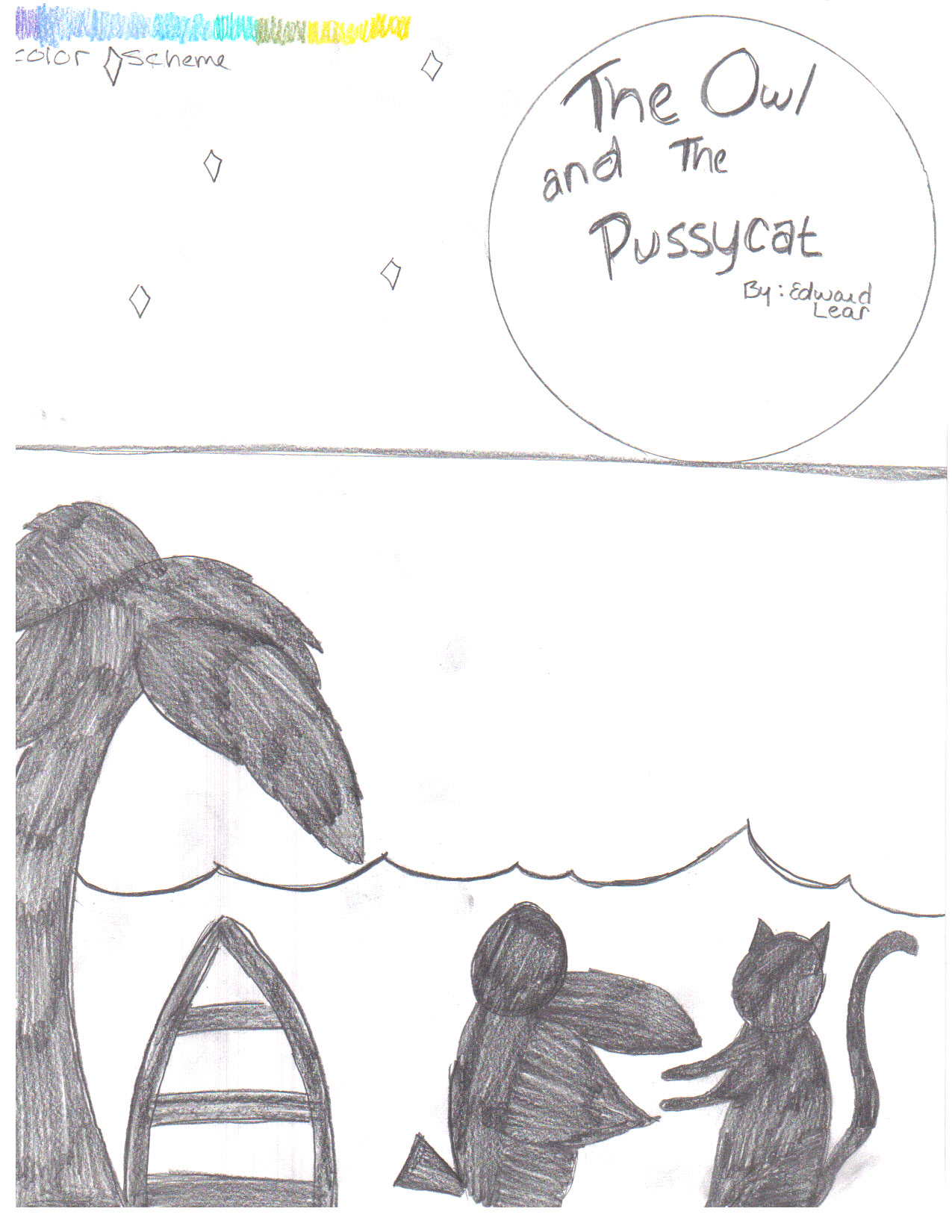
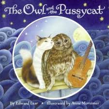
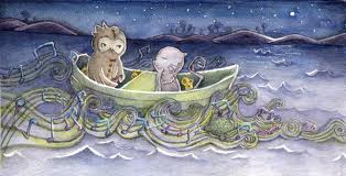
The story I have decided to use for my children’s story poster is The Owl and the Pussy-Cat by Edward Lear. This book was a favorite of my dad’s when he was a kid and when I was born, it was his turn to read it to me. With it’s poetic flow, I was able to memorize the story by age three, and I can still recite most of it to this day.

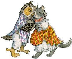
The story, for those of you who do not know, is about and owl and a cat who are in-love and decide to sail away. Along their journey, they decide to get married and have some issues finding a ring and someone to marry them. This is where the other characters come into play.

First we have the pig, who gives them the ring from the end of his nose. Then we have the turkey from the hill who marries them. The story is very simple, as one can tell, and only holds four characters; the owl, the cat, the pig, and the turkey.

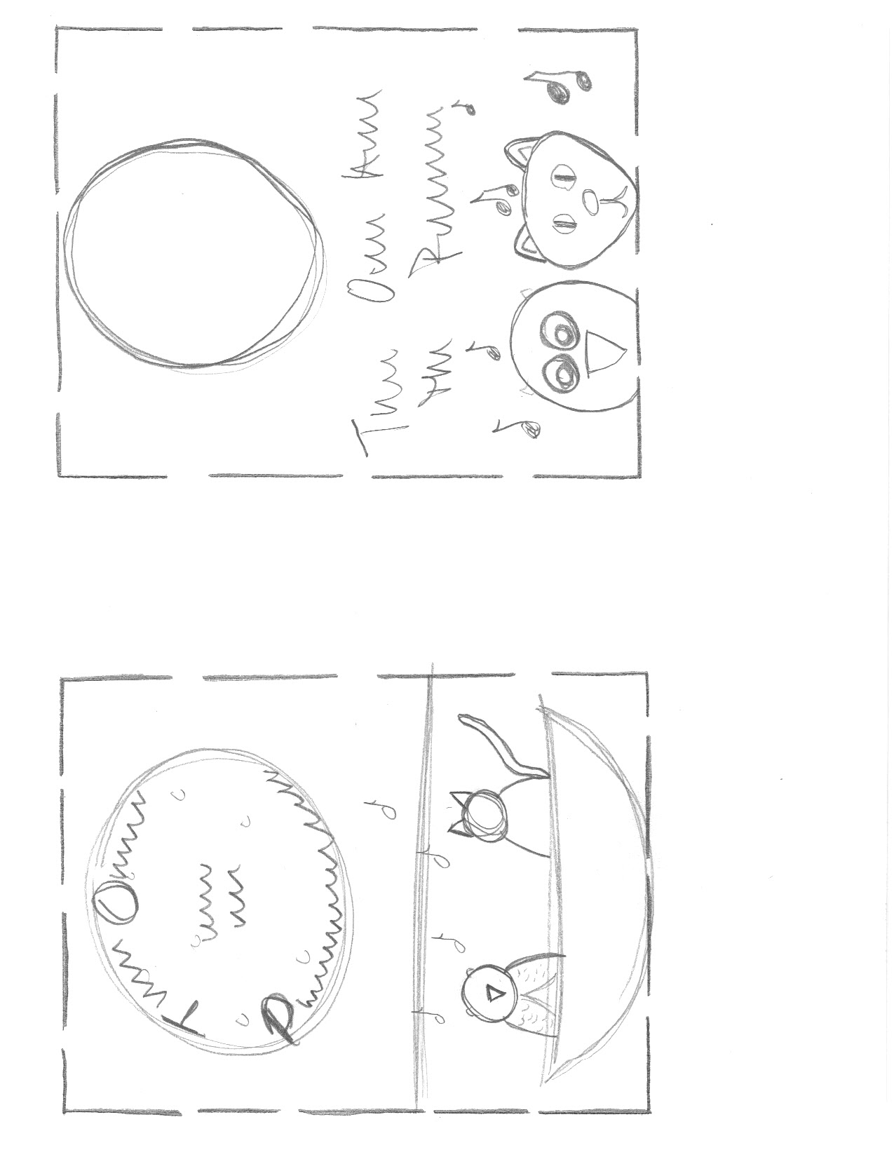
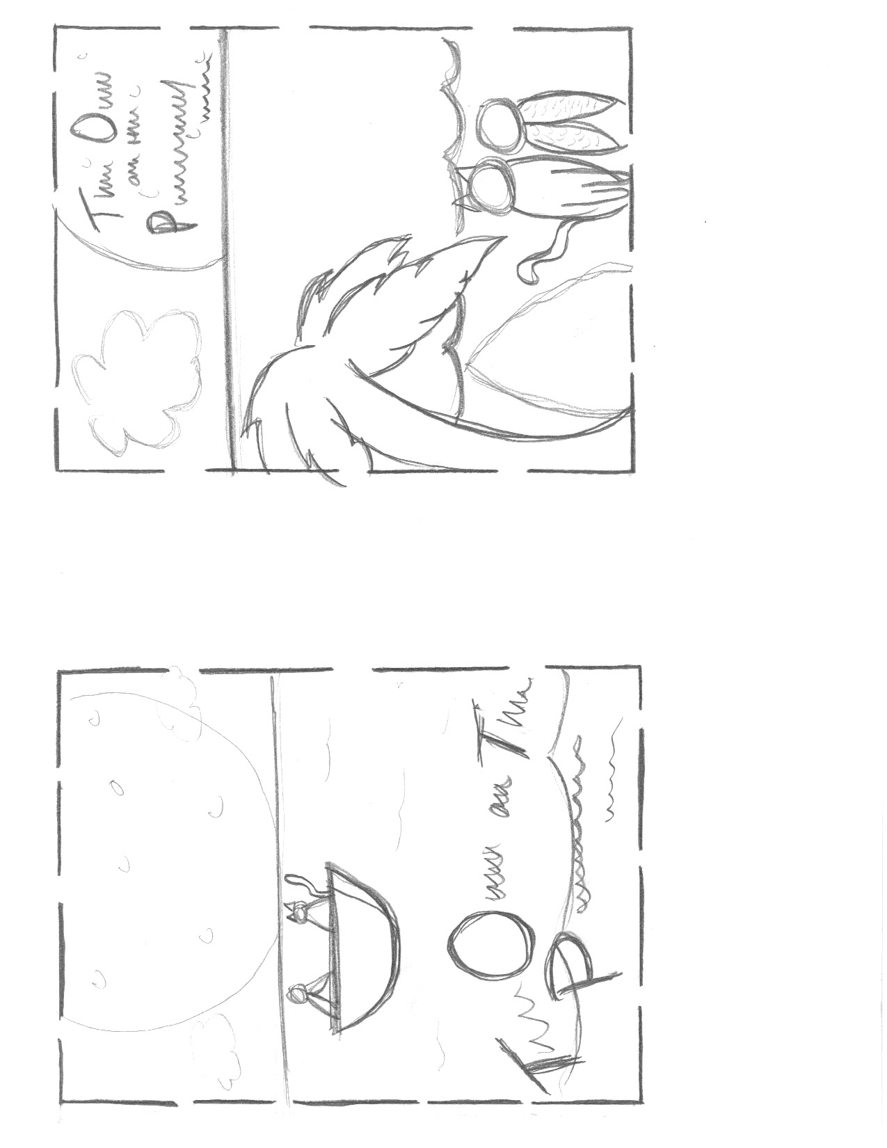
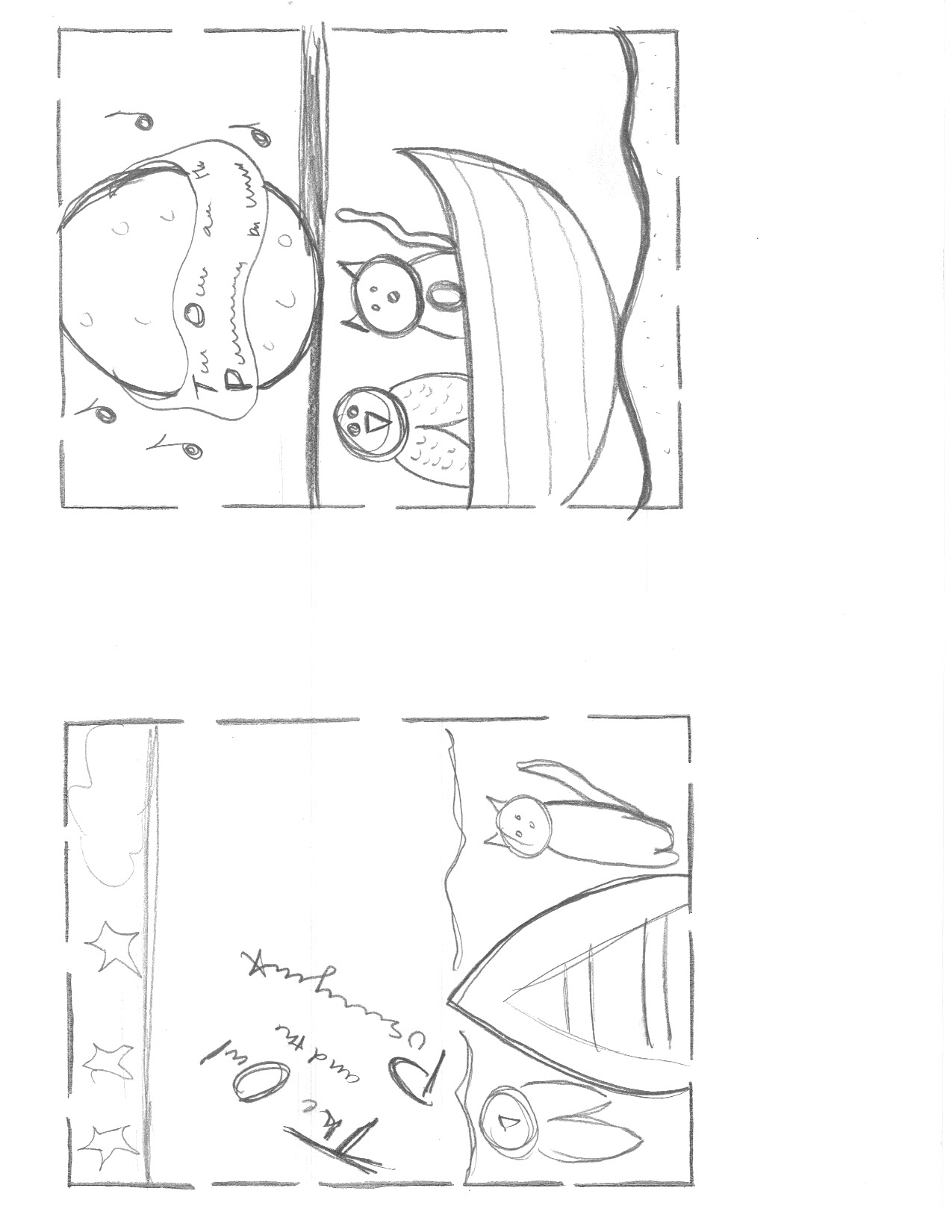
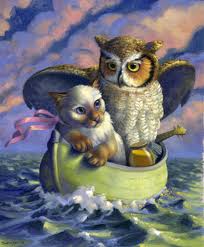
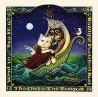
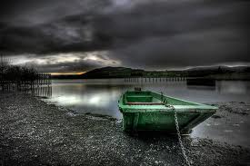
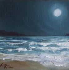
Although there are not many characters, there are other objects that make the story. To me, the “beautiful pea green boat” is a big part of the story. Also there are the “bong trees” the ring from the pigs nose, a five pound note, honey, a guitar, the moon, a “runcible spoon” and that’s about it. To me all these are important but I have decided on including the owl and the pussy-cat, the boat, and the moon. To me, this sums up the beginning, the middle, and the end of the story.

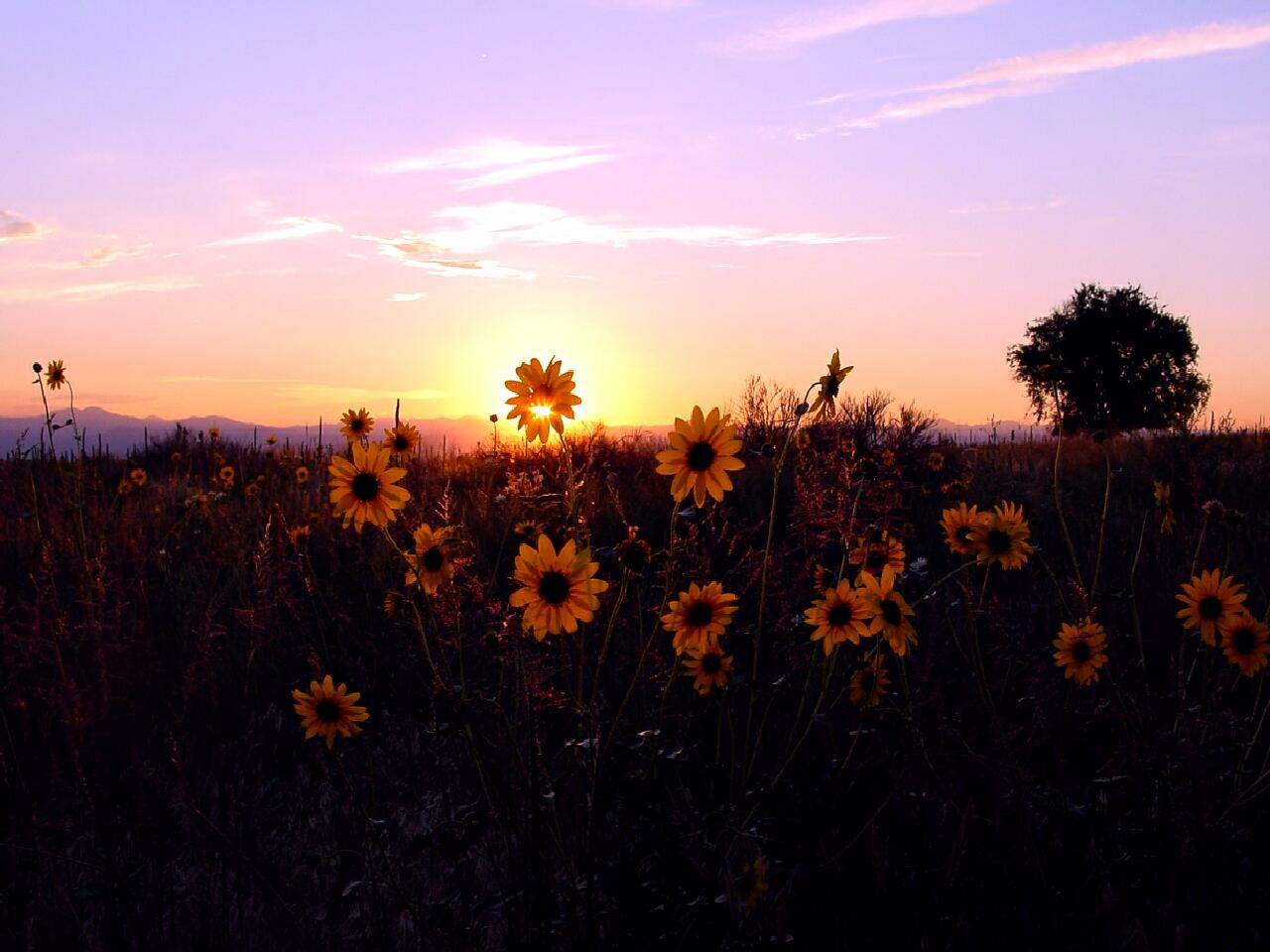
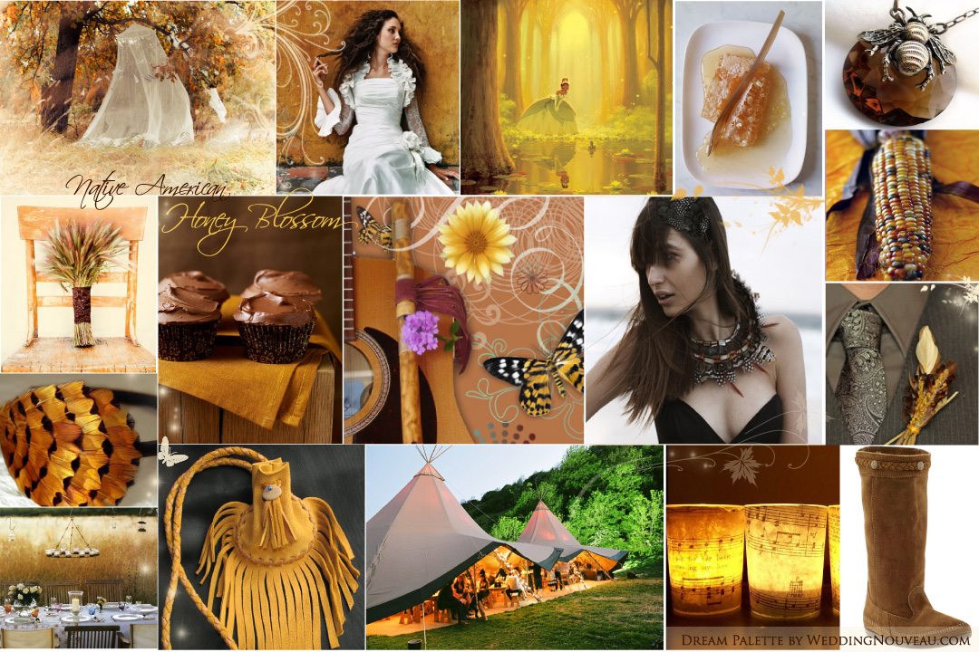
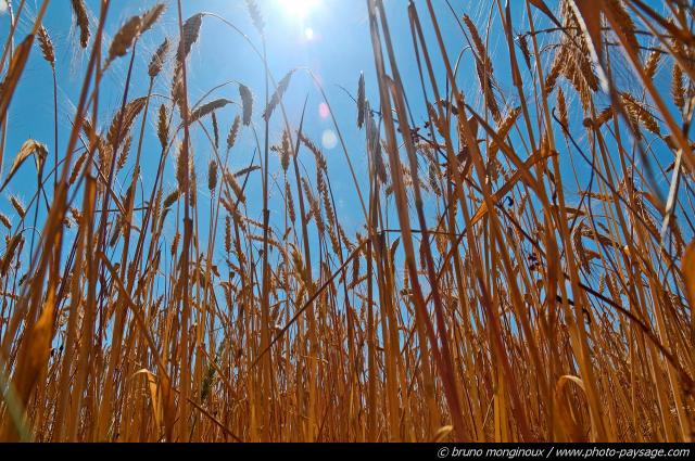
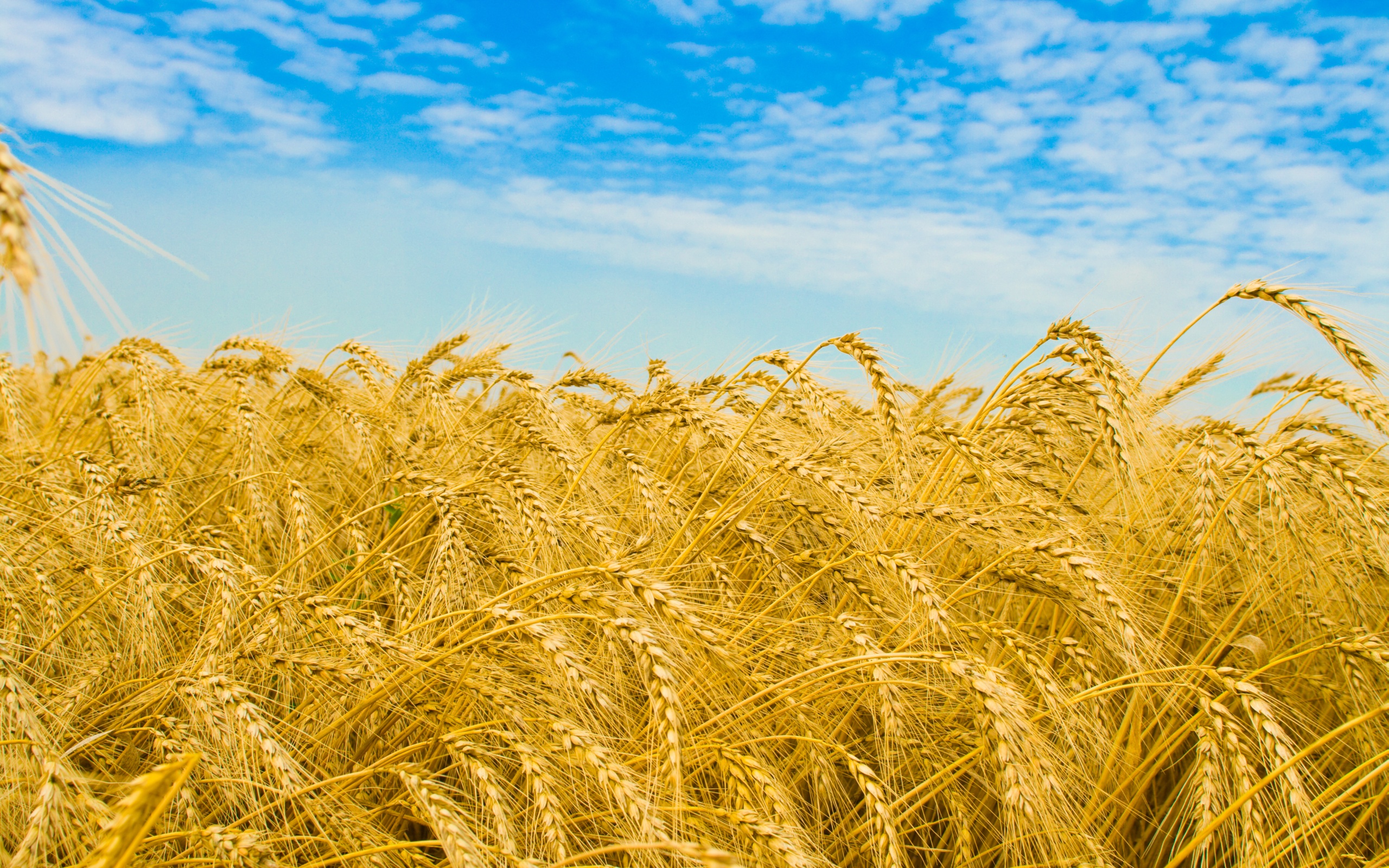
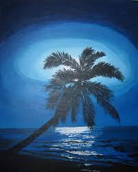
As far as color schemes go, a variety of blues, greens, yellows, and purples really stood out. I would like the poster to be peaceful and calm. The story has a very peaceful flow to it and I would like to portray that with the poster. With the text I would like to use something in the serif style. The Owl and the Pussy-cat is a children’s story but it’s not a story like Curious George or something along the bubbly side of things.

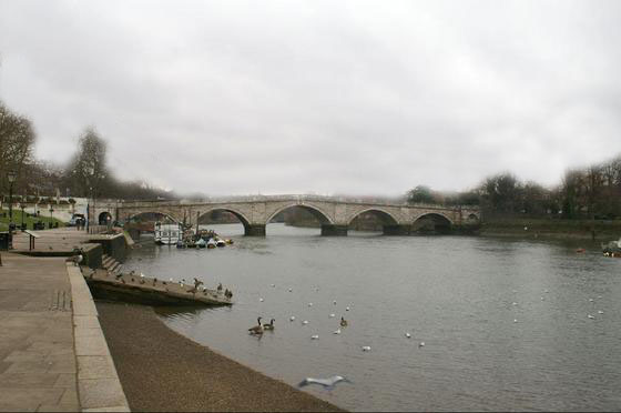
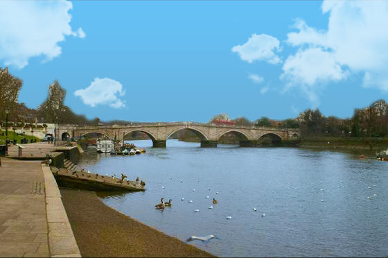
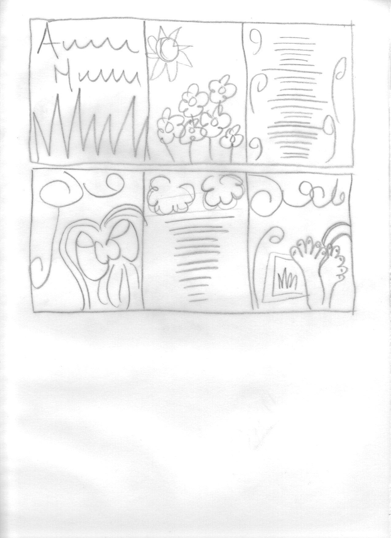
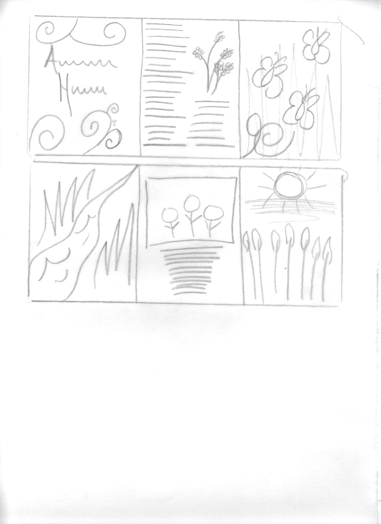
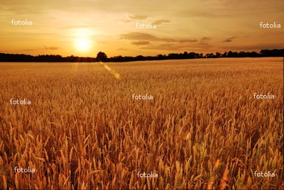
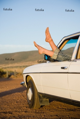
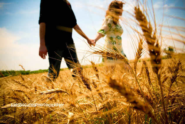
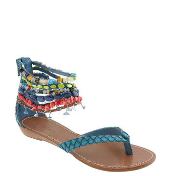
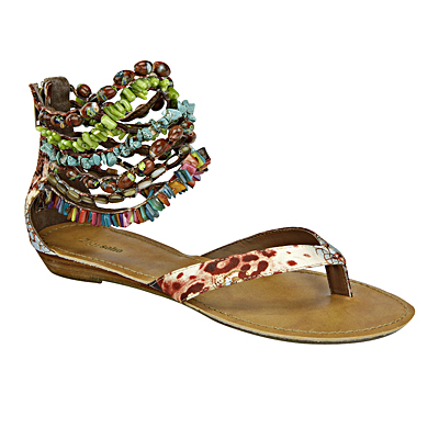
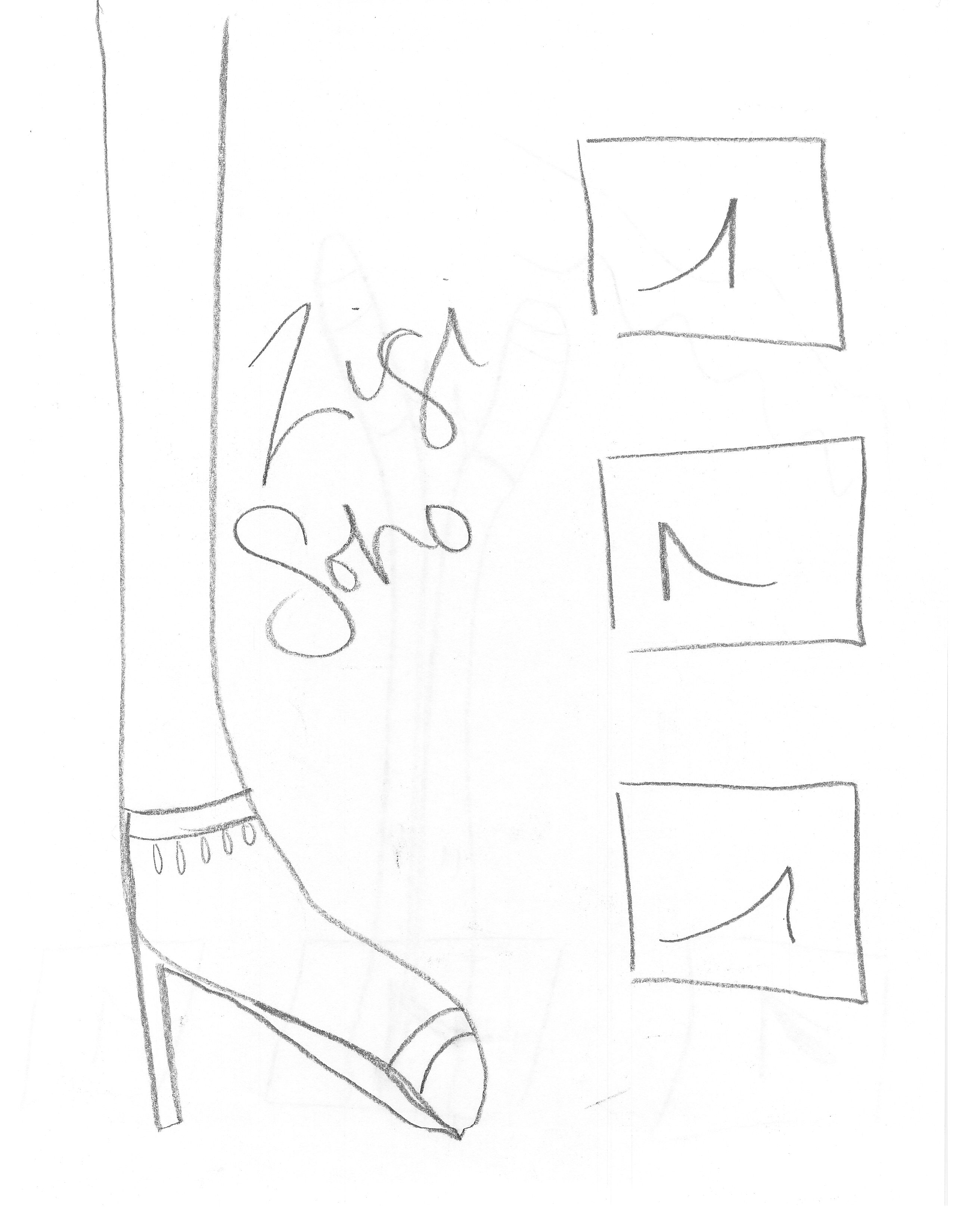
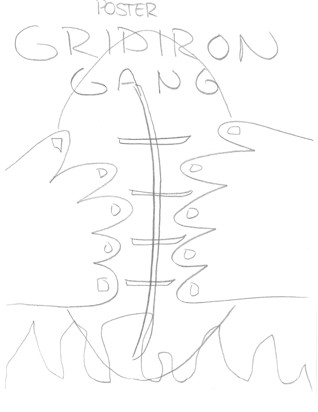
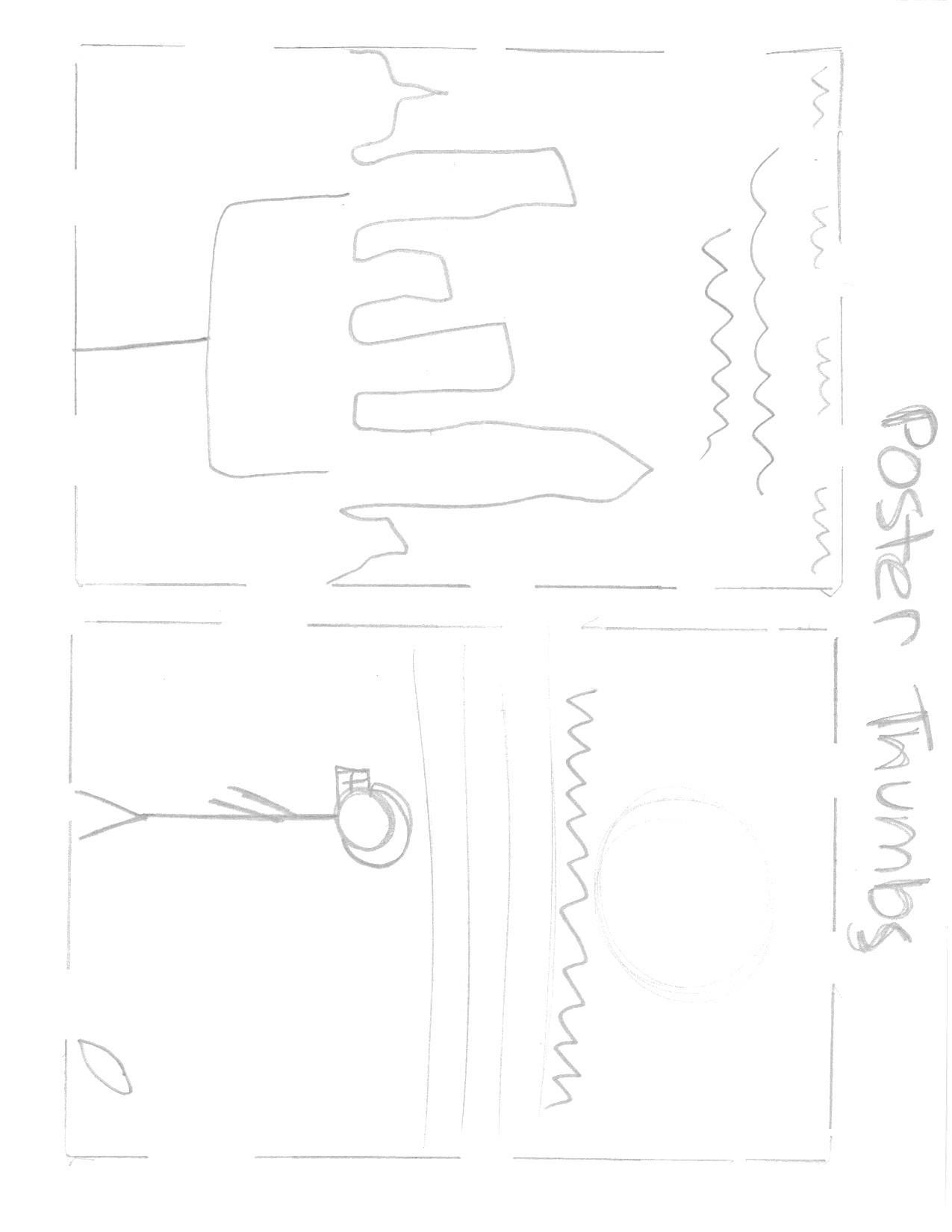
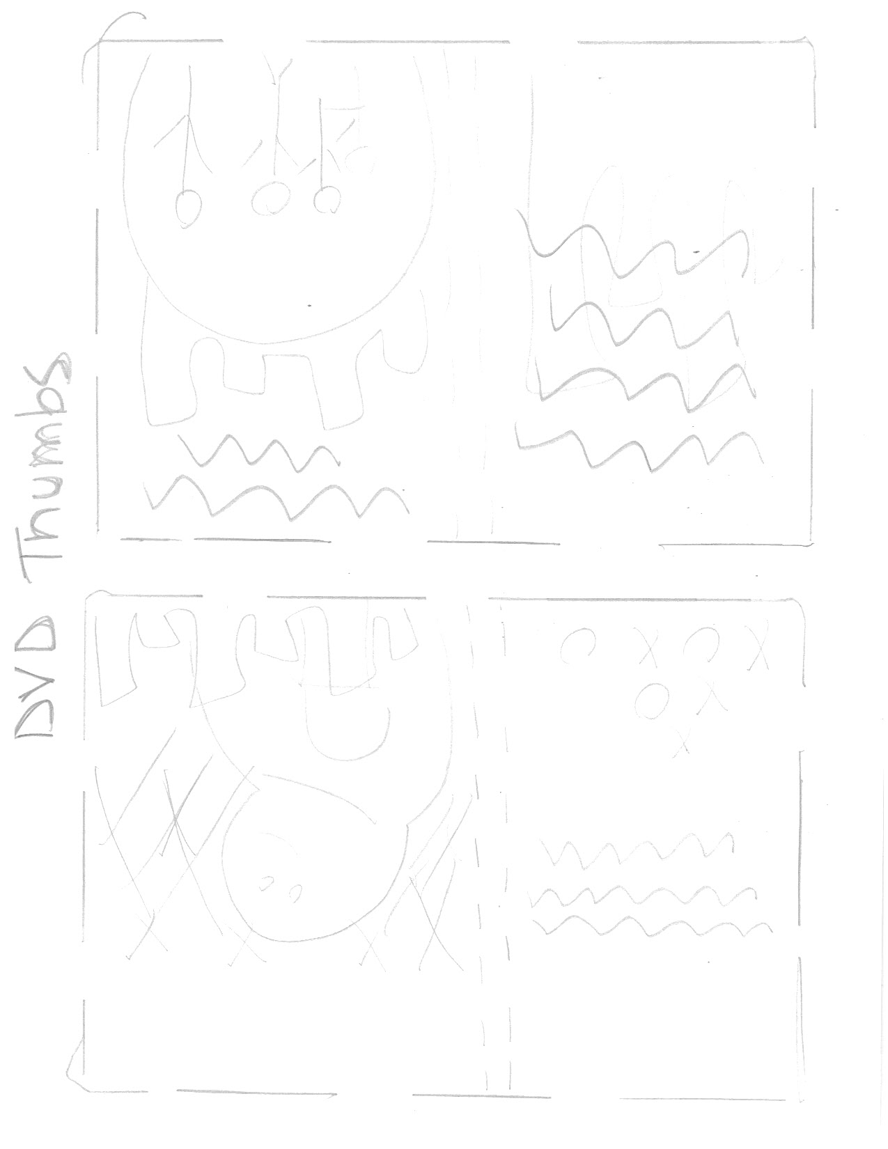
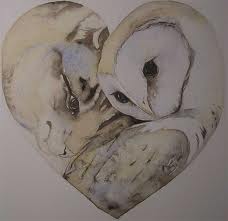
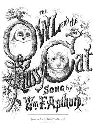
In my gallery I have included some photos I have found online representing my story of choice as well as my thumbnails and sketches.

Comments (3)

Hello world!

Welcome to blogs.bgsu.edu by COBL. This is your first post. Edit or delete it, then start blogging!

Comments (2)

« Previous entries Next Page »

Skip to toolbar