These are some ads that I researched and some I liked and disliked later explained below.

In the four skin care advertisements shown above I like each of them for different reasons.
1. The top left corner, with the older women for a dove ad. I really like that her body does not seem super retouched. It stays true to what this lady may look like in real life. I also like the the simplicity of the text in the ad.
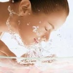
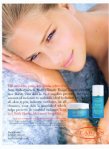
2. To the right of the previous ad. I really like the element of water in the ad. It make the entire image feel a calm and the model has a flawless natural looking face. The skin may be a little bit too retouched for my liking in this photo, but that is just the nature of skin care advertising.
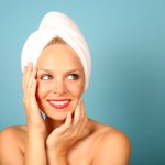
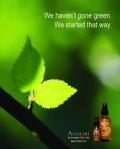
3. To the right of the previous ad. I also like the simplicity of this ad, but what stood out to me the most was the green in the ad. They are advertising “going green” and claiming that they have been green the entire time. I really like how they did this overall ad. Everything in the ad has a meaning.
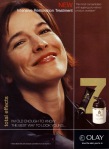
4. The bottom ad. This is the olay skin line that I wanted to do and I really like how they made the model look more nature and older looking. I am not crazy about the color combination that they use in the photo, so I would try to create a softer palette of colors when I try to create this ad.
In advertising skin care, the new trend is to describe the type of skin you have on the website by answering specific questions. Then from the answer you have chosen the skin care companies picks specific products to help your specific skin type. This is suppose to give you a feel of going to the dermatologist, without the ridiculous prices.
Another trend in skin care is trying to create a spa like feel when trying to convince people of the products they are using. For this particular project I think I am going to try to create this spa like feel. In order to accomplish that I need to stick to more natural colors and images. A lot of skin care products tend to use whites, pinks, greens, and blues. These colors tend to make people feel more at peace.
Also I researched different skin care companies such as Garnier, Estee Lauder, Neutrogena. The company skin care product that I am choosing to use it Olay. The normal color tones tend to be red, black, and gold. Well with the advertisement that I am trying to create I am going to try and change things up for them and create a bit of a softer image.
The products that I plan on using are facial moisturizers, specialty treatments, facial cleansers, body wash, and body lotion. (Total effects anti aging.
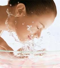
I want to create a more watery feel to my advertisement by either using a bathroom or beach setting
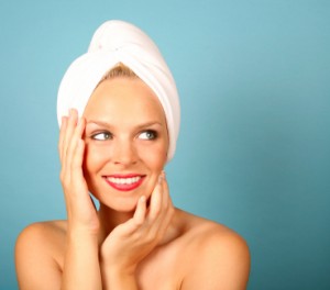
I may use this picture to create kind of a dream sequences since she has pretty skin and is looking away.
I want a picture like this for the background and somehow creatively place the products and write some sort of text to go along with the theme.
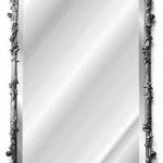
These next two images I would want to use if I decide to do the bathroom theme. I want someone washing their face with a mirror or such in the background.

