Blog 6- 7/19

Only two weeks left!! Only two weeks! haha I think I have a serious case of summeritis and senioritis combined. Good thing there is only a short amount of time left. I have given my client the examples I made for the business card and letterhead design and they picked one and we are happily moving forward. I think the next step is the begin an outline of a website design for the client. I know I will not have time to actually start a website before the class is over, but we are going to move forward and start getting serious about this website design stuff and continue once the class is over.

Hope everyone had a nice week

peace and love xx

Posted in VCT 4670 | Leave a comment

Blog 5- 7/12

This week has been pretty crazy. I have not had much time to advance in my project. I am about the same place as I was last week. I got a chance to meet with my client this week and discuss some things. We were able to narrow down some design choice and figure out  a more direct approach to where we want to be heading with this project.

This week’s co-op report was due so on top of working 40 hours I had to finish that and work on the homework for this class. So I know all of us VCT student’s have been pretty stressed out this week.


Well have a nice weekend.

Peace and love. xx

Posted in Uncategorized, VCT 4670 | Leave a comment

CD insert

For my CD insert I want to do the song RESPECT by Aretha Franklin. This song has two different version, but I feel as if this version is better suited for what I am trying to accomplish. Franklin’s version is a declaration from a strong, confident woman who knows that she has everything her man wants. She never does him wrong, and demands his “respect”. Franklin’s version adds the “R-E-S-P-E-C-T” chorus and the backup singers’ refrain of “Sock it to me, sock it to me, sock it to me…”

Below are the thumbnails and comp ideas that I have for me project.

For the CD inserts I in vision many different things, but some of things that I see are big bulkier fonts of little excerpts of the lyrics of the songs

For color and contrast I want to make all the images back and white and have brighter bolder font colors to give the CD cover a little bit of an older feel since the song is an older song. This images kind of the idea that I am thinking in my head for the cd insert.

For images I want to show respect, but it many different forms. So the images I have below are some examples of what I consider to be respect.

Over all I kind of just want to do a collage of images with the background black and white and the font in a bright kind of color. Hopefully I am able to follow through with my idea.

Posted in VCT 4600 | 2 Comments

Project 3- Movie Poster

The movie that I chose to create the poster for was Black Swan. The basis of the story line is a ballet dancer who wins the lead in “Swan Lake” and is perfect for the role of the delicate White Swan. Princess Odette, but slowly loses her mind as she becomes more and more like Odile, the Black Swan. The main character in this movie is played by Natalie Portman and her name is Nina Sayers. When she finally lands the lead role it becomes really difficult for her to play both the black and white swan. She starts to hallucinate, which eventually ends up killing her.

So while researching for this movie poster I think I want to use the head of Natalie Portman. Her make-up is and eyes say a lot of what happens in the movie.

If that idea does not work then I want to have black lit image of Natalie Portman dancing and then on the DVD cover have half of her face on the front and back of the cover.

I do not think it is important to show all the information about the film. I think the show that she is a dancer and that she has gone crazy are the two most important part of this film. I may add some feathers in the background to tie in the swan like feel.


Below is the thumbnails that I created…

Some of the images that I found that I may use in my final poster are below as follows…

I think as far as color wise for this project I am going to stick to the black and white theme and have an accent of red. I think it gives the dark feel that this movie has and the red gives a final last touch.

With the images that I found I think I have a lot of good images to work with, it is just a matter of getting them into the photoshop and see what works with what I want to accomplish.

Posted in VCT 4600 | 1 Comment

In Class #5

Content-Aware

For the content-aware I did the edit<fill<content-aware and feathered the edges of the images. Then any parts that didn’t look well I did the clone-stamp in those areas.

Before

After

HDR

For the HDR images I did exactly what was told to do in the demos. I created a shadow and highlight layer and changed it to 50%. Then created a desaturation layer, changed the blending mode to hard light. Then created a blur layer, put on a gaussian blur to 40 pixels and changed the blending mod to normal to soft light.

Before

After

Action- Blur

Created a duplicate layer then went filter< radial blur and changed the blur method to zoom and quality to best and moved it toward her face. Then I took the gradient tool and changed it to black to white and radial gradient and added a mask and created the affect.

Before

After

Sunny Days

I first found a blue sky then an image with a not so blue sky. I selected the sky with the lasso tool then went select inverse and added a layer mask and got the following affect.

Before

After

Posted in VCT 4600 | Leave a comment

Child Book Poster

The book that I choose to use was Harold and the Purple Crayon. The plot of this story is a curious four-year old boy who, with his purple crayon, has the power to create a world simply by drawing it. The brand of this book is the purple crayon. I think it is a really important aspect of it. The content of this book is creating a world that does exist simply by using a crayon. The function of this book is creating a poster that is kid friendly and that they can relate to.

Listed below are the thumbnails that I have created.

I think for my final poster I am going to do a city scape with a moon and a little boy with a purple crayon. The main color of my poster is going to be purple and black I believe. I am going to try and make it look as much as an illustration as possible with using photos.

In the book, the city and the moon are very symbolic because the little boy draws a city and all these windows looking for his bedroom window. And the half moon is the first thing he draws when he starts his journey. This is why I have chose to add it into my poster.

Listed below are some of the images that I am considering using unless I can find something better to use.

I really wish that we could use illustrations to make the effect I going for to work a little bit better. But since we have to use images these are some of the ones that I plan to use minus Harold himself. I am still looking to put in a boy that is not a illustration to get the effect I am looking for.

For the font on the poster I plan on using something similar to the chalk font. The poster needs a crayon effect I think that font will do that for it. On my poster I think I want to put a punch line of something that says ” Create the world you have always dreamed of.” I feel like that statement captures what the book is about.

Posted in VCT 4600 | Leave a comment

In Class Assignment 4

Assignment 4

For the in class assignment first selected door of the car and made it white. Then I selected the entire car and went to the adjustment layers and change the hue and saturation of the car then I change the curves to give it a richer black color. After that I selected the star, siren, and sheriff writing and placed them into the new file and distorted them a bit so they would fit into the new image.

Some problems that I had were changing the color of the car. I tried many different ways to get the rich black color until I was told that the curves would help achieve that goal. I also did not not think I the things that I distorted turned out very well in the final product.

Posted in VCT 4600 | Leave a comment

In Class Assignment 3


Part 1

For part one places both the background and portrait into a photoshop file. Then I used the lasso tool to cut out the portrait of the man. After that I went into the refined edges and smoothed out and feathered some of the edges. Then I used the radius tool to bring out some of the pieces of his hair that were missing. Then I clicked the decontaminating box to get ride of the blue background that was there from previous. Then the layers were combined to create the final image.

Part 2

For part 2 I used the adjustment layers to create this affect. I clicked the black and white adjustment and then opened the brush tool and painted over the areas where I wanted to color to come through.

Part 3

For part three I opened the five different psd files in bridge and selected them and went to tools> photoshop> photomerge and the then it appears in photoshape and I keep it at auto and pressed okay. Two of the images didn’t connect with the other three so I cropped them out and used the ruler tool to straighten out the background to get the final image.

Posted in VCT 4600 | Leave a comment

Lab-Assignment2

Part 1

Before

After

In order to remove the creases and tears I used the clone stamp to even everything out. For the bottom right corner I used the spot tool then the clone stamp to create the lines in the floor again. The part I struggled the most on was the little boys face and I used to patch tool to try and recreate the little boys face.

Once I was finished with the entire image I edited the levels of the image to try and match the original corrected one.


Part 2

Before

After

To recreate the background I used the spot tool at the bottom and cloned stamped that to create the background at the top. for the face I also used to clone stamp to try and get rid of some of the white spots that were created on the photo. The boys left ear got a little messed up in the process and I tried to fix it, but ran out of time.

Part 3

Before

After

This was my favorite one to edit and I think it turned out the best. First off I had to change it to grayscale to get ride of the discoloring that was on the photograph. Then I used the clong stamp tool on the background since it was a black color and that made it very easy. For the jersey I used clone stamp tool to get rid of the creases that were in the jersey.

Posted in VCT 4600 | Leave a comment

Hello world!

Welcome to blogs.bgsu.edu by COBL. This is your first post. Edit or delete it, then start blogging!

Posted in Uncategorized | Leave a comment

Product Composition Ad Images


These are some ads that I researched and some I liked and disliked later explained below.

In the four skin care advertisements shown above I like each of them for different reasons.

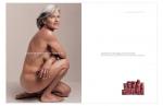
1. The top left corner, with the older women for a dove ad. I really like that her body does not seem super retouched. It stays true to what this lady may look like in real life. I also like the the simplicity of the text in the ad.

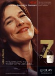
2. To the right of the previous ad. I really like the element of water in the ad. It make the entire image feel a calm and the model has a flawless natural looking face. The skin may be a little bit too retouched for my liking in this photo, but that is just the nature of skin care advertising.

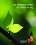
3. To the right of the previous ad. I also like the simplicity of this ad, but what stood out to me the most was the green in the ad. They are advertising “going green” and claiming that they have been green the entire time. I really like how they did this overall ad. Everything in the ad has a meaning.

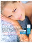
4. The bottom ad. This is the olay skin line that I wanted to do and I really like how they made the model look more nature and older looking. I am not crazy about the color combination that they use in the photo, so I would try to create a softer palette of colors when I try to create this ad.

In advertising skin care, the new trend is to describe the type of skin you have on the website by answering specific questions. Then from the answer you have chosen the skin care companies picks specific products to help your specific skin type. This is suppose to give you a feel of going to the dermatologist, without the ridiculous prices.

Another trend in skin care is trying to create a spa like feel when trying to convince people of the products they are using. For this particular project I think I am going to try to create this spa like feel. In order to accomplish that I need to stick to more natural colors and images. A lot of skin care products tend to use whites, pinks, greens, and blues. These colors tend to make people feel more at peace.

Also I researched different skin care companies such as Garnier, Estee Lauder, Neutrogena. The company skin care product that I am choosing to use it Olay. The normal color tones tend to be red, black, and gold. Well with the advertisement that I am trying to create I am going to try and change things up for them and create a bit of a softer image.

The products that I plan on using are  facial moisturizers, specialty treatments, facial cleansers, body wash, and body lotion. (Total effects anti aging.

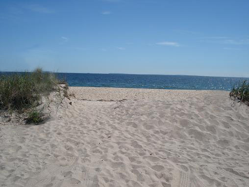
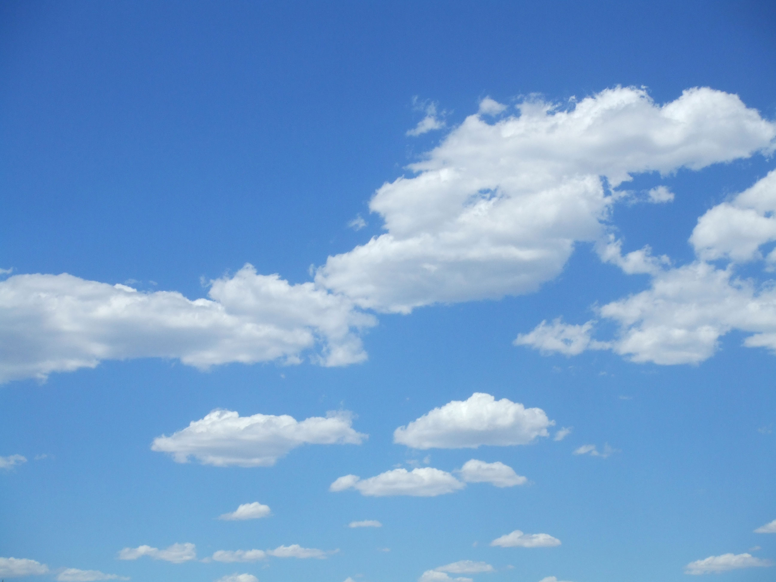
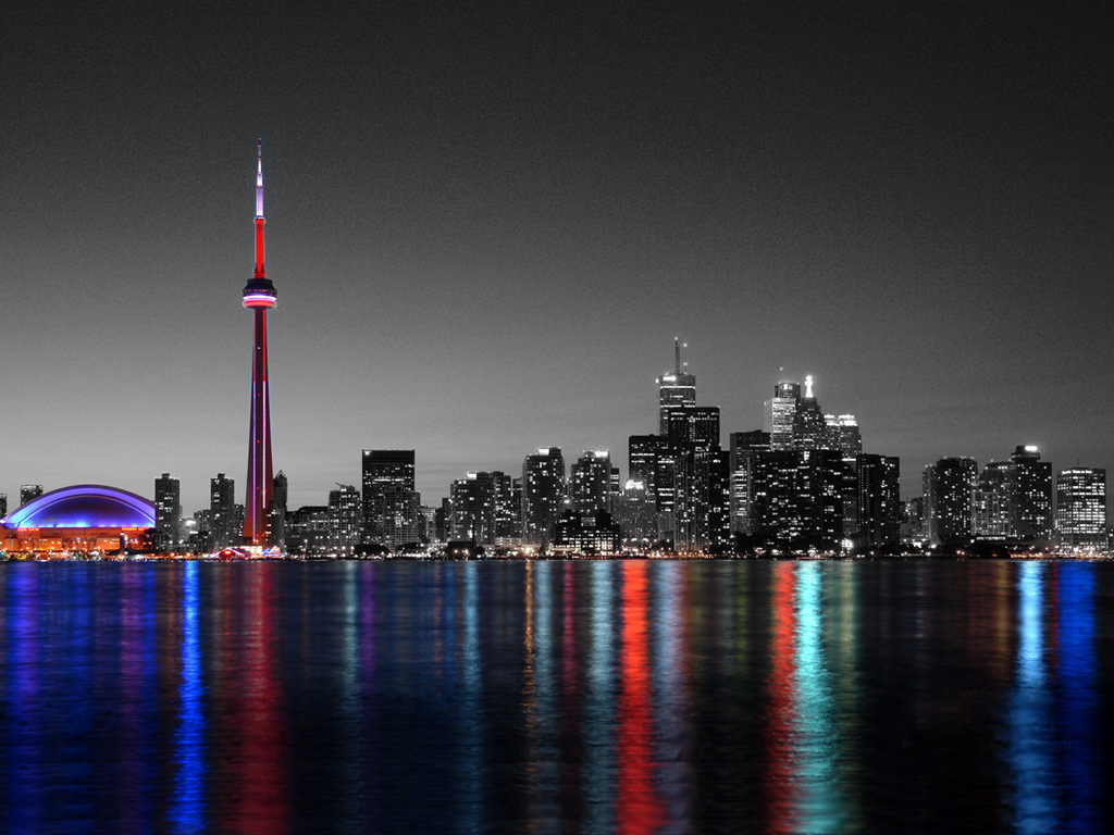
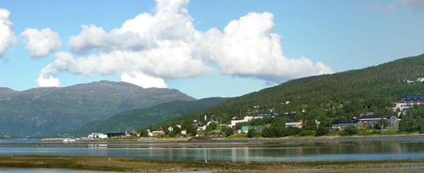
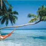
I want to create a more watery feel to my advertisement by either using a bathroom or beach setting

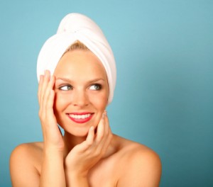
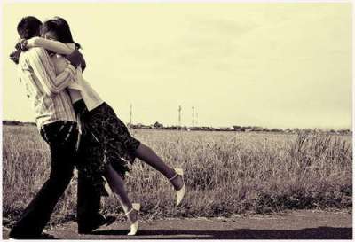
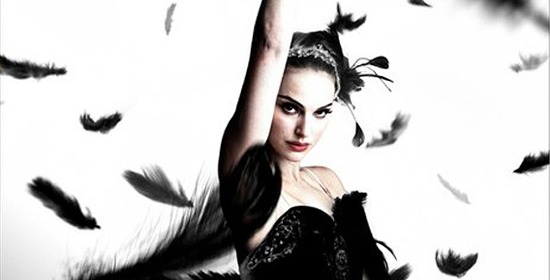
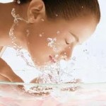
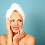
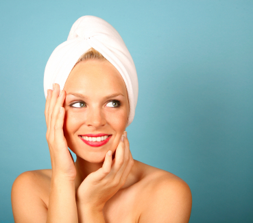
I may use this picture to create kind of a dream sequences since she has pretty skin and is looking away.

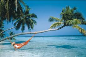
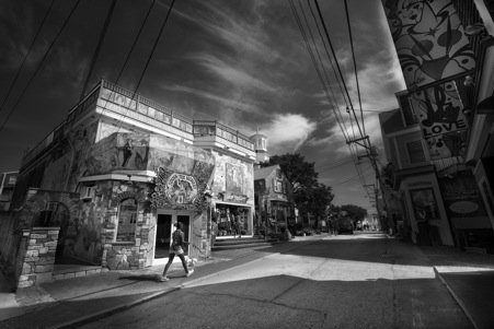
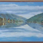
I want a picture like this for the background and somehow creatively place the products and write some sort of text to go along with the theme.

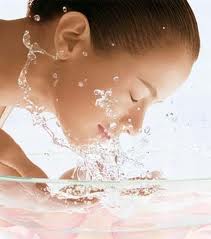
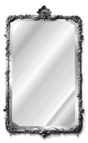
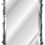
These next two images I would want to use if I decide to do the bathroom theme. I want someone washing their face with a mirror or such in the background.


Posted in VCT 4600 | Leave a comment

VCT 4600 in Class Assignment 1

Part 1 Boat Slant

The first two pictures  I used the ruler tool and drew a line on the horizon line then pressed straightened. It quickly first the problem.

Part 2 Correcting Perspective

The next 6 pictures are used from a the same process. You crop the images then click the perspective button and crop to the appropriate position. Then press crop and it will crop your image the make the perspective correct.

Part 3 Creating a composite

I used the red and blue cars and outlined them in photoshop with the magnetic lasso tool. After that I refined the edges to fix the mistakes that I had made. Then I found the background online and placed the cars into the images and played out with the images settings to get it look realistic.

Part 4- Using Camera Raw

I used camera raw the edit the color of of the dog to match the correct image. Then I used the magnetic lasso tool to cut the dog out. I refined the edges in order to get some of the finer details to become more noticeable. Then I found an image with other dogs looking in the same direction and placed the black dog into it. Once I placed the dog I messed around with the drop shadow settings to make it look more realistic.


Posted in VCT 4600 | Leave a comment