Image Essay #4

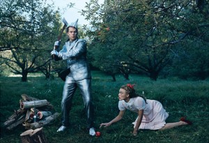
This is a photo by Annie Leibowitz. She is one of the best photographers that I have ever seen because she knows how to create tension in her photos and she thinks outside the box. This is her newer version of The Wizard of Oz. What this picture is an example of is color/color schemes and it also shows area of focus. What I love about this picture is that some of the colors are toned down and some pop out at you such as the reds in her shoes, the apple, and the bow in Dorothy’s hair. The other colors that are bright are the blue in the sky and the silver in the tin mans suit. The grass and the trees are toned down. I feel that did this because she wanted the two people, Dorothy and the Tin Man, to be the main focus in the picture and not everything surrounding them. everything in this picture is very sharp and crisp. In some pictures certain things will be out of focus such as the objects that you don’t want to be the main purpose of the picture, but Annie Leibowitz has everything infocus so nothing goes unnoticed but you also can tell what the area of focus in the photograph is.