Package Designs
So I have finally completed my 3 comps using Illustrator and I am going to post them here to my blog! I would LOVE some feedback from everyone so please leave me lots of comments and tips. I am going to have a meeting with my client tomorrow, probably a 15-20 minuet meeting so I can present my 3 designs to him. I am hoping he will pick the one he likes best and I can then tweak it to his liking. Nothing is concrete yet, including layouts and colors. Because I am going to be printing on direct cardboard it’s a little hard to know how the colors are going to turn out exactly so that’s one concern I will express to Gary when I meet with him tomorrow. So without further adieu, here are my designs:
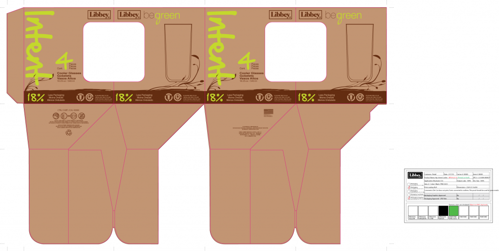
4pc Intent Cooler Be Green
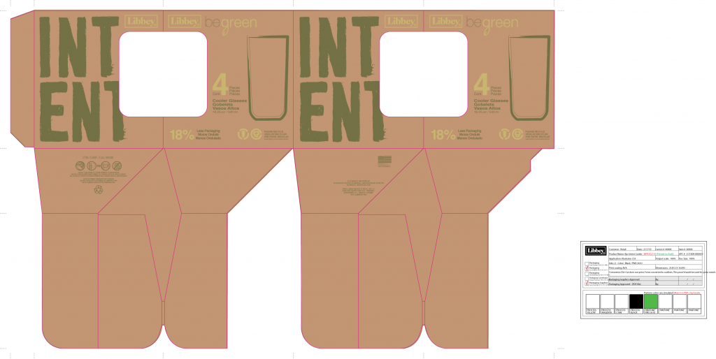
4pc Intent Cooler Be Green v2
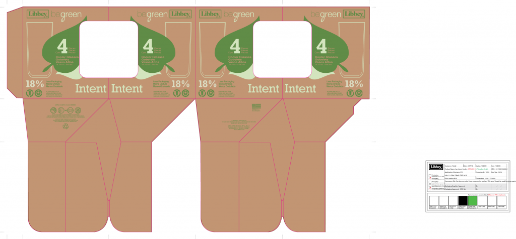
4pc Intent Cooler Be Green v3
3 thoughts on “Package Designs”
Leave a Reply
Recent Comments
Pages
Recent Posts
What Day is it Again?
The Archives
Blogroll
- BGSU
- BGSU Blogs
- Melissa Fleig's Portfolio Website This is the portfolio website of BGSU student Melissa Fleig
10:00 pm - 3-30-2010
The first design except with the color of green from the second one. The word “Intent” is kind of hard to read at first, but I think it will work out fine anyways.
7:45 pm - 3-31-2010
I like the first one, I can see it sitting on the shelves already. I like the dark green that you selected on the darker leaves in the v3 design. So, what did they pick???
8:40 pm - 3-31-2010
See, I personally like the third one! I think the text works well with the illustrations. I’m not fully sold on those shades of green, but I like it overall! But I agree, my second choice would be the first one, the contrast works well, with the dark brown, and I agree maybe a different green for that one too. Either one I could see working well on the shelves!
Yeah, which one did they pick? 🙂