The movie that I chose to create the poster for was Black Swan. The basis of the story line is a ballet dancer who wins the lead in “Swan Lake” and is perfect for the role of the delicate White Swan. Princess Odette, but slowly loses her mind as she becomes more and more like Odile, the Black Swan. The main character in this movie is played by Natalie Portman and her name is Nina Sayers. When she finally lands the lead role it becomes really difficult for her to play both the black and white swan. She starts to hallucinate, which eventually ends up killing her.
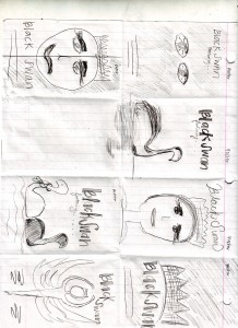
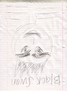
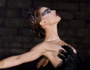
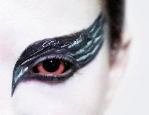
So while researching for this movie poster I think I want to use the head of Natalie Portman. Her make-up is and eyes say a lot of what happens in the movie.
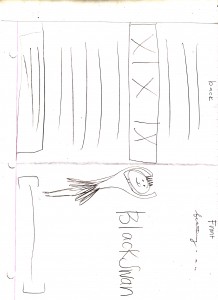
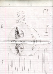
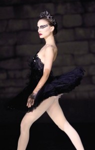
If that idea does not work then I want to have black lit image of Natalie Portman dancing and then on the DVD cover have half of her face on the front and back of the cover.
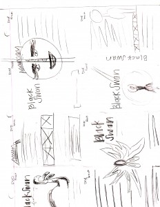
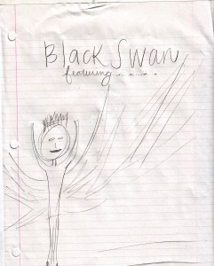
I do not think it is important to show all the information about the film. I think the show that she is a dancer and that she has gone crazy are the two most important part of this film. I may add some feathers in the background to tie in the swan like feel.
Below is the thumbnails that I created…
Some of the images that I found that I may use in my final poster are below as follows…
I think as far as color wise for this project I am going to stick to the black and white theme and have an accent of red. I think it gives the dark feel that this movie has and the red gives a final last touch.
With the images that I found I think I have a lot of good images to work with, it is just a matter of getting them into the photoshop and see what works with what I want to accomplish.





Black Swan is a movie I can watch over and over again, simply because every time I do, I can associate it to something different. But overall, the embodiment of evil and good and their all-time battle for superiority is overwhelming and is presented in such a genius manner! Great choice and images to it. You can not go wrong with sticking to black and white in this case. I wonder how did it come out?
Moving Company