MATH 6820 Week 14:Pop Charts
On April 4, 1964, the top five songs on the Billboard Hot 100 were all Beatles songs. The title of these songs are :
No. 1, “Can’t Buy Me Love”
No. 2, “Twist and Shout”
No. 3, “She Loves You”
No. 4, “I Want to Hold Your Hand”
No. 5, “Please Please Me”
As you see, the first part is only the fun fact to remark the 50 years anniversary of the big success of Beatles. The following part are more related to today’s topic: Pop charts.
“Any data that can be encoded by one of these pop charts (such as a pie chart, divided bar chart or an area chart) can also be decoded by either a dot plot or multiway dot plot that typically provides far more pattern perception and table look-up than the pop-chart encoding.” Now I will use two cases to demonstrate his word.
The first case of pop chart is a pie chart of Brower usage on Wikimedia, the graph is collected from Wikimedia.org
Browser usage on Wikimedia, March 2012
 The pie chart that graphs 7 different Browsers that used on Wikimedia. The labels, 7 Browsers’ name, are categorical variable. We can see that Android Browser seems the least use, however, it is hard to say which one is the most use, IE or Chrome, whose area of segments are similar. Also, we are hard to identify the specific use of each Browser.
The following graph (the first one) is a dot plot of the Brower usage on Wikimedia. On one hand, the pattern perception is far more efficient for this display than for the pie chart. We can effortlessly see a number of properties of the data, for example, we can easy detect and cluster the line segments between the three dominant Browsers— IE, Chrome and Firefox and the three least use Browsers—Opera, Android and other. Also, it is easy for us to get an approximate difference (about 25%) between two clusters of Browsers. There is no corresponding detection operation for the pie chart that allows effortless decoding of differences. This result is degraded pattern perception of Pie chart. In addition, the line segment estimation was found to be more accurate than the sector size estimation, and this was assumed to be the fundamental issue for the poorer pattern perception from Pie chart encoding. But the fundamental issue is the efficient detection of differences of values for position along a common scale, which cause of the better estimation.

The following graph, I draw another dot plot with ordering the percentage from largest to smallest, which gives us a better visual decoding for the graph, while keep other good properties as the non-ordered one. The order of the categories for each categorical variable is an important aspect of the dot plot display method that substantially affects our visual decoding. Moreover, ordered data graph is more informative than non-ordered one. On one hand, when we study a distribution of values such as the enrollment of different universities, we want to know what is large, what is medium, and what is small. The organization in ordered data graph allows us to easily assemble and estimate the large values, or the medium values, or the small values. On the other hand, we cannot do this nearly as effectively in non-ordered data graph, because each of these sets of vales is scattered throughout the graph. It is easier to assemble the large values because they are spatially grouped by the ordering, and estimation is more accurate because the symbols encoding the values are closer to one another.

The second case is an area chart of scientific paper publication in 2010. The graph is collect from the following website.
The area chart of scientific paper publication in 2010 http://phytophactor.fieldofscience.com/2011/12/were-number-one-were-number-five.html

The area chart includes the top 40 countries by number of research papers published in 2010. For simplicity, we only focus on the Europe part. For that part, the area chart encodes the number of research paper publication of 20 Europe countries by the areas of circles. From the graph, we can easily identify that UK, Germany and France the largest three circles. However, the area charts do not provide efficient detection of geometric objects that convey information about the differences of values.
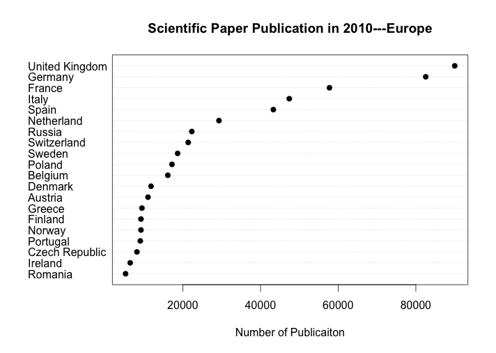
The above graph is a dot plot of scientific paper publication in 2010 with ordered number of publication. The data are graphed by position along a common scale and pattern perception is far more efficient than the original area chart. For example, since all the circles are placed by geographical location on map, it is hard to detect the difference in the circle area from Greece, Finland, Norway, to Ireland and Romania, but the ordered dot plot shows that the number of publication vary by a comparable large factor. Moreover, table look-up is far more accurate and rapid form the ordered dot plot than the area chart. Although every circle has the number of publication on it, the geographical location limited the space of data label display and plotting symbols are not sufficiently visually distinguishable form the label. In this case, the matching operations necessary to decode values from the area chart are both slower and less accurate than the scanning and interpolation operations that provide table look-up form the ordered dot plot. Also, the reason that I use order on dot plot is listed above.
In sum, the dot plot provides far more efficient pattern perception and table look-up than the pop-chart encoding. These two cases well demonstrate Mr. Cleveland’s word.