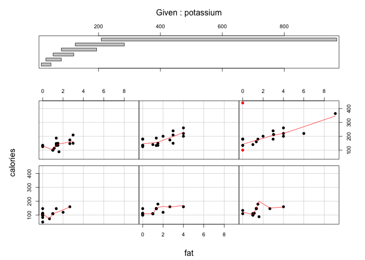
According to the requirement, I choose two graphs from my previous blogs and reconstruct them by ggplot2. The first one, a coplot of variables “reputation” and “a.grad.rate” in conditioning on Tiers, comes from the week13 color. The original graph is below: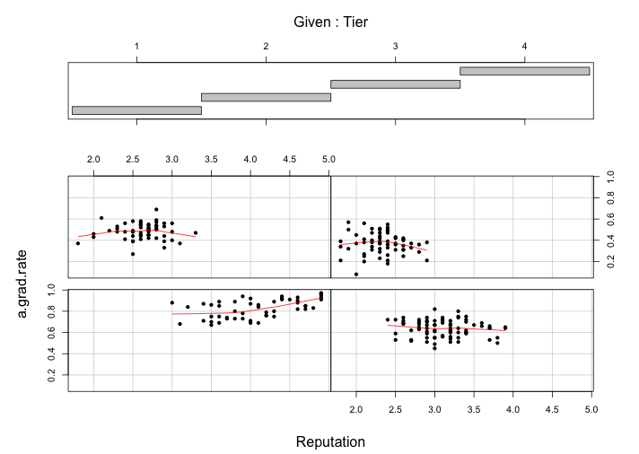
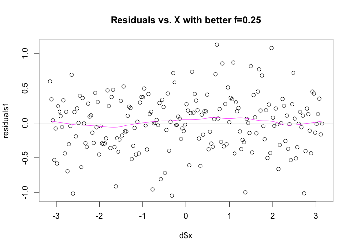
The panel at the top is the given panel, which is tier; the panels below are the dependence panels, which are Reputation (horizontal) against a.grad.rate (vertical). Each rectangle on the given panel specifies an interval of tiers. On a corresponding dependence panel, a.grad.rate is graphed against Reputation for those observations whose values of tier lie in the interval; a loess curve has been added to the panel, which produces smoothed values at any desired collection of values along the x scale and summarizes how y depends on x. If we start at the (1,1) dependence panel, the leftmost panel in the bottom row, and move form left to right in the row, then from left to right in the next row, and so forth, the corresponding intervals of the given panel proceed from left to right and from bottom to top in the same fashion.
For the four tier intervals, the patterns on the corresponding dependence panel are somehow different. The conditioning on tier has a linear pattern(if not too picky). For the (1,1) panel on the corresponding dependence, reputation ranges from 3.0 to 5.0 and a.grad.rate ranges from 0.7 to 1.0, although from reputation 3.0 to reputation 3.5, it seems a close to flat slope, we can still treat the whole interval as a positive linear relationship. For the (1,2) panel, the reputation ranges from 2.5 to 4.0 and the a.grad.rate ranges from 0.4 to 0.8, the overall trend is an almost flat. For the (2,1) panel, the reputation ranges from 1.8 to 3.3 and the a.grad.rate ranges from 0.3 to 0.7, the overall trend is almost flat line. For the (2,2) panel, the reputation ranges from 1.8 to 2.9 and the a.grad.rate ranges from 0.15 to 0.6, the overall trend is still almost an flat line.
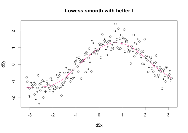
However, I redraw the graph with package ggplot2 and get even better graph: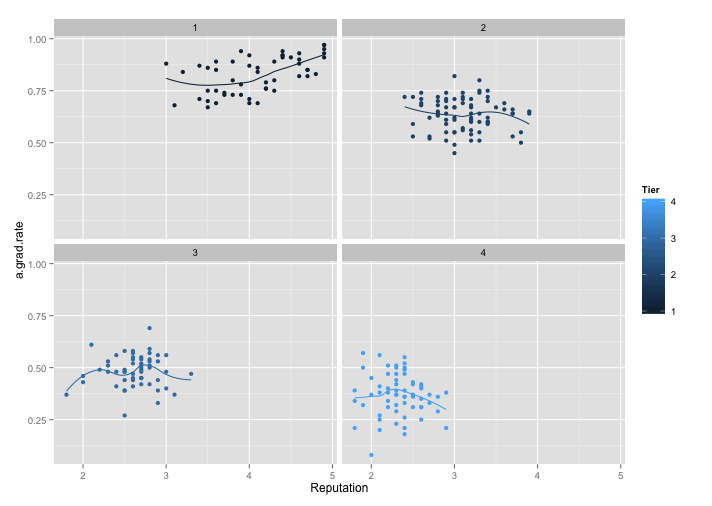
From the above graph, we can see that without a top given panel, the four panels give us a clear vision of Reputation versus a.grad.rate under each Tier label, which are divided 4 levels blue hue. In this way, not only the points can be easy recognized, but also the loess smooth lines. For visualization stand point, color is a powerful tool for encoding data, and it genuinely enhances the visual decoding of information from data displays and makes the visual operation of assembly as efficient as possible. In addition, without the top panel, we can treat the 4 panels as a whole and do not need to look back and fourth for the Tier information. Moreover, from this new graph, we can see more detail of the trend change for each Tier. Especially for the Tier3, which is fluctuated in the (1,2) panel in the new graph. Also, for Tier 2 and 4, there are somehow decreasing instead of a flat line. Overall, I prefer the ggplot2 display, based on graph efficiency, visual decoding and detail information.
From the same blog week 12 color, the first one is a scatterplot with 4 color: 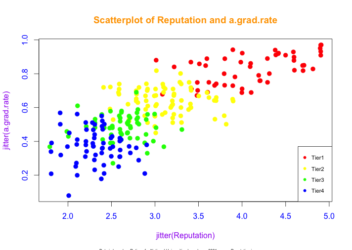
From above graph, we can see that as reputation score increases, the a.grad.rate increases as well, corresponding from Tier 4 to Tier 1. The result means the better reputation, the higher a.grad.rate. Also, I use four different colors, red, yellow, green and blue to represent Tier1, Tier2, Tier3 and Tier4, respectively.
Then I use ggplot2 reconstruct the same graph: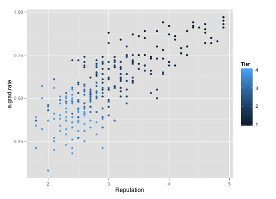
This graph use four level of cyan hue to Tiers: from dark(Tier1) to light(Tier4). However, if only based on color choosing, I prefer the original one. According ot HSL and HSV model, choose three primary colors-red, green and blue at first. If additional color needed, I will pick one of these secondary colors, such as yellow, orange, and purple and so on. For the new graph, it seems hard to identify the four levels of cyan hues, especially for non visual training people. However, if we change the default color setting, I think the new ggplot2 will be better, due to its additional grid line and legend outside, which will improve the visual decoding of the data information.
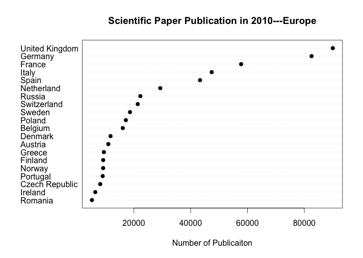
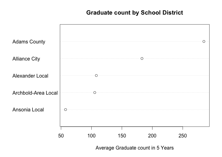
For more cases, the Second one, a dotplot of the average high school graduate count (# of people) in 5 years (from 2006 to 2010) for 5 Ohio school districts, comes from the week 8 dot plots. The original graph is below: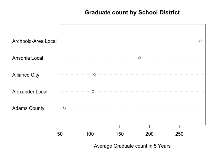
this graph is the average high school graduate count (# of people) in 5 years (from 2006 to 2010) for 5 Ohio school districts, which are Archbold-Area Local, Ansonia Local, Alliance City, Alexander Local, and Adams County. Since my data is ordered from high to low by row (School District), the distribution of the average high school graduate count of 5 school districts is showed in above graph. We can see that the school district “Adams County” has the highest 5-year average high school graduate number, which is close to 300. We can interpret that this school area either has a large population, or the reputation in this school area is very good, which attract many students to enroll in. Also, the school district “Ansonia Local” has the smallest 5-year average high school graduate number, which is barely above 50. We may interpret that this area has less population than other school districts.
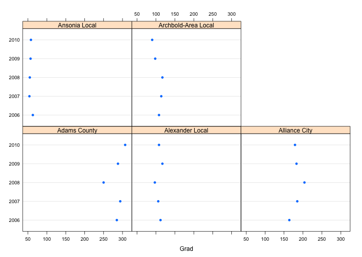
Same as the last example, I redraw the graph with package ggplot2 and get a better graph: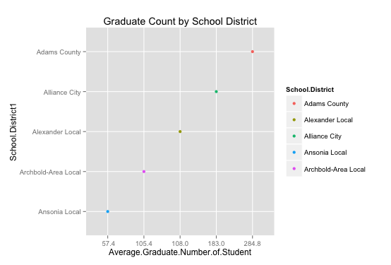
With the same data, we can see that by adding both horizontal and vertical grid line, we can see exactly the average it is. For example, the 5-year average graduate for Ansonia Local School District is 57.4, which is the lowest one, and the 5-year average graduate for Adams County School District is 284.8. Comparing to the first dot plot, the new one by ggplot2 has exact tick mark label, colorful points represent different school district, and improved grid lines, which are genuinely enhances the visual decoding of information from data displays and makes the visual operation of assembly as efficient as possible. (one problem is the distance between each tick mark label is equally divided, but the actual numbers are not. However, it does not affect our interpretation of the graph.) In this case, I prefer the ggplot2 graph, which gives us a better visual display and make the data stand out.
As semester approaches to the end, for dear readers who continue support my blog, I make an additional one for you to compare and thank you for your kind word and appreciation. This is one is stripchart(distribution) plot from week 7, distribution. The original graph are: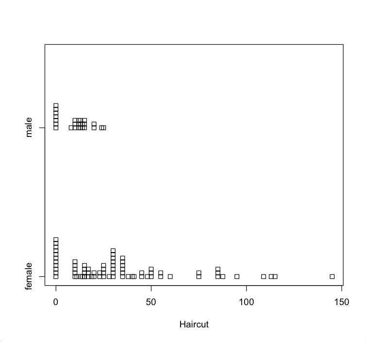
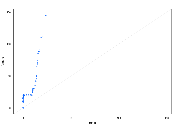
From the parallel stripchart we can compare the distribution of two groups of students and see that male students’haircut prices have narrow range, which is from 0 to 25 dollars. However, female students’ haircut prices have very wide range, which is from 0 to 145.On one hand, there are one third of male students(11) do not spend any money on haircut and almost half of male students(16) spend from $10 to $15, and only two male students spend more than $20 on haircut. The maximum money spend spends on haircut for male student is $25. On the other hand, over two third (47) of female students spend from $10 to $50 on haircut. Three females do not spend any money on haircut and only 4 female students spend more than $100. The maximum money spends on haircut for female student is $146. The distributions of these two groups are quite different.
However, I use ggplot2 package redraw another distribution plot, which can be see below: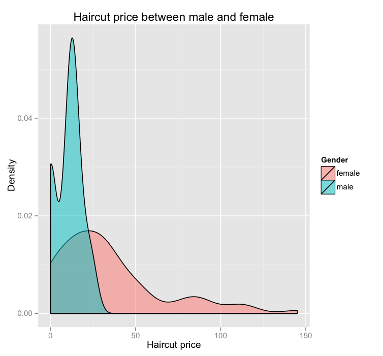
With the same data, we can see that there are two distributions cover different areas. As the data label showed, the pink represents female students and cyan represents male students. Based on this graph, the male student distribution is more concentrated compared to the female student distribution, which is more spread out and right skewed. On one hand, since this is a density graph, we can see that majority of male students spend between 10-15 dollars and majority of female student spend between 10 to 50 dollars. The extreme expense of female student is close to 150 dollars, while the maximum of male expenses is only close to 30 dollars. On the other hand, from the original graph, we can see exactly how many people spend how much money on haircut by counting the cube. The new ggplot2 graph, we can only see the density and overall distribution trend. Also for visualization standpoint, color is a powerful tool for encoding data, and it genuinely enhances the visual decoding of information from data displays and makes the visual operation of assembly as efficient as possible. Since I would like to know the overall trend and enjoy color visual display, I prefer the new ggplot2 graph, how about you?
In sum, ggplot2 is a plotting system for R, based on the grammar of graphics, which tries to take the good parts of base and lattice graphics and none of the bad parts. It takes care of many of the fiddly details that make plotting a hassle (like drawing legends) as well as providing a powerful model of graphics that makes it easy to produce complex multi-layered graphics. In most cases, ggplot2 will give us better visual decoding graphs.
R-code:
Rep.matrix=as.matrix(college.ratings[, c(2,4,6)])
Rep.matrix
mine =data.frame(Rep.matrix)
color
library(ggplot2)
m = ggplot(mine, aes(Reputation, a.grad.rate, color=Tier))
# panels.  We do this by means of the facet_wrap() function.
m + stat_smooth(se=FALSE, method=loess) + geom_point() +
  facet_wrap(~Tier)
# Distribution
qplot(Haircut,data=d.sample,geom="density",fill=Gender,alpha=I(.5),
      main="Haircut price between male and female",
      xlab="Haircut price",ylab="Density")
# dotplot
# default plot# the variables are alphabetically reordered.
m1.matrix=as.matrix(Book1)
mine1 =data.frame(m1.matrix)
m2 = ggplot(mine1, aes(Average.Graduate.Number.of.Student, School.District, color=School.District))
m2 + geom_point()
#reorder by average graduate number
mine1$School.District1 <- factor(mine1$School.District, levels=c("Ansonia Local", "Archbold-Area Local", "Alexander Local", "Alliance City", "Adams County"))
ggplot(data=mine1, aes(y=School.District1, x=Average.Graduate.Number.of.Student, color=School.District))
+geom_point()+labs(title = "Graduate Count by School District")