MATH 6820 Week13: Color
Part A:
The data frame college.ratings in the LearnEDA package provides ratings of a group of national universities based on 2001 survey data.
Based on the original data, I choose the variable “Reputation” and variable “a.grad.rate”, which represent “measure of academic reputation” and “percentage of freshmen who graduated within a six-year period”, respectively. The reason I think they are highly associated is because I believe the people who attain better universities not only have high talent, high self motivation and better study method, but also have stable financial support. These factors will help them graduate within 4 or 5 years regular time ranges successfully. In this case, the better university (high reputation), the higher a.grad.rate, vice versa.
After I construct the scatterplot with different colors for the different 4 Tier groups, I find that the graph confirms my believe, that reputation and a.grad.rate have positive relationship, nearly positive linear relationship if not too picky.

From above graph, we can see that as reputation score increases, the a.grad.rate increases as well, corresponding from Tier 4 to Tier 1. The result means the better reputation, the higher a.grad.rate. Also, I use four different colors, red, yellow, green and blue to represent Tier1, Tier2, Tier3 and Tier4, respectively.
The reason I choose these four colors is based the color identification ability of human visual system. Since light with a single color is a mixture of energies at different wavelengths in the visible spectrum ranging from about 380 nanometers to 770 nanometers. The variation in the amounts of radiation at the different wavelengths accounts for our different perceptions. While just three numbers that are derivable from the radiation amounts can describe our perception of color accurately, here I use HSL and HSV system to choose the best colors.
HSL and HSV are the two most common cylindrical-coordinate representations of points in an RGB color model. HSL stands for hue, saturation, and lightness. HSV stands for hue, saturation, and value (or brightness). Hue is measured in degrees from to since there is a circularity to our perception of hue. Lightness refers to how light or dark a color appears. Saturation refers to how pale or deep a color appears.
From the following picture, we can see that the angle around the central vertical axis corresponds to “hue”, the distance from the axis corresponds to “saturation”, and the distance along the axis corresponds to “lightness”, “value” or “brightness”. Note that while “hue” in HSL and HSV refers to the same attribute, their definitions of “saturation” differ dramatically.

From above picture, HSL and HSV are both cylindrical geometries, with hue, their angular dimension, starting at the red primary at 0°, passing through the green primary at 120° and the blue primary at 240°, and then wrapping back to red at 360°.
In both geometries, the additive primary and secondary colors are red, yellow, green, cyan, blue, and magenta. As showed below:
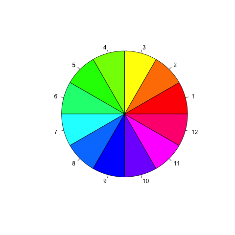
In this case, I prefer to choose three primary colors-red, green and blue at first. If additional color needed, I will pick one of these secondary colors, such as yellow, orange, and purple and so on. These colors have clear boundaries between adjacent ones, which will help viewers to identify different groups or tiers. Therefore, I choose red, yellow, green and blue to represent Tier1, Tier2, Tier3, and Tier4, and provide efficient visual assembly of the four categories, allowing us to see each category of elements as a whole, mentally filtering out the other categories.
Also construct a coplot for the same two variables where you are conditioning on Tier group.
The panel at the top is the given panel, which is tier; the panels below are the dependence panels, which are Reputation (horizontal) against a.grad.rate (vertical). Each rectangle on the given panel specifies an interval of tiers. On a corresponding dependence panel, a.grad.rate is graphed against Reputation for those observations whose values of tier lie in the interval; a loess curve has been added to the panel, which produces smoothed values at any desired collection of values along the x scale and summarizes how y depends on x. If we start at the (1,1) dependence panel, the leftmost panel in the bottom row, and move form left to right in the row, then from left to right in the next row, and so forth, the corresponding intervals of the given panel proceed from left to right and from bottom to top in the same fashion.
For the four tier intervals, the patterns on the corresponding dependence panel are somehow different. The conditioning on tier has a linear pattern(if not too picky). For the (1,1) panel on the corresponding dependence, reputation ranges from 3.0 to 5.0 and a.grad.rate ranges from 0.7 to 1.0, although from reputation 3.0 to reputation 3.5, it seems a close to flat slope, we can still treat the whole interval as a positive linear relationship. For the (1,2) panel, the reputation ranges from 2.5 to 4.0 and the a.grad.rate ranges from 0.4 to 0.8, the overall trend is an almost flat. For the (2,1) panel, the reputation ranges from 1.8 to 3.3 and the a.grad.rate ranges from 0.3 to 0.7, the overall trend is almost flat line. For the (2,2) panel, the reputation ranges from 1.8 to 2.9 and the a.grad.rate ranges from 0.15 to 0.6, the overall trend is still almost an flat line.
Compared to the Coplot, I prefer the single scatterplot with colored labels. Because color is a powerful tool for encoding data, it genuinely enhances the visual decoding of information from data displays and makes the visual operation of assembly as efficient as possible. In the Coplot, the intervals of tiers are somehow overlapped (based on the method used). For this question, I choose red, yellow, green and blue to represent Tier1, Tier2, Tier3, and Tier4, and provide efficient visual assembly of the four categories, allowing us to see each category of elements as a whole, mentally filtering out the other categories. In the colored scatterplot, four different categories of plotting symbols are color encoded, and we can easily assemble the symbols of each category. Therefore, I prefer the colored scatterplot.
Part B:
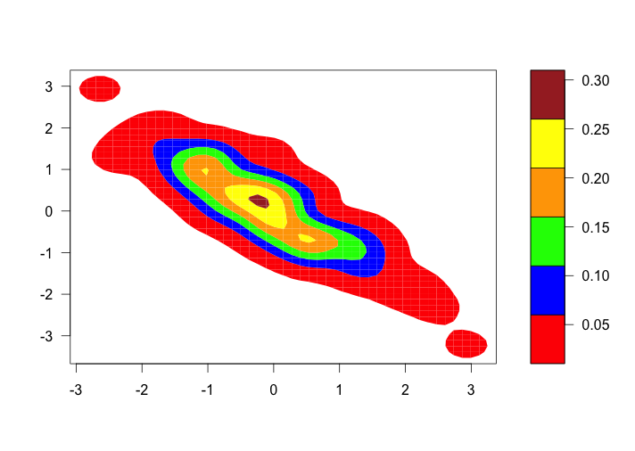
The question simulates a sample of size 100 from a bivariate normal distribution with correlation rho = -0.9 and use a bivariate density estimation algorithm to construct a contour graph of the density estimate. Colors of red, blue, green, orange, yellow, and brown are used to color the regions of the contour graph.
As we can see the original graph use red, blue, green, orange, yellow and brown to represent 0.05,0.1,0.15,0.2,0.25 and 0.3.(all the value are random)
The improved graph:

Based on the two desiderata in choosing a color encoding of the quantitative values of a function. First, we want effortless perception of the order of the values. Second, we also want clearly perceived boundaries between adjacent levels. The original graph just satisfied the second desiderata. However, those colors just make people easy to identify the differences but hard to see the order of the values. The improved graph is a color level plot , which encodes different level regions by different colors. The level region for the levels is the set of (u,v) values in the plane whose function values lie in the level interval and a level is an interval of values along the measurement scale of a function. It provides effective visual efficient visual assembly of the six categories, allowing us to see each category of elements as a whole. There are 6 intervals, ranging from the minimum to the maximum function values. There are two hues, cyan and magenta. From the middle to the extremes, the cyan ranges from 30%-cyan to 100%-cyan in steps of 33%-cyan, corresponding to 0.15 to 0.05. And the magenta ranges from 30%-magenta to 100%-magenta in steps of 33%-magenta, corresponding to 0.15 to 0.30. This method provides efficient ranking because it allows accurate ordering and it allows a sufficient number of distinct colors. Therefore, this improved graph gives a good compromise to both goals, effortless perception of the order of the encoded quantities and clearly perceived boundaries between adjacent levels. Also,it genuinely enhances the visual decoding of information from data displays.
April 21st, 2013 at 8:01 am
Howdy! Quick question that’s entirely off topic. Do you know how to make your site mobile friendly? My weblog looks weird when viewing from my iphone 4. I’m trying
to find a template or plugin that might be able to fix this problem.
If you have any suggestions, please share. Thanks!
April 21st, 2013 at 10:21 am
You are so awesome! I don’t suppose I’ve read through something like this before.
So nice to discover another person with original thoughts on this subject matter.
Seriously.. many thanks for starting this up. This web site is something that
is required on the internet, someone with a bit of originality!
April 21st, 2013 at 10:43 pm
Hi, I use iPhone 4S. It looks like there is no problem viewing the blog. Thank you for supporting my webpage.