MATH 6820 Week12: Multivariate Data
The dataset UScereal in the MASS package gives eleven variables for a group of 65 breakfast cereals. Based on the requirement I choose three variables, which are calories, fat and potassium. Later, I construct a scatterplot matrix, a coplot and a spinning 3-dimensional scatterplot for these variables.
The first graph is a scatterplot matrix with variables calories, fat and potassium.
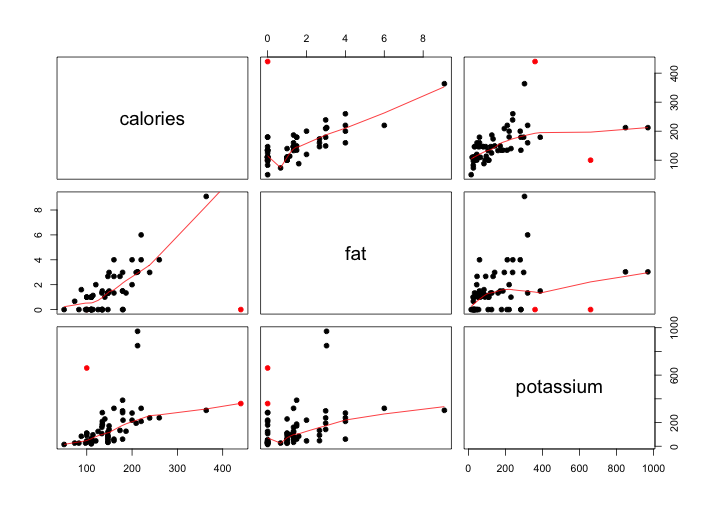
Scatterplot matrix is a method for studying multidimensional data. It sample, elegant solution to a difficult problem is one of the best graphical ideas around for displaying scattered measurements of three of more variables. As we observed, each panel of the matrix is a scatterplot of one variable against another. The upper right triangle of the scatterplot matrix has all of the pairs of scatterplots, so does the lower left triangle. For example, in my graph the (2,1) panel is a graph of potassium on the vertical scale against fat on the horizontal scale, and the (3,2) panel has the same variables but with the scales interchanged.
According to above graph, we can see that the calories and fat, calories and potassium, and fat and potassium all have positive relationship with each other. The overall trend is, as fat increases calories will increase, as potassium increases fat will increase too, and as potassium increases calories will increase as well, and vice versa. (If not too picky for the overall trend)
Specifically, for the upper right triangle of the scatterplot matrix, saying the (2,3) panel (calories vs. fat), we can divide it into 3 parts. The first part, calories has a decrease until fat increase to almost 1 gram. After 1 gram of fat, which is the second part, calories have a positive relationship with fat, until fat increase to 1.5 grams. After fat increases more than 1.5 grams, calories and fat almost have a comparably smooth positive linear relationship.
For the (3,2) panel (fat vs. potassium), we can divide it into 3 parts. The first part(most points locate in this area), fat increases until potassium increases to almost 200 grams. After 200 grams of potassium, which is the second part, fat almost keeps constant until potassium increases to 400 grams. After potassium is greater than 400 grams, which is the third part, fat keeps a positive linear relationship with potassium.
For the (3,3) panel (calories vs. potassium), we can divide it into 2 parts. The first part(most of points locate in this area), calories increase until potassium increases to 400 grams. After 400 grams of potassium, which is the second part, calories have a close to flat positive slope with potassium.
For the lower left triangle, including (1,1), (1,2), (2,1) panels, we get the similar conclusion that calories, fat, and potassium have positive relationship with each other.
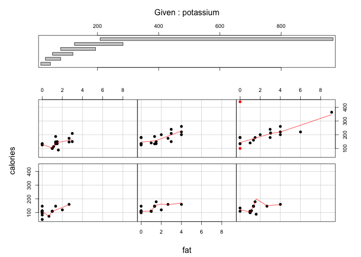
The display method of the coplot presents conditional dependence in a visually efficient way. The panel at the top is the given panel, which is potassium; the panels below are the dependence panels, which are fat (horizontal) against calories (vertical). Each rectangle on the given panel specifies an interval of values of grams of potassium. On a corresponding dependence panel, calories is graphed against fat for those observations whose values of potassium lie in the interval; a loess curve has been added to the panel, which produces smoothed values at any desired collection of values along the x scale and summarizes how y depends on x. If we start at the (1,1) dependence panel, the leftmost panel in the bottom row, and move form left to right in the row, then from left to right in the next row, and so forth, the corresponding intervals of the given panel proceed from left to right and from bottom to top in the same fashion.
For the first four-potassium interval, the patterns on the corresponding dependence panel are similar (if not too picky). The conditioning on potassium has a nonlinear pattern: a slight hockey-stick function. For the (1,1), (1,2), (1,3), and (2,1) panels on the corresponding dependence, the range of fat is within (0,200) grams and the range of calories is within (80,200). For example, for the leftmost panel on the first row, below 1-gram fat, the pattern is negative linear; above this value, it is a nonlinear positive line. Similar relationship happens in middle panel of bottom row and leftmost panel of upper row. The relationship between calories and fat on the rightmost panel on the bottom row is a little bit complicated. Specifically, we can divide it into 4 parts. The first part, calories increase until fat increases to almost 1 gram. After 1 gram of fat, which is the second part, calories take a sharp increase until fat increases to 2 grams. When fat is greater than 2 grams but less than 3 grams, which is the third part, calories a negative linear relationship with fat. After fat is greater than 3 grams, calories have a close to flat positive slope with fat.
For the last two-potassium intervals, the patterns on the corresponding dependence panel are just simply positive linear relationship between calories and fat. However, due to the three variables that I choose, the last interval is longer than any of other intervals, which range (0,9) grams of fat and range (100,400) calories.
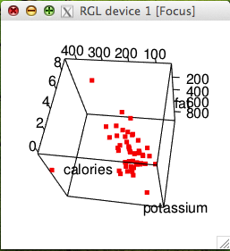
From the above 3-dimensional scatterplot, we can see that the calories and fat, calories and potassium, and fat and potassium all have positive relationship with each other. The overall trend is, as fat increases calories will increase, as potassium increases fat will increase too, and as potassium increases calories will increase as well, and vice versa. Here’s also a video that shows spinning the plot by use of the mouse. I think the spinning feature is really necessary to see the 3-d structure in the graph.
Finally, I find two “special” cereals that seem to deviate from the general relationship patterns. They are listed following:
# calories fat potassium
# Grape-Nuts 440.00000 0.0000000 360.00000
# All-Bran with Extra Fiber 100.00000 0.0000000 660.00000
For Grape-Nuts cereal, which has the highest calories and comparably high potassium but no fat, these features deviate from the general relationship patterns that as calories increases fat will increase, as potassium increases fat will increase too. In the scatterplot matrix, we can find this point (red) deviates from the overall pattern in (1,2),(2,3) panels, located at either upper right corner or bottom right corner.
The other special cereal is All-Bran with Extra Fiber, which has the third highest potassium but with low calories and no fat. These features deviate from the general relationship patterns that as potassium increases calories will increase, and as potassium increases fat will increase too. In the scatterplot matrix, we can find this point (red) deviates from the overall pattern in (1,1), (1,2), (3,3) panels, located either upper left hand side or lower right hand side, away from other points.