Category Archives: Uncategorized

Presentation of Reading Articles

Below is the link of my presentation on two Reading Articles; “Winds Across Europe” and “How long is short” by Howard Wainer.

https://docs.google.com/presentation/d/1gIGUf6C0w6ws18JnRZveWZ0FGgiEqRDRVesyUCU0IhQ/edit#slide=id.p

Also, the link of two articles are as follows;

http://www-math.bgsu.edu/~albert/graphics/visual.revelations/vol%2014-15%20(7)/winds.across.europe.pdf

http://www-math.bgsu.edu/~albert/graphics/visual.revelations/vol%2016-17%20(6)/How.long.is.short.pdf


Comparison between Pop Charts with Dot plot and Multi-way plot.

For this blog, I have picked two pop charts from the media; a pie chart and a divided bar chart as shown below;

The first pop-chart that I found in media is the pie-chart of Honey composition indicating the percentage share of various sugars, waters and other minor constituents which was published in Journal of Bio-medicine and Biotechnology, February 2009.

For this pie chart, I have redrawn a dot plot which is shown below. It is clear that dot plot is more effective than the pie chart as it improves the pattern perception. Even though, the pie chart uses different color to indicate different components, the dot-plot makes the table look-up easier for readers to detect, assemble and estimate the output.

The second pop chart, I found is divided bar chart having three variables; production in kg, Years, and Types of Cereal. It shows the quantity in hundred kgs of wheat, barley, and oats produced in certain form during the years 1991 to 1994.

I redrew a multi-way dot plot grouped by Years for the above bar chart which is shown in the graph below. The new plot provides far more pattern perception and table look-up than the original divided bar chart. Also, It is much easier to view a distribution of the values in dot-plot and multi-way plot than those pop charts ( pie chart, bar chart).

Hence, overall we can say that these dot plot and multi-way plot improve the pattern perception and table look up for decoding visual information OR They increase the Table look up efficiently and have good pattern perception than those pop charts (pie charts and bar charts) found in the media.

Visualizing Multivariate data

Here, I have used three variables; calories, protein and fat from the dataset UScereal which we is stored in the MASS package of R programming.  And, to see the relationship between these three variables, we can use different types of visualization methods as scatter plot matrix, coplot and spinning three dimensional scatter plot as given below.

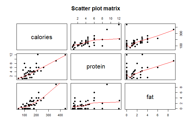
From the above scatter plot matrix, we can see that there is fairly strong positive association between variables calories and fat, calories and protein but weaker positive relation between protein and fat. That means, calories increase with the increase of level of fat as well as protein and vice versa. Also, even there is weaker positive association between fat and  protein, we can say that the level of fat tends to increase with the increase in protein and vice versa.

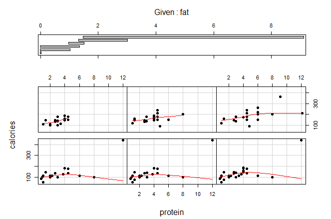
Above three plots are called coplot which gives more accurate result in than scatter plot matrix. In this plot, one variable is given and we find the relationship between other two variables.

In the first coplot, we can see the weaker positive association between calories and protein at the top panels and almost no association at the bottom panels  when fat variable is given or controlled.

In second coplot, variable calories is given/controlled and we can see there is no association between fat and protein.

And in third graph, if we control variable protein, there will be strongly positive association between calories and fat as in the scatter plot matrix.

Finally from the above spinning 3D scatter plot matrix as well, we can see that is strongly positive association between calories and fat, weaker positive relationship between protein and calories and no association between protein and fat.

Two special cereals that seem to deviate from the general relationship patterns are; 1) Grape-Nuts which has the highest calories but lowest level of fat . 2) Great Grains Pecan.

Coloring in different types of plots

Part A

Here, I have constructed a time series plot for two different shows; Chicago and Wicked from Broadway shows on the basis of the attendance from 1990 to 2016. From this plot below; it becomes much easier to compare the two shows on the basis of the attendance and see change in the number of attendance.

At the beginning, i. e, around 1990, approximately 8000 people attended the show “Chicago”, it increased to 12000 in 1996 and decreased to 5000 attendance in the year 2000. And the trend was almost constant after that year except in 2003 where least attendance was recorded which was about 1000 for the show, Chicago. While, people started attending “Wicked” in 2003 and the attendance as higher in compare to Chicago, around 13000 and dropped to approximately 8000 in 2007.  Even if the trend was irregular for the show, Wicked, there was some constant trend from 2007 to 2013 and 2013 to 2016.


Part B

Here, we have use simulated function of two variables to display in a plot. The values of the function are grouped into 5 different categories depending on their magnitudes.

In my plot, it is easier to see how the levels are changing as I have used only one color with its different order. With the change or say increase in the order, we can get an idea about the change in the level of the magnitudes, without looking at the key to understand the level of intensity of the regions. While, in the plot given by Dr Albert, due to the use of multiple colors it is harder to understand the change in the order of the values. We have to look at the key every time to understand the intensity of the regions. Thus, my set of color is better than the one Dr. Albert chose.

LOESS plot for simulated data

The above graph is the scatter plot of the simulated data. The graph has loess smoothing curve with default value of span =0.75.

In the above second graph, residuals are graphed against the loess curve with the default span.

In third graph, I have constructed scatter plot using same simulated data and selected suitable smoothing parameter, alpha = 0.25. We can see there is some changes in loess curve after reducing the alpha to 0.25.

Finally, the fourth graph below is of residual plot for the fit with f=0.25. The graph clearly shows that there is no specific pattern on the residuals on x variable. Though the loess curve has f =0.75, the smoothing curve does not distort the underlying pattern for the smoothing parameter.


Different types of dot plots on Gasoline consumption by six different countries from 1960 to 1966

I collected the data sets on gasoline consumption per auto by six different countries such as France, Germany, Belgium, Austria, Denmark and Canada from 1960 to 1966, and constructed the dot plot of average logarithmic gasoline consumption for those countries.

From the above dot plot, we can see that France had least gasoline consumption and Canada had highest from 1960 to 1966.

In 2nd graph, I constructed a dot plot grouping by rows (countries) in a single panel.  The different dots in each line of the countries is for different years from 1960 to 1966 which is shown by different colors as labeled in right side of the graph.

And, in third graph, I constructed dot plot grouping by columns using different panels for each year. It is better to use different panels (facets) while grouping by rows or columns as it has nice visual impact on reader.

I prefer to group by rows (countries) and use different panels while grouping which is shown in the figure below; I think, it becomes visually more effective and shows a nice pattern of the data set when we group this way.

Comparing Distributions with the help of different plots.


The data is collected from a survey of large group of students from a introductory class where I have randomly sampled 100 students. I chose gender and number of shoes owned by male and female students and wanted to see the difference between the distribution of number of shoes owned by them. I first constructed parallel dot plot or parallel one dimensional Scatter plot which is shown above. From this plot, we can see that females tend to own more shoes in compare to male students but we do not know how many more shoes do females own.

The second graph is called parallel quantile plot and is more effective in compare to the one dimensional scatter plot as we can compare corresponding quantile, quartiles and median in this graph. Black dots represent number of shoes owned by male students and blue ones for female. We can see that median number of shoes for male students is 5 and 15 for female, so we can clearly say that females own more shoes.

The quantile-quantile plot or q-q plot is another way of comparing the distribution between two variables which is shown in above 3rd graph. Here, quantiles from one distribution are graphed against quantiles of the another.

We can interpret Q-Q plot by showing Tukey mean-difference plot where I plot average of quantiles against their differences as shown in the above graph. I added green horizontal line at 13 as it seems to summarize the differences. Hence, we can conclude that on an average, female students own 13 more shoes than males.

Overall from all three graphs, we can get same conclusion, that is female owned more shoes than male. However, the Q-Q plot and its interpretation plot which is Tukey Mean-difference plot provides best graphical display among other two graphs as it gives more detailed comparison of the two distributions.

NBA Basketball References, April 11,2018

Here is the data on basketball standings of historical league in April 11, 2018 given below;

The four variables that we will be using are as follows;

W – the number of games won
L – the number of games lost
PS/G – the number of points (or runs, goals, etc) scored by the team
PA /G- the number of points allowed by the team

The Pythagorean formula is been created by Bill James to predict the winning percentage which is given below;

\frac{W}{L}=\left(\frac{P}{PA}\right)^k  where k is constant that depends upon basketball standings.

After taking logarithms on both sides, we can re-express the above formula as;

\log\frac{W}{L}=k\:\log\left(\frac{P}{PA}\right)^{ }

where P=PS/G and PA=PA/G.

The data that, I have collected seems to be normal. And, if we draw the scatter plot between the ratios  log (W/L) and log(PS.G/PA.G), we can see that there is no any unusual points in the plot. Besides, the best fitting line of the form k log(PS.G/PA.G) is also shown in the graph.

However,  we can see few outliers in the residual plot below. Thus, there are some lucky and unlucky teams in the data.


Best Broadway shows in two time periods from 2000-2008 and 2009-2016.


The above bar graphs shows the number of performances in Broadway shows during two periods of time intervals 2000 to 2008 and 2008 and 2016 in two formats; stack and dodge. The the right labels on vertical side give the names of the shows. As, we can see that these graphs are visually not very clear as there are numerous data due to which the labels on the right vertical is unclear as well.


The above two graphs are much improved form of the First set of two graphs. The shows that had less than 1000 performances have been removed which will help to find the best broadway shows. These graphs are visually clear  than earlier graphs. We can see the names of the shows are now visible and can figure out highest performances and lowest performances easily compared earlier ones. However, it will be little time consuming for deciding 2nd, 3rd and so on.

Thus, below we have better graphs showing the order of the good shows on the basis of the number of performances. We can easily see the rank of different shows on the basis of performances for two time periods; from 2000 to 2008 and 2009 to 2016 respectively.

Finally, the complete graphs are shown below where we have titles, proper labels in x and y axes so that we can easily get the information about the graph. Even, non statistician will be able to understand these improved graphs. We can tell the Best Broadway Shows was “Rent” during 2000-2008, likewise “The Lion King ” and “The Phantom Of The Opera” were best shows in 2009 to 2016 at one glance.


Population growth Rate in United Arab Emirates from 2000 to 2009 and its comparison with another country.


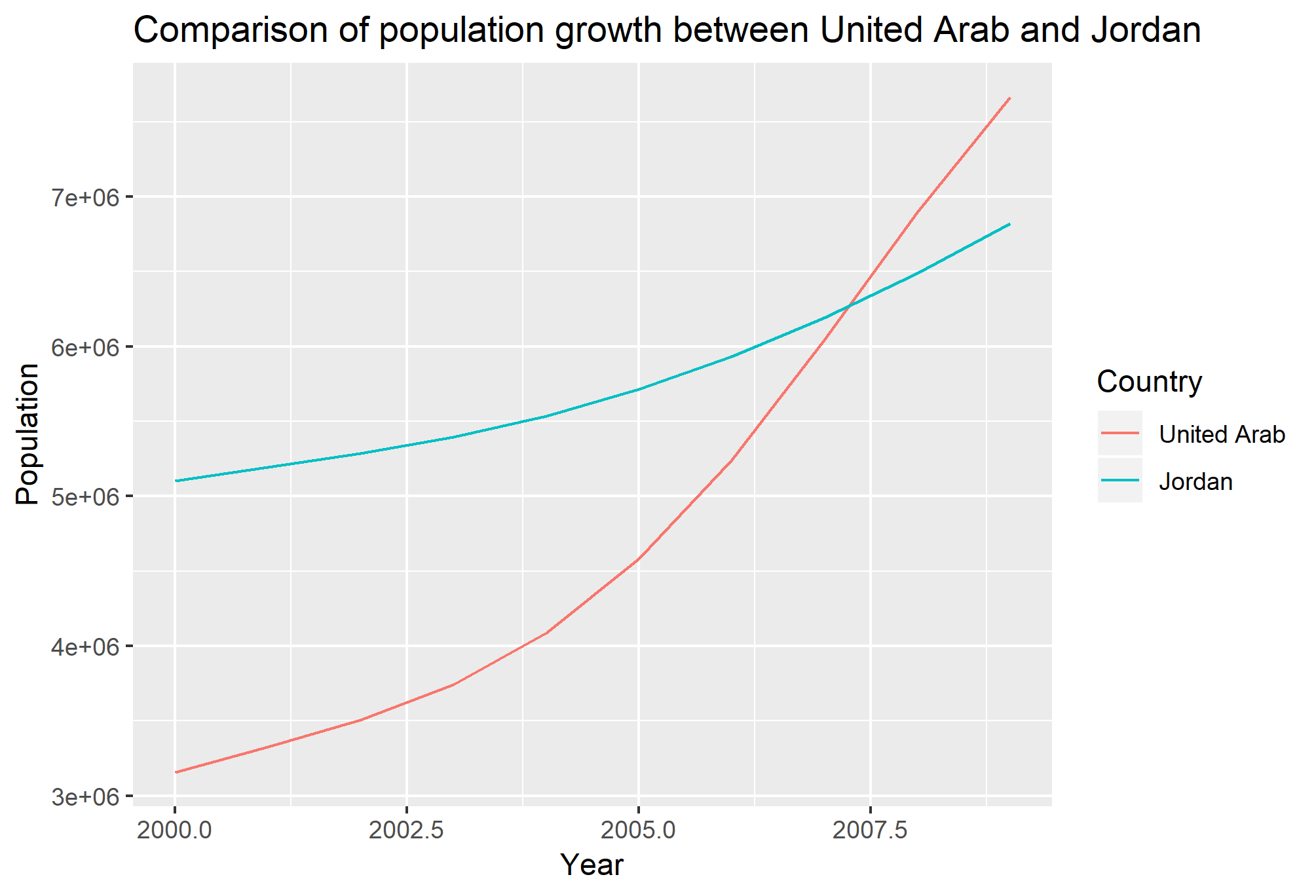
The above figure shows how population has been increased within 10 year from 2000 to 2009 in United Arab Emirates. We can see two vertical scales, the actual population is on the right scale and left scale represents log transformation of the population with base 2. The actual  population has been increased exponentially but after taking log transformation, we can see constant rate of increase in population. Thus, this transformation is helpful in a way as it shows  how the population is increasing without doing any further arithmetic.

The above graph represents the population growth between two countries United Arab and Jordan from 2000 to 2009. Clearly, we can see that the population has been increased significantly in United Arab Emirates (UAE) within that period of time; while the population growth is slower in Jordan in compare to UAE. Thus, it is quite helpful if use single panel of graph for comparison; as we can easily figure out the differences between two or more curves when drawn in a single panel than in separate panels.

How level of fat contained in US cereal effect calories?

The above graph was about the data of 65 different cereals product and the type of nutrition contained in the cereals of US. The graph shows the relationship between level of fat that US cereal contained and how it effected in calorie gain. We can see that increase in the level of fat cause gain in calorie for most of the Cereals except for few. Also, we can say that most of the cereals contained fat level between 0 to 6.5 and their calories gained lie between 0 to 250. However, there’re very few cereals having higher fat level more that 8 and gained around 350 calories.

The 2nd graph shows the same thing as first one, but it is visually unattractive than the first one; because the data labels are in the interior of the scale rectangle that clutters the graph. This is quite interfering and not able to clearly visual all labels as well. Another problem with this graph is the use of bigger unfilled triangular symbols that are completing blocking other neighbor values. Use of smaller dots or small circles would reduce these kind of problems.

The third graph contains one more variable (nutrition contained in US cereals), “sugar” and how it is associated with the level of fat and its impact on calorie gain. Increase in size and brightness of circle indicates the increase of sugar levels in US cereals. Moreover, this explains that higher the level of fat and sugar, higher the calories will be gained. Apart from this, there are few cereals at the top left of the graph which contain zero fat and moderate sugar level but have highest calories. This is an exceptional case and may contain any other nutrition that cause more calorie.

Growth of Instructional fees for BGSU(per term) over selected years.

The above graph explains about how the Tuition fees have been increased for BGSU (per term) from 1960 to 2018. The horizontal axis shows the periods or years and vertical axis is the logarithm of tuition fees. We can see that the fees have been significantly increased over several years. And, the vertical line represents the year (2008) when I started my College life.


Is Horsepower of a car related to its Mileage?

Motor Trend magazine collected the horsepower and mileage for 32 cars in the 1973-74 model year. To see if there is any relationship between horsepower and mileage, I construct a scatterplot of the two variables.

From the above plot, we can see that there is  negative association between horsepower and mileage for 32 cars. That is, as the horsepower increases, mileage for 32 cars decreases and vice versa.