The above bar graphs shows the number of performances in Broadway shows during two periods of time intervals 2000 to 2008 and 2008 and 2016 in two formats; stack and dodge. The the right labels on vertical side give the names of the shows. As, we can see that these graphs are visually not very clear as there are numerous data due to which the labels on the right vertical is unclear as well.


The above two graphs are much improved form of the First set of two graphs. The shows that had less than 1000 performances have been removed which will help to find the best broadway shows. These graphs are visually clear than earlier graphs. We can see the names of the shows are now visible and can figure out highest performances and lowest performances easily compared earlier ones. However, it will be little time consuming for deciding 2nd, 3rd and so on.
Thus, below we have better graphs showing the order of the good shows on the basis of the number of performances. We can easily see the rank of different shows on the basis of performances for two time periods; from 2000 to 2008 and 2009 to 2016 respectively.


Finally, the complete graphs are shown below where we have titles, proper labels in x and y axes so that we can easily get the information about the graph. Even, non statistician will be able to understand these improved graphs. We can tell the Best Broadway Shows was “Rent” during 2000-2008, likewise “The Lion King ” and “The Phantom Of The Opera” were best shows in 2009 to 2016 at one glance.


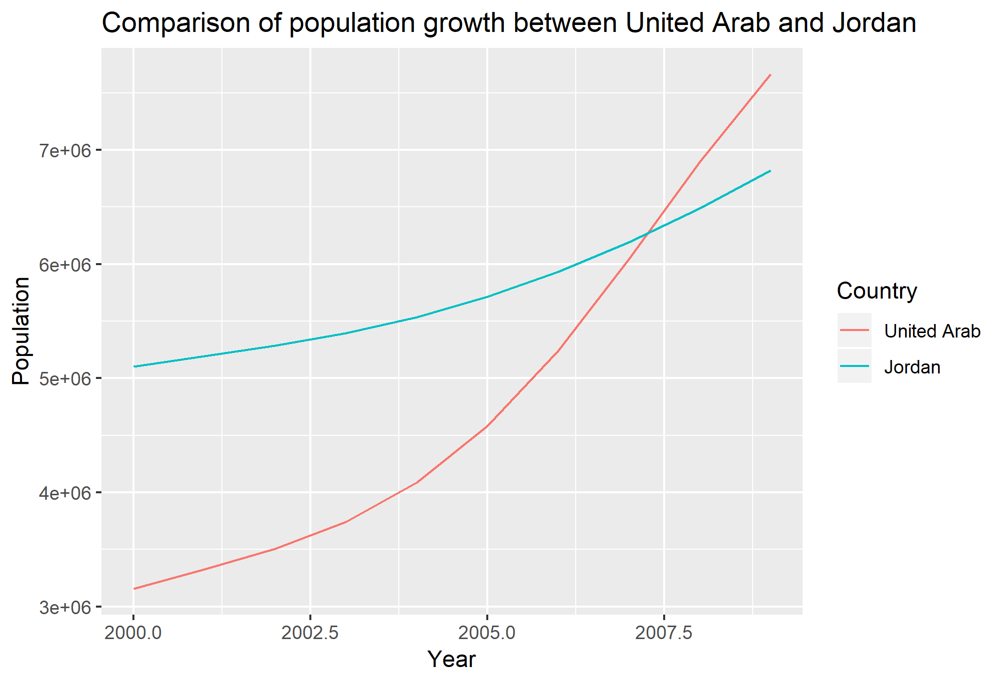
 The above figure shows how population has been increased within 10 year from 2000 to 2009 in United Arab Emirates. We can see two vertical scales, the actual population is on the right scale and left scale represents log transformation of the population with base 2. The actual population has been increased exponentially but after taking log transformation, we can see constant rate of increase in population. Thus, this transformation is helpful in a way as it shows how the population is increasing without doing any further arithmetic.