Reviews of Howard Wainer’s Articles

I was assigned the following three articles for review:

  • Using Graphs To Make the Complex Simple: the Medicare Drug Plan as an Example
  • A Rose by Another Name
  • Visual Aids When Comparing An Apple to the Stars

You could see my reviews of the first two articles by the following link:

https://docs.google.com/presentation/d/1k85VBoIvT0eEIffOMkIJL0r7eWn74esh420jayOgHGU/edit#slide=id.p

If there is any issue viewing the work, please email me at lyiheng@bgsu.edu.

Just feel free to leave comments and questions.

Thank you!

Pop Charts

In order to demonstrate that  “Any data that can be encoded by one of these pop charts (such as a pie chart, divided bar chart or an area chart) can also be decoded by either a dot plot or multiway dot plot that typically provides far more pattern perception and table look-up than the pop-chart encoding.”, I picked up two examples of pop charts.

This pie chart gives an ordinary response of how frequently people would go shopping on weekends grouped by gender. One apparent drawback of this graph is that the quantitative side of the data is not easy to obtain. Also, the color encoding is not enough representative for the orders of the responses.

After transforming into a dot plot, these responses are listed in 5 rows. More importantly, for each response, we have clear impression of how the values can differ for males and females in dots with different colors.

The second example is an area chart of seven groups. It has more or less the same issue as the first example which is not that reader-friendly for comparison and classification. Again, this encourages me to apply multiway dot plot for better interpretation of data as following.

Now we seems to have more enough evidence to conclude which sector has the most or the least quantitative values in each year, and it’s relatively easier to actually obtain the values. Additionally, we have straightforward comparison among the years as well because these values share the same horizontal scale.

Multivariate Data

The dataset UScereal in the MASS package gives eleven variables for a group of 65 breakfast cereals.  I choose the variable calories, sodium and potassium to explore their general relationships using the scatterplot matrix, the  coplot, and the spinning 3-dimensional scatterplot below.

Scatterplot matrix:

There is a general positive trend between calories and sodium, cereals with higher calories tend to contain more sodium as well. And this positive correlation is even more solid with calories and potassium as dots stay closer to the smoothing despite the fact that there are three “special” types of cereals which are the “100% Bran”, “All-Bran with Extra Fiber”, and “All-Bran”(red dots) whose potassium is abnormally high at a relatively small calorie value . Also, cereals with higher sodium tend to contain more potassium.

Coplot:

As seem from the scatterplot matrix above, the values of sodium are quite constant and we seem to be more interested in the stronger correlation between calories and potassium so I construct this coplot of calories as a function of potassium given sodium. We’re supposed to observe a solid positive slope which is not always the case shown in this coplot since these three “special” cereals are quite off the trend.

Spinning 3-dimensional scatterplot:

The spinning feature helps us observe the 3-d structure of theses three variables. What we can see from this plot is that most observations do not stray far from the “diagonal” of the cube where all these three variables change in the same direction which verifies the fact that there are general positive trends between the calories, sodium and potassium.

Color

The web page https://think.cs.vt.edu/corgis/csv/broadway/broadway.html provides an interesting dataset about Broadway shows.

I plot the time series plots on the graph blow about the Capacity(which is measured out of 100 percent) of the show “Jersey Boys” as a function of week numbers grouped by the year 2005-2016 with the smoothing.

What stands out in this plot is there is an apparent increasing trend at the year 2005 when the show released, and the decreasing trend since 2015 when the show were taken out of theater. Within our expectation, that show was hot from the year of 2006 to 2012 where the colors are closed to green.

Next I simulated a sample of size 200 from a bivariate normal distribution with correlation rho = -0.9 and use a bivariate density estimation algorithm to construct a contour graph of the density estimate.

And compared with the sample contour plot.

It not hard to find that the first graph better distinguishes the simulated data since it has a smaller amount of layers of colors within one theme from white to green whereas it becomes ambiguous to tell, especially for the light colors, in the second graph.

Loess

I simulated 200 data of (x, y) where the true signal follows one of the curves
sin(x) + cos(x), sin(x) – cos(x), sin(x) * cos(x),
.28 – .88 * x – 0.03 * x^2 + .14 * x^3.

The first graph is the scatterplot of y over x, and the loess smooth is the curve in red.

Then I plot the residuals versus x, it’s is not effective since we clearly observe a pattern where the observations zigzag regarding the loess smooth curve. Quite a few are all below the curve at the very left of the graph and quite a few are all above the curve at the very right. This pattern suggests there is somewhat a dependence of the residuals on x which distort the true signal and this comes from the a relatively larger value of default span.

Next I plot the residual at span=0.6:

span=0.5:

span=0.4:

From the above graphs, we find that the pattern in the first residual graph starts to occur at span=0.5, so I might choose a value of span which is slightly smaller than 0.5. Then I choose 0.4 since the residuals are fairly independent with x shown by the graph above. And I draw the scatterplot of y over x with the loess smooth at span=0.4:

As I’ve demonstrated above, the graph at span=0.4 should effectively help find the signal. Besides, the pattern in this graph indicates that the true signal follows sin(x)+cos(x).


Dot Plots

I constructed a two-way table of exchange rates for US dollars on different currencies from 2018 June to October.

                                                      Month
    June July August September October
Exchange Rate


EUR 0.851 0.855 0.860 0.863 0.867
GBP 0.746 0.756 0.778 0.775 0.767
CAD 1.294 1.313 1.307 1.299 1.288
AUD 1.312 1.351 1.357 1.400 1.401
IEP 0.670 0.673 0.684 0.680 0.683

Graph 1: The mean of each currency among these months.

Graph 2: The exchange rate  grouped by currencies.

Graph 3: The exchange rate for each currency grouped by months.

It’s shown by the first graph that one US dollar is worth the most amount of Australian dollars, then Canadian dollars and the least amount of Irish pounds. If we look at the trend over these months in graph 2, we could find that the exchange rate of Euros and the Irish pounds to US dollars are relatively stable whereas there is a large spread in Australian dollars. And the grids on graph 3 help us better illustrate the exact amount of change and the change rate.

Overall, the graph 2 which is the exchange rate grouped by currency that are most efficient since overall the exchange rates does not change too much throughout these months but group 2 also show the differences between different currencies clearly as well.

Distributions

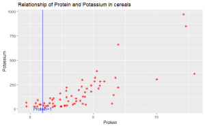
The dataset studentdata from the LearnBayes package contains results from a survey given to a large group of students from a introductory statistics class.

I took a random sample of 100 from the data and looked at the number of shoes owned by the men and women in the class. From the sample we generated, there are 59 females and 41 males.

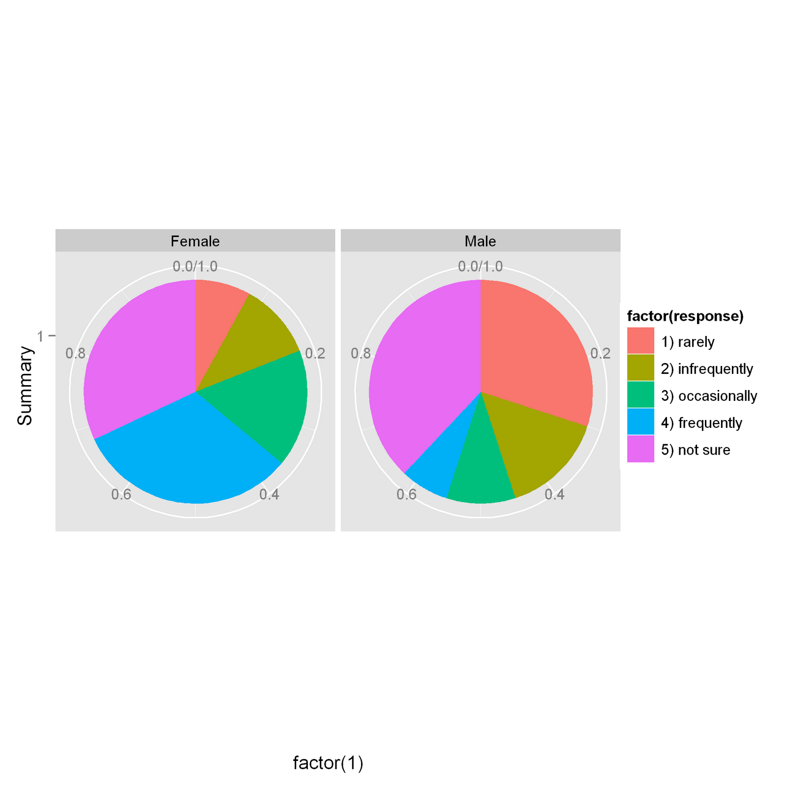
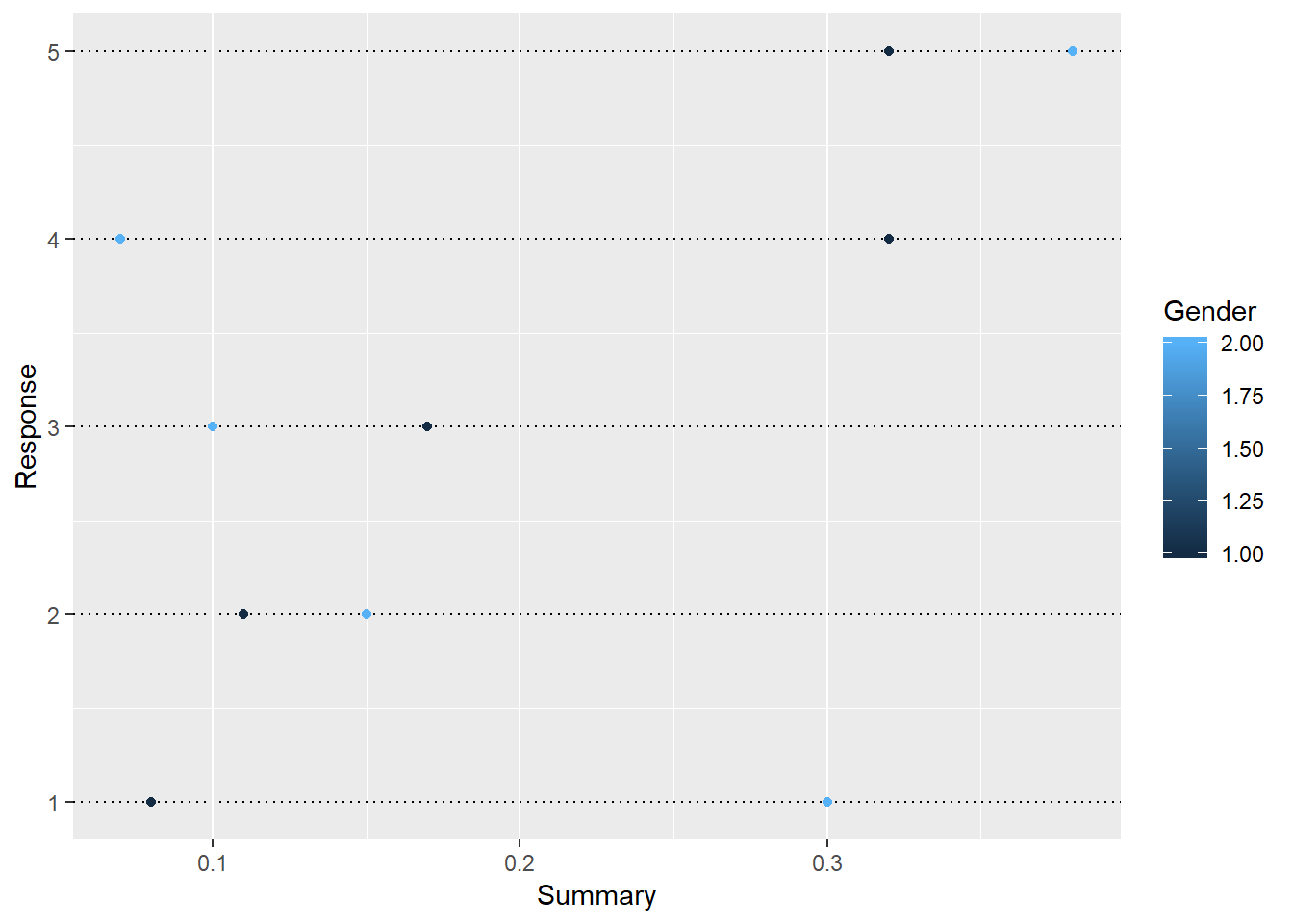
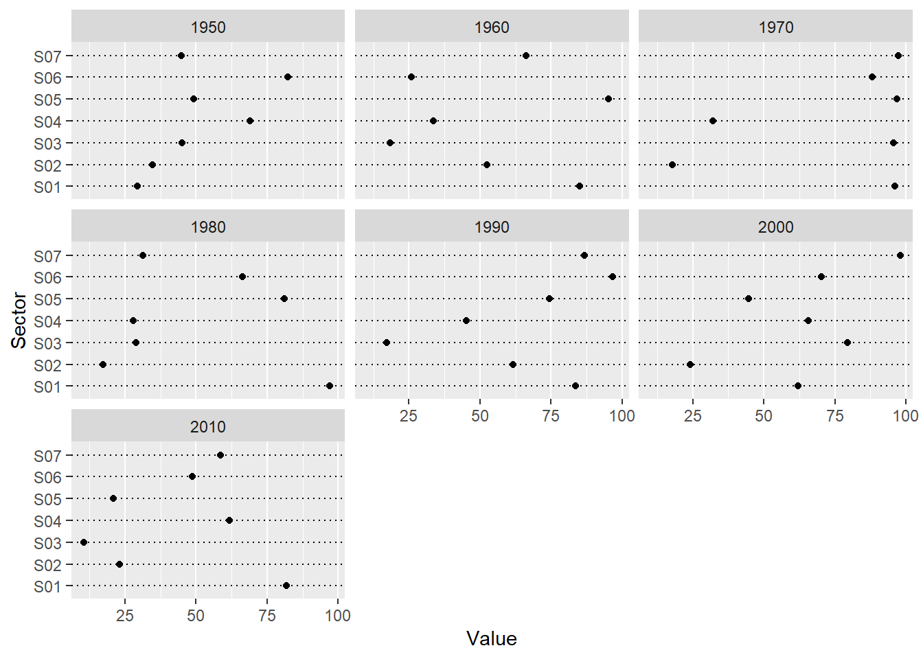
Parallel one-dimensional scatterplots of the variables by gender:

Parallel quantile plots of the male values and of the female values:

The x-values are representing the fractions of the haircut prices from the smallest to largest with the value (i-0.5)/59 for female which are in black, i=1……59, i is the order in the group of females; (j-0.5)/41 for male which are in red, j is the order in the group of males. The y-values are representing the haircut prices. So we clearly see what’s the quantile for each haircut price in terms of gender by this graph.

Quantile-quantile plot of the male and female values:

Tukey m-d plot from the quantiles of the two samples:

The average difference of haircut prices between females and males are around 15.4, from this graph we observed that the difference between males and females are always negative which indicates the haircut prices are always higher than women, and one interesting thing is that the difference generally increases as for higher haircut prices.

In conclusion, the Tukey Mean-difference plot is the best to provide the graphical comparison of the haircut prices of these two groups. We clearly see all the differences are negative and more important, there is a roughly linear trend of the differences over the average haircut prices. As haircut prices increases, the difference tend to increase as well which is not that apparent in other graphs.


Exploring the Pythagorean Formula

I collected 10 NBA teams of the 2017 season  and the following variables:

W – the number of games won
L – the number of games lost
P – the number of points (or runs, goals, etc) scored by the team
PA – the number of points allowed by the team

Data displayed in the table below:

The Plot of log(W/L) against log(P/PA) with the best fitted line of the form k log(P/PA) and Residuals against log(P/PA) is presented below: The formula of best fit is given by “lm” method as: log(W/L)=13.76*log(PA/P) which implies the corresponding Pythagorean formula is W/L=(PA/P)^13.76.

Lucky or unlucky, there is no apparent unusual observation in the residual plot, all the observations are bounded by 0.2 log(W/L) away from the fitted line, and the high leverage observation which is to the very left also fits well with the formula.


“Best” Broadway Shows from 2000-2016

The web page https://think.cs.vt.edu/corgis/csv/broadway/broadway.html (Links to an external site.)Links to an external site.  provides an interesting dataset about Broadway shows.

First I picked up the data within the year 2000-2016. Then split the time period to 2000-2008 and 2009-2016 and tried to choose the “best” Broadway shows respectively.

I used the variable “Gross” namely how much money made in total to define the “best”, grouped the data by the show name and displayed the data by bar graphs where the “Gross” of each show is stacked by “Month”.

“Bad” Graphs:

These two bar graphs are too messy, we can not really tell the name of the show from the horizontal axis, and which graph stands for which period as well. There is huge variability in the graph, the gross of some show is extremely larger than the other ones.

“Good” Graphs:

It turns out “The Lion King” is the “best” from 2000-2008 based on the “Gross”, note that the gross of “The Lion King” is the highest for every month.

In the second period of 2009 to 2016, both “Wicked” and “The Lion King” have the highest gross. One interesting observation is that “Wicked” performed better in the first season whereas “The Lion King” won the third season.

The revised graphs are more organized, we can clearly see the names of shows displayed from the highest gross. And titles and captions are being added for a better explanation to the information. In conclusion, based on the gross, I would choose “The Lion King” as the best show for 2000-2008, “The Lion King” and “Wicked” as the best two shows for 2009-2016.

Population growth for Maldives compared with Grenada from 1960 to 1969

A csv file found on the website http://data.worldbank.org/indicator/SP.POP.TOTL?cid=GPD_1 (Links to an external site.)Links to an external site.
gives the population of many countries for many years. I chose the population of Maldives from the year 1960 to 1969.


The shape is roughly linear which implies an exponential increase.

I graphed the log2(population) versus the year and the slope is around 0.033 of this positive linear trend, that is to say, the population of Maldives is roughly 1.023 times of the previous year from the year 1960 to 1969. And the right vertical scale gives us the exact number of population to verify this fact.

The red line is constantly increasing with about the same rate, whereas the blue line grows slower by year and tend to stop at around the year 1965.

I chose the country Grenada which had almost the same starting point of population in the year 1960 to better illustrate how they differed in this decade. It turned out that the population of Grenada told a completely different story from Maldives. The trend for Grenada was not even always positive, and the growth rate was smaller than that of Maldives. Besides, it gradually slowed down since the year 1962.

Relationship of Protein and Potassium in Cereals

Based on data USCereal in the R MASS library, I chose protein and potassium from all the given nutritional information for a selection of US cereals to study their correlation.

Good display:

Overall there is an increasing pattern over log(Potassium) by log(Protein) which indicates cereals with high protein is likely to have high potassium.

Bad display:

This reference line is worse than unnecessary since there is no practical meaning for that, and it interfere with the data, we have some trouble more or less to view the observations at protein close to 1. Besides, it does not obey the ”banking to 45 degrees” principle. The angel from the horizontal axis is apparently less than 45 degrees which may create the illusion that potassium increases slower than protein. So the log transformation is necessary for a good display from this point of view.

It’s not hard to tell that cereals in shelf 3(in blue) have the average highest level of protein and potassium, and the relationship between protein and potassium seems to be the strongest because of the smallest vertical spread. Also, cereals in shelf 2(in red) have a little bit higher average level of protein and potassium than cereals in shelf 1(in green). The correlation between protein and potassium is weaker for cereals in these two shelves than shelf 3 which indicates the variable ‘shelf’ not only makes a difference on the level of protein and potassium, but also their correlation.