Hi Guys,
Here is the link to my presentation:
https://docs.google.com/presentation/d/13L3tcJwdOtIzksDYR-AFKfX6OaZ3KTToD6H5AsQeLCg/edit?usp=sharing
Hope you can enjoy it.
Hi Guys,
Here is the link to my presentation:
https://docs.google.com/presentation/d/13L3tcJwdOtIzksDYR-AFKfX6OaZ3KTToD6H5AsQeLCg/edit?usp=sharing
Hope you can enjoy it.
Cleveland states that “Any data that can be encoded by one of these pop charts (such as a pie chart, divided bar chart or an area chart) can also be decoded by either a dot plot or multiway dot plot that typically provides far more pattern perception and table look-up than the pop-chart encoding.”
To demonstrate this statement, I found the following two examples:

Resource: https://www.mathsisfun.com/data/pie-charts.html
In this pie chart, it is not ordered by the proportions circularly. Without attaching the corresponding labels, both table look-up and pattern perception are less efficient for this chart. For instance, the areas of “SciFi”, “Comedy” and “Action” seem to be literally similar. It would be difficult and time consuming for us to distinguish the differences in such scenarios.
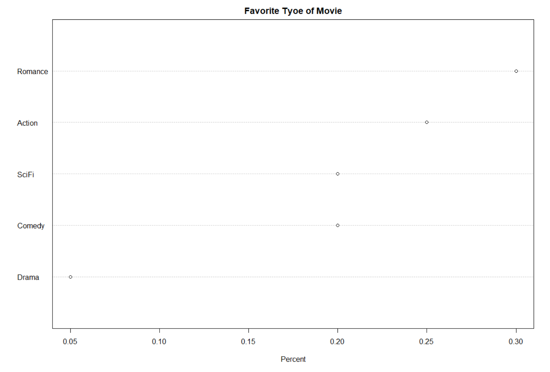
After converting the pie chart to a dot plot, it is clear to see that the dot plot above allows effortless decoding of differences. Furthermore, the categories are ordered based on the proportions. Now, it is much easier to tell the largest one and the smallest one comparing to the pie chart, which implies the conclusion that the participants like the romance movies the most and the drama the least. Thus, both pattern perception and table look-up are enhanced.

The truth of the divided bar chart is one of the pop charts reminded me of the work back to the 5th week of this semester while I was doing the stacked bar chart. Before I got the above final divided bar chart, honestly, I did not put on the labels for the first time. But immediately I realized that it was so hard to compare the attendance for the period of 2000 to 2008 because the red rectangles were stacked upon the blue ones with different heights. Also, it was hard to tell the difference between the two periods given the specific show if it happened to have similar values in performance.

So, I went back to that work and converted the divided bar chart. From the above dot plot, it could tell everything that the divided bar chart did. Additionally, with the grids, we could easily compare the difference between the two shows given the period or estimate the corresponding attendance of a show. And, the trend with the show seemed to be legible as well.
The dataset UScereal in the MASS package gives eleven variables for a group of 65 breakfast cereals. The three variables that I am interested with are “calories”, “fat” and “sugars”.

From above scatter matrix, clearly, there is a positive trend between “calories” and “fat”, so as “calories” and “sugars”. And, the relationship between “fat” and “sugars” seems to be slightly positive as well. Hence, it is reasonable to choose “calories” as the response variable.

The above graphs “calories” against “fat” given “sugars”. By adding the loess curves, it is more clear that the patterns have roughly the same slope, which supports my previous claim of week association between “fat” and “sugar”. And when I go back to the scatter matrix, it seems observations that contain high grams of fat have high grams of sugar as well, which gives the reason of existing differences in length of the loess curves.
Generally, as the given grams of sugars in these cereals increase, the positive relationship between “calories” and “fat” becomes more clear.

It is really cool and funny to play with the spinning 3-dimensional scatterplot. Actually, this method is really helpful and effective in identifying any outliers. As shown above, I have labeled the two “special” cereals that seem to deviate from the general relationship patterns: “Great Grams Pecan” and “Grape Nuts”.
According to the blog Broadway shows, to plot the time series plot by choosing one specific show, I picked my favorite one — “The Lion King”. I want to plot the mean Capacity as a function of week number, comparing several years.

Note: Capacity is the percentage of the theatre that was filled during that week
The above plot shows the weekly mean capacity of “The Lion King” among a year from 2012-2016. By using different colors, I draw all the lines on the same graph. Generally, these lines have similar patterns which indicate the performance of “The Lion King” tends to be “stable” among the chosen 5 years. It makes sense to me because this show has being one of the most popular shows for a long time period.
But I still notice several facts from it. The data of 2016 is not complete, the records stop at the 33rd week. Also, It seems to have an unusual decrease in capacity between the 30th and the 40th week in 2015.
In the “sim.and.plot2” function, I simulate a sample of size 200 from a bivariate normal distribution with correlation rho = -0.9 and use a bivariate density estimation algorithm to construct a contour graph of the density estimate.


From the above comparison, while considering about the property of bivariate normal distribution, I want to emphasize the area which is close to the mean of the distribution. Conversely, the area which is far from the center should be treated as the outlier. Thus, the sequential palettes should be more suitable in this case than the “Spectral” (Diverging palettes).
Of course, in the situation that I’d like to emphasize the middle-class with light colors and low and high extremes with dark colors, then “Spectral” is preferred.
This week, I will practice how to add an appropriate smooth line by applying the “loess” method. The dataset is simulated where the true signal follows one of the curves
sin(x) + cos(x) OR sin(x) – cos(x) OR sin(x) * cos(x) OR .28 – .88 * x – 0.03 * x^2 + .14 * x^3.


Note: when I simulated my dataset, it randomly chose the second signal: f = sin(x) – cos(x).
From the scatterplot, the red line is the smooth line under the default value of span in the loess function while the blue line is the true signal under the function of (sin(x) – cos(x)). I noticed that the lowess curve generally followed the pattern of the blue one which indicated that it had effectively found the true signal. However, from the residual plot (the loess curve was superposed), I found that there was a dependence that could not be ignored of the residuals on x, which means the value of span was too large and was kind of distorting the true signal. Thus, the smooth line could be improved for sure.

 By comparing the scatterplots of part a and part b, the loess curve under the span of .5 followed the true signal more precisely than it under the default of span which was .75. From the residual plot, the red line was nearly the same with the horizontal line of y=0 which showed almost no dependence of the residuals on x. Hence, my choice of .5 was better and the loess curve of it was not distorting the true pattern.
This week, I will construct the three (Cleveland style) dotplots based on a 2-way table.
Meet with data
The 2-way table I chose records the Top 10 population by states in the U.S from 2010 to 2017. The following is an overlook of the dataset:

Note: I round the values of the population to million because the raw numbers are relatively large.
Graph 1. Construct a dotplot of the means by rows which are ordered from high to low.

From the above figure, it is clear to see that, among the past 8 years, California has the highest population among these 10 states and the difference is literally significant. Impressively, even more than 10 million ahead of Texas which is in the 2nd place.
Graph 2. Construct a dotplot, grouping by rows.
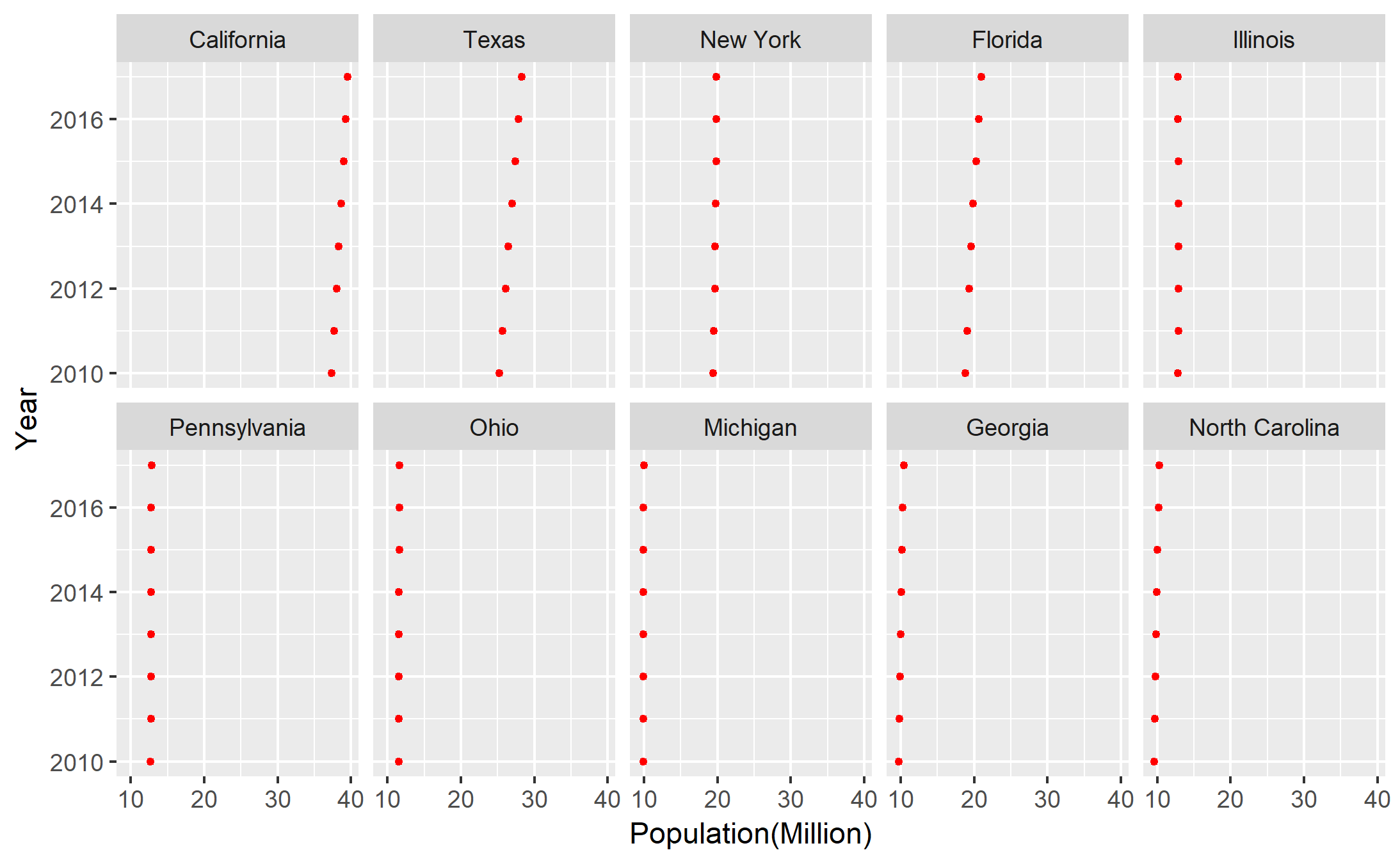
Form this graph, we are able to observe the changes among the past 8 years in each state. Because the unit of the population is million, it is not easy to tell the changes in some states, but California and Texas still are outstanding. Between these two states, Texas seems to have the stronger growth of population.
Graph 3. Construct a dotplot, grouping by columns.

Grouping by columns, this graph tells the general patterns of these 10 states among the past 8 years. As mentioned anteriorly, the unit of million makes most of the states seem to be stable in the growth of population except California and Texas. Thus, there is no dramatic change in the general patterns.
Summary
These three different graphs provide different aspects into the dataset. In this case, the dotplot grouped by rows (states) makes more sense to me, because I am more interested in the annual growth of population in each state. Actually, we could compare the differences among the states as well from this dotplot.
Data Resource
United States Census Bureau: https://www.census.gov/data/datasets/2017/demo/popest/state-total.html
The dataset “studentdata” is from the LearnBayes package, which describes the results from a survey from an introductory statistics class.
I took a random sample of 100 from the dataset and aimed in displaying the graphical comparison of haircut prices of the men and women in the class. (The relevant variables in the dataset are “Haircut” and “Gender”).
Note: Generally, people would not get a zero price for the haircut. So, I removed all NA values or zeroes of these two variables because they would mislead the quantiles by increasing the sample size.

From the parallel dotplots, the distribution of the female group is obviously right-skewed. And, most of the haircut prices in the female group are higher than them in the male group. But it is not clear to tell the pattern of the differences.

Notice that, in this case, the number of black circles is larger than it of red circles since we have more observations of the female than them of the male.
To construct the Parallel Quantile plots, I sort the data from the smallest to the largest, denoted as X(i), i=1,…,n; n is the sample size of each group. Then I create the equidistant fractions from 0 to 1. Actually, they are f-values in each group by computing (i-0.5)/n; The last step is to plot the fractions against the sorted values. It is clear for us to compare quartiles, medians, etc. For instance, assume we want to compare the maximums. The maximum in the female group is nearly 150 bucks when the maximum in the male group is around 25 bucks. Also, the differences under the same fraction between the two groups are increasing significantly.

From the Q-Q plot, more specific than the previous two graphs, it implies that, before the upper 50% quantiles, the differences with the same quantiles are under 10 bucks. After around 80% quantiles, the differences increase dramatically.

I’d like to choose the Tukey Mean-Difference plot as the best graphical comparison of the two sets of measurements among the above 4 graphs.
Actually, Tukey Mean-Difference plot is an alternative expression of Q-Q plot. It converts interpretation of the differences around a 45-degree diagonal line to the interpretation of differences around a horizontal zero line. Now, it shows that all the differences among the same quantiles are positive. And we get the same conclusion from the Q-Q plot but easier and faster, because y-axis is the straightforward difference.
In summary, women have higher haircut prices than men. But the lower level haircut price has no big difference between men and women. But in advanced haircut service, it costs women much more than men.
This week, I collected the stats of NBA Regular Season (2017-2018) for the Eastern 15 teams, and the following variables:
W – the number of games won
L – the number of games lost
W/L% – the win-loss percentages {W/(W+L)%}
PF – the number of points (or runs, goals, etc) scored by the team
PA – the number of points allowed by the team

The Pythagorean formula (described first by Bill James in the context of baseball) says that W/K = (PF/PA)^k, where k is a constant that is dependent on the particular sport. Taking logs, we can reexpress this formula as Log(W/K) = k*Log(PF/PA)

From the above plot, on the top of it, it is the scatterplot of log(W/L) against log(P/PA). Also, I add the best line by adding a smooth with the “lm” method. It shows that the slope of this line is 15, which indicates that the estimated best fitting choice of k based on my collected dataset is 15. Thus, the Pythagorean formula claims that, for any team in NBA, the ratio of its “W” and “L” is approximately 15 powers of the ratio of its “PF” and “PA”.
On the bottom of the graph, it is the residual plot of the fitted line I added. 4 teams are labeled as the unusual points. It is clear that Bulls, Cavaliers, and Hornets are the unlucky teams which could not be well predicted by the Pythagorean formula. Conversely, Wizards seems to agree with the formula immensely.
Data Resource: https://www.basketball-reference.com/boxscores/#site_menu_link
This week, I will try to compare the best Broadway shows for the two-time intervals: 2000-2008 and 2009-2016. In my perspective, the attendance for a show should be an important and robust evidence to show it is excellent or not.
I choose the top 5 shows of each time period as my target dataset by ranking the total attendance of all Broadway shows.
Grouped bars

Firstly, I draw a bar chart of the dataset grouping the two periods. It seems to be a little bit messy at the first glance because there is no order for the bars of these shows. But if we look into this graph, we will find that there are 6 shows in total, with 4 of them have the values for the 2 periods, but the rest 2 of them just have one value recorded in the dataset. This means “Mamma Mia!”, “The Lion King”, “The Phantom of The Opera” and “Wicked” have been quite popular for the whole two periods and They are on the Top-5 list for both “2000-2008” and “2009-2016”. We can tell the rough periodical changes of these 4 shows from this bar charts. Unfortunately, “Beauty and The Beast” is on the Top-5 list for “2000-2008”, but fails to win the honor for “2009-2016”; “Jersey Boys” is out of Top-5 during the first period, then comes to the list. However, I am still not satisfied with this plot. For instance, it is hard to tell the exact rank of the top-5 shows for each period.
Stacked bars

Then, I draw the stacked bar chart of the dataset to see if I can dig more about it. As shown in the graph, we are able to know the champion now-“The Lion King”, which has the highest attendance from 2000 to 2016. Nevertheless, we could barely tell any significant periodical changes for those four shows except “Wicked”. And there is no direct information about the rank as well.
Alternative grouped bars

Consequently, I redraw the bar chart groped by the period and sorted by the attendance as shown above. It is interesting to notice that “Wicked” came to the first place during the second period but it was the 5th place in the first period. And, “Mamma Mia!” tended to be out of the Top-5 soon because its position decreased by 2 degrees. However, this graph does not directly provide the comparison between the two periods of the same show.
Revised stacked bars
Also, the stacked bar chart becomes more clear in making comparisons by adding labels with the bars. But lack of rank information is still unsolved.
Faceted bars

Finally, I choose to draw one more plot which is called the faceted Bar. Adding the labels and making the graphs into one column make it so clear for us to identify all the periodical changes. Also, the rank of each period is available as well. But notice that the missing bars for “Jersey Boys” and “Beauty And The Beast” do not represent they were not available during the corresponding time period. Recall that the dataset just records the Top-5 shows. Hence, different types of bar chars will capture different aspects of the dataset.
Data Resources: https://think.cs.vt.edu/corgis/csv/broadway/broadway.html
This week, I would like to plot some graphs regarding the population of the specific country in recent five years. Hopefully, we could take a glance at the growth rates.
I downloaded the population dataset from The World Bank:
https://data.worldbank.org/indicator/SP.POP.TOTL?end=2017&start=2013
And, the USA(United States) and the UK(United Kindom) are the two countries I feel interested in.
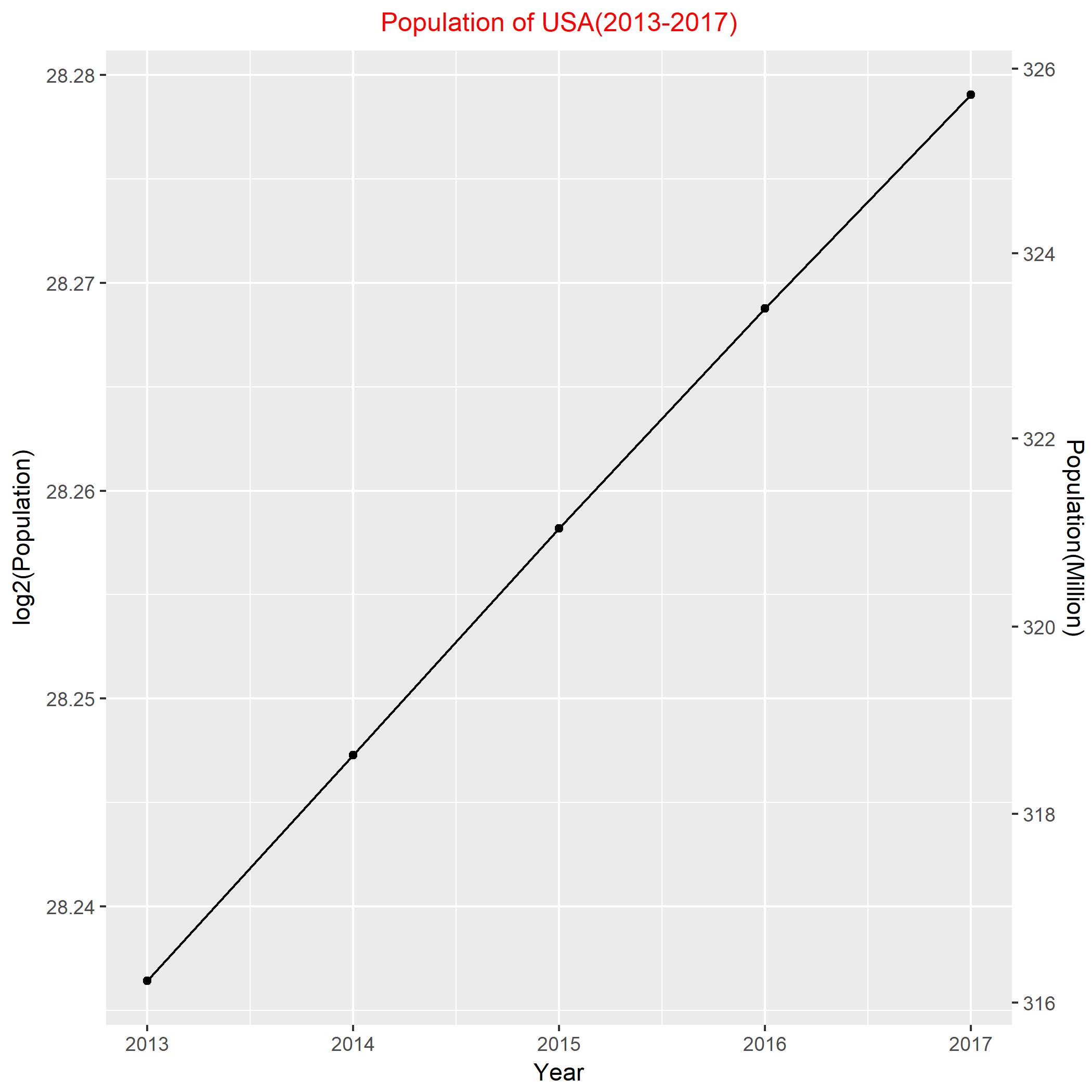
To check the population is exponentially increasing, I took the log2 of the population. According to the above graph, it is almost perfectly linear. And, the slope of the line is informative about the rate of growth. Roughly, from 2013-2017, the yearly population growth rate of U.S.A is 2^((28.288-28.237) /4)- 1= 0.888%.
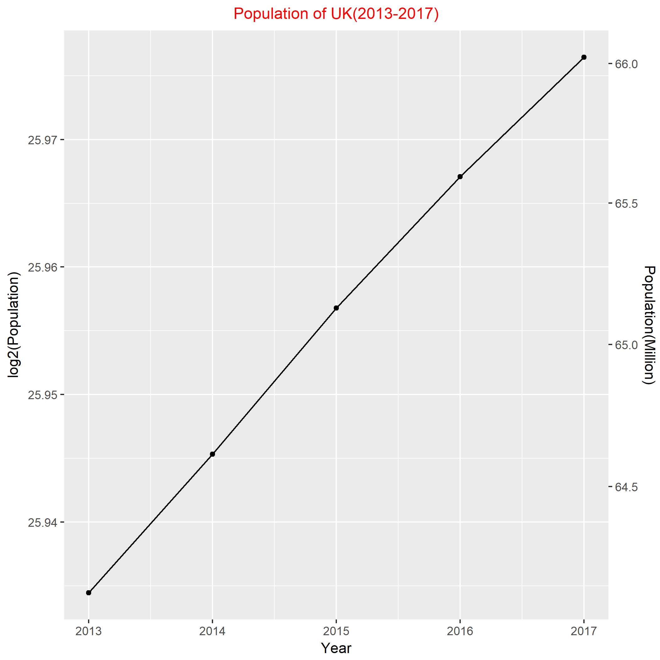
I did the similar work to the data of U.K. Based on the figure, it also shows an adequate linear relationship between the log2(population) and the year. Thus, from 2013-2017, the approximate yearly population growth rate of U.K is 2^((25.977-25.934)/4) – 1= 0.748%.

Finally, I put them together to compare the growth rates. In terms of foregoing statistics, 0.888% > 0.748%, this implies the growth rate of population in U.S.A is slightly larger than U.K. However, from the above plot, that difference is literally tiny. The two lines are almost parallel, which indicates that U.S.A and U.K have the quite similar growth rate of population in recent five years.
In this post, I use the dataset USCereal in the R MASS library which gives nutritional information for a selection of US cereals in 1993.
Firstly, I chose “Protein” and “Calories” as the two variables that are associated to draw the scatter plot.

In the above figure, obviously, I failed to draw a good graph of the two variables. Since I want to tell all the labels of the observations, actually, most of them are concentrated in the lower left corner. Thus, the labels overlapped a lot and obscured the whole graph, which implied that the graph failed to make the data stand out. Also, I noticed several “odd” observations to the right side of the graph. They represent the cereals that contain high quantities of both protein and calories. Unfortunately, the labels were obscured as well, even were outside the boundary and they seemed to have the issue of overlapping. One more thing, because these points are far away from the main part, that makes me really hard to read their corresponding values.
Hence, I decided not to show all the labels but some of them the viewers might be interested in. Furthermore, using a pair of scale lines for each variable seemed to be a good improvement.

Well, now it is clear to see a positive trend for these two variables, which indicates that higher protein US cereals appear to contain more calories. The new graph makes the data stand out to viewers. And, after using a pair of scale lines, it is not hard to read all observations. I also labeled some “extreme” cereals in the graph. For instance, Puffed Rice has the least calories among all the recorded cereals, but it has almost the least protein as well.
Further, I choose the third variable in the USCereal dataset: “shelf floor”, that I believe is associated with the two variables because it seemed to be a group factor.

I used different color and different size to construct a new graph. In this graph, it indicated that all observations are classified into 3 groups in terms of the index of “shelf floor”. Unfilling shape style and the different size made it clear to observe some overlapping points. Due to the different color used, I would conclude that the 3rd shelf floor seemed to have the most diversity of cereals and there is no significant relationship between the cereals of the level 1 and level 2 shelf floor.

Based on the data set, I constructed a scatterplot of the year against log10 of tuition fees with the points connected by lines. It showed the roughly decade changes in log 10 of tuition fees starting from 1960 to 2018. From the graph, I saw a strictly positive trend between tuition and years, which indicated the tuition fees of BGSU have been increasing for the past 58 years.
Furthermore, before 2010 (the year I stepped in college), it seemed the changes in tuition fees increased more radically comparing to the years after 2010. Then I went back to the raw data and found that the fees got almost doubled every 10 years before 2010 (especially from 1980 to 1990), which was really impressive. Thus, I labeled the two periods as “Explosive Years” and “Steady Years”.
To get the current graph, I did several iterations to adjust the positions of labels and the tile. Also, to avoid the overplotting issue, it could be fussy to make the choices of the shape, size or color of the points and lines. In my perspective, there should be further improvements regarding this plot. For instance, people might think of the original tuitions fee of one specific point since I took the log 10 of it and the value was not as straightforward as before. Maybe I could draw some horizontal lines indicating 100 dollars, 1,000 dollars, 2,000 dollars, etc.
Welcome to blogs.bgsu.edu This is your first post. Edit or delete it, then start blogging!
Based on the dataset collected by Motor Trend magazine which records the horsepower and mileage of 32 cars in the 1973-74 model year, I desire to figure out the relationship between horsepower and mileage. It is reasonable to construct a scatterplot of these two variables.

According to the scatterplot above, there is an obvious negative relationship between the horsepower and the mileage per gallon (mpg) relying on this dataset. That is, as the horsepower of the car increases, its mpg is more likely going down.