My presentation link: https://docs.google.com/presentation/d/1X01G_IBF0tdjo1NOIFpaxQIEsLrD9zv31ZXRc1dSg6c/edit?usp=sharing
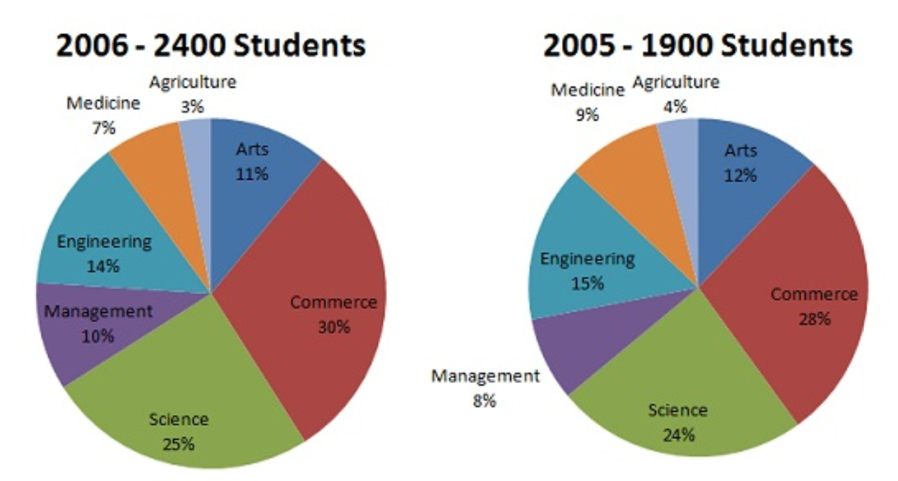
The original Pop chart and dataset
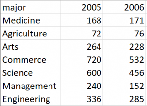
Redrawing data by using a multiway dot plot
According to the new multiway dot plot, I can easily find scale information of observations by using table look-up, which is not directly obtain from the original pie chart. For instance, the scale information of the observation with the largest people is (1) major =Commerce (2) Year=”2005″; (3)Student= 720 people.
And viewers can get more accurate physical information from the new dot plot by using Pattern Perception. From the dot plot, I observe that the red symbols as a group are shifted to the right with respect to the blue symbols, which means the number of student at particular major in 2005 is larger than the number of students at that major in 2006. However, this information is impossible to visually get from the pie charts.
Over all, the statement that “Any data that can be encoded by one of these pop charts, such as a pie chart, divided bar chart, can also be decoded by either a dot plot or multiway dot plot that typically provides far more pattern perception and table look-up than the pop-chart encoding” is correct.
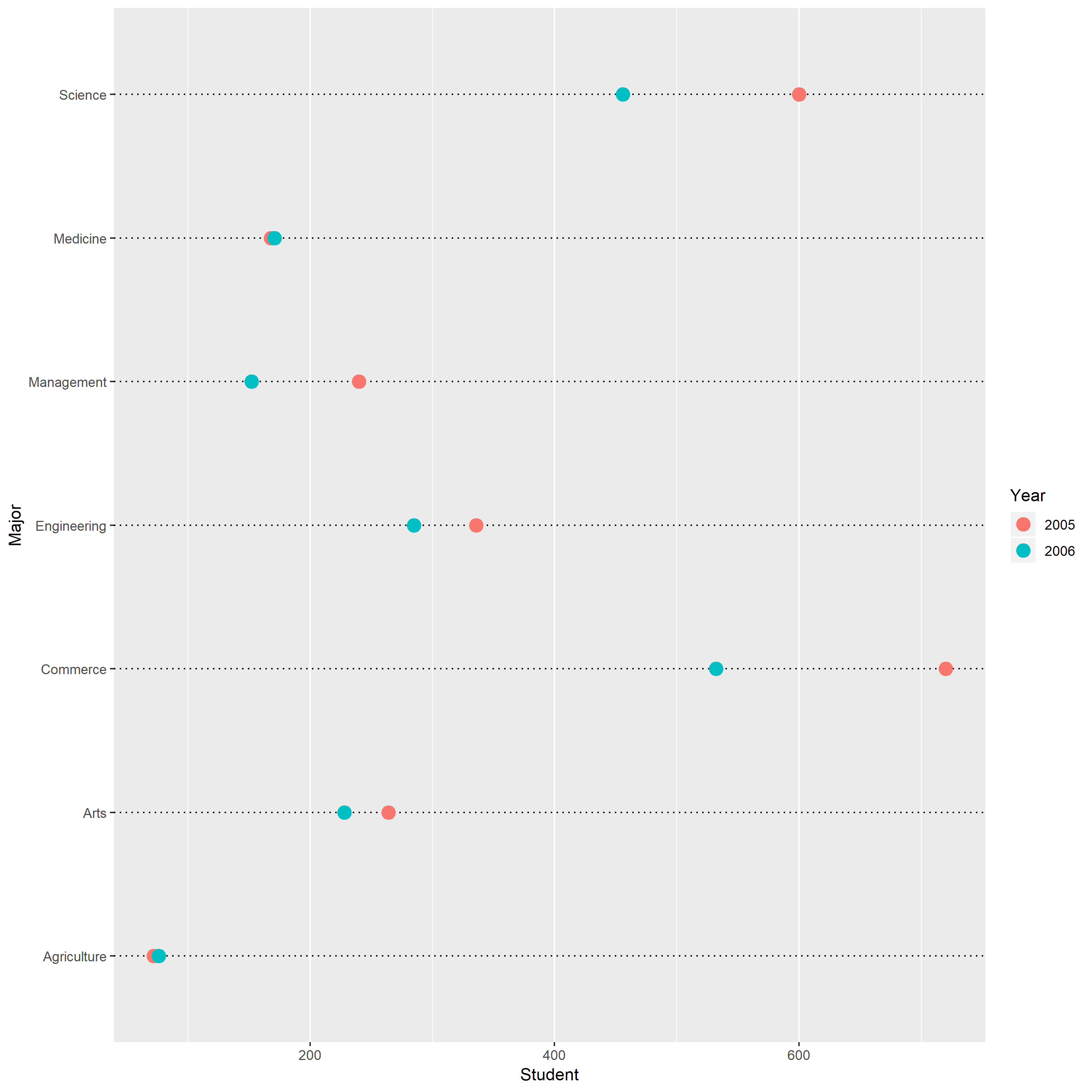
The data contain three variables, calories, fat, sugars, from UScereal dataset.
In this Figure the (2,3) panel is a graph of calories on the vertical scale against sugars on the horizontal scale. From the (2,3) panel, I find that the general relationship between calories and sugars is positive. As the sugars increases, the calories also increase.
In this Figure the (3,3) panel is a graph of calories on the vertical scale against fat on the horizontal scale. From the (3,3) panel, I find that the general relationship between calories and fat is positive. As the fat increases, the calories also increase.
In this Figure the (2,1) panel is a graph of fat on the vertical scale against sugars on the horizontal scale. From the (2,1) panel, I find that the general relationship between sugars and fat is positive. As the fat increases, the sugars also increase. As the sugars increase, the change of fat become larger.
The two special points marked in red. Based on the original data, one is Grape-Nuts, another one is Great Grains Pecan.
Grape-Nuts: Calories= 440, fat=0, sugars=12
Great Grains Pecan: Calories=363.63, fat=9.09, sugars=12.12
Therefore, Grape-Nuts has zero fat but its calories is higher than others. Great Grains Pecan has much higher calories but its sugars and fat are not large. These two points do not follow the general pattern.
2. Coplot
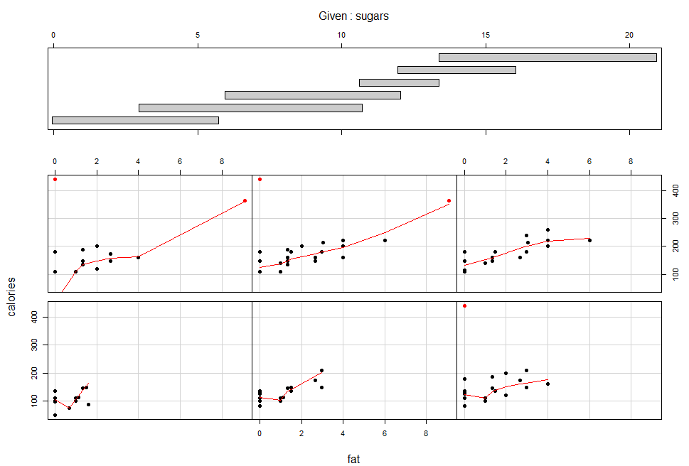
This plot condition on Sugars; calories is graphed against fat for six intervals of sugars chosen. Except for panel (2,2), each conditioning on sugars, the dependence of calories on fat has a nonlinear pattern: hockey-stick. On the five panels, the slopes are positive. the panel(2,2) shows this conditioning on sugars has linear pattern. This suggests that there is no interaction between the two factors; the effect of fat on calories is the same for most values of sugars.
3. Three-dimensional scatterplot
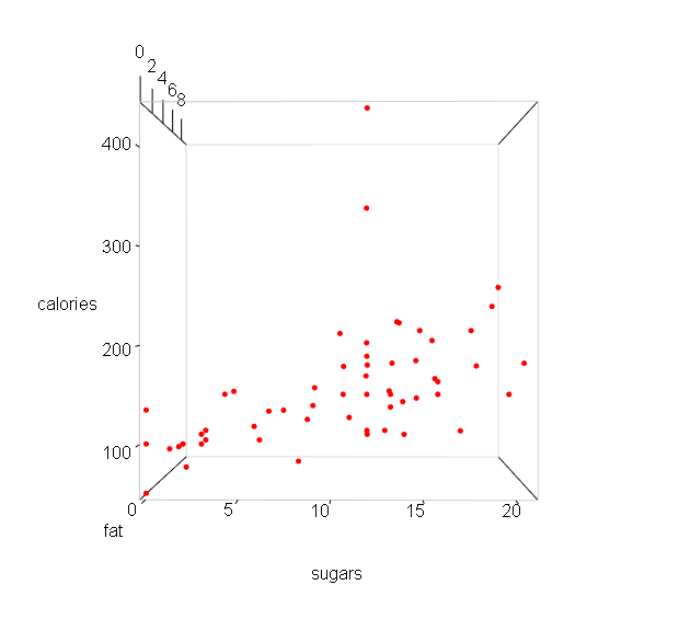
From the above plot, I find that the general relationship between calories and sugar is positive. As the sugar increases, the calories also increase.
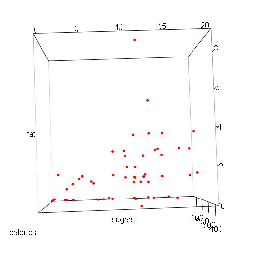
From the above plot, I find that the general relationship between sugars and fat is positive. As the sugars increases, the fat also increase.
There are two special points in the upper space. They do not contain large sugars, but their calories are higher than others.
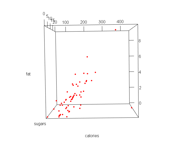
From the above plot, I find that the general relationship between fat and calories is positive. As the fat increases, the calories also increase.
And a special point in the right corner has zero fat and highest calories, which do not follow the general pattern.
Part A:
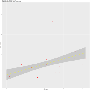
I plot the mean Capacity as a function of week number, comparing four years 2012-2015.
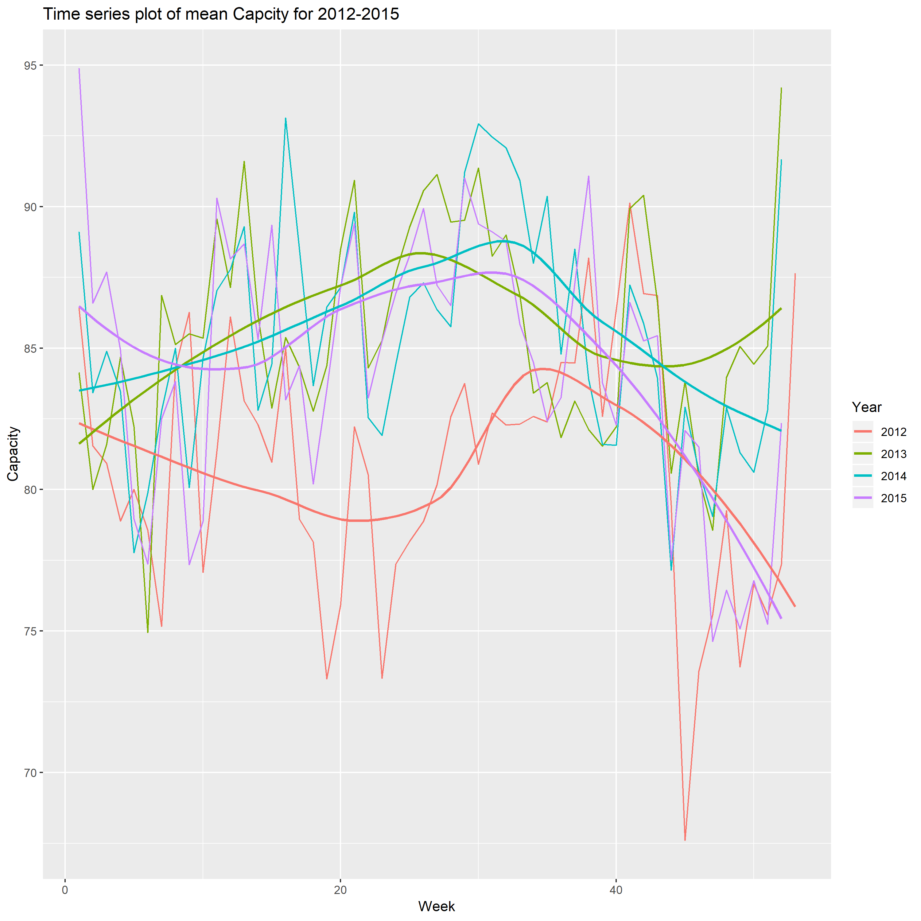
From the above plot, I find that when the number of week is about 30, the mean of capacity reach a peak, and the capacity has significant increase from 2012 to 2013, and does not have obvious change for the rest three years. The another interesting thing is the biggest decreases are from week 35 to the end of year, and reach the minimum on the week 52. In my opinion, the audiences would like spend more time with their families celebrating holiday.
Part B
Form the contour plot using different color set
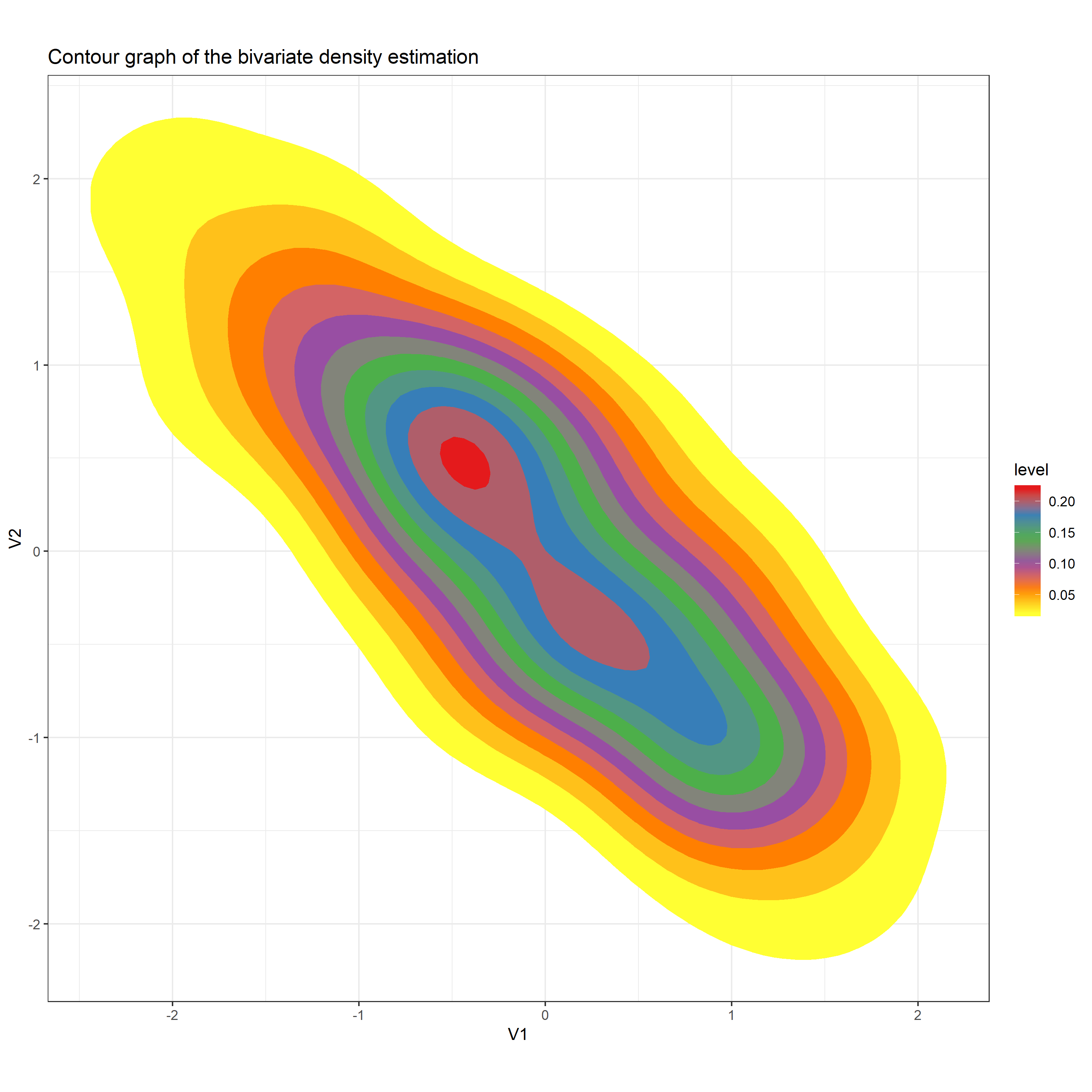
I select Set1 to be the Palette in the function Scale_fill_distiller. After running the code, I got the above plot. The reason why I think this plot is better than the plot shown on Canvas is that this contour plot is formed by a set of color which distinguish the different levels clearly. The contour plot shown on Canvas does not give a clear vision.
The simulated data (x,y) where the true signal follows one of the curves
Curve 1: sin(x) + cos(x),
Curve 2: sin(x) – cos(x),
Curve 3: sin(x) * cos(x),
Curve 4: .28 – .88 * x – 0.03 * x^2 + .14 * x^3.
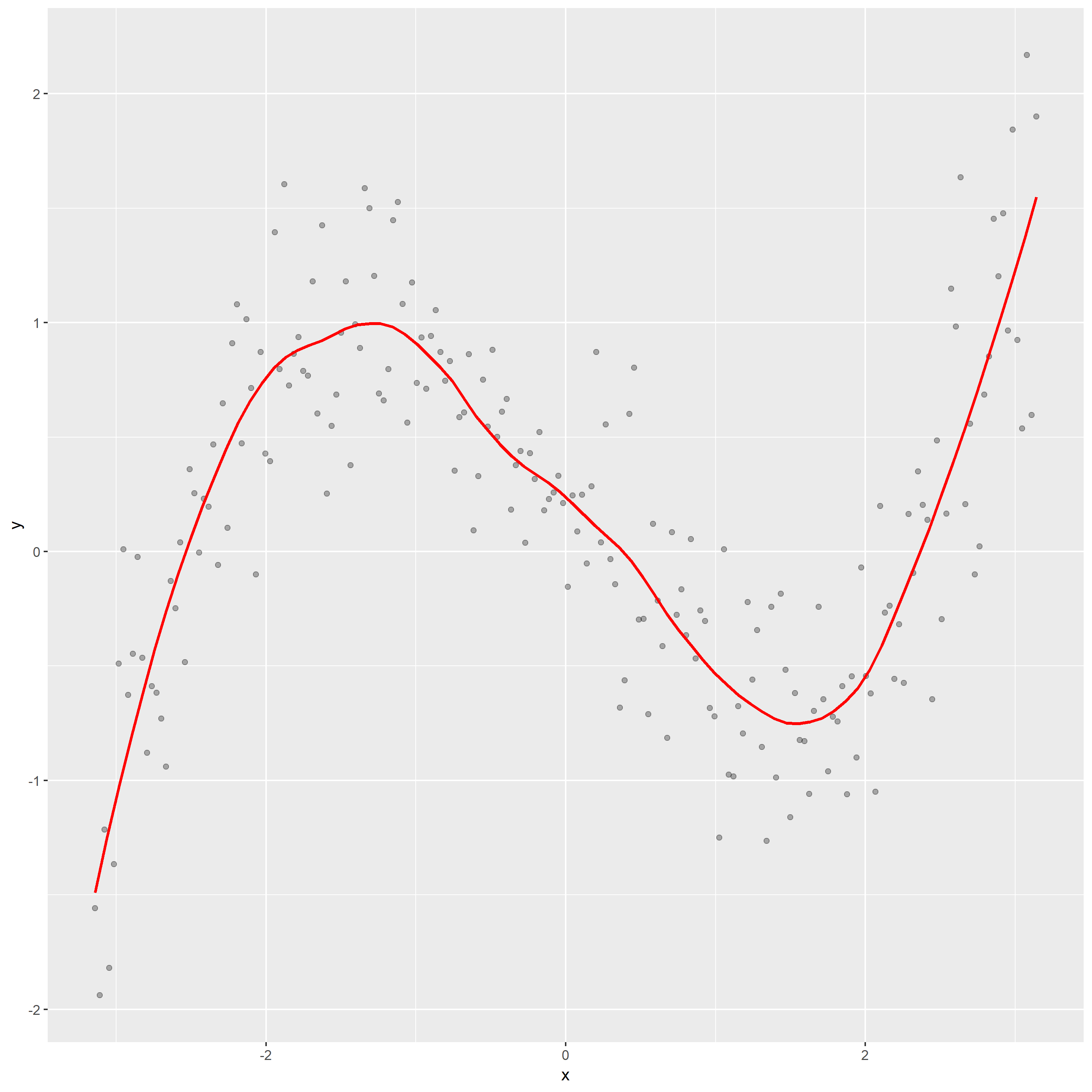
1.Construct a scatterplot of the simulated data and overlay a loess smooth.
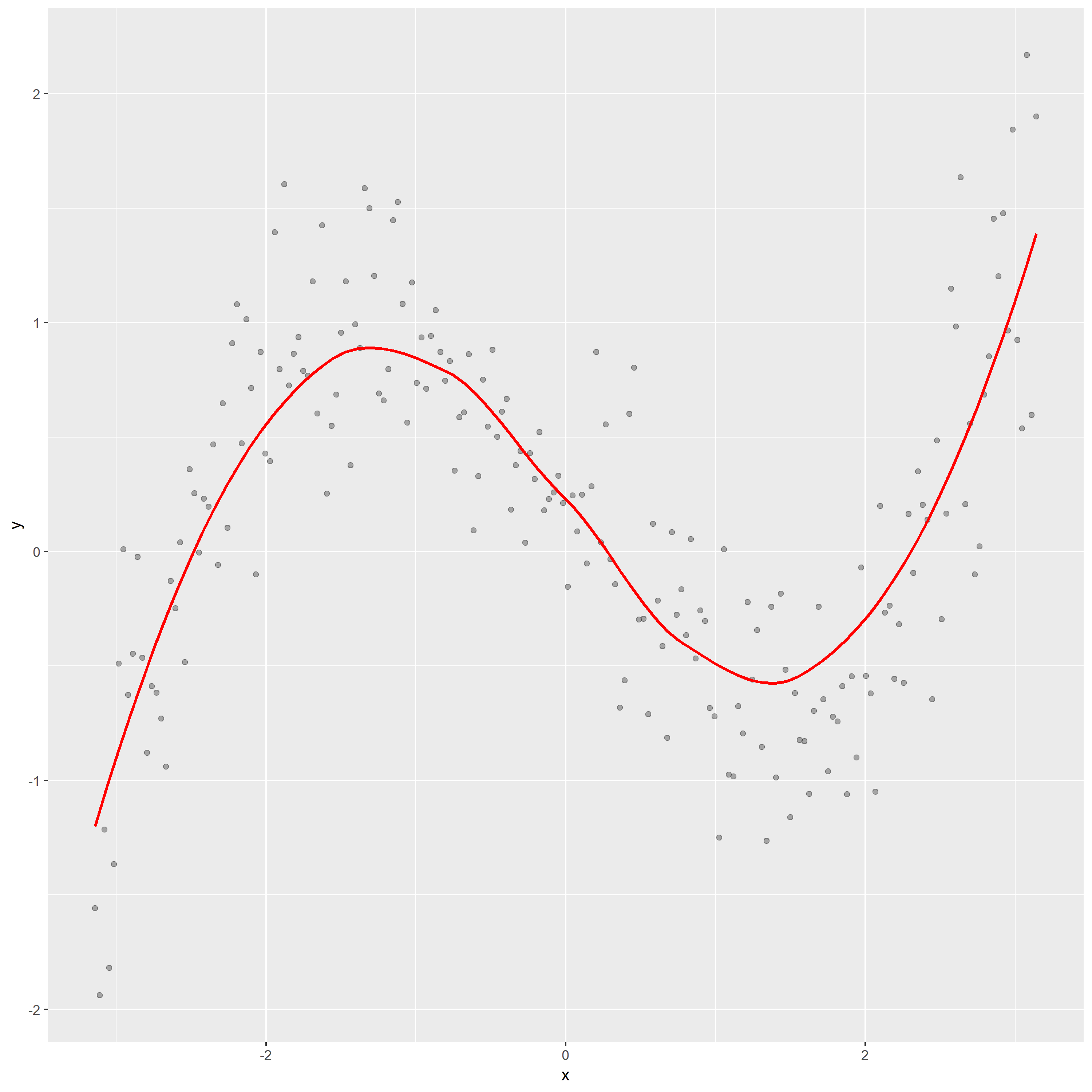
In above graph, the loess curve shows that the relation between y and x is nonlinear. According to the overall shape of loess curve, it seems like the curve 4, which indicates that the response y follow this curve: .28 – .88 * x – 0.03 * x^2 + .14 * x^3.
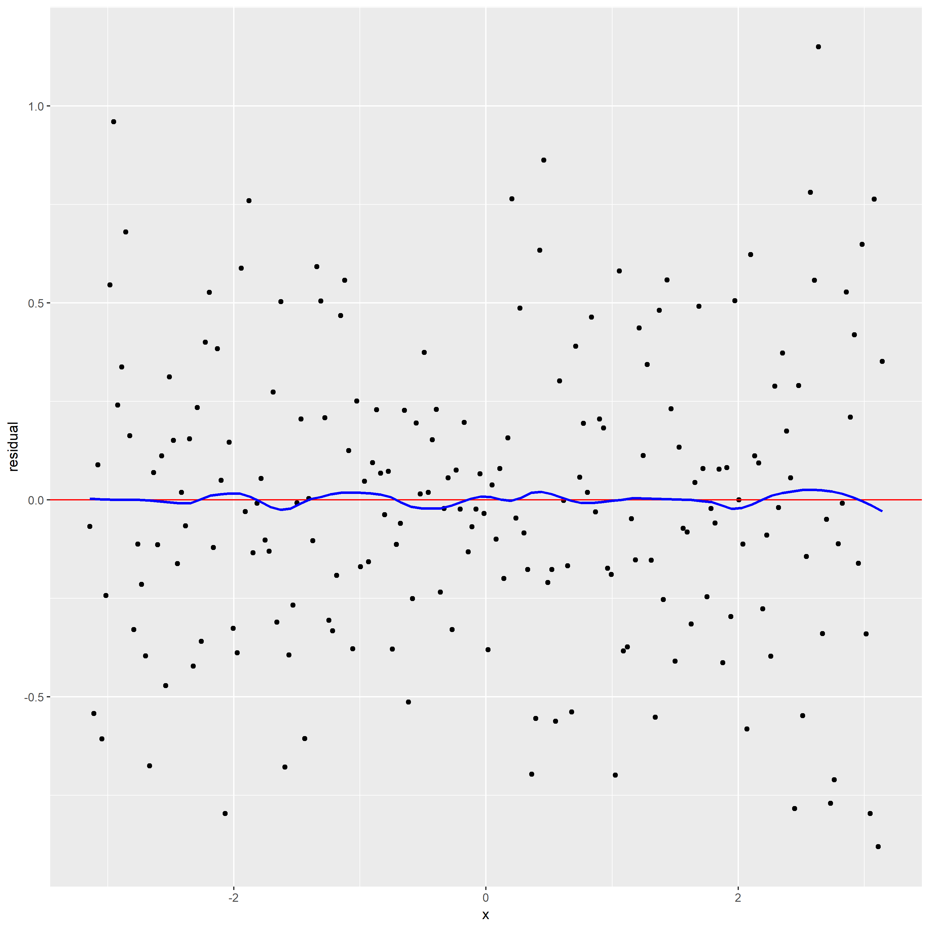
2.Construct a plot of residuals and comments
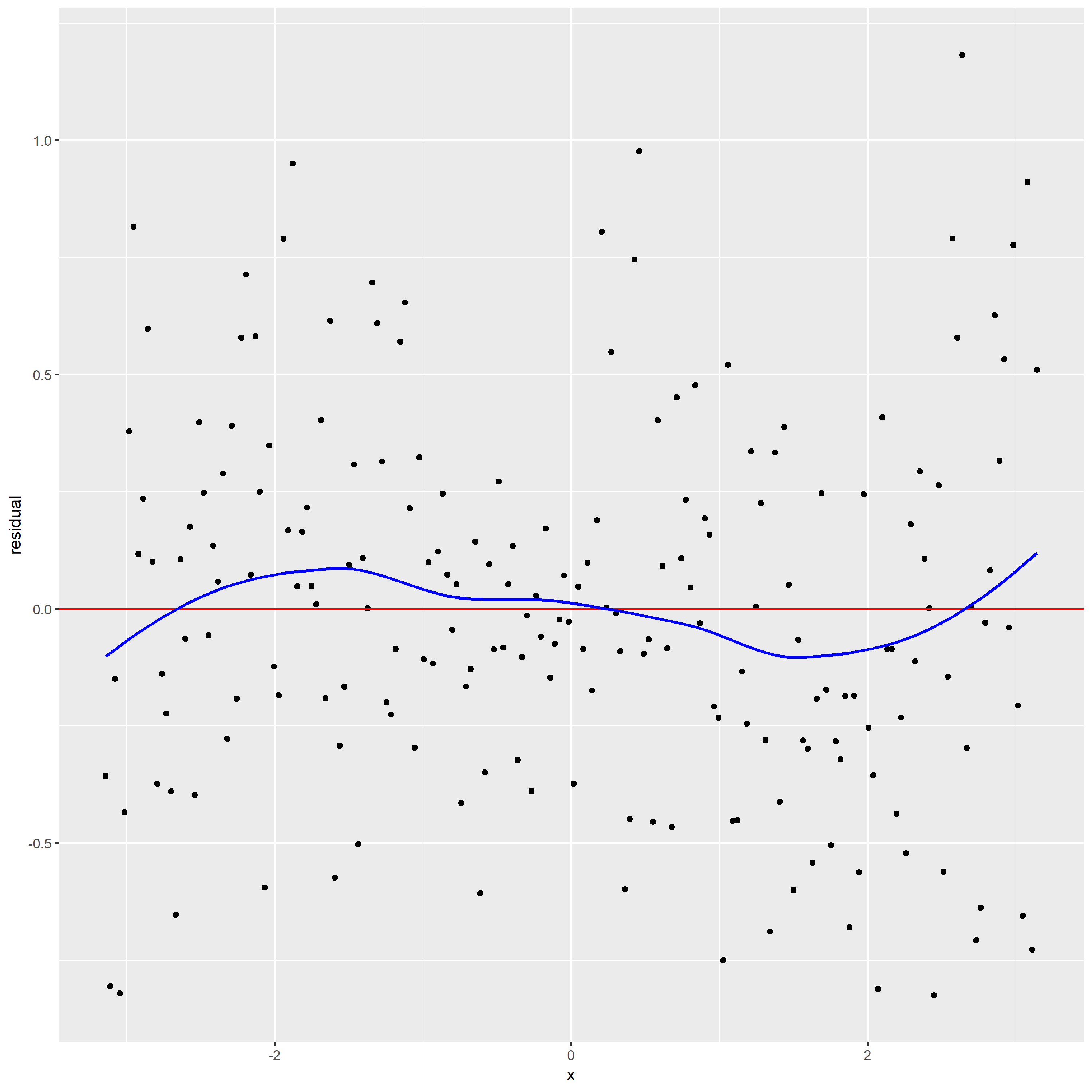
From the residual graph with loess curve superposed, the loess curve is not a horizontal line, which suggests there is a dependence of the residuals on x. It indicates alpha maybe too large leading loess smoothing has missed part of the pattern.
The loess curve in scatterplot has effectively found the signal. But the loess curve in residual graph does not have effectively found the signal.
3. Use better loess smoothing parameter draw scatter plot and residual plot.
For this time, I choose span=0.3. The top one is scatter plot, the bottom panel is residual graph.
From the residual graph, the loess curve is nearly a horizontal line, which shows no dependence of the residuals on x. It also indicates that the loess curve with alpha=0.3 is not distorting the underlying pattern.
Then, according to the new scatterplot, I think f is .28 – .88 * x – 0.03 * x^2 + .14 * x^3 (curve 4) since the pattern seems like the curve 4. And for this time, we eliminate the problem that x effect the residual since the loess smoothing parameter is too large.
I collect the temperature of five cities for five months. This data table shows below where the response is the average high temperature in Fahrenheit, row classification is city, column classifications is month.

#Graph 1. Find the mean response for each row. Construct a dotplot of the means where the means are ordered from high to low.


In this above plot, the x value represents the mean of temperature from January to May. And the data is ordered from largest to smallest. So, Phoenix has the highest temperature among these five cities in first five month. And the temperature of Adak is distinctly less than other cities.
Graph 2. Construct a dotplot, grouping by rows.

For this above plot, I construct a dotplot grouping by City. I find that the temperature in May always is largest one than other months. And ranges of temperature for Phoenix, Montgomery, Acampo, and Addison are almost equal. But the range of temperature for Adak is much narrower than others. Finally, we can observe that the means of different cities are roughly same as the first graph.
Graph 3. Construct a dotplot, grouping by columns.

This dotplot grouping by column Month. From this plot, I find the temperature increases when time goes by for five cities. But the temperature of Adak has the least growth than other cities.
At the end, I find draw a dotplot by grouping the data by row or column is a better option, since it allows us to effectively decode the distribution of quantitative data from different angles and enhance data visualization.
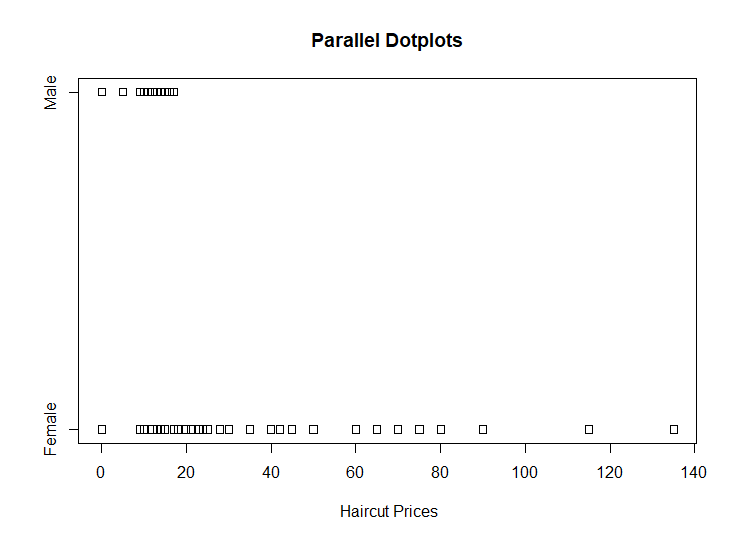
1.Construct parallel one-dimensional scatterplots of the variable by gender.
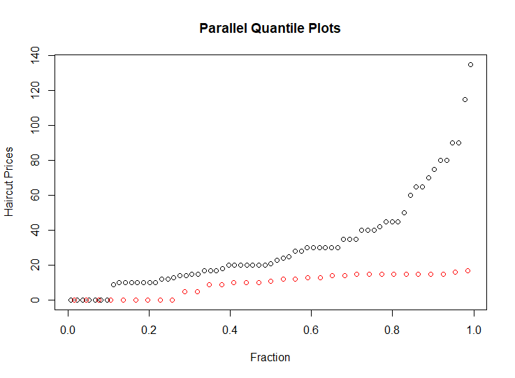
2.Construct parallel quantile plots of the male values and of the female values.
In above plot, the red circles represent the male, the black circles represent the female.
This plot shows that the median of the haircut prices for male is near by 10 dollars, the median of the haircut prices for female is about 20 dollars. And the upper quartile and lower quartile of haircut cost of female are larger than males’.
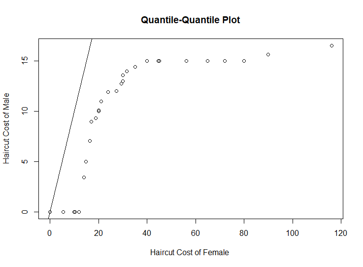
3.Construct a quantile-quantile plot of the male and female values.
4.Construct a Tukey-m-d plot from the quantiles of the two samples.
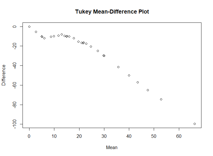
The above plot shows that throughout the entire range of the distribution, the haircut cost of female are greater than the haircut cost of male. And for the top half of the distributions, haircut cost of female are typically 0 to 30 higher, and that for the bottom half the difference ranges from 30 to 100 in going from the median to the highest quantiles.
The quantile-quantile plot provides the best graphical comparison of the two set of measurements. Since q-q plot give us a detailed comparison of the two distributions, It can reveal the complication of data distributions to us.
Here is NBA 2017-18 season standing. I used these data complete this blog assignment.
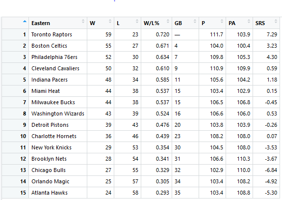
This data set contain seven variables and variable W, L, P and PA are numerical variables. The data is the season summary for 15 teams of the Eastern Conference of the NBA. I used the following variables to graph the above plot.
W – the number of games won
L – the number of games lost
P – Points per game
PA – Opponent points per game
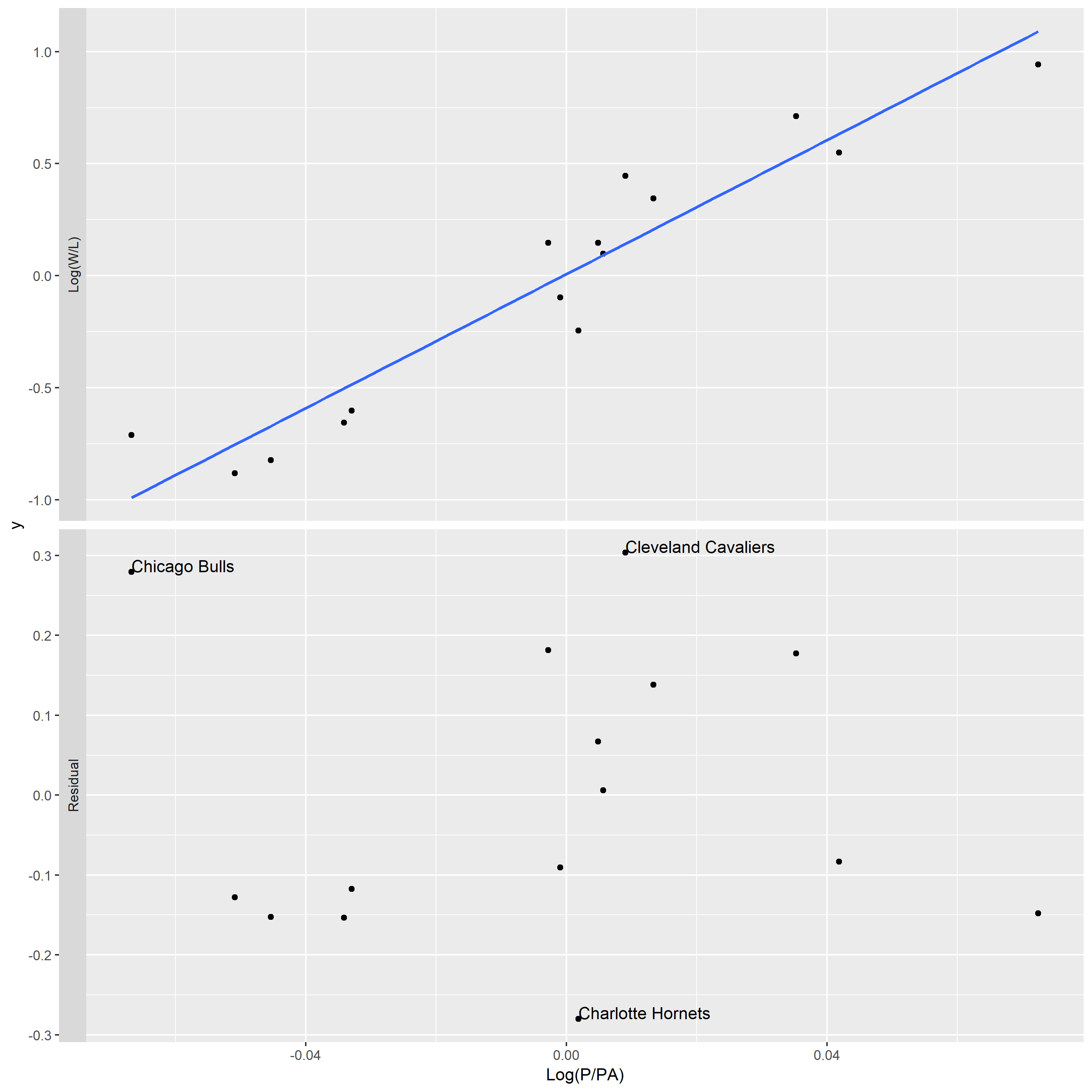
In the top panel of plot, the overall pattern of data follow a trend that Log(W/L) goes up when Log(P/PA) increase. But it is hard to assess the residuals since the points of the plot lie in a narrow band around the line. Then, based on the bottom panel of plot, the percent deviations of the actual Log(W/L) from the ideal ones range between about -20% and 20%.
In the top panel of above figure, the fitting line go through point (0,0) and point (0.04,0.12). So, the best fitting choice of k is 3.
The unusual teams are Chicago Bulls, Cleveland Cavaliers, and Charlotte Hornets. In my opinion, Chicago Bulls is lucky teams, since they win games with smaller points scored by their team.
The first stacked bar plot
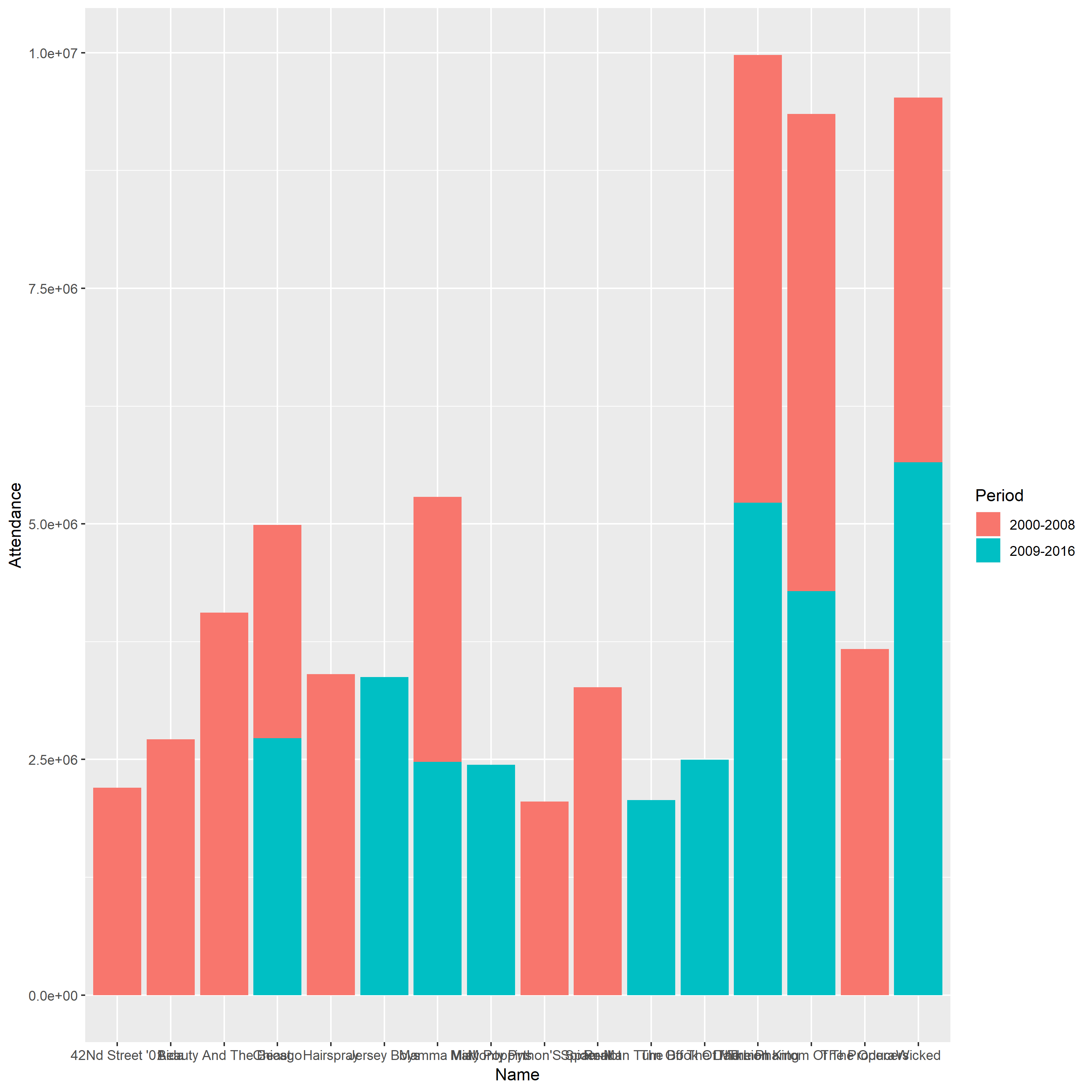
Problem
1.The bars of this plot are arranged arbitrarily, which make the figure become more confusing and less intuitive.
2.The labels of each bar cannot be discerned since them take up a lot of horizontal space.
3.The vertical scale line does not have detailed description and this plot does not have descriptive title.
The improved stacked bar plot
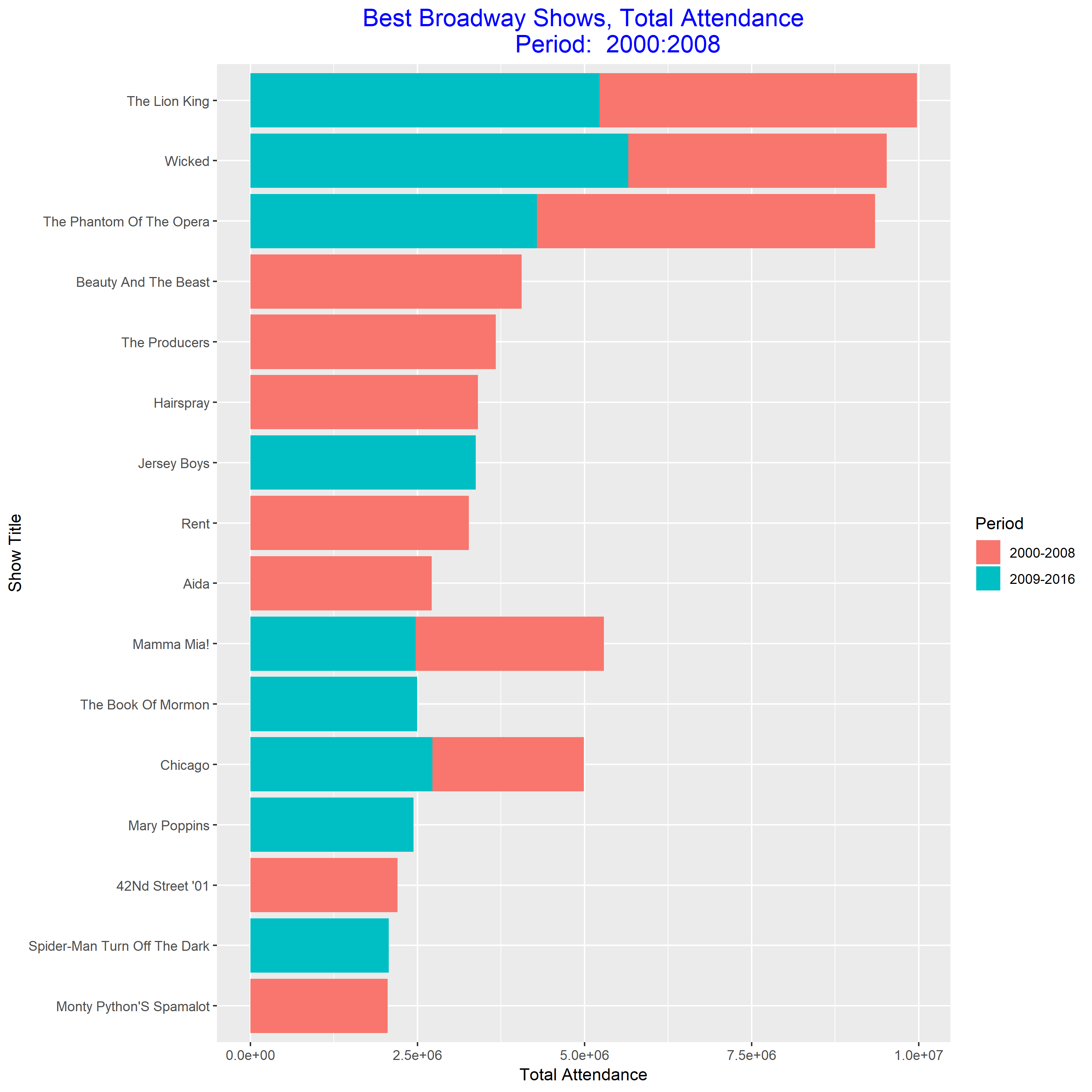
This plot is much easier to read than the previous one. From this plot, we know that “Wicked” is the best show during 2009-2016, and “The Phantom of the Opera” is the best show during 2000-2008. And “Wicked” become more and more popular.
The first grouped bar plot
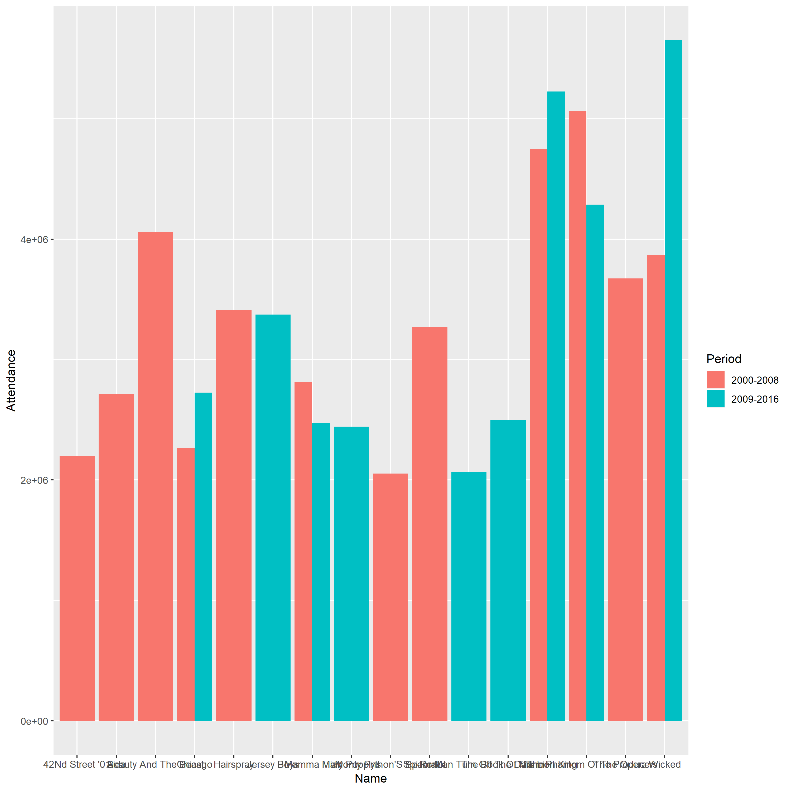
Problem
1.The bars of this plot are arranged arbitrarily, which make the figure become more confusing and less intuitive.
2.The labels of each bar cannot be discerned since them take up a lot of horizontal space.
3.The vertical scale line does not have detailed description and this plot does not have descriptive title.
The improved grouped bar plot
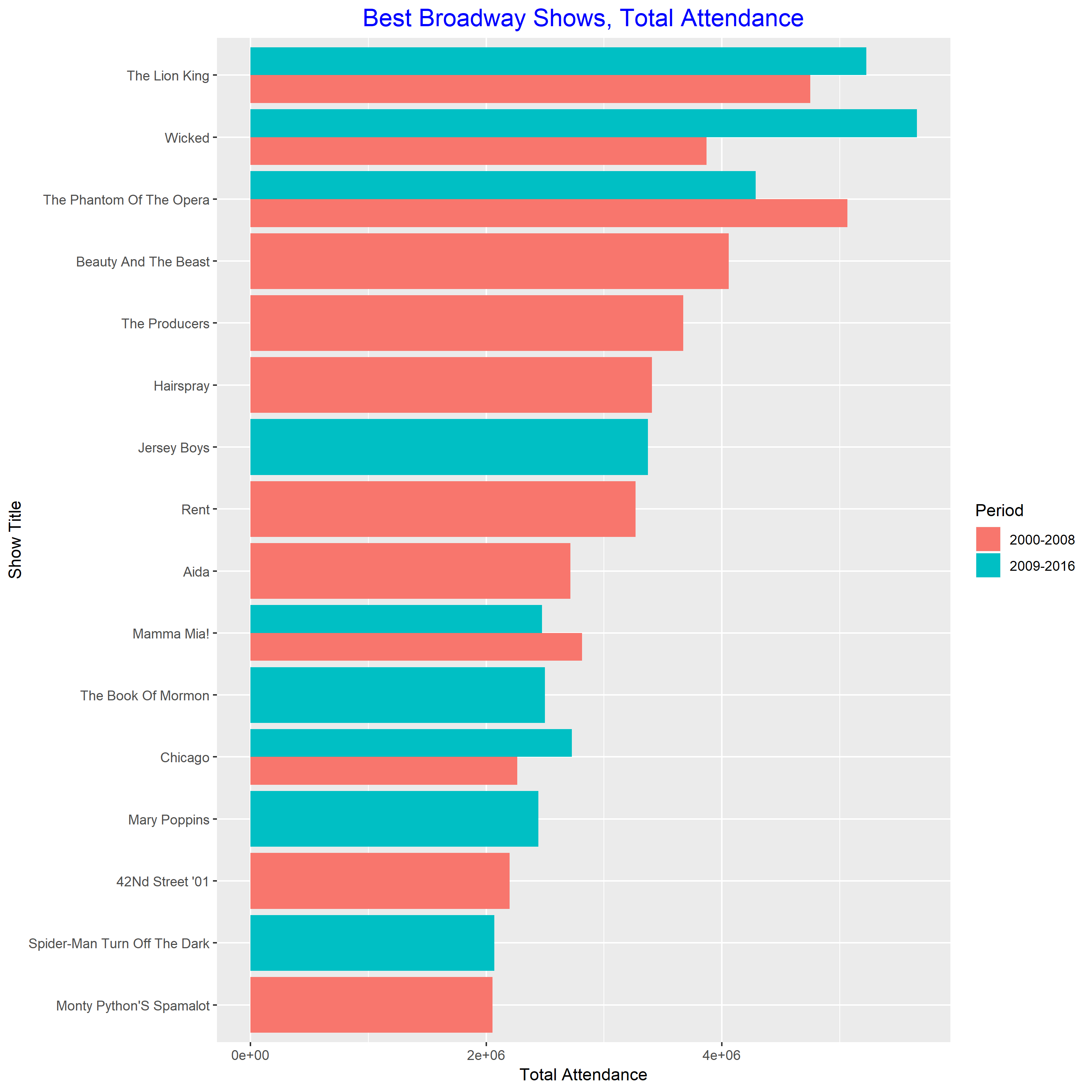
This plot is much easier to read than the previous one. From this plot, we know the best show in 2000-2008 is “The Phantom of the Opera”. The best show in 2009-2016 is “Wicked”. And both of them are very popular during 2000-2016.
Part I
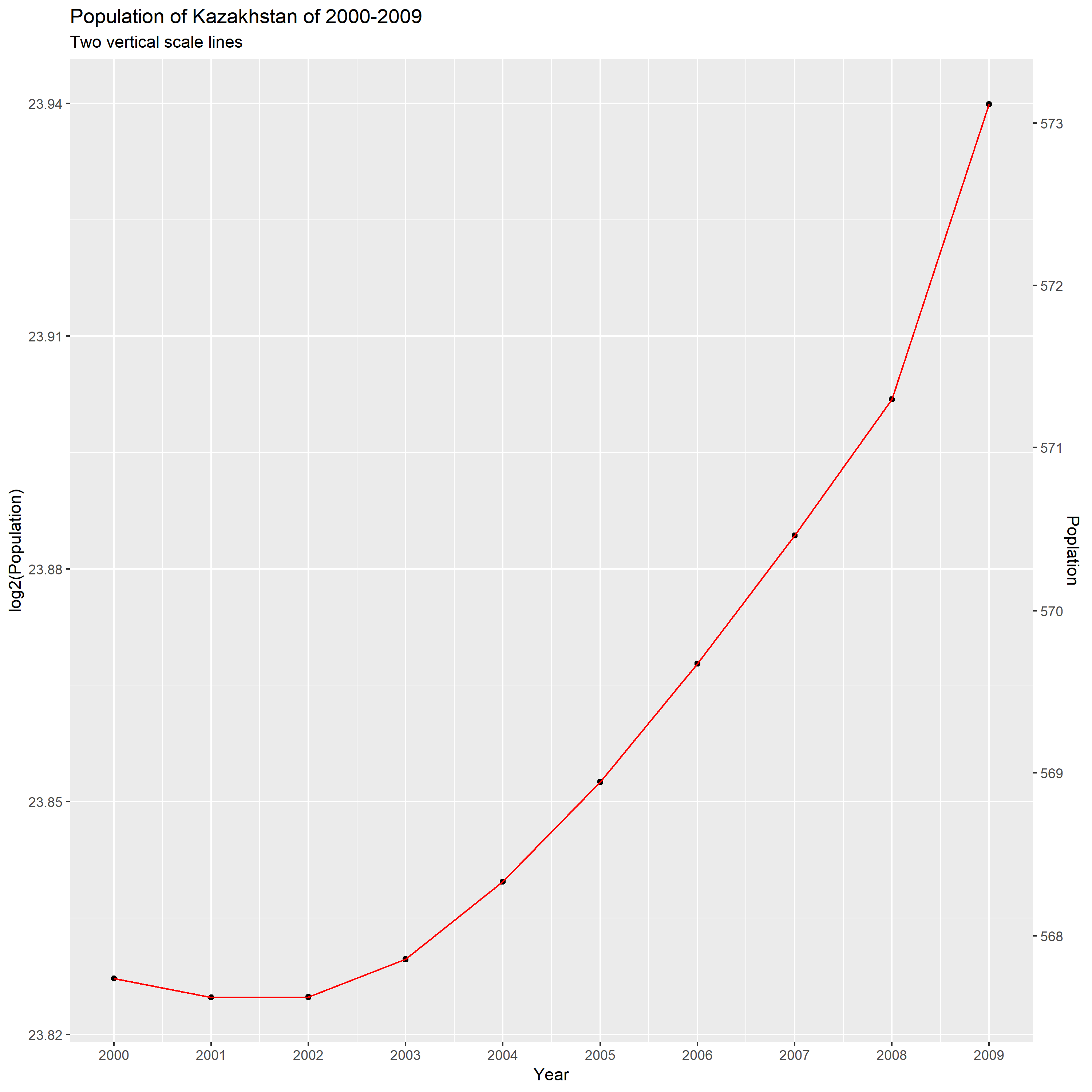
From this plot, we can know that the population grow faster and faster as it gets larger during this decade. And we can know that the percentage increase in population is unstable and increasing. According to the following calculation, we can know the Kazakhstan’s population of change percents is 8%.
23.94-23.83=0.11; 2^0.11=1.08; 1.08-1=0.08=8%
Part II
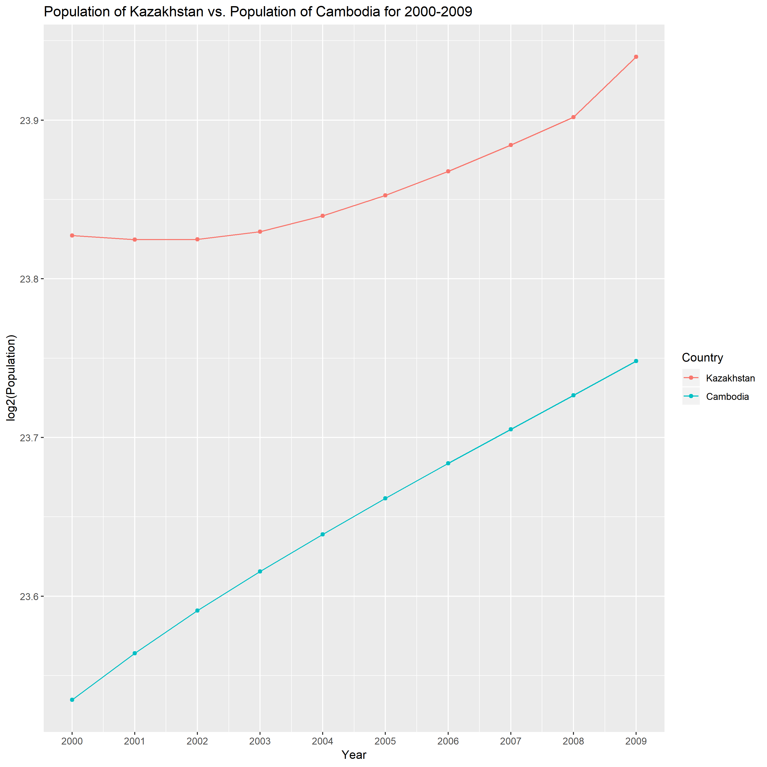
The second country is Cambodia. From the above plot, I observe that the percentage change increase of Cambodia through this ten year has been roughly stable. It is different with Kazakhstan’s growth pattern.
This dataset UScereal involves the nutritional information for a selection of US cereals.
Part I
Good display
Bad display

The modified graph violate the following elementary principles of graph, which make the modified graph has unclear vision.
1.do not allow data labels in the interior of the scale-line rectangle to interfere with the quantitative data or to clutter the graph.
Some points are obscured by the tick marks and the regression line.
2.tick marks should point outward.
The tick marks all point inward and obscure the data inside the scale-line rectangle.
Part II
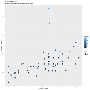
In the new graph, I use color to add protein variable in the graph. I delete the regression line in order to make the data stand out and avoid superfluity. And I change the size of the plotting symbols to prevent being overlooked.
From the new scatter plot, I observe that higher protein contains higher calories for one portion. The cereal has higher protein could contain higher sugars.

The data includes the instructional fees (per term) for BGSU for selected years. Then I created a scatterplot of year against log10 of instructional fees. Based on this scatterplot, I observe that the instructional fees increase rapidly in 1960-2010. In past eight years, the growth speed of tuition is slower than before.
I find that understanding and applying a new function into my case are pretty hard in sometime.
Welcome to blogs.bgsu.edu This is your first post. Edit or delete it, then start blogging!
I create a scatterplot through R to show the relationship between Horsepower and Mileage based on the data collected by motor trend magazine.

When horsepower is less than around 250, mileage decreases as horsepower increase. When horsepower is bigger than around 250, mileage slightly increases as horsepower increase.