Archive for October, 2012
The Use of Space in The Great Dictator
0 The film I saw was The Great Dictator, written, produced, directed by and starring Charlie Chaplin in 1940. We can see Bruce Block’s visual element of space used in the film in it’s many forms. In the film, there are many shots representing flat space, deep space, and ambiguous space.
Block says that “Flat space emphasizes the two-dimensional quality of the screen surface” (Block 43).This can be seen in many shots in the movie since a lot of the film but probably the most memorable would be the ending scene when The Tramp gives his speech to the masses when he was mistaken for the Hinkle (Chaplin 1940). Some of the other flat space shots may be a result of the time period in which it was made. The 1940’s was when filmmakers just started to make the transition from flat, staged studio shots to more deep space and depth of field shots. This is also when the camera started to become more mobile. Seeing as Chaplin was most famous for his films made in the 30’s which were silent and held true to the typical 30’s film-making style, it is not surprising to see he still held some of that style even as he went into his first non silent movie. It is really interesting to see someone who was successful in one form of storytelling allow himself to reinvent his art with the changing of the times (and be good at that too) as well as retain some of he elements that made him famous in the first place from the old style.
Chaplin wasn’t new to the idea of deep space shots for The Great Dictator , because we can see he experimented with it in his older films, such as The Kid where all the scenes out on the street can be considered deep space. This is true for the street scenes in The Great Dictator as well, when they are walking down the street, the road creates lines to indicate that it has depth to it. Block says “Deep space is the illusion of a three-dimensional world on a two-dimensional screen surface” (Block 14). Chaplin furthers this illusion when on a studio stage by using back drops to create the sense that the scene is deeper than what it actually is. This is visible in the scenes on the rooftop of the house in the ghetto, where the actual physical rooftop surfaces end and a drawing of many rooftops in the distance is places in the background to give the illusion of deep space even when it is flat.
Block says “Limited space is a specific combination of deep and flat space cues” (Block 52). This type of space can be seen on the set right out side the barber shop, next to the brick wall with the open doorway, the space above the wall and the windows of the building next to it. The wall creates a flat space but the open doorway gives it an opening into set inside. When The Tramp is talking to one of the stormtroopers inside the doorway while the stormtrooper is outside the doorway, it creates a limited space. Add onto this when the lead female leans outside of her window to hit the stormtrooper and this creates an even more limited space effect. On a side note, in that specific scene the camera goes from limited space to deep space as The Tramp gets hit in the head by mistake, he starts to walk down the street revealing the lines of the road to look like it keeps going into the distance. Then he comes back into the limited space shot.
It is interesting to see how relevant these ideas of space have been since the beginning of film and how the are a part of the technology and techniques used back then. I very much enjoyed the film and it is one of my favorites now. It was truly funny (beyond words funny), and truly inspiring. I think it proves just how much of an impact a film can have not just on an individual but on society and on the world.
Inspiration for my moving logo for Applied Aesthetics
0
The simple shapes and colors of the New Line Cinema logo appeal to me and I tried to use the same kind of idea of simplicity in my logo. Also how the shapes kind of come together to form an image can be seen in my logo as well. It’s a smooth little clip with not a whole lot going on, but I think the subtleness of it wont distract from the movie to be coming after it. If you have a completely wacky and goofy logo and then put that at the beginning of a more dramatic movie, it will stand out negatively I think. By keeping my logo general and not too themed keeps the audience fresh for the kind of movie that is about to play after it, as I think New Line Cinema was trying to go for as well.
Production Logo Concept
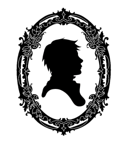
0The title on my production logo will be Juxtapose Films. The color pallet will be black and white, and it will include a cameo style Victorian silhouette. I chose this title because many of my interests and aesthetic tastes center around the idea of juxtaposing two styles into one visual component. I am using black and white to give contrast and I chose the Victorian silhouette because the Victorian era is a time period I like to reference in my art. It is also there so I can begin one of my movies with a symbol referencing to the time period in which movies were born. Something like what I inserted below but a woman instead.


