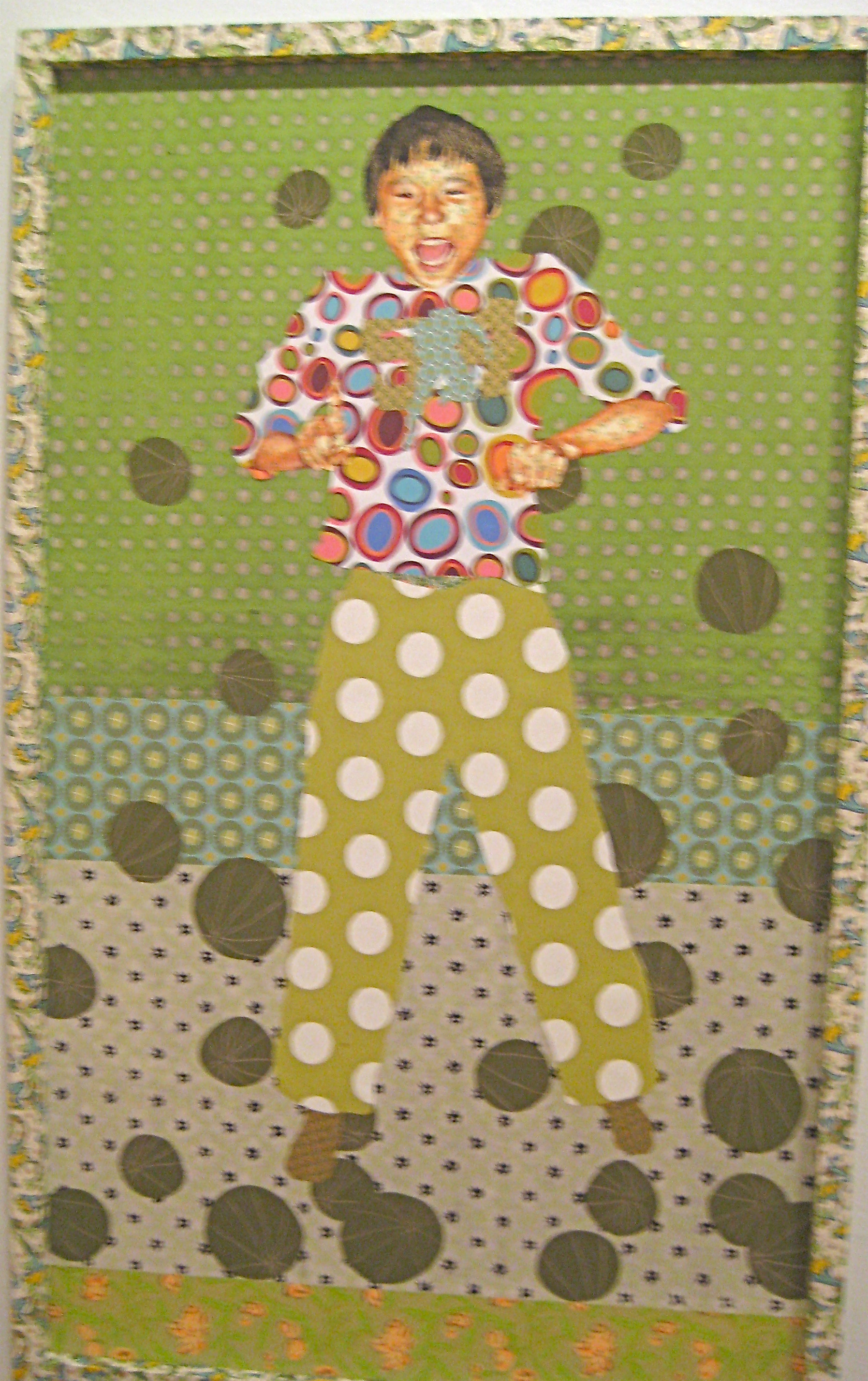
 This piece, titled …Number 54…Bo!, is an example of a composition utilizing color to enhance the viewing experience. The colors are various shades and tints of green, blue, red, orange, and yellow. This color selection suggests that the artist was attempting to use the principle known as split complementary, where the hue of the green is paired with the two hues on either side of its complement. These are the colors red-orange and pink-violet. Furthermore, blue is paired with the hues yellow and orange-red which are also placed on either side of its complement. Complementary contrast between the green and red hues adds even more variety to this piece. Variety can also be seen in the intensity or saturation of hues. The different intensities and shades of green allow the artist to overlap shapes in a way that creates a sense of perspective. Because the overall piece is comprised in mostly lighter tones of color, the viewer feels a sense of joy—a warm emotion that is also reflected in the boys face.
Image Essay #4
Mar 31st, 2009 by erynp