In-Store Display
The product I chose to do an in-store display of is Apple ipods. I chose ipods because they are extremely popular but I don’t think any of the displays I have seen promote them well. The one I saw in walmart doesn’t allow them to stand out and when I was searching for them I couldn’t even find them. This is what the display looks like in walmart: 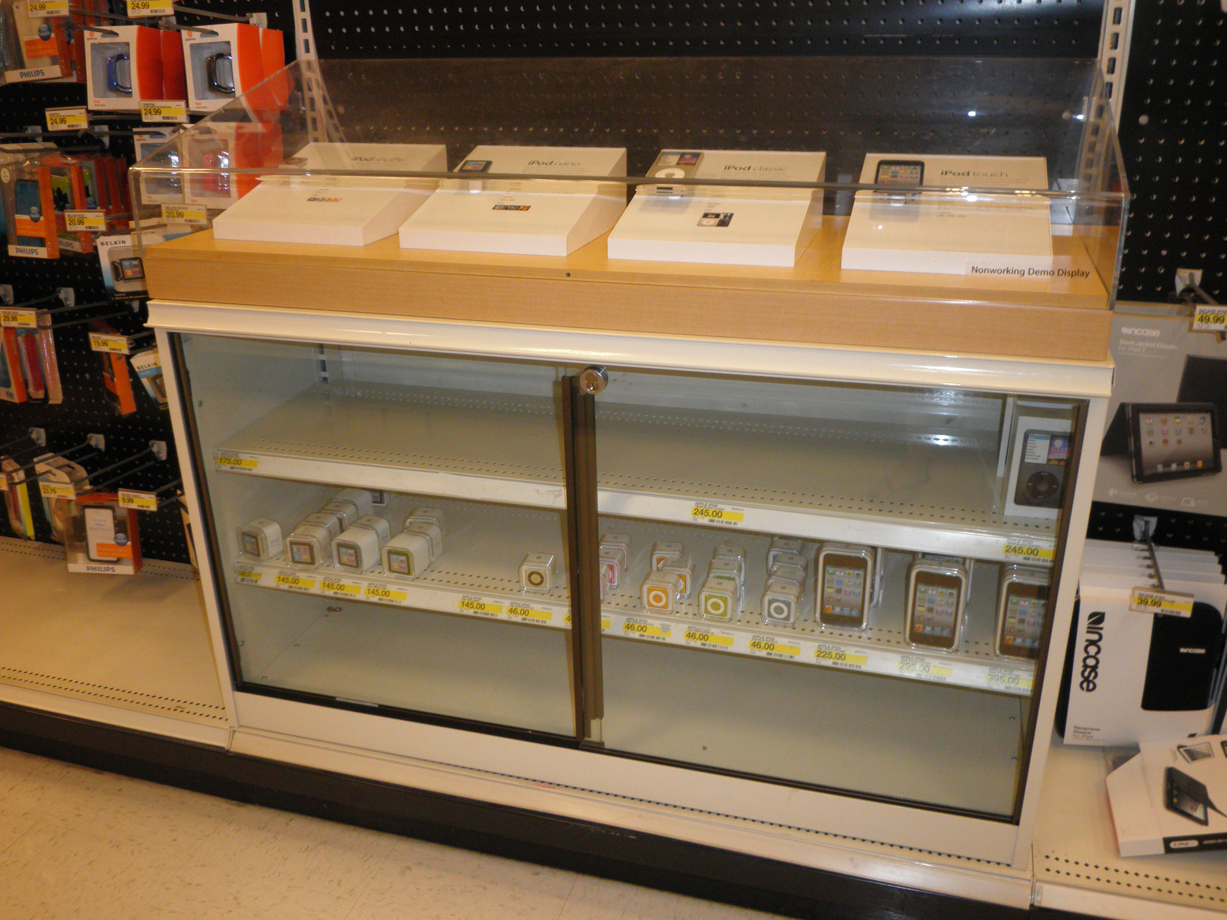
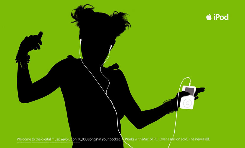
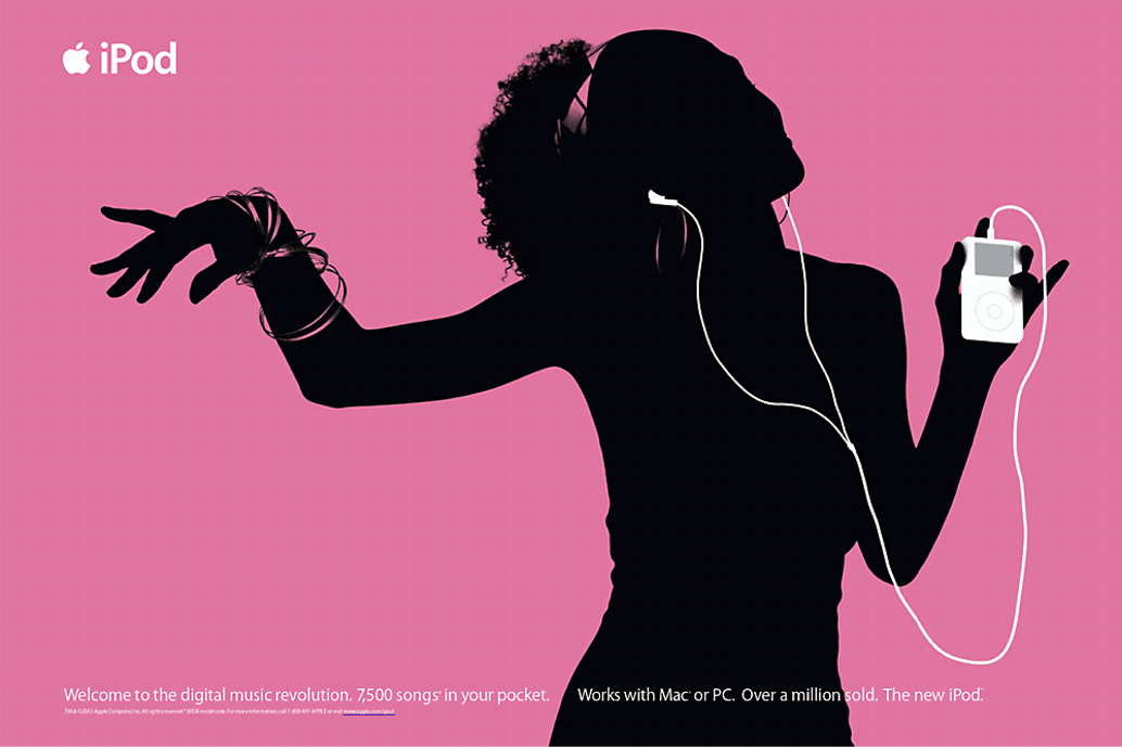
It isn’t too bad, it is simple and clean, but it isn’t the way I think they should be promoted. In my opinion, they should use the colors that they picked for the ipods in a fun and interesting way so that the in-store displays are eye-catching and make people want to buy an ipod. I found a few examples of companies trying to incorporate the colors in to their displays but not too many. Here is what I found:
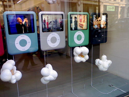
These displays are more exciting then the walmart display and I am sure they get more attention then the ipods at walmart. I want to design a display for stores like Walmart, Target, and Best Buy because in the apple store you know you will find an ipod but in the other stores you might not expect to find one and with the display I want to design the customers would be drawn to the ipods. When researching I found a very interesting display and it was the first one I found that I thought was very appealing to customers.
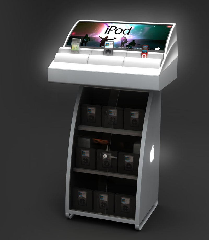
This is the best ipod display I have seen and I think if this was in stores like Walmart they would sell a lot more ipods because of it. A few displays that I don’t like are:
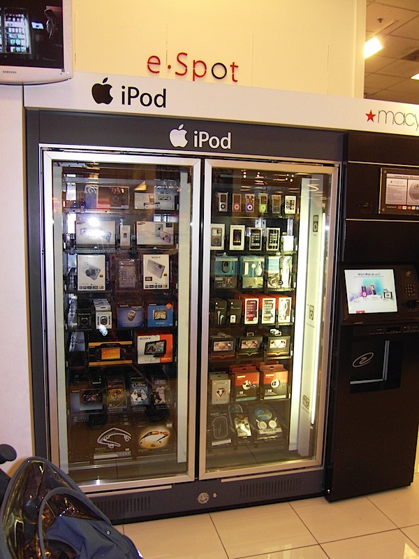
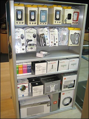
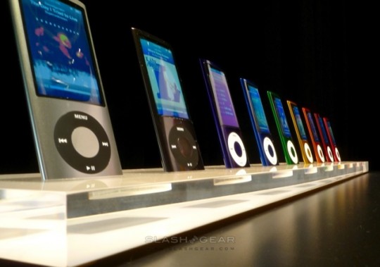
I find these displays to be very boring and not something that will attract customers. The first one is a display where you can purchase something right from it, but I still think it could be designed better to allow customers to be drawn to it.
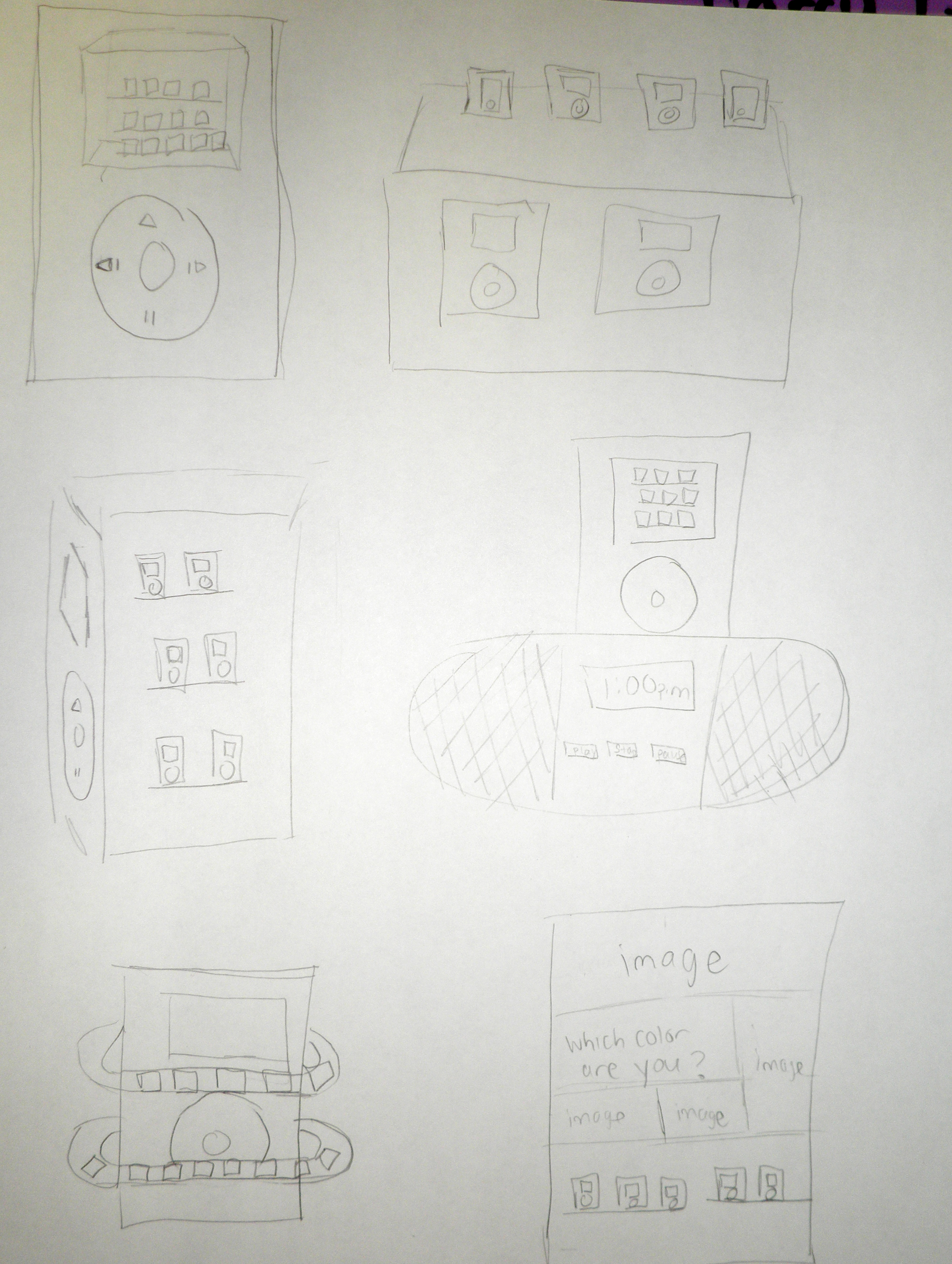
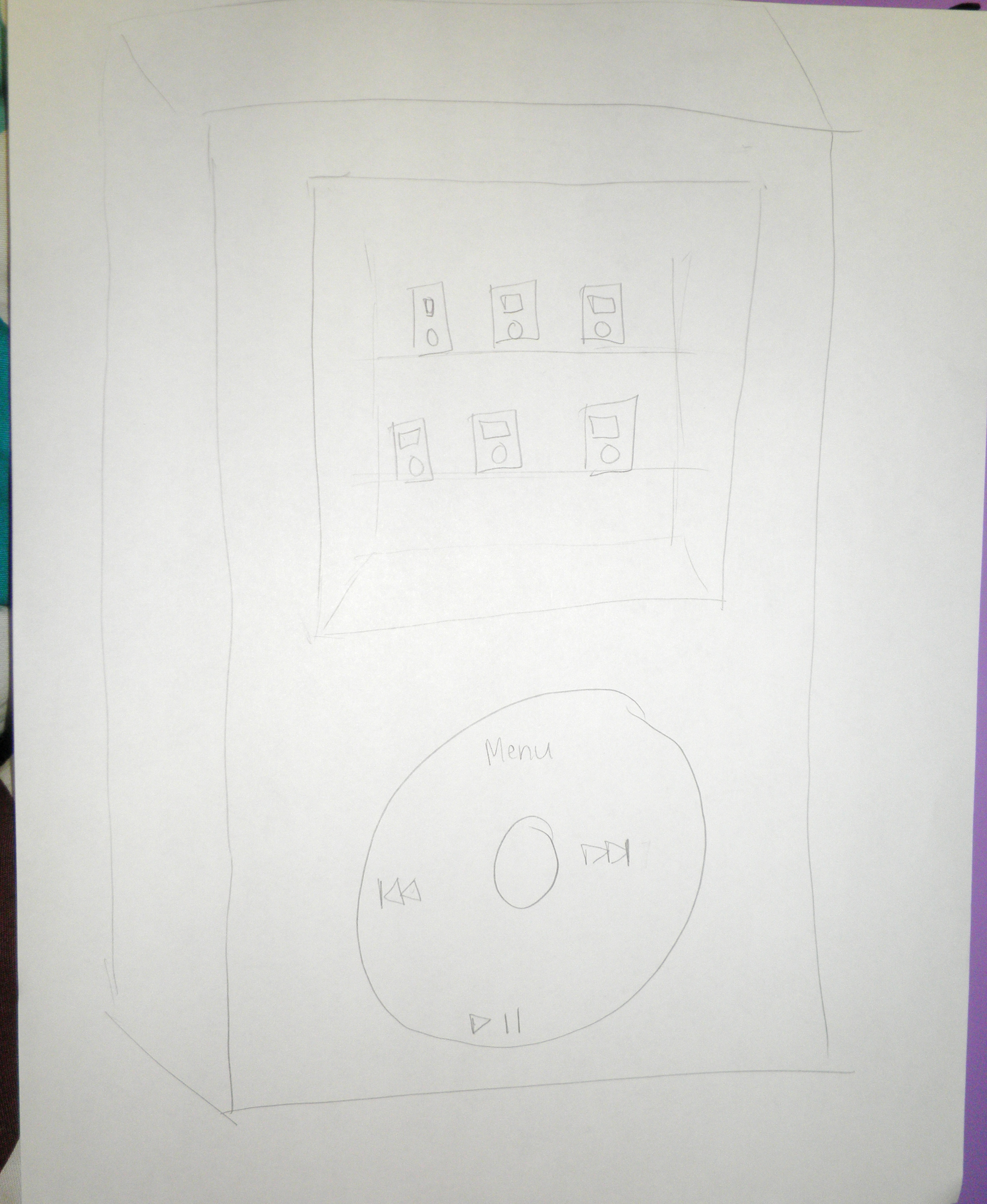
Here are my thumbnails and comps:

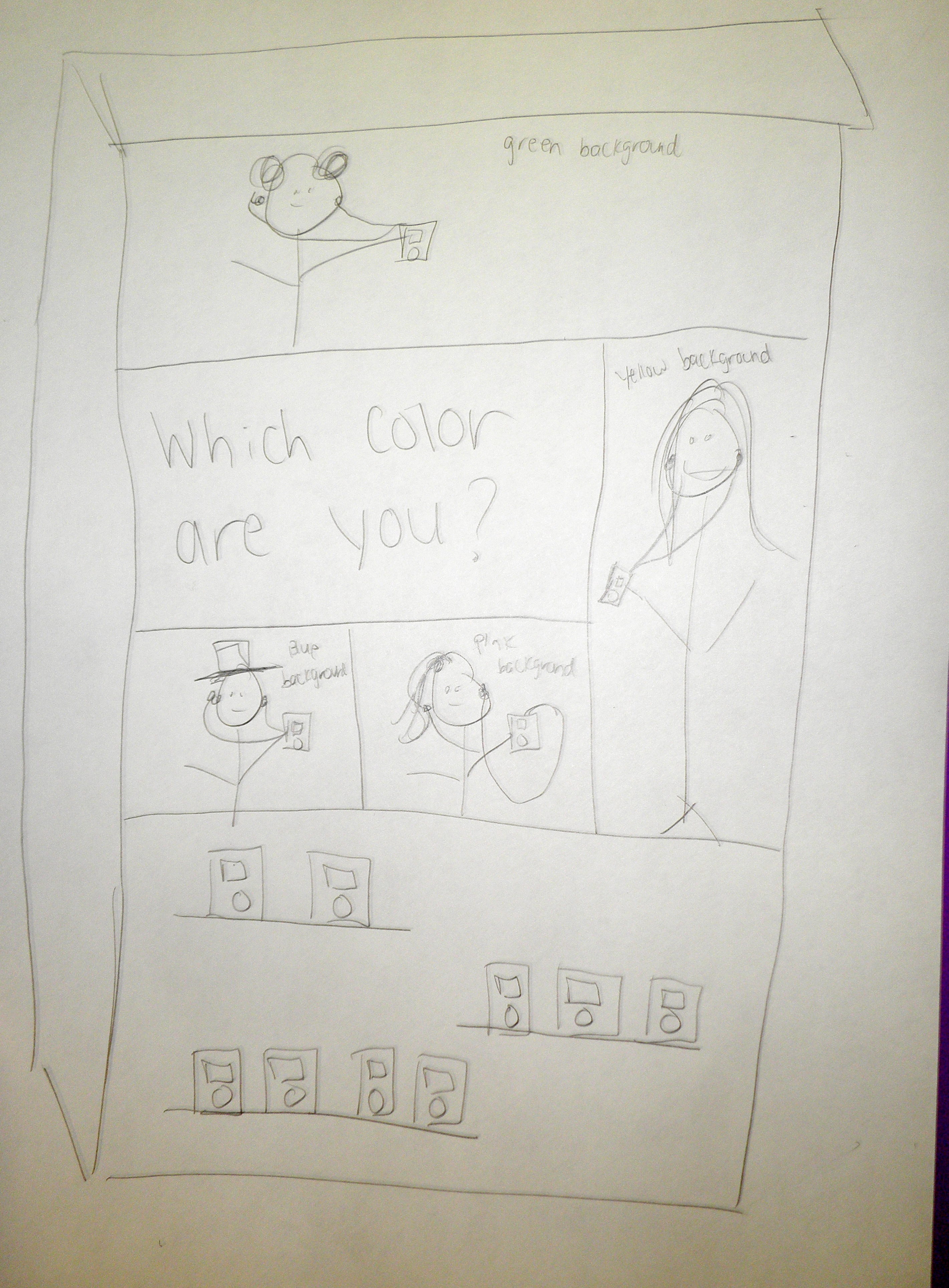
These are the images I will use if I select the comp. directly above this: