
Director – Steven Spielberg
Starring: Leonardo DiCaprio, Tom Hanks
The existing posters have a common theme. They are all clean and to the point. Not a lot of graphics are use and the typeface can be the most imp
ortant part of the message.
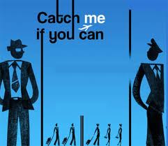


For example in this poster The images are blurred out. It’s no important to see the action just important to know something is going on.
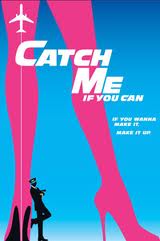
In this poster contrast is key but never overpowers the text. It would seem like the pilot is insignificant and is just apart of the movie. The plane catches my attention but the legs make me think that there is a important female character. 

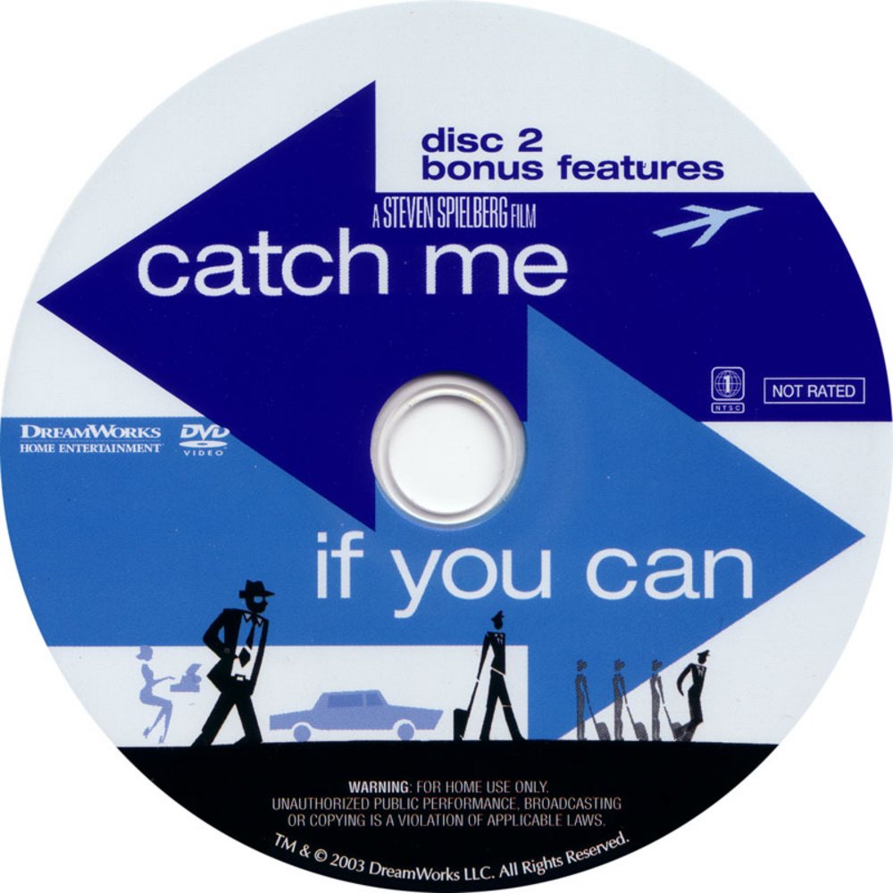
The DVD/CD cover that I found resembles the most popular posters but isn’t a exact duplicate. The n noticeable difference is what should be in my DVD cover.Images
I am choosing to do a a make over for the movie. I watched the movie myself so I think I could add some key aspects into the movie. Also, the movie puzzled me at first so I decided to play a little on that. The one thing that I am keeping guaranteed is the that the font will run the show. I will emphasize the name of the movie because it is what brings the movie all together.
I am going to stick with the clean and simple aspect of the poster. The colors that I plan to use are blue, white and yellow. I also plan to make the text an element. With that said I will have an overall element will be four. One puzzle, one check, one airplane and some text.
Thumbnails + Comps

Final Designs
Final Thoughts
I like how everything turned out. Om particular my dvd cover has the elements that I have in my poster and they both relate to each other.
The most critical part of this was getting my concept out of my head and to materialize. It became apparent to me aafter I got all the elements down that they didn’t flow. On my next assignmet I think I will try to identifiy the major parts in order of importance.
The poster:
The poster was made from an online picture I found. Next, I place a gradient on top of it and sampled the colors from the photo. This created my background . Then I added a picture of a check changed its blend layer to multiply and added type to it to give it character. Once it look appealing to me I changed the opacity of it. I add text (the title)then organized it.
The DVD:
The back of the DVD looks like a receipt from a check. The front looks similar to a poster in a more put together puzzle feel. Mostly. I applied text to the objects to get the desired look that I wanted