Archive for June, 2009

Working with architects.

Sunday, June 28th, 2009

snapshot_0011

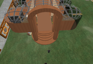
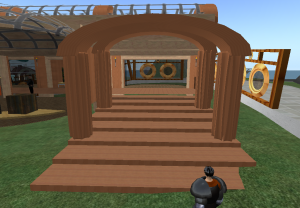
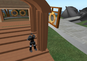
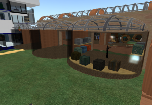
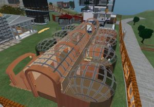
Working with architects is one ordeal I will not soon forget.  Being the only digital artist in the group, I did enjoy having the insight and perspective of 3 architects in the group.  However I kept feeling as though I never had a final say in most of the modeling matters, where I am most proficent at.  At time when unity was key, I felt as though everyone was going a seperate direction, or did not know where else to go.  I don’t claim to know much about buildings, but I felt as though some of the changes made to what I had orignally planned out had no reason to be changed. Nor, when they were changed without me knowing, I wasn’t told why they were changed.  I don’t mind that they were changed for the interest of the store, just having some insight on it for future reference would be great.  I don’t feel as though I learned much from my group, which I was hoping to be a learning experience. This project has definitly changed my views on architects.

Final Project – Freebie Store

Saturday, June 27th, 2009

store_007

My main job in the making of the store was being one of the main modelers, layout and design of the store.  I wanted the store to be big to allow for the awkward avatar movement and to allow plenty of space for anything that might need to be added to the store.

store_001

store_002

In the design of the column, I decided to put a twist on the creation by using six 1/4 cylinders and hollowing them out then inverting them so that it gives the concave section of pillars.

store_003

For the rooms, after getting a talking to about how square modernistic buildings are seen far to often, I put a spin on it by making the rooms more cylinder-esque. My original rooms were connected all the way through, but after the group had looked at it, we decided to put dividing walls up.

store_004

I am most proud of the roof. This was one of the few objects I chose the texture for.  I love natural light in buildings and I thought it was would be a nice addition in this building, giving it a more open, grandeur feeling.  To make the center roof I took 3 sections of cylinders, hollowed them out, cut them in half and squashed them down, giving it a long archway of a look. Curve surfaces are a re-occurring theme throughout the building, because I tend to agree, square is getting rather old.

store_005

The room I was in charge of was the clothing room.

store_006

I designed the shirt after a button up, and the textures remind me of hawaiian shirts.  I started with a square, and after hollowing and cutting it, I made another one for the other half. Then taking 2 triangles and squashing them flat for the collar flaps. I used a squashed, flattened, hollowed, half circle for the collar. I wil have to fix the texture on the sleeves, but they are also a section of a flattened circle.

Platform (revised)

Friday, June 12th, 2009

platform_005

For the upstairs I used the Gamble House as a bit of a reference. But instead of using wood textures for a rustic feel, I used metal textures for a industrial feel, which I feel makes it look more modernistic.  One of the things I like about the Gamble house is how it fits so well into the environment. Unfortunately, I cannot make plants in 2nd life without permission, so I attempted to make some flowers, as seen at the bottom of the page.

platform_004

This is a picture of the bottom floor of my platform. This area I was playing with textures. I intend for this area to be a gallery of work.

platform_002

platform_001

Aerial few of the platform. I used mostly metallic textures for the platform and changed the transparency to create a glass look for the upstairs.

platform_006

A picture of a flower I made on the sill of the top balcony. I used circles and cylinders to create the flower. The textures I used were metal textures, to give it a matching industrial feel with the house.

Office Space (without people)

Tuesday, June 9th, 2009

office1_004office1_003

office1_002

office1_001office1_005

The reoccuring theme of the office is glass and steel and black leather, adding a transparent, yet clean cut and refined view to the room. I made all the furniture with simple shapes and the same texture of glass and black leather. The tree was made of tube shapes by adjusting the tapering and the circle radius several times, giving it a glass, hair, leaf look.

Office Space

Tuesday, June 9th, 2009

snapshot_005

This is a picture of the office I created. I used glass and metal textures to create a sterile looking environment, also giving it a modernistic appeal. I used simple shapes for the furniture, to give them a minimalistic look. I like the transparency of glass, because when the cushions sit on them, it looks as though its floating.

snapshot_004

snapshot_007

snapshot_008

On an asthetic note, glass also creates alot of trust.  People can see what your doing all the time. Giving to a structured, clean cut appearence.