Posted by Emily Digeronimo on July 22, 2018
One of the most controversial songs that I can remember is the song “Blurred Lines” by Robin Thicke. The song is so bad that around 20 UK student unions banned the song. This song is about a man wanting to have sex with a woman but there are “blurred lines”. These blurred lines meaning that a girl acts like they do not want to have sex with him but in reality or so he claims they do want to. It also can refer to women who like to participate in casual sex but want to keep a “good girl” image. Another thing the blurred lines can refer to is a woman who is in a relationship that Thicke is flirting with even he knows that she is not single. Even another meaning of burred lines could be consent. The consent is “blurry” possibly due to alcohol or drugs. He also goes on to say that this woman he is talking about is an “animal” meaning that she’s outgoing and likes to have fun. He is comparing this woman to an animal and saying that she has a sexual nature to her. By calling a woman an animal it is implying that all she is good for is sex and he does not respect her as a human being. In the song he says “I know you want it” many times. This is something that many women who have been sexually assaulted have heard their perpetrator say. This is something that sounds much too similar to rape or assault. He then goes on to say “do it like it hurt, do it like it hurt, what you don’t like work?” meaning that women should enjoy pain during sex. There is no mention of the women’s pleasure only about what he would like to do to her. This runs a parallel to rape because of the fact that often times the perpetrator is not doing it for sex but as an act of power.
Posted in WS 2000 | Tagged: sexisminmusic, sexisminpopculture, sexistmusic | Comments Off on Sexism in Music
Posted by Timothy Patterson on July 22, 2018
Recently in Branson, Missouri a tragic boating accident occurred. I have more questions than answers at this point, but what I’ve been able to gather thus far is that a special type of boat, called a duck boat, one whose top is completely covered, was launched into a lake. According to news and personal accounts by a few survivors, a storm was incoming and winds short of being hurraine force were present.
So I ask, WHY would a boat captain take tourists into the middle of a lake, in these conditions, and expect something good to come out of it? Oh, and here’s the topper. The captain stated that to the tourists that they DIDN’T have to wear a life jacket unless they felt it necessary. I was caught dumbfounded by this statement, only to be corrected later by a narrator who stated that because the boat was covered, and if the boat were to say “capsize,” the life jacket would thrust the person into the top of the boat potentionally further exposing them to drowning.
Unfortunately this boat captain went down with the ship, so we can’t ask him. However, the NTSB has confirmed that the windspeed was just shy of that of hurricane force and that the waves were too high to be out on the water in that kind of boat. I forsee this company being sued for wrongful deaths due to the captains negligence to identifying the the environmental conditions in the area, before launching a boat into the lake.
A sample of a duck boat is posted.
http://www.foxnews.com/us/2018/07/21/doomed-missouri-duck-boat-faced-near-hurricane-winds-ntsb.html?utm_source=feedburner&utm_medium=feed&utm_campaign=Feed%3A+foxnews%2Fnational+%28Internal+-+US+Latest+-+Text%29
https://www.usatoday.com/story/news/2018/07/20/branson-duck-boat-accident-what-happened/806195002/
Posted in Water Tragedy | Tagged: Boat, Duck, Sink, Tragedy, Water | Comments Off on Patterson Duck Boat Disaster
Posted by Jeremy Blanton on July 22, 2018
For this week’s blog, have chosen to review a greeting card. This a birthday card, that I believe, is directed toward primarily the male population. Before taking this course, I had bought this card for my father and thought he would enjoy it and get some laughs from it. He did enjoy the card but if I had the to choose a card today, it would not be this one. It states that it is a birthday aging quiz, on the inside of the card it asks the question, “What color is the purse she is carrying?” And just below the question it has a statement of: (If you said, “What purse?” then you are still young.)
The cover of the card is demonstrating gender norms with how this young lady presents herself. The men should be interested white females that have a tan, wears clothing that reveal their mid-drift and cleavage, have large breasts, skinny, young and blonde, has whitened teeth, and dons very tight clothes that does not leave much for one to imagine what they look like underneath. A lot of these characteristics are difficult for one woman to have all together at one time. This cover is trying to say that it does not matter what your race or ethnicity is, if you are sexually attracted to women this is what she should look like. The wording on the inside of the card continues to reinforce the idea that men should be surveyors and judge women on their appearances. It makes it seem that all young men are not observant of their surroundings when a beautiful woman is near. This birthday card has the light set so that highlights the women’s large breasts. This demonstrating to the young population that women are sexual objects for men to stare at.

Posted in Greeting Card, WS 2000 | Tagged: ageism, gendernorms, surveyor | Comments Off on Birthday Card
Posted by Vivian Pham on July 19, 2018
Back in the day things were very different than they are in today’s day and age. The advertisement that print companies were able to print would not be acceptable by society today, maybe to some but not all. This advertisement from the fast food joint Hardee’s clearly stated that “Women don’t leave the Kitchen!” ever. That women are meant to be in the kitchen cooking up breakfast before the husband leaves for work or have dinner prepared and on the table for when he gets home from work. In this advisement the father either just got home from work or is leaving for work and is greeting or saying goodbye to his little girl. While the wife is dressed in her apron and high heels watching from the kitchen window because “she never leaves the kitchen.” Hardee’s statement of “We all know a women’s place is in the home, cooking a man a delicious meal” really states that back in the days women weren’t allowed to leave the kitchen or maybe even the house because woman was to stay at home and clean the house, take care of the kids, and “make me a sandwich” type gal. Since she has such a busy life cooking, cleaning, watching her show, or anything “wifey material” that Hardee’s can take care of the cooking for tonight. Woman today are still to be looked at in the kitchen and some people may still be old schooled, but most women do work and help support their families and still cook when coming home from work. While stereotypical men come home from work and have a beer right away and not help with the prep of dinner. Other times and families the man does come home from work and get dinner ready for the wife that comes home from work.

Posted in WS 2000 | Tagged: kitchen, wife material | Comments Off on Cooking in the Kitchen
Posted by Emily Digeronimo on July 15, 2018
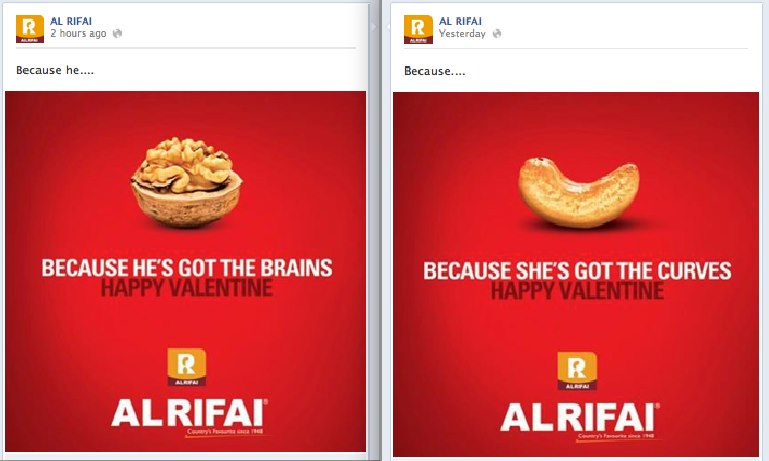
This is an ad for Valentine’s Day from a company called Al Rifai that makes and sells nuts. It shows a walnut representing a brain and the caption under it reads “because he’s got the brains”. On the other side is a cashew which represents hips or curves and it reads “because she’s got the curves”. This ad is basically implying that what makes men attractive is their high level of intelligence and what makes women attractive is their physical attributes and not their intelligence. It is implying the message that we see so often in society that physical beauty is all a woman is worth. The company did apologize for the ad claiming that they believe everyone is equal and that they were not trying to belittle the role of women in society. Although, this does not seem to be a valid claim when what they said in the ad is sexist towards women in a few ways. In some ways it is also making reference to society’s views that the ideal or perfect woman must be slender but have curves as well. We rarely see men being held to the same beauty standards that women are. Take the fact that women’s products are even more expensive than men’s. We do not see examples of how men’s bodies should look as often as we do women’s. When asked to picture someone such as a doctor or accountant in your head a picture of a man and not a woman comes to mind for many people. This ad contributes to that exact thinking by enforcing that thought that men are the intelligent ones with the important jobs and women are not. This is just one of the ads amongst many that are sexist because it brings in a quick profit.

Ad Critique: Sexism in Al Rifai Nut Advertisements
Posted in Advertisement, WS 2000 | Tagged: sexistads, sexsells | Comments Off on Sexism in Ads
Posted by Alaya Jones on July 14, 2018
I did not realize how something as simple as a greeting card could reflect gender norms so heavily. The greeting card below is a birthday card for a male and reflects gender norms in many ways.
This birthday card reminds me of the 1900’s. The color scheme of the birthday card (black and white) reveals that image is a vintage print. Also, the woman pictured fits the description of a 1950’s house wife. She is white with perfect eyebrows and light colored lipsticks to further reveal her beauty. Her hair is perfectly curled at the bottom which was a common hair style for women in the 1900’s made by curling or perm rods. She also has an half apron on with cooking essentials in her hands. The apron, the cooking supplies and the kitchen background implies that the woman is getting ready to prepare a meal for her husband and children, which was the main job of a housewife in the 1900’s. This card sends the message that the wife must cook and prepare a delicious meal because its the husband’s birthday.
This card not only signifies gender norms associated with women, it also signifies gender roles attached to men as well. The comment “First, you start with LOTS of alcohol..” sends the message that the recipient of the birthday card is a heavy drinker. In the 1900’s, it was seen as normal for men to drink heavily because they were the workers of the home. It was acceptable for men to get drunk every day if they wanted to. It was the same for smoking as well. Similarly, in today’s society, it is seen as normal for men/husbands to drink large amounts of alcohol for special events including birthdays, job promotions, networking events, huge football games (super bowls) and other celebrations.

Posted in Greeting Card, WS 2000 | Tagged: #birthdaycardsforhusbands #womenwhocook #gendernorms, #menwhodrink | Comments Off on Greeting Card
Posted by Timothy Patterson on July 13, 2018
Professor,
I didn’t see a grade for Project 1 of the Blog project. Here is a copy/past link from I’m guessing my blog site. As you can see by the date it was turned in on time, I just may have had the wrong location for you to see it. Please advise if you require anything further. Thank you.
Tim Patterson
Thailand Cave Trip Gone Wrong
Posted in WS 2000 | Tagged: caves, soccer team, Thailand | Comments Off on Patterson Thailand Cave
Posted by Vivian Pham on July 12, 2018
My first thought that came to mind when thinking about a certain toy for gender norms was a little kitchen set for the girls; most us girls had one when we were younger. As society today would say that females have a place in the kitchen to cook up some food, bake a cake, clean up the house, and taking care of the kids. The kitchen set are normally bright pink or purple and the accessories such as spoons, forks, plates, and bowls that came with it was some wild vibrant color as well. Though they do make neutral colors as well now. While women are cooking in the kitchen, they have also made tool sets for boys. Men are known to have the place in the garage playing with his tools and fixing things around the house. The tool sets are normally red, blue, black, or anything really neutral. The tools look almost like real tool colors, using gray, orange, or black again for the accessories. The packaging for the kitchen set would normally have a girl on the front and for the tools sets, would be a boy on the front. It shows kids that only girls can play with the kitchen set and boys can only play with the tool set. When in reality men aren’t much different from women, they can cook in the kitchen, clean up after themselves and the house itself, and also take care of their own kids. While women are capable of spending time in the garage playing around with tools and fixing things around the house as well. There is nothing wrong with men who like to cook and back. There is nothing wrong with women who likes to fix things, both of these things should not define a gender activities. 

Posted in WS 2000 | Tagged: expectation, rolemodel | Comments Off on Children’s Toys
Posted by Alaya Jones on July 10, 2018
When I was younger, my favorite toy to play with my was my toy kitchen. My toy kitchen was very similar to the one pictured below. It was all purple (my favorite color) and actually had a seat attachment for my baby doll. My younger brother (who was only one year younger than me) hated my toy kitchen and never wanted to play with me. He would always tell me that “only girls play with toy kitchens” or “Boys can not have babies”. In today’s society there are beliefs that a woman’s place is in the kitchen. Woman are suppose to cook, clean and take care of the children while the men in the household work. My toy kitchen reflected that idea and has many gender norms and expectations attached to it as well. The color of the toy is gender normative. Colors that society associates with girls are pink or purple or bright and vibrant colors. Colors that are associated with boys are blue, green or darker colors. Not only was the kitchen set purple, but all the accessories were purple as well. The plastic bowls, plates, silverware and baby seat were all purple. The baby seat is gender normative as well. Since only women can physically give birth to a baby, this toy sends the message that this is not meant for a boy. When in reality, guys have the same ability as a woman to care for a child even though they can not give birth to one. Lastly, the packaging of the toy sends children the message that boys can not play with the toy because it only has girls pictured on the box. Toys like this discourages boys, especially when exposed to at a young age, from engaging in culinary activities such cooking and baking because they believe it is a “girl thing”. When in fact, there is nothing wrong with guys liking to cook. Cooking should not be a gender specific activity.


Posted in Children's Toy, WS 2000 | Tagged: #genderstereotypes, #toykitchens | Comments Off on Children’s Toy
Posted by Jeremy Blanton on July 10, 2018
For my second blog entry, I will be reflecting on a piece of advertisement that I found in the People magazine. This piece of advertisement is of a young white female holding a bottle of body wash, that can also help nourish her hair. The company used a skinny and good looking female to be their model. She is wearing a very revealing top in this photo, showing her cleavage, neck line, and a fair amount of her face. They have the model smiling in this photo, possibly trying to relay the idea that if you use their product you will be happy. They have her hair pulled behind her left to reveal more of her face. The advertisement is trying to relay the idea that being skinny, white, and flawless skin is beautiful. The product states love and beauty on its label, giving you thought that you can achieve this by using their product. The flawless skin, perfect complexion, and long “nourished” hair are difficult to achieve all at once or at all due to the fact the advertise company had the image photoshopped. The overall image has a light pink color to reinforce the gender norm that females are fond of the color pink. The border of the image and the label of the bottle are roses, again it going after the gender norm. The contrast of this image, dark brunette hair and bright white top, draws the eye toward her breasts and chest. If you compare the size of space that is taken up by the bottle to the size of space that is taken by the model, the product is not the main focus of this image. The image does not include anything about the recycled bottles or helping the plant, this a key piece of imagery that is left out but is part of the product name and is something that they are using to set them apart from other products.

Posted in Advertisement, WS 2000 | Tagged: Beauty, Bodywash and planet, Help the planet, sex sells | Comments Off on Advertisement for Body wash