
Within this semester, I have learned a lot about how much actually goes into filmmaking. From this class, I have learned that each and every aspect must be analyzed to make sure that it comes off the way you wanted it to. As a filmmaker, I have realized that every part of a clip is very important and the finishing project must come together and not be forced. During this semester, I had trouble with the time limits of each project, but I have learned to get used to it and work as hard as possible in that short time. I also had trouble thinking of ideas for projects. I really enjoyed learning after effects to give myself a new tool to work with, and I had a lot of fun working on my production logo using that. In the beginning I thought that I was aware of how much thought is put into a film, but I definitely learned about a lot more than I knew in the beginning. Although my film manifesto seems very simple, I still agree with it because of that. I truly enjoyed being in this class and will definitely use the information I learned to move on with my filmmaking goals.
Screening Analysis of Footloose
For my screening analysis, I decided to use Footloose directed by Herbert Ross in the year 1984. This film is about teenagers of a small town trying to have fun and be teenagers, and the way it uses many visual components allows for the story to be understood by many. Using the book “The Visual Story” by Bruce Block, I could pinpoint a few specific aspects that worked for the film. The one most important visual component was the use of tone. “Tone refers to the brightness of objects” as stated by Block. He says that it can be used to, “help direct the audience’s attention” and “affect its mood and emotional feeling.”
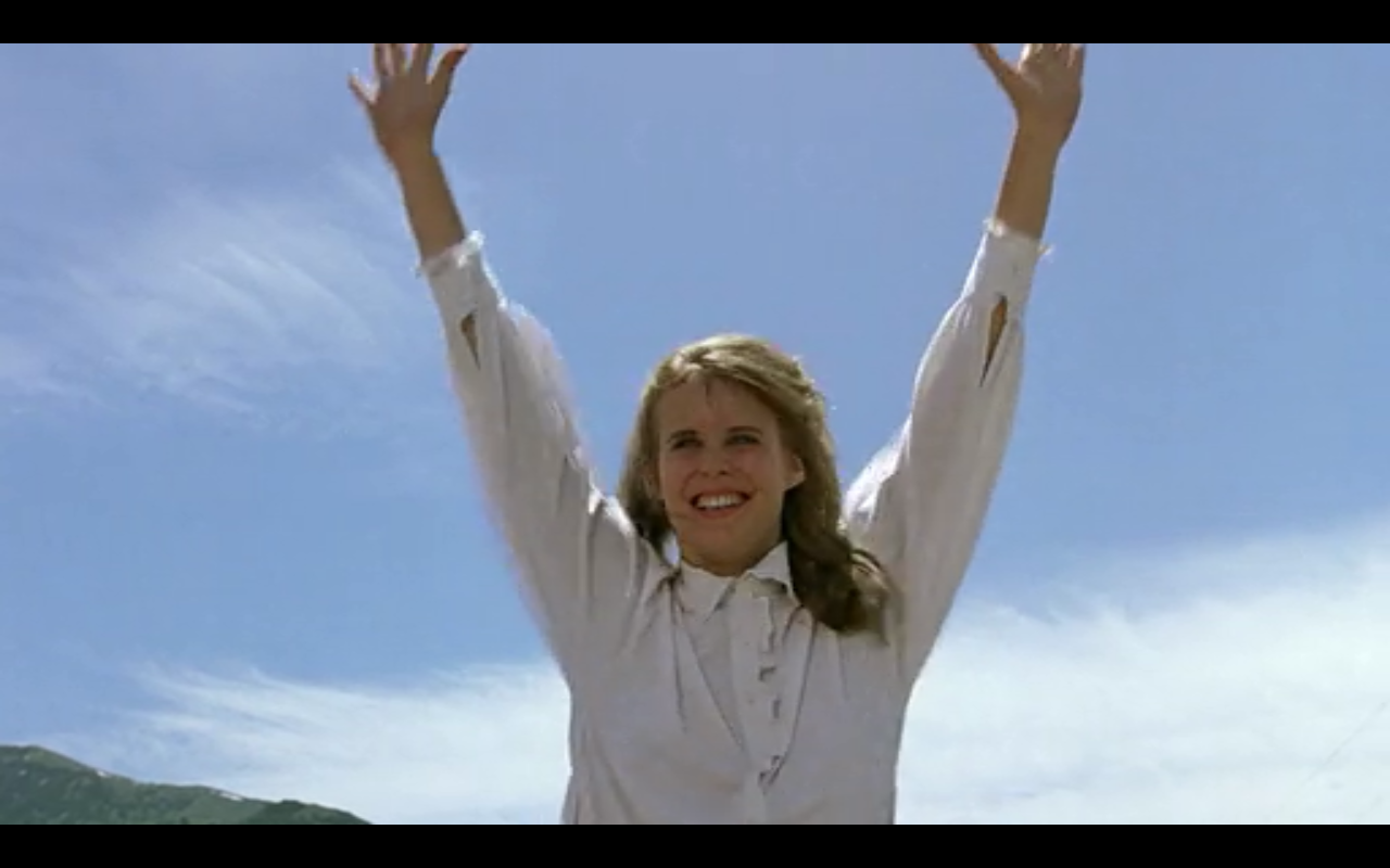
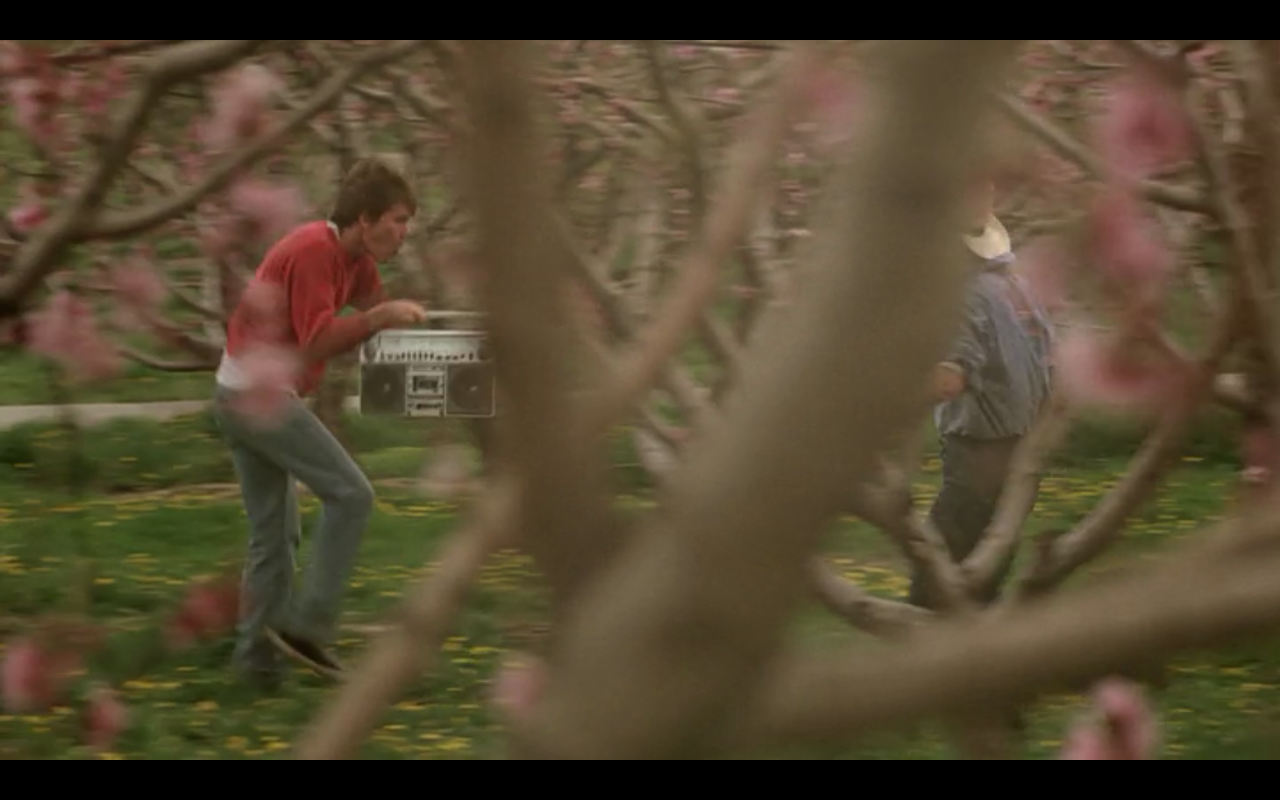
This movie’s use of tone really showed the most important parts of the movie. Scenes would be dark in the most emotional parts of the movie, while bright scenes would be whenever these teenagers were just living freely. The entire movie is filled with bright scenes that show happiness, whether the main characters are dancing or playing around. In the first picture, a teenager named Ariel is standing on two cars as they drive down the street. Although there is an oncoming truck, she is happy to be out of the control of her father and the bright lighting shows this. She seems to not have a care in the world even though she is in so much danger. The second picture is from a sequence where the main character, Ren, is teaching his friend how to dance. Being that dancing is banned in the city they are in, they are so happy that they get to have fun and be teenagers. The bright lighting and colors show how exciting this is for them.
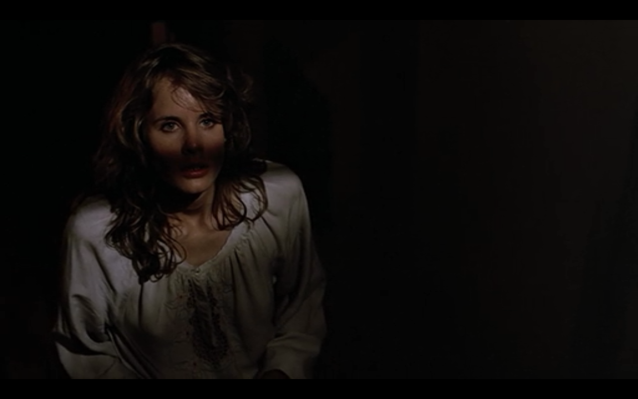
Then, there are a few scenes that are mostly dark and shadowed that show the opposite of the emotions in the past two pictures. These next two pictures show anger and sadness that the teenagers feel inside when they are unable to do what they want. The first picture is when the main character gets yelled at for causing too much trouble when he is truly not. He gets stressed out and runs off to an abandoned warehouse to let off some steam, and the dark shadows all over him show the audience his emotions. The second picture is of the character Ariel being told off by her father, she is told that she was out too late and to not hang out with Ren anymore. This image from within the scene shows how closed in she feels. The darkness displays how unhappy she is with the situation and that she wishes to just be a teenager and live free. Another thing I noticed within these pictures is that they both have white shirts on that contrast from the background along with lights shining onto their faces, which allows the audience to be able to see them and their emotions during the scenes.

Shot-for-Shot Group Project
With a group of 4 people, we set out to recreate the interrogation scene from The Dark Knight. We wanted to make it serious but with small jokes within it, including the mask and the graffiti on the white board. Although it was a very hard scene to recreate, we did our best to get the sound and shots very close to the original. The only issue we truly had with this project was that the cameras continued to die so we had to use 2 different ones, both with different settings, which messed up the look of the video. This was a very fun project to work on and ended up working quite well with the limited time we had.
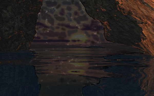
Group Mini-Movie
In class, we had the chance to use the cameras available to us. We had one week to use these cameras to create a short film with a group that was assigned to us. We had to incorporate canted shots within our film so we decided to make our short film about someone being upset about a breakup. This topic ended up working well with the amount of time we had and with the canted shots.
Final Project Draft/ Status Update
I have multiple different drafts going of this specific project, but I think this might be my favorite. With this draft, I believe it becomes more of a narrative rather than just a video with music. Is the topic of this making sense to anyone? Should I shorten the clips I use like I planned on doing, so the audience doesn’t get bored of each clip? Although I’m not super far into this, I feel like I’m on the right track.
Final Project Pitch
I was thinking about doing a music video, but not in the narrative sense. Being that I am in Cleveland I decided to do some filming of the city. People going to work, people celebrating, people doing all kinds of things within the city. I know about a lot of festivities going on tomorrow so it was a perfect chance to do so. I am deciding on a song but I was thinking of an obvious use of “Cleveland Rocks” by The Presidents of the United States of America or Freeze Frame by J Geils Band. Either way, I want to use an upbeat song that I am able to use a large portion of editing on. I’ll be working on this with my Rebel T3i Camera and a tripod, and I might be driving around filming out the window or just filming on the streets. I want to use a lot of rhythm and similarity of the buildings. I will be working on this alone and it should end up as a music video between 2.5 to 4 minutes. My main challenge is that I am unsure of the exact song I plan on using. It should be working the other way around, I know, but I have a video in my head and need to find the perfect song to use it for.
Experimental Film
This is an experimental film of my roommate’s art project. It uses secondary rhythm (the feet moving are secondary to the people going in circles), editorial rhythm (the edits are made in a distinct pattern), relative movement (the person in the middle is in the same spot while all of the other people surround her), and actual movement (the people are walking). The sound of the metronome is to keep the rhythm and pull it all together.
Hoopla Productions (Motion Graphics Project)
This project was inspired by my nickname and the episode of Spongebob that the nickname came from. This was very fun to work on and worked better than I thought. The use of color was important, the black and white is to show how boring the world is while the “Hoopla!” is bright blue and increasing in brightness as the “Hoopla!” gets louder. The two faces were used to add to the movement so it was not as boring, and the red brick also stood out within the project. I used sound (and the picture of the brick) directly from the Spongebob episode and it ended up coming together quite well.
Color
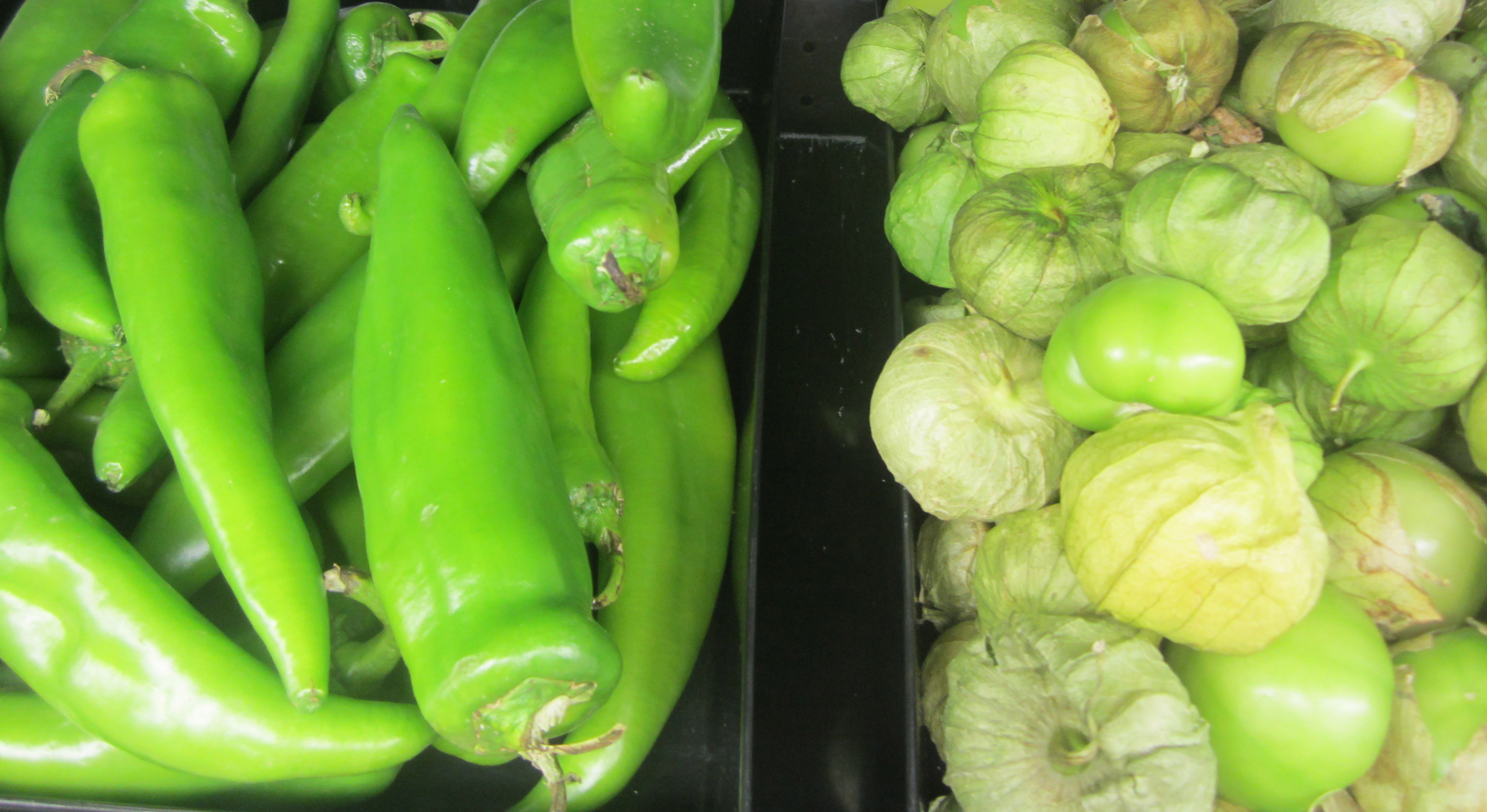
This picture is showing an analogous color scheme, which is when colors that are next to each other on the color wheel are present. The yellow tinted veggies with the green veggies show the two colors that are near each other.
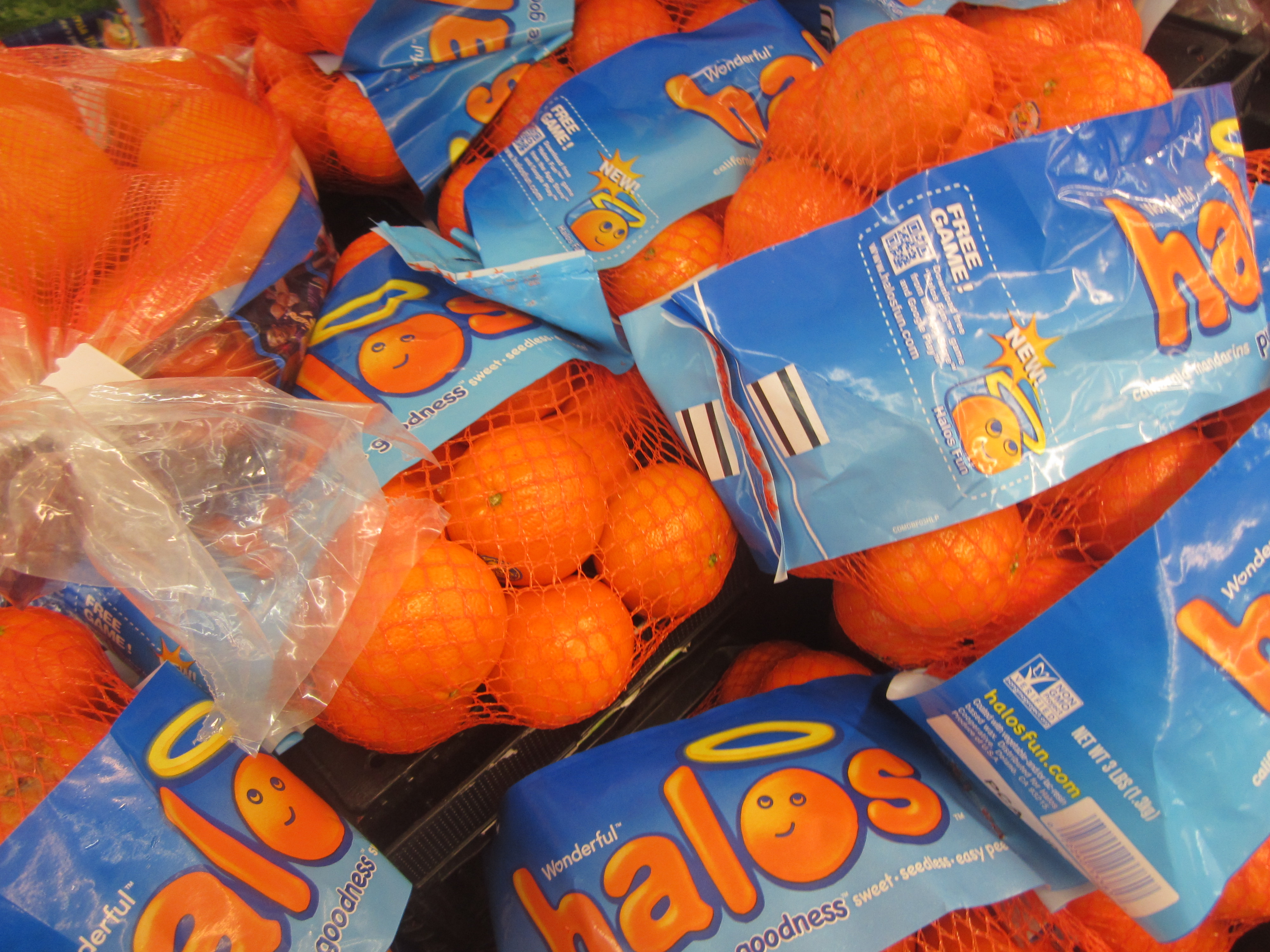
This picture shows a complementary color scheme. This is when colors that are across from each other on the color wheel are used to to show the main focus. The blue on the bags is used to make the oranges pop in this picture.
Tone
This picture demonstrates contrast of tone. There is each end of the gray scale within it but no grays in between, only black and white.

This picture demonstrates affinity of tone because each shade of gray within this picture is within the same part of the gray scale. The tone doesn’t stray from the specific portion of the gray scale.
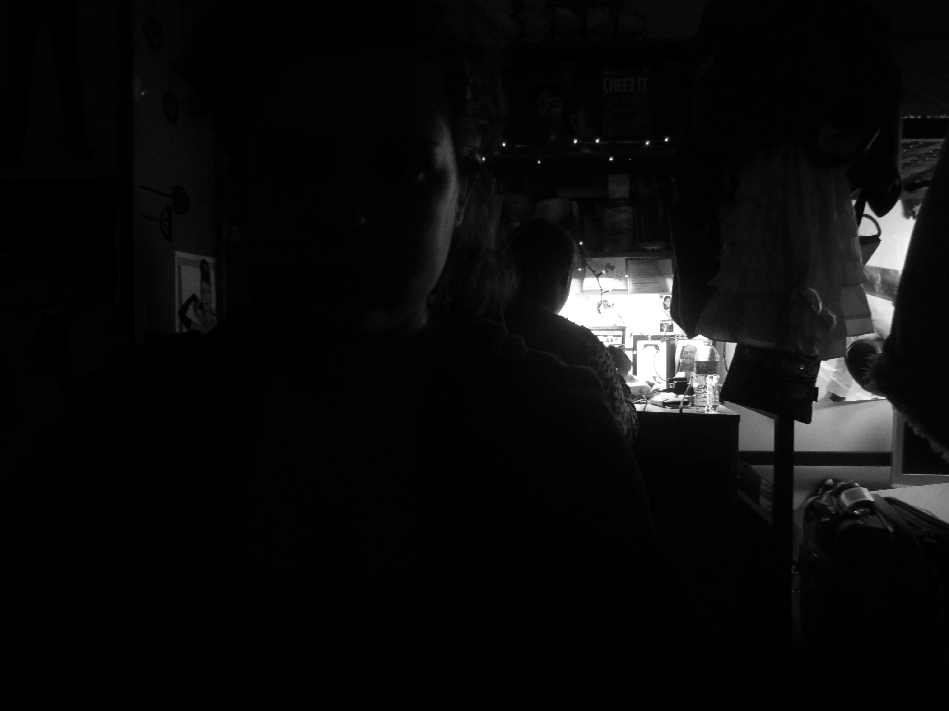
This picture demonstrates noncoincidence of tone because the subject is obscured by the darkness of tone. You are unable to make out the face due to the tone.
Linear Motif
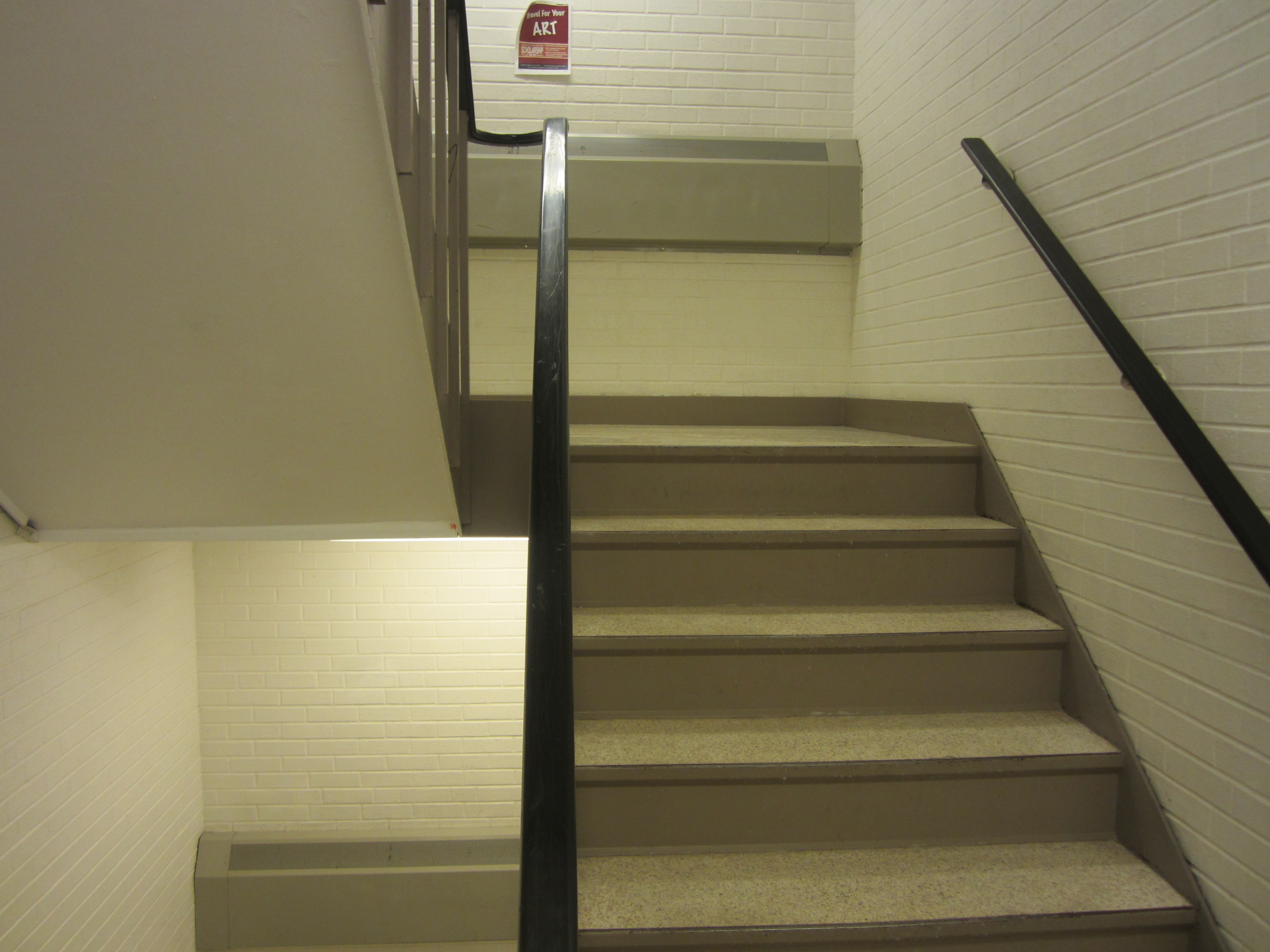
This is my example for linear motif. Linear motif is when a picture gets reduced to simple lines, and you can see how this picture is made up completely of lines going in different directions.
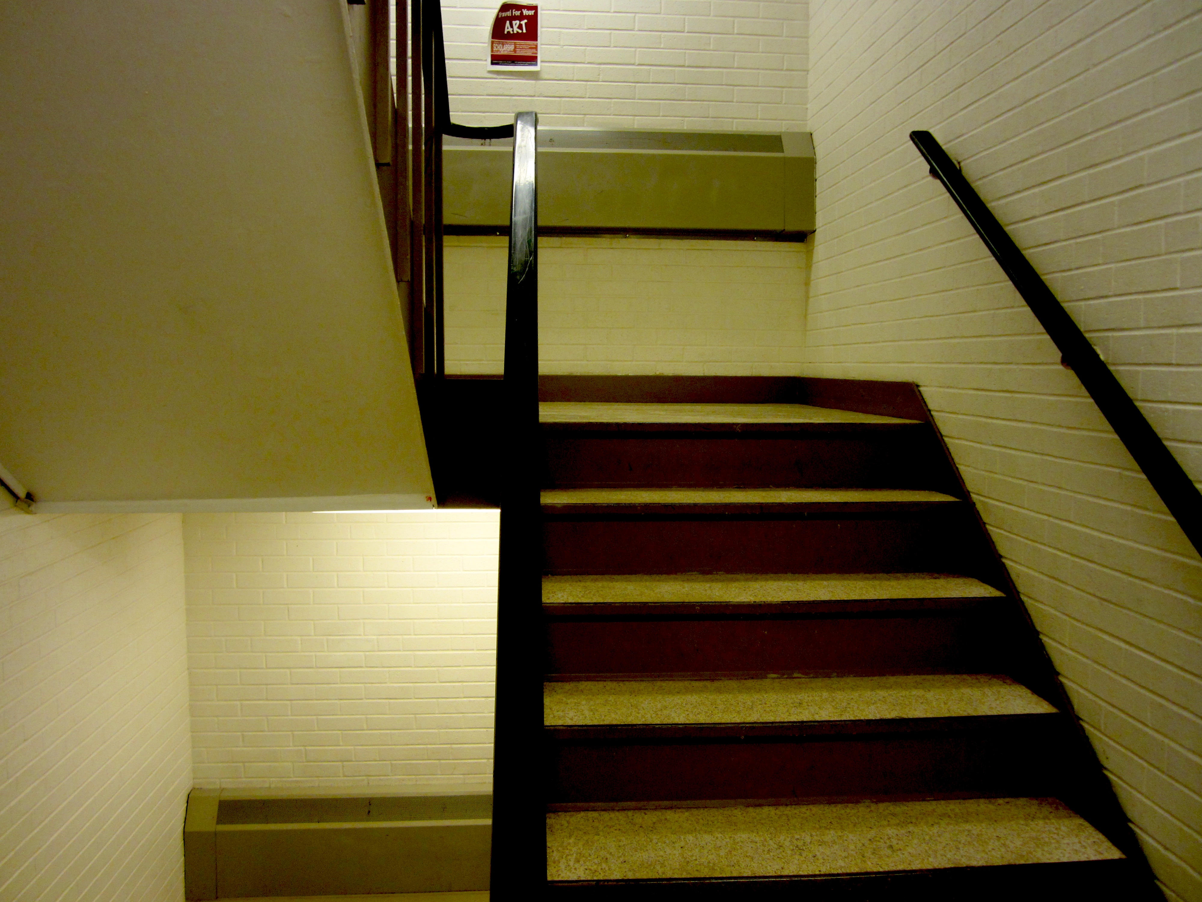
When I used contrast to edit the picture, you can see how many lines are within this image. Each line is creating the picture and your eyes are drawn where each line is and where lines meet. Linear motif is important to make sure that things are lined up correctly and to make sure eyes are drawn to exactly what you want to show. In this picture, the stairs stand out because of the amount of lines that outline them.
Still Image Video
This video is about art in the world today, that many people do not get jobs even though they work hard on what they love. Whether you are a dancer, musician, or artist you may go to work but you will be thinking more about the thing that you love. Art never leaves your mind despite how many other things you do with your life, including just regular everyday jobs. I worked a lot on ensuring that the daily life and the art blended together for each person, and I feel as though it turned out well.
Film Manifesto
Filmmaking is a way to get your words and opinions across without judgement of who you are. They should be made to reflect who you are and what you enjoy and should not be brought down by those “in charge” of the cinema. Make something you’re proud of.
Deep Space vs. Flat Space
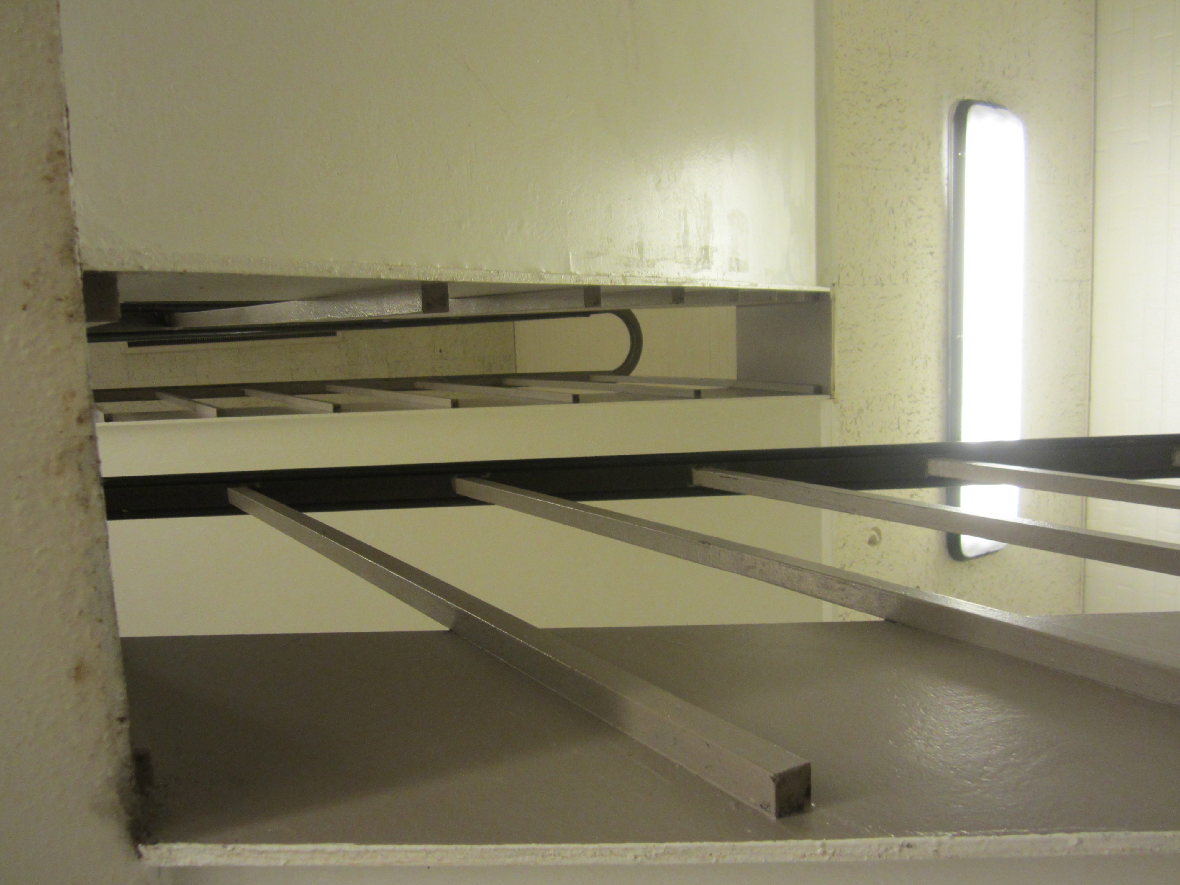
This image is a deep space image because it gives us the illusion of depth in a 2D picture. When you look at this picture, there is a vanishing point that could be drawn by lines of the ceiling and the floor. You can see that there are things in the distance, and it is not just flat space. Being that the doors and water fountain look smaller when they are farther away, the viewers will instead see it as an illusion of depth.
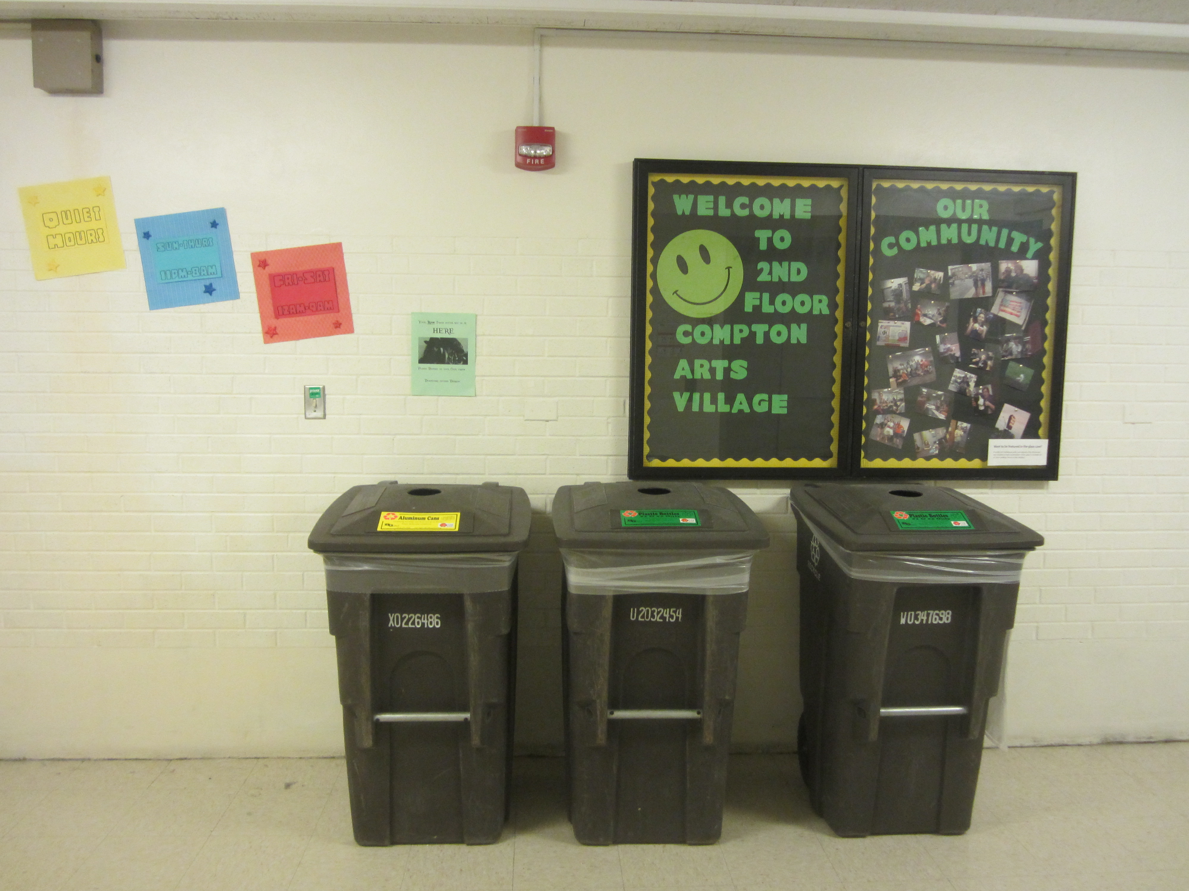
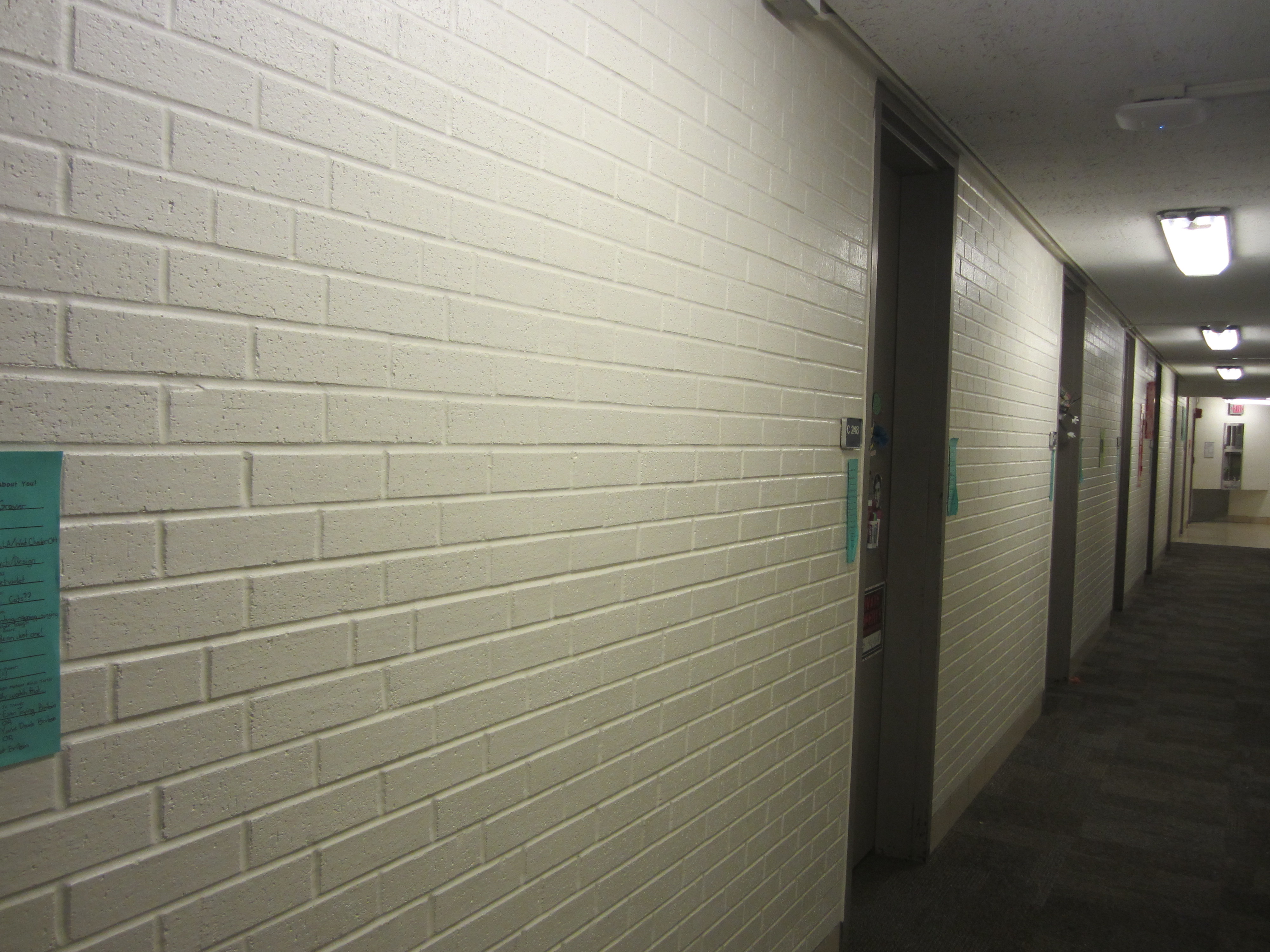
This image would be classified as flat space because there is size consistency and no perspective. There is a wall and the recycling bins seem to blend in and look very flat and 2D. Also, there would not be a way to draw vanishing points within this picture because it does not have any depth, the mind makes you think that you are not missing anything to either side of the image.
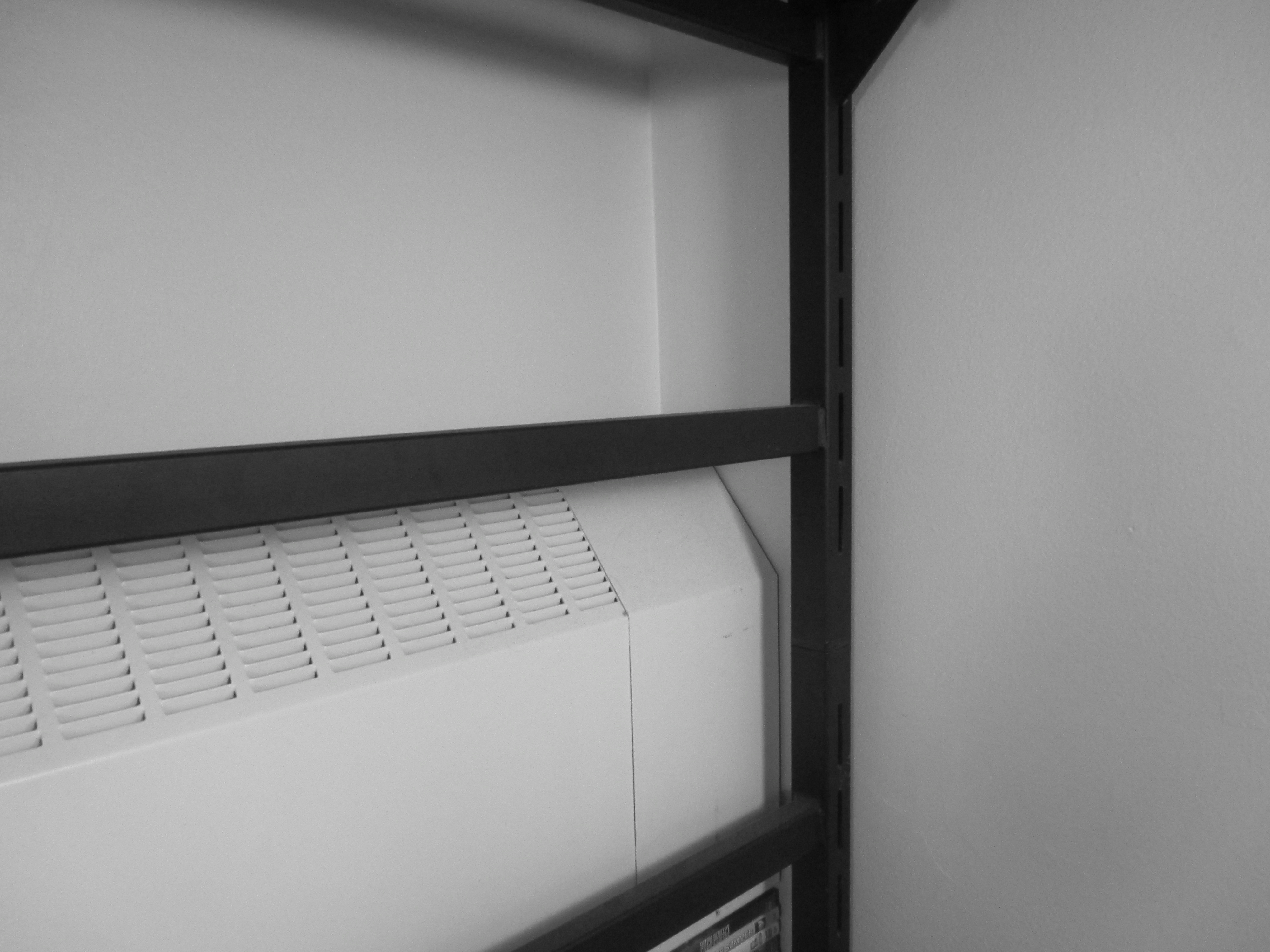
This image has limited space because you can see two obvious frontal planes. You can see the wall in the foreground and the refrigerators in the background. With these two planes, you can see the visual and physical separation between them.
This image has ambiguous space because you are unable to understand the actual size or spatial relationship. There is also a lack of movement and a disorienting camera angle to make it so the viewer is unable to understand what is truly happening within the image.
Photoshop
Messing with Photoshop in class!
Low and High Visual Intensities

This picture has very low visual intensity. The colors are all around the same tone with grayscale and there is not very much to look at. The mother and baby are in the center of the frame and have a lot of space surrounding them. We can see the line of the wall/floor and your eye is drawn there, but the image as a whole is very calm and not “intense” although many of the visual componants are visible.

This picture has very high visual intensity. The lines of each building and the skyline can draw your eyes everywhere. The color is very intense in this picture, as well, when you don’t know whether to look at the blue in the sky or orange in the sky and windows. These colors are opposite on the spectrum so they stand out more against each other. There is a lot of empty space but it is filled by color in the sky. With this picture, you have no idea where to look because the colors and lines will cause you to look in every direction. This makes it so this image has higher visual intensity.