Research
The movie I chose to do for this project was that of Stop-Loss. It is a film about a man who just returned from Iraq and is discharging from the Army only to find that they are not letting him get out. He goes AWOL and tries to survive life on the run from the military. When doing my research for this film, I found that the most useful items for the post and dvd cover would be a American flag, A soldier, and possibly a tank or some kind of burnt background to symbolize a burnt past. I believe that the centralized object in the poster and dvd cover should be the American Flag, after that some secondary objects can be either a soldier or a tank. With the American Flag in the middle and a soldier at the bottom I believe that the audience looking at the poster will get the hint of what the movie is about without knowing too much to not want to see it. It provides intrigue and wonder about what the movie itself is.
DVD
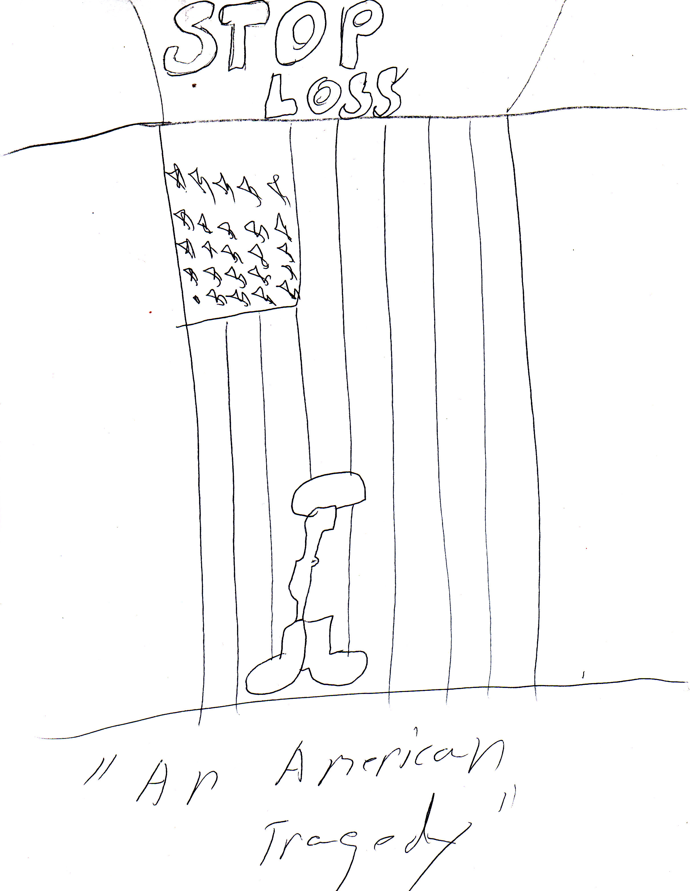
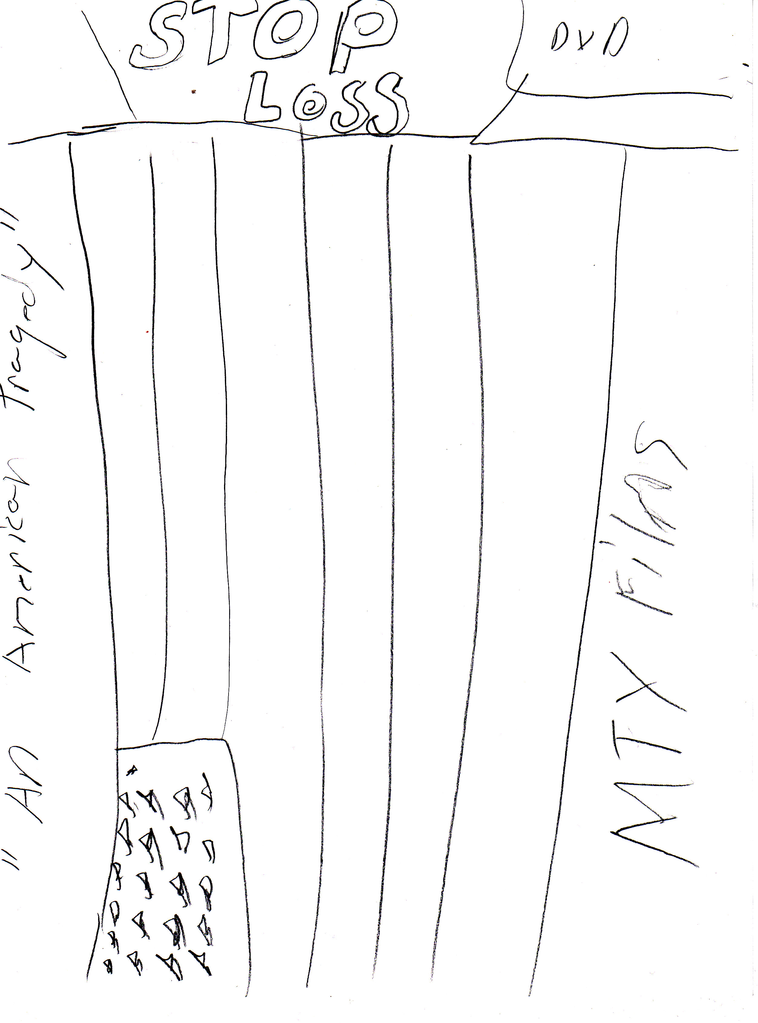
These images are my sketches and half size images of the DVD cover. I made them look like the poster so they would relate to each other. I like to incorporate the US flag in both the poster and the DVD cover, it is the relating image that puts both of them together. I think the edge of the DVD cover will be burnt so it also relates with the poster in that way. I plan on using STD Font for the text at a 60 pt- 100pt range depending on what one fits.
 ]
]

POSTER
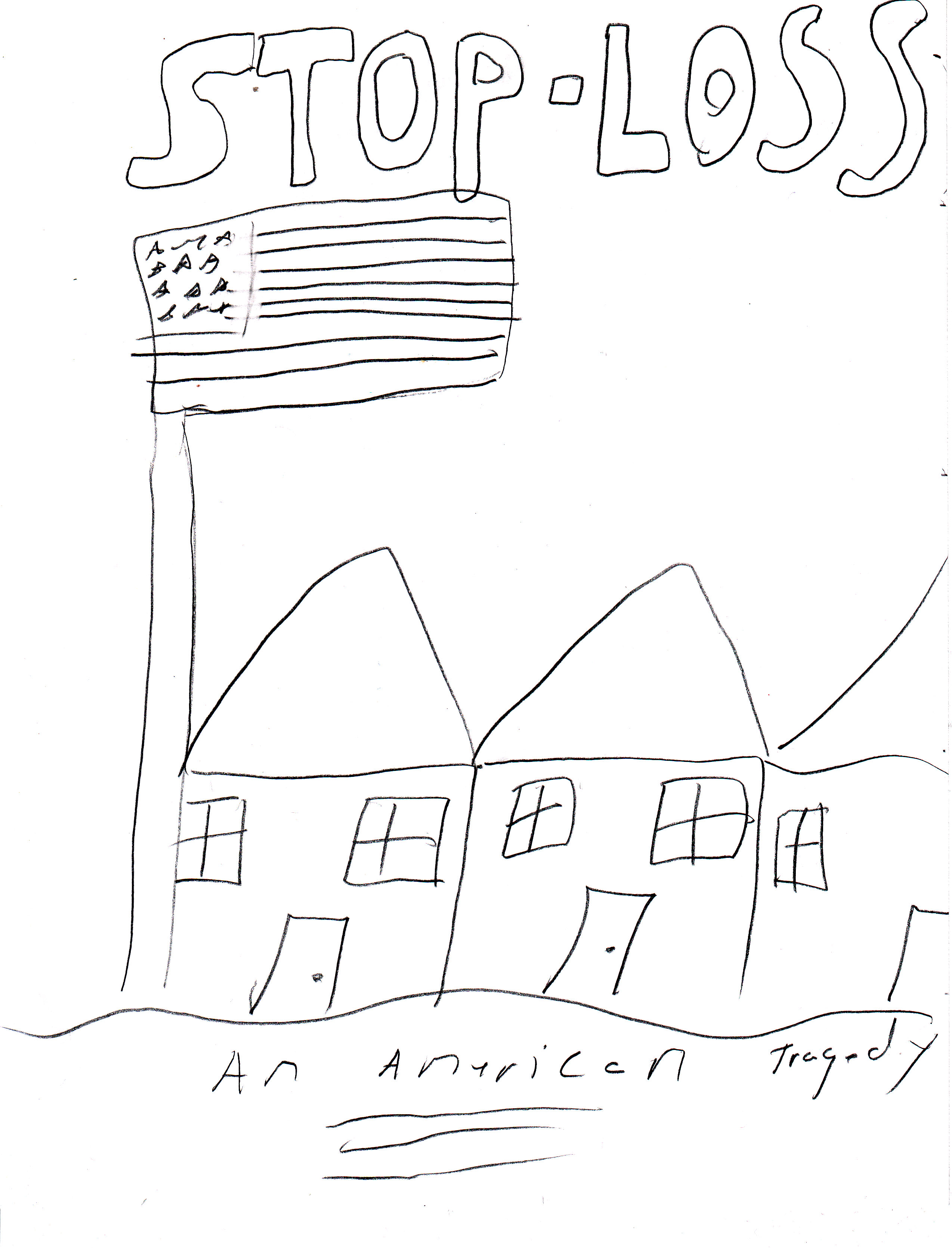
Like the DVD, I have incorporated the flag as the main image and made the soldiers the secondary images for the poster. I plan on using the STD font at the same pt range as the DVD cover and also plan on using a burnt background so that it also ties in with the DVD cover. Incorporating these images will help the person looking at it relate to what the movie is about. As the research above stated, I believe that these images will help the poster relate to the audience but not give away too much about the film.


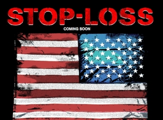
Poster
These are the actual posters that have been used for the movie. I could not find any dvd covers for the movie but I know that they are similar to the posters. I like the way that they incorporated the flag and the people. You can relate to what the film is about this way, I think though that I can modify these versions and make them better by tweaking them.

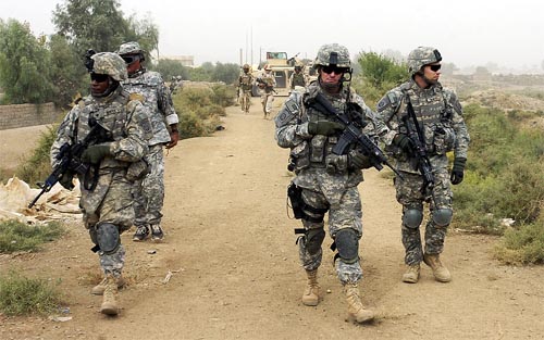
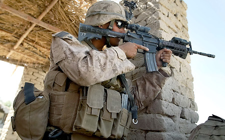
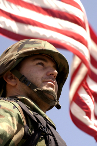
Soldiers
These are the images of soldiers that I would like to incorporate into the poster and DVD cover. I think that most of them provide a quality and Hi-Res image that will go great with the poster. I think the middle one will be the most likely one used because with it being a group of people helps relate to the film. The film incorporates a group of people and not just one, by using one soldier I may have a mixed message about what the film is about to the audience.

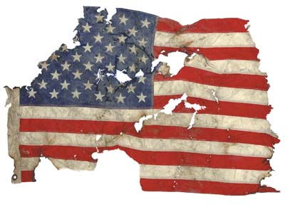
Flag
I like the torn flag images. I would go along with the feel of what I want the poster and DVD cover to be. It shows a sign of hardship, something that went through a hard time but still holds it shape. Its a hidden message that I think the audience viewing these items will connect with. I also would like to see how the soldier with the flag would look within the image. If I can make it work, I think that would also be a useful item to incorporate into the two images.


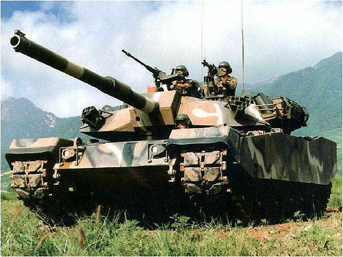
Tank
This is the only image of a tank that I liked, If I chose to incorporate this into the design I feel that it would have to be in the center of the poster or DVD cover with the American flag in the back. The tank is one of those pictures that everyone associates with the military. It shows power and strength but with the image of a torn flag in the background could have the effect of something strong that has went through very hard times. I will try the two items together to see how the they look. If they go together in the final design, I believe that it will provide a powerful combined image.