THE GIVING TREE BLOG
RESEARCH
After doing some research on the giving tree by Shel Silverstein the them became apparent to me This book is about our relationship between our parents and us and how they give and we receive. The book involves three main items that I wanted to include into the poster that would represent the main them of the book. These items are a tree, presents, and a child. They all represent different items and would tell the person looking at the poster that its about the giving tree, and with these three items they would associate the poster easily with the book. With the given items below, I think that I can easily put together these images and make for a great photo poster in the end.
This book is focused on the people around the age of 5-12 and I believe that by using more of a cartoonish look to it instead of a real look that it would allow for the poster to make a more meaningful message and image. I like the fact that most of the images in the book itself are hand drawn, which also allows for the illustrated images used to be more effective.
PHOTOS
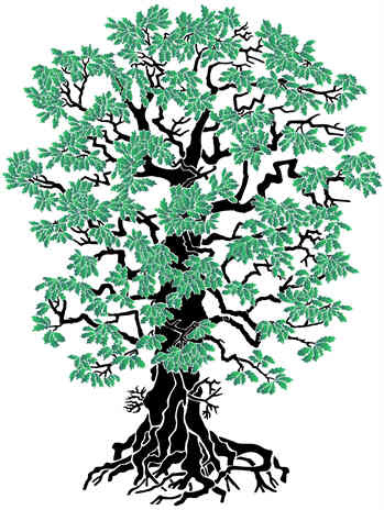
Trees:
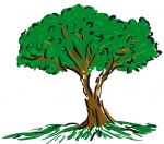
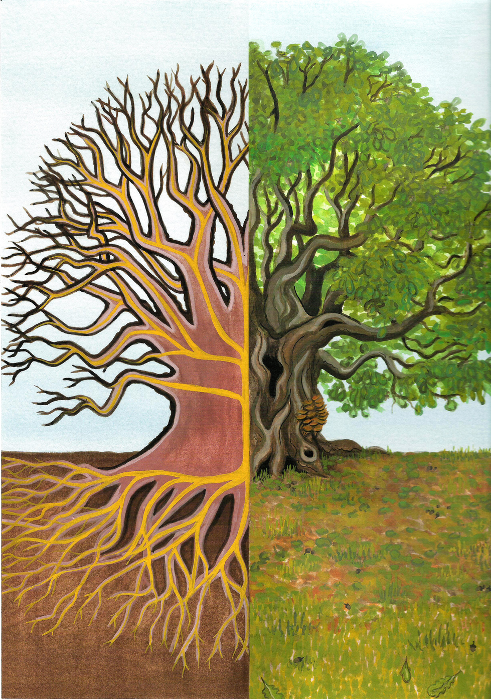
I like all of the tree versions, but the best ones are the illustrated ones. They all show a image quality that I would want in the final design and would help with the overall project. I want to pick a bigger image though so that it doesn’t look pixelated in the end. All of the images can be easily cut out and used for the final project, I also think that all of them go with the color scheme of the rest of the images. With the book in real life, the images are all hand drawn so by using the illustrated images that I have found it will be a better fit for the poster.

Presents:
Each of the present images are good. I believe though, that I will choose the first one listed because it looks as though it is the best representation of a straight on present design which is what I want. While there is ways to make the other one straightened, I think that by choosing the first one it will save me time and allow for me to work more on the rest of the project than worrying about straightening one of the images.


Child:
I like all of the photos that include the children. I think though that to go with the rest of the choices of images that I should pick a cartoon or illustrated version of the children. This will help it all look uniform as mentioned and prevent any kind of confusion with the image choices for the final design.


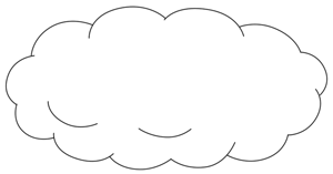
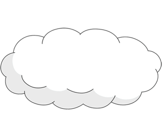
Clouds:
The clouds are the same way as the sun, it looks as though the best way for these clouds to be represented is by illustration. The reason behind this is because with the real clouds it is hard to pick and cut them out of photoshop because of the un-uniformed behavior that the clouds represents. I like the way they all look and it should go well with the design elements of the story poster.

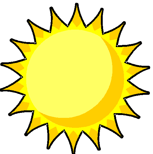
SUN:
For the sun image, I think that the only way it would work is with a illustration type sun. I want to make all of the images uniform so that they make sense in the final output and because of this reason, I think that going with illustrations is what the final output is going to be.
Thumbnails:
With the thumbnails, I like the idea that of using the trees as the biggest image is the best. I think that in the book itself, the tree is the greatest thing mentioned so because of that, I think that it will be good to use that as the center image. The surrounding images would be the other two main images along with supporting images.
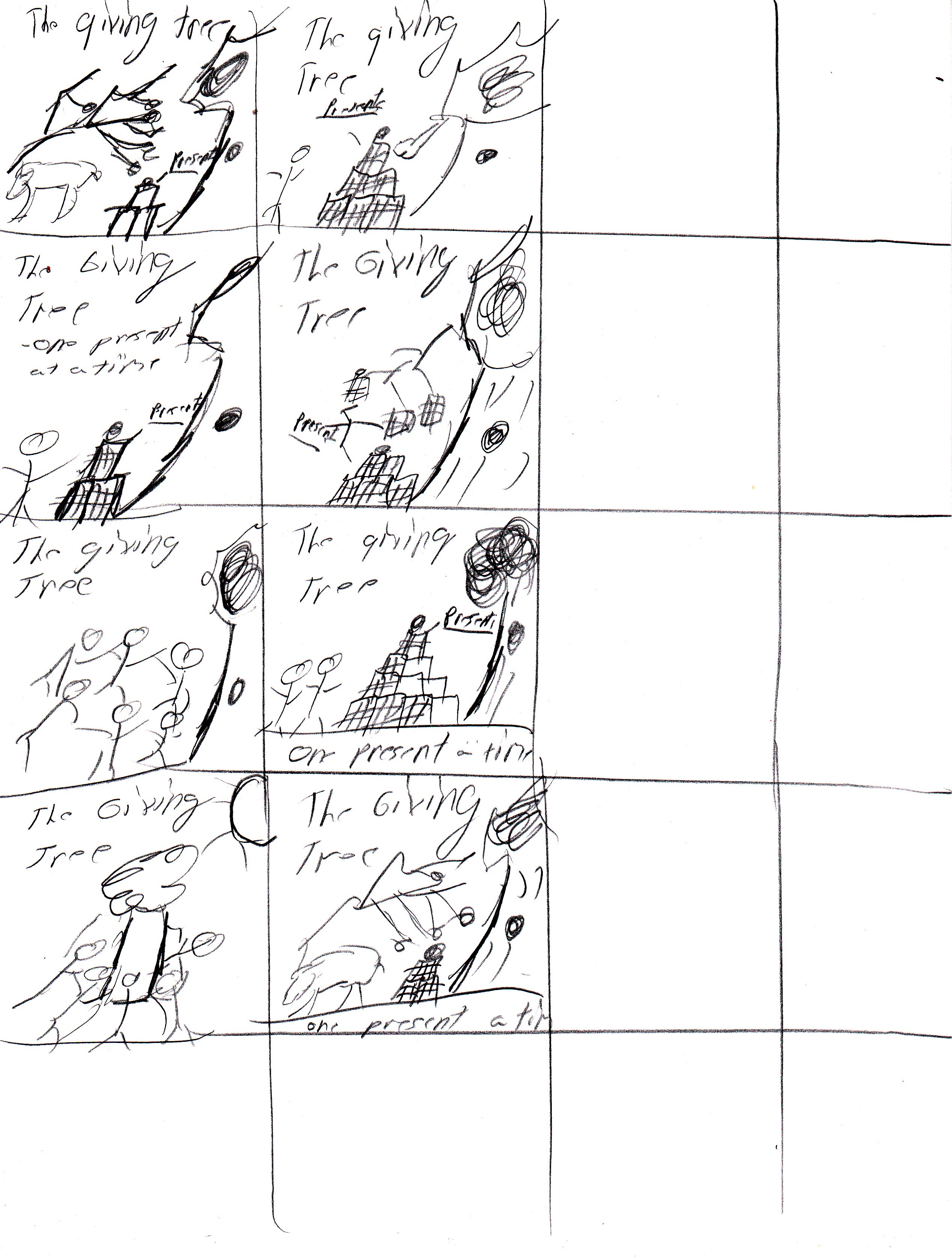
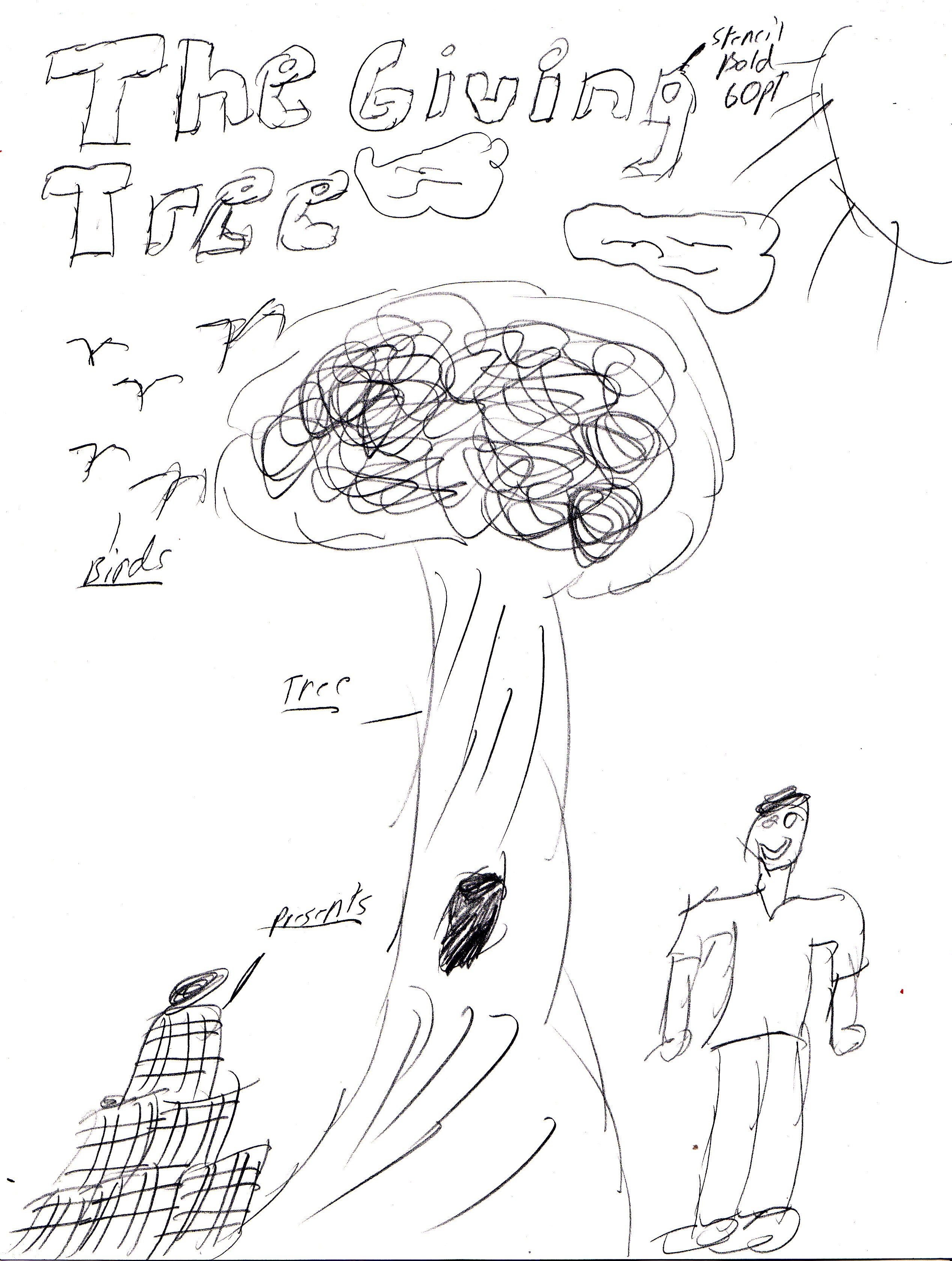
Sketchs:
With this 8 1/2″ x 11″ sketch, I like the way that it has the tree as the tallest object because it allows for the person looking at the poster to know that it is in-fact the most important object. It has all three images that I wanted to include into it and I believe that the overall flow of the design is very fluent and precise. Both of these sketch’s contain a font collection of 60 pt stencil bold which will be used for the title of the poster.

With the 8 1/2″ X 11″ sketchs, I put all three of the images that were researched (Tree, presents, child) and made them into the final design. I feel that by having the name “the giving tree” up top it helps the person looking at the poster know what book its about because of the obvious name. I like the way that all of the items are aligned together, giving the tree the greatest height because it is the most important in the book so it should be the same way on the poster.