Blog entry assignment #2
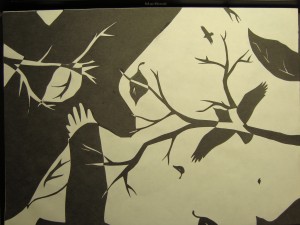
I am very happy with the end result. There was a lot of confusion on my Part III due to me making the leaves be maple leaves. Everyone saw the maple leaves and thought that it has something to do with Canada. When in fact it had nothing to do with Canada, it was just a leaf. I think that changing it to a leaf shape that isn’t recognizable to the public was a good choice. It made it more how I wanted it to look. As if the viewer was laying on the ground looking up at the sky with leaves falling all around. The smaller shapes pull the viewer in by making them look farther in the distance. And it makes sure that there is something going o in every space, but not so much that it would distract the viewer from the rest of the piece. I also didn’t have the tree branches in the Part III version. It added a lot of interest into it. Even though it was very hard to cut out the pieces like that. In the end the extra time and effort I put into it turned out a lot better.

