mislam Math 6820 Blog

Another amazing bgsu blog

Archive for the 'Uncategorized' Category

Presentation of Reading Article

Posted by mislam on 29th April 2013

I have made a presentation based on two articles  such as ”   Improving Graphic Display by Controlling Creativity” and ” Like A Trout in the Milk ” by  Howard Wainer .

Here is the link to my  presentation:

https://docs.google.com/presentation/d/1b2Z6vAaeq_bnsXVmy6pE0RaOb7qnBSPJOK0FCgl7pzk/pub?start=false&loop=false&delayms=3000


Also, there are the links to the articles:

https://docs.google.com/file/d/0BxO6yFPutAmOaWhteUJ4Q2I0LVE/edit?usp=sharing


https://docs.google.com/file/d/0BxO6yFPutAmOcjVGY3ZjWGtvd2M/edit?usp=sharing

Pls leave  your comments on this presentation.

Posted in Uncategorized | 6 Comments »

GGPLOT2

Posted by mislam on 18th April 2013

In this blog we compare ggplot2 display to the display made with the other graphical methods. The displays produced in Blog 11 -Time series and in Blog 13-Color are to be compared with the displays that we produce using ggplot2.

The following display  we produced in  Blog 13 using  traditional graphics plot()

The figure  below is produced using ggplot2 for the same dataset used in Blog 13.


The following R code  is used in producing the above ggplot2:

library(LearnEDA)
library(ggplot2)

DD<-na.omit(college.ratings[,c("Tier","F.retention","a.grad.rate")])

DD$Tier<-factor(DD[,1])
p=ggplot(DD, aes(F.retention, a.grad.rate, color=Tier))
p+geom_point(size=3)+labs(title="Graduation Rate versus Retention Rate\
                          by Tier")+
ylab("Graduation Rate")+xlab("Retention Rate")
The following figure taken from Blog 11 using plot().
The next display is produced by ggplot2 for the same dataset
used in figure above.


The following R code is used to produce the above ggplot2:
library(datasets)
library(ggplot2)

Time<-seq(1871, 1970)
Flow=Nile
DD<-data.frame(cbind(Time, Flow))

p=ggplot(DD,aes(Time,Flow))
p+geom_point(color="red", size=3)+
labs(title="Time Series Plot of Annual Flow of River Nile")+
stat_smooth(method=loess,se=F)+
xlab("Time (year)")+ylab("Annual Flow ")

Discussion:

The ggplot2 produces nicer and good looking graphs rather the traditional graphics plot ().
The background color in ggplot2 makes the display more pleasing, though it is not necessary for data decoding information. Due to grid in ggplot2 it seems that the visual decoding of physical

Information is easier than plot (). In traditional graphics we need to be more careful to produce the desired graph.

However, in ggplot2 it can be done very easily and with the less commands.

Although the displays produced in traditional and ggplot2 graphics are the same in view of graphical perception, I personally prefer ggplot2 to traditional graphics. Because it requires less effort and produces aesthetic shape.


Posted in Uncategorized | 72 Comments »

Pop Charts

Posted by mislam on 10th April 2013

Part 1

The titles of the top 5 songs on “The Billboard Hot, April 4, 1964”, these were Beatles songs, are:

Position

Title

No. 1

Can’t Buy Me Love
No. 2 Twist and Shout
No. 3 She Loves You
No. 4 I Want to Hold Your Hand
No. 5

Please Please Me

Part 2

In the next section we redraw the data found in two pop charts taken from “USA TODAY” by using Dot plot in order to improve the pattern perception and Table Look-Up.

The first pop chart is a pie chart representing the survey results about employees’ Top Health Concerns.

USA TODAY Snapshots – USATODAY

The dot plot is more effective display than the pie chart. The dot plot improves the pattern perception more compared to the pie chart. Although the pie chart uses different bright colors and beautiful pictures, the dot plot makes the Table Look-Up and perception easier for the readers to detect, assemble, and estimate the output. Our perception of the distribution of the values on the dot plot is increased more than the pie chart.

The second pop chart is Most NCAA Men’s Tournament Winners. This pop chart is collected from “USA TODAY”. 

USA TODAY Snapshots – USATODAY_1

In order to improve the pattern perception and Table Look-Up for decoding visual information from the graph, we graph the data by Dot Plot. Dot Plot increases the Table Look-Up efficiently and also has good pattern perception than the bar chart.

Posted in Uncategorized | 8 Comments »

Color in Graphing Display

Posted by mislam on 5th April 2013

Part A

In this blog we explore the effectiveness of color in encoding categorical and numerical  variables .  In order to see the use of the color in graphing display, we use two correlated variables such retention rate and graduation rate  found in the dataframe called college.ratings in R package LearnEDA. These two variables are classified into four groups called “Tier” according to the classifying variable Tier.

Two different graphing methods are used in displaying the data- Scatterplot, Coplot, and Color Level Plot.

In this Figure we graph graduation rate against the retention rate. Four different colors are used to display the graphing elements. Since the objective of this plot is to see how four different Tier groups differ each others. The use of color helps us to decode the information easily. Each category is seen clearly and easy to compare the groups. For example, within Tier 1 has the highest graduation rate and also more retention rate. In Tier 1 the low retention rate results in low graduation rate.

Next we use coplot to show the graduation rate against retention rate by conditioning on Tier.

The coplot shows the relationship between graduation rate and retention rate given different Tier. Looking at the above coplot graph, we can can easily compare  association between graduation rate and retention within four different Tiers. Tier 1 appears to have the highest positive correlation between these two variable. The graduation rate is highly associated to the retention rate. this finding is understand in single scatterplot. The comparison in Coplot seems to be easy rather than single scatterplot.

The slopes of four different  scatter  plots in the panel of coplot are easily understandable. So we prefer coplot to single scatterplot.

Part B

we  display a simulated function of two variables on a level plot.  The values of the function are grouped into six categories depending on their magnitudes.

To display the region of the contour Dr. Jim Albert use colors of red, blue, green, orange, yellow, and brown.   It is very hard  to understand the change in the order of the values in Jim’s graph. To understand the intensity of the values of the function we have to look repeatly the key. However,although  the perceived boundaries between the adjacent level is more visible, the colors used in the level plot  do not   give the  perception about how the regions are changing from outer to center of the graph. So we use different set of colors that shows the gradual progression in the level regions.


In our level plot the colors shows how the level regions are changing.  The graph tells us that different colors show a continuous variable. we don’t need to look at the key to understand the intensity of the level regions, and also clearly separable regions. The smoothing color in display the level regions is more important rather using different bright color.


Posted in Uncategorized | 33 Comments »

Visualization of Multivariate Data

Posted by mislam on 29th March 2013

In this blog we use three variables- calories, carbo, and protein from the dataset UScereal in the MASS package  in order to see what sort of relationship among them using scatterplot matrix, a coplot, and a spinning 3-dimensional scatterplot.


Coplot of Multivariate Data

Three Dimensional Scatterplot

The scallterplot matrix shows that carbo and calories, calories and protein are strongly positively associated, but carbo and protein has a weaker positive relationship.

In the coplot when seeing relationship between two variables by controlling other one, we can see the  more accurate  relationship among themselves.  In the first coplot it is seen that the protein and calories are positively related at a specific carbo of the cereal, though the relation is not so strong when carbo is low in the cereals,  as is observed in scatterplot matrix.

The second coplot shows that at the given calories, carbo and protein seem to have no relation, which is supported by scatterplot matrix.

In the third coplot when controlling protein, the calories and carbo has a positive relationship. However, at the given low protein  the relationship seems to be very low.

Overall, the relationship between calories and carbo , calories and protein are positvely related but carbo and protein has very low relation. That is also revealed in the three dimensional plot.

Two special cereals that  seem to be unusual compared to the other cereals are Great Grains Pecan and Grape-Nuts. They are shown in the graph as a red color.

Posted in Uncategorized | 60 Comments »

Time Series Plot of Annual Flow of The River Nile

Posted by mislam on 22nd March 2013

In this blog I have used four graphical methods to graph the annual flow of the river Nile at Ashwan  1871-1970–connected symbol plot, symbol plot , connected plot, and vertical line plot.

In this data analysis , since it is not important to see the order  of individual observation in the plot and my objective of the study is to  see the long -term trend over the time period, the symbol plot is suitable. And also since there is low frequency behavior in the data, the symbol  plot method of graphing  the time series is appropriate.

In the long run at Ashwan the annual flow of the river Nile decreased with some fluctuations from 1871 to 1970.

Posted in Uncategorized | 100 Comments »

Loess Plot for Simulated Data

Posted by mislam on 15th March 2013


 The following graphs show the simulated data by R program. The first graph is a scatterplot of the simulated data. This graph has a loess smooth curve with default smoothing parameter f=0.75.

In the second graph, the residuals are graphed against  and a loess curve with f=0.75   is superimposed. The loess curve suggests that there is dependency of the residuals on, which indicates that the smoothing parameter is too large. The smoothness of the data distorts the underlying pattern.


After doing some experimental process to select the best smoothing parameter, I have found the optimal parameter to be 0.25. The third graph is created using the same simulated data and then a loess curve with is added.

The fourth graph is the residual plot for the fit with f=0.25. In the graph there is a loess curve with f=0.75. It shows that there is no specific pattern on the residuals on independent variable. It means that the smoothing curve does not distort the underlying pattern for the smoothing parameter 0.25 .


Posted in Uncategorized | 40 Comments »

Dot Plots for Annual Rainfall of Some Major Cities of Bangladesh

Posted by mislam on 1st March 2013


In order to construct the dotplot for two ways data table, I have selected some rainfall data from Bangladesh Meteorology Department (BMD) for four big cities –Chittagong, Comilla, Khulna, and Dhaka, over the time period of 1990-2000.


The first graph is the average annual rainfall by some selected cities of Bangladesh in the time period of 1990-2000. The city Chittagong has the highest annual mean rainfall, with about 250 mm. On the other hand, Khulna has the lowest annual average rainfall, which is slightly over 140 mm.

The graph shows the annual rainfall for the years grouped by the cities. This graph reveals the nice pattern of the distribution of annual rainfall over time. It helps the reader to compare four cities.  Over time Dhaka and Chittagong experienced the increased annual rainfall. However, Khulna and Comilla had the almost same rainfall over time.

In the third graph I plotted annual rainfall for the cities grouped by the years. Though this graph shows the comparison s of four cities within each year, it is not easy to compare over time.

So I think  the dotplot , drawn for rainfall  data selected for some cities in Bangladesh, grouping by row (Cities) is good and nice rather than the dotplot, grouping by column (Years).

R code:

library(lattice)

d=read.table("Rain_data_BD.csv",header=TRUE,sep=",")

d$Year=factor(d$Year)
d.mean=sort(tapply(d$Rainfall,d$City, mean),decreasing=T)
dotplot(d.mean, main="Rainfall in Bangladesh Cities in 2005",
        xlab="Average Rainfall (mm) ",
       col=2, pch=19)


dotplot(Year~Rainfall|City, data=d )
windows()
dotplot(City~Rainfall|Year, data=d)


Posted in Uncategorized | 88 Comments »

Stripplot, Parallel Quantile plot and Tukey Mean Difference Plot

Posted by mislam on 22nd February 2013


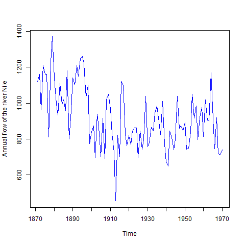
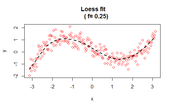
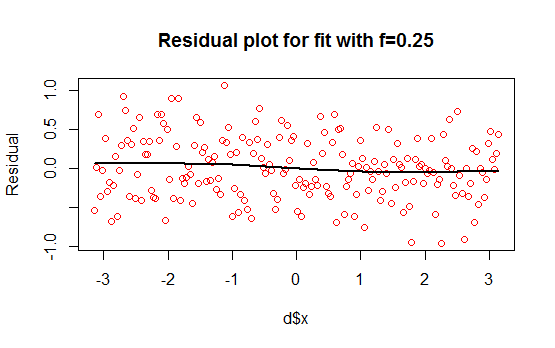
In this blog I have used three different types of graphics such as stripplot, Parallel Quantile plot ,  Quantile-Qunatile  plot and Tukey m-d plot for male and female students’ height collected in an introductory statistics class to see the difference in the distribution of the height of male and female students.

In the original dataset there are many variables, of which I have selected two variables –Gender and Height. A random sample of size 100 is then finally selected from the large dataset.

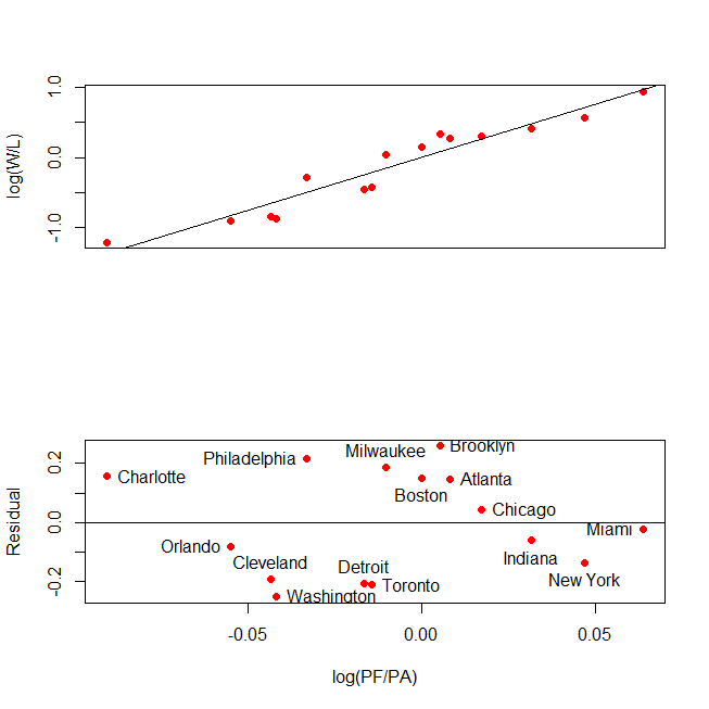
The stripplots show that male students’ height is more than female students’ height.

This above figure shows parallel quantile plots of the distributions of the heights of male and female students.  The median height of female students is about 65 . On the other hand, the median height of male students is 70.

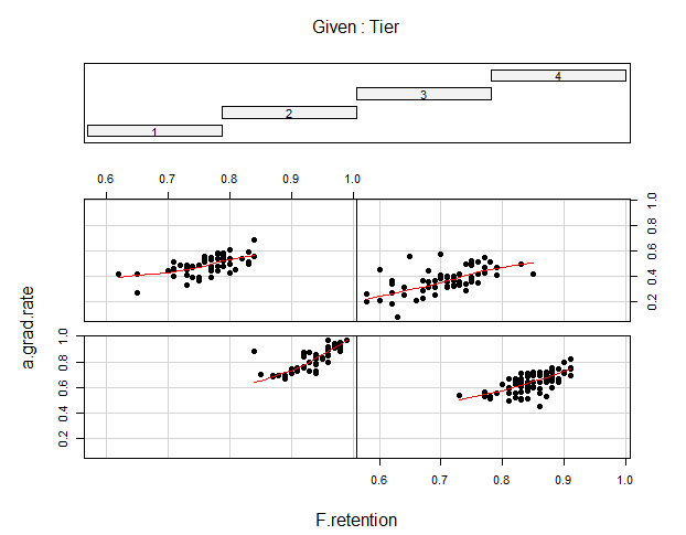
In the left panel quantiles of female students’ height are graphed against corresponding quantiles of  male student’s height.  In the entire range of the distribution, the male students’ height is greater  than that of female students’ height. There is  no simple relationship between male and female students’ height.

In the right panel Tukey mean difference plot is drawn. It shows that all male student’s height is higher than that of female students except one . It is very hard to find exact comparison between two groups.

R code:

library(lattice)
library(ggplot2)

d=read.table("http://bayes.bgsu.edu/eda/data/studentdata.txt",header=TRUE,sep="\t")
d.complete=d[complete.cases(d),]
d.sample=d.complete[sample(559,100),]
d.data=subset(d.sample,select=c(Gender,Height))
#####################################

stripplot(Height~Gender,data=d.data)

######################################

d.male<-subset(d.data,Gender=="male")
attach(d.male)
d.male.s<-d.male[order(Height),]
detach(d.male)
d.male.final<-within(d.male.s,{
  id=seq(1,nrow(d.male.s))
  f<-(id-0.5)/nrow(d.male.s)
        
})
d.male.final

d.female<-subset(d.data,Gender=="female")

attach(d.female)
d.female.s<-d.female[order(Height),]
detach(d.female)
d.female.final<-within(d.female.s,{
  id=seq(1,nrow(d.female.s))
  f<-(id-0.5)/nrow(d.female.s)
  
})
d.female.final


data.final<-rbind(d.male.final,d.female.final)
data.final


p <- ggplot(data.final, aes(f, Height)) + geom_point()

p + facet_grid(. ~ Gender)

#p=ggplot(d, aes(Haircut, Gender))
#p + geom_point(position = position_jitter(h=.1))
###########################################

d.male1<-subset(d.data,Gender=="male")
d.female1<-subset(d.data,Gender=="female")
d.female2=d.female1[sample(64,36),]
dd2<-rbind(d.male1,d.female2)
dd2


#p <- ggplot(mpg, aes(displ, hwy))
#p+geom_point()
#d.data=subset(d.sample,select=c(Gender,Height))

library(lattice)

#windows(height=10, width=10)
#par(mfrow=c(2,2))
plot1<-qq(~Height|Gender,data=dd2,
    aspect=1))

attach(dd2)
dd3<-unstack(Height,Height~Gender)
dd3<-within(dd3,{
            Mean<-(male+female)/2
            Difference<-(male-female)
            })


plot2<-xyplot(Difference~Mean,aspect=1,data=dd3)
#with(dd3,plot(Difference~Mean, col=2, pch=19))

print(plot1,position=c(0,0,.5,1),more=T)
print(plot2,position=c(0.5,0,1,1))

#par(mfrow=c(1,1))

#xyplot(Sepal.Length + Sepal.Width ~ Petal.Length + Petal.Width | Species,
#       data = iris, scales = "free", layout = c(2, 2),
 #      auto.key = list(x = .6, y = .7, corner = c(0, 0)))

#qq(voice.part ~ height, aspect = 1, data = singer,
 #  subset = (voice.part ==  "Tenor 1"| voice.part == "Bass 2"))


library(lattice)
plot3<-qq(Gender~Height, aspect=1,col=2, pch=19,data=d.data)

plot4<-tmd(qq(Gender~Height, aspect=1,col=2,pch=19,data=d.data))
print(plot3,position=c(0,0,.5,1),more=T)
print(plot4,position=c(0.5,0,1,1))


Posted in Uncategorized | 166 Comments »

Pythagorean Relationship in NBA Data

Posted by mislam on 15th February 2013

I have collected National Basketball Association data ( NBA Standings  2012-13 , Eastern Conference) from ESPN NBA.

The best k in this case is 15.03. The lucky teams Brooklyn, Milwaukee, Charlotte, Philadelphia . On the other hand, the unlucky teams include: Washington, Toronto, Detroit, and Cleveland.


R code


#png("NBA2.png")
windows(height=10, width=10)
NBA.data<-read.table("NBA.csv",header=T, sep=",")
par(mfrow=c(2,1))


#xx<-within(NBA.data,
           #{log.w.l<-log(W/L)
          #log.pf.pa<-log(PF/PA)})

with( NBA.data, plot(log(PF/PA), log(W/L),col="2", pch=19, axes=T, xaxt="n",xlab=""))
abline(lm(log(W/L) ~ log(PF/PA),data=NBA.data))

lm.NBA<-lm(log(W/L) ~ log(PF/PA)-1,data=NBA.data)
lm.NBA
Residual<-lm.NBA$residual
Residual

attach(NBA.data)
logpp<-log(PF/PA)

 plot(logpp,Residual,ylab="Residual",xlab="log(PF/PA)",axes=T, col=2, pch=19)
abline(h=0)
identify(logpp, Residual, n=15, labels=Team)


#dev.off()


Posted in Uncategorized | 10 Comments »

Logarithmic Scales (log base 2 and 10)

Posted by mislam on 8th February 2013

The graph shows the cereal production in Bangladesh during the time period 1991 2010. The log base 2 and the original productions are plotted in the graph. Over time the production increased very rapidly.

In the graph the log base 10 of cereal production is graphed against the time. This also shows the same pattern as in figure 1.  The cereal production over the time had a upward tendency with some fluctuations.

In the both graph we plotted the original production in the right scale in order to understand the conversion from logarithmic scales to the original.  Although both graph (log base 2 and 10) produces the same type graphs, log base 2 graph is more appropriate than log base 10 because log base 10 produces the fractional exponent of 10, which makes the conversion hard to understand.

That’s why I prefer the log base 2  graph to log base 10 graph  for the cereal production data of Bangladesh.


Posted in Uncategorized | 74 Comments »

Population Comparison of Bangladesh and Nepal 1971-1980

Posted by mislam on 31st January 2013


The graph shows a comparison of total population of Bangladesh and Nepal during 1971-1980.  Over time the population of both countries increased rapidly.The total  Population of  Bangladesh grew exponentially over the decade. However, in Nepal it grew linearly over the same time period.

R code

rm(list=ls())
windows(height=10, width=10)
#png("BD_Nepal.png")
BD_Population<-read.table("BD_population.csv", sep=",", header=T)
Nepal.P<-read.table("Nepal_T_Population.csv",sep=",",header=T)


par(oma=c(0,0,0,2))
#par(mar=par()$mar+c(0,0,0,3))


within( BD_Population, plot(log2(Population)~Year,  ylab="Log  Population (log2)", axes=T,type="b",
                            tck=1,tcl=-.75,col="2", pch=19))
title("Comparison in Population of Bangladesh and Nepal\
      (1971-1980)")

tm = par("yaxp")

ticmarks = seq(tm[1], tm[2], length=tm[3]+1)
axis(4, at=ticmarks,labels=as.character( round(2^ticmarks,-1)))
mtext("Population", side=4, line=2)
legend(1971,26.25,c("Bangladesh","Nepal"),pch=c(19,15),col=c("red","green"))
par(new=T)
within (Nepal.P, plot(log2(Total.Population)~Year,type="b",xlab="", ylab="",axes=F,pch="o",col=3))


#dev.off()


Posted in Uncategorized | 176 Comments »

Two Scales of the Graph

Posted by mislam on 28th January 2013


In order to produce this graph, I have selected the population of Bangladesh from 1971 to 1980; only the population of that period shows the exponential growth.


Posted in Uncategorized | 86 Comments »

Unclear Vision in Graphing Data

Posted by mislam on 25th January 2013


This scatterplot shows the relationship between calories and carbohydrate in different US cereals.  There is a positive relationship between calories and carbohydrate in foods. The more carbohydrate the cereals contain the more calories the cereals have. This graph is drawn by maintaining the principles of clear vision. It is easy to understand the underlying pattern of the data.


This plot, however,  is drawn  without following the principles of clear vision. For example, the tick mark in the above graph is inward, which is clear violation of clear vision principle.  The scale-line  rectangle and data rectangle are the same in this graph. So some points of data are obscured by the left vertical scale line.  This is clearly violation of the clear vision principle.

In addition, there are two scale-line in the above graph . With two scale-lines, the right upper corner data seems to be overlooked. This makes the data unclear.


Posted in Uncategorized | 61 Comments »

Tuition Fees over Time at BGSU

Posted by mislam on 18th January 2013


I had  difficulty adding the text for reference line . I do not know how to add this kind of text showing what the reference line means. In addition, when I open the windows() device for controlling the size of the plot areas, windows() and mtext are not working well.  That’s why ,after blocking the windows(),  I have created the graph. When I control the outer=”F” in mtext , then windows() and mtext work. However, if I open outer=”T” in mtext, the writing will not appear in the graph.  These are the major challenges I  have faced while drawing this graph.

R code

png("Tuition_Growth_at_BGSU.png")


Ins.Fee<-read.csv("instructional_fee.csv")

attach(Ins.Fee)
par(oma=c(0,0,4,0))

#windows(width=6, height=7, pointsize=10)


plot(Year,log10(Fees), lwd=3,pch=19,xlab="Time" , ylab=" Log of Fees",cex= 1.2,main="Instructional Fees over time" ,type="b" )


mtext("The data present the instructional fees over time at BGSU. 
      Over time tuition fees linearly increased.", 
      outer=T, cex=1.3, col="blue", side=3)


abline(v=2008, text(2002,2.5,"My college Year"),lty=3)
text(2002,2.5,"My college Year")

dev.off()

Posted in Uncategorized | 7 Comments »

Hello world!

Posted by mislam on 7th January 2013

Welcome to blogs.bgsu.edu This is your first post. Edit or delete it, then start blogging!

Posted in Uncategorized | 6 Comments »

Is Horsepower of a Car Related to Its Mileage?

Posted by mislam on 7th January 2013

Motor Trend magazine collected the horsepower and mileage for 32 cars in the 1973-74 model year.  To see if there is any relationship between horsepower and mileage, I construct a scatter plot of the two variables.


From this scatter plot,  it is clear that the horsepower and mileage are negatively related. The mileage decreases as HP increases.

R code

png("cargraph.png")

with(mtcars, plot(hp, mpg ,pch=19, col="red"))

dev.off()

Posted in Uncategorized | 948 Comments »