GGPLOT2
Posted by mislam on April 18, 2013
In this blog we compare ggplot2 display to the display made with the other graphical methods. The displays produced in Blog 11 -Time series and in Blog 13-Color are to be compared with the displays that we produce using ggplot2.
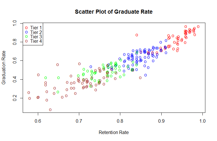
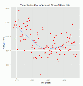
The following display we produced in Blog 13 using traditional graphics plot()
The figure below is produced using ggplot2 for the same dataset used in Blog 13.
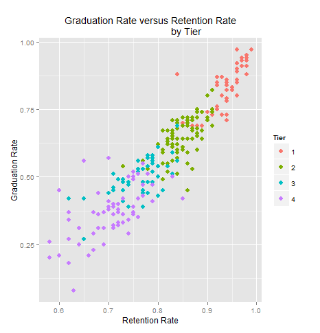
The following R code is used in producing the above ggplot2:
library(LearnEDA)
library(ggplot2)

DD<-na.omit(college.ratings[,c("Tier","F.retention","a.grad.rate")])

DD$Tier<-factor(DD[,1])
p=ggplot(DD, aes(F.retention, a.grad.rate, color=Tier))
p+geom_point(size=3)+labs(title="Graduation Rate versus Retention Rate\
                          by Tier")+
ylab("Graduation Rate")+xlab("Retention Rate")
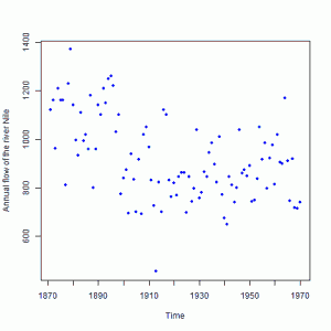
The following figure taken from Blog 11 using plot().
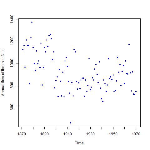
The next display is produced by ggplot2 for the same dataset
used in figure above.
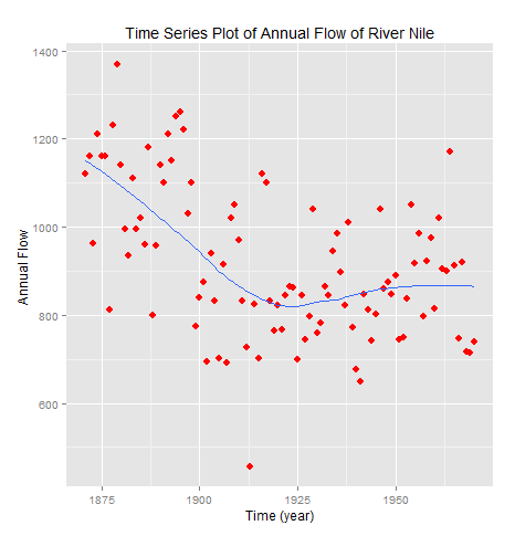
The following R code is used to produce the above ggplot2:
library(datasets)
library(ggplot2)

Time<-seq(1871, 1970)
Flow=Nile
DD<-data.frame(cbind(Time, Flow))

p=ggplot(DD,aes(Time,Flow))
p+geom_point(color="red", size=3)+
labs(title="Time Series Plot of Annual Flow of River Nile")+
stat_smooth(method=loess,se=F)+
xlab("Time (year)")+ylab("Annual Flow ")
Discussion:
The ggplot2 produces nicer and good looking graphs rather the traditional graphics plot ().
The background color in ggplot2 makes the display more pleasing, though it is not necessary for data decoding information. Due to grid in ggplot2 it seems that the visual decoding of physical
Information is easier than plot (). In traditional graphics we need to be more careful to produce the desired graph.
However, in ggplot2 it can be done very easily and with the less commands.
Although the displays produced in traditional and ggplot2 graphics are the same in view of graphical perception, I personally prefer ggplot2 to traditional graphics. Because it requires less effort and produces aesthetic shape.