Pop Charts
Posted by mislam on April 10, 2013
Part 1
The titles of the top 5 songs on “The Billboard Hot, April 4, 1964”, these were Beatles songs, are:
|
Position |
Title |
|
No. 1 |
Can’t Buy Me Love |
| No. 2 | Twist and Shout |
| No. 3 | She Loves You |
| No. 4 | I Want to Hold Your Hand |
| No. 5 |
Please Please Me |
Part 2
In the next section we redraw the data found in two pop charts taken from “USA TODAY” by using Dot plot in order to improve the pattern perception and Table Look-Up.
The first pop chart is a pie chart representing the survey results about employees’ Top Health Concerns.
USA TODAY Snapshots – USATODAY
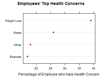
The dot plot is more effective display than the pie chart. The dot plot improves the pattern perception more compared to the pie chart. Although the pie chart uses different bright colors and beautiful pictures, the dot plot makes the Table Look-Up and perception easier for the readers to detect, assemble, and estimate the output. Our perception of the distribution of the values on the dot plot is increased more than the pie chart.
The second pop chart is Most NCAA Men’s Tournament Winners. This pop chart is collected from “USA TODAY”.
USA TODAY Snapshots – USATODAY_1
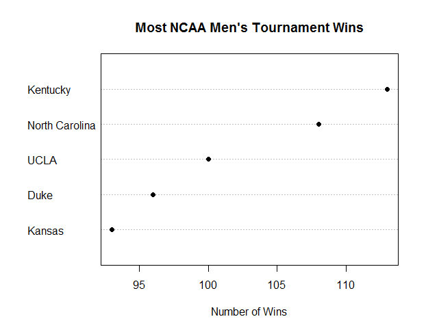
In order to improve the pattern perception and Table Look-Up for decoding visual information from the graph, we graph the data by Dot Plot. Dot Plot increases the Table Look-Up efficiently and also has good pattern perception than the bar chart.